my colour short course is
now offered online through
Australia's National Art
School in Sydney! There's
a choice of two sessions to
suit every time zone. LINK
Home
The Dimensions of Colour
Basics of Light and Shade
Basics of Colour Vision
Additive Mixing
Subtractive Mixing
Mixing of Paints
Hue
Lightness and Chroma
Brightness and Saturation
Principles of Colour
Afterthoughts
- Purves and Lotto
- Modern Colour Theory
- Traditional Colour Theory
- What is Color?
- Answers
- Colour Constancy Illusions
- The Colour Quiz
- What is a Colour?
- Colour Education
- Color Impact 2020
- Colour Attributes
- Shillito portfolio
- Dimensions Today
- Index of Works
- Psychophysical
- Shillito Talk
- Elements of Colour
- Objects and Light
Glossary
References
Contact
Links
NEXT COLOUR
WORKSHOPS

11.10 Report on the ISCC Color Impact 2020 Virtual Symposium
- Philip Ball
- Jennifer Cohlman Bracchi
- Andreas Schwarz
- Robin Kingsburgh
- Luanne Stovall
- Paul Green-Armytage 1
- The colour theory debate
- Paul Green-Armytage 2
- Panel discussion
- Maggie Maggio
Below is my summary of the talks presented at the Inter-Society Color Council virtual symposium Color Impact 2020, originally prepared as a report submitted to a meeting of the National Executive Committee of the Colour Society of Australia on June 24, 2020.
The ISCC Color Impact 2020 Virtual Symposium was held on Saturday June 6th (that’s 1 am to 7 am on June 7th in eastern Australia!). Eleven speakers presented in a variety of formats over the six hours, and 254 colour educators, enthusiasts, and professionals registered from around the world. Robert Hirschler, chair of the AIC Study Group on Colour Education and member of the AIC/ISCC Colour Literacy Project, introduced each speaker, and ISCC President Elect Dave Wyble provided technical support.
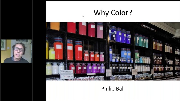
Keynote speaker Philip Ball worked for over 20 years as an editor for Nature and authored many books on the interactions of the sciences, the arts and culture, including his outstanding book on artists’ pigments, Bright Earth: The Invention of Colour (2001). His talk was a plea for a fully multidisciplinary approach to colour, an approach that aligned closely with the positions of most of the speakers at the symposium. Philip described how his whole approach to writing was transformed by his realization in writing Bright Earth that the subject of colour “ought not to be chopped up into the art bit, the science bit, the history bit, and so on. The real story here was about how our cultures emerge from this crucible in which these subjects, conventionally boundaried for our intellectual convenience, emerge, mingle and alloy with one another to spark human creativity and knowledge. ... It’s not so much that colour touches on many different intellectual and creative endeavours but that it defies the very idea that this is how our minds see and organize the world. Colour doesn’t so much span the curriculum as challenge it”.
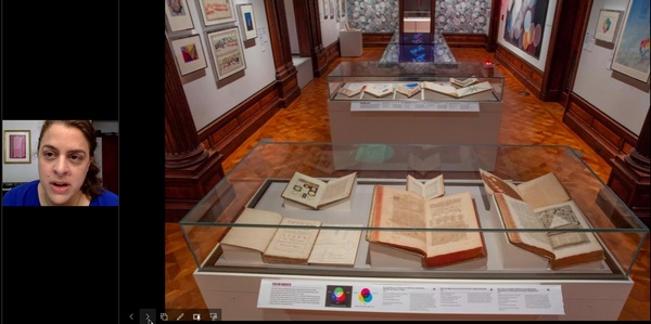
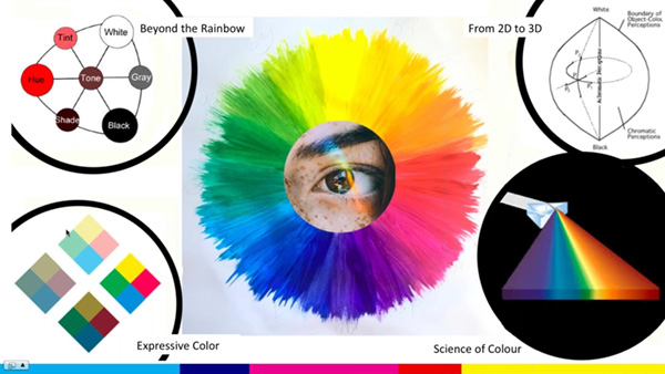
Jennifer Cohlman Bracchi also highlighted the intersections of art and science in describing two exhibitions she curated and co-curated, Color in a New Light (February 2016 – May 2017, Smithsonian Libraries, National Museum of Natural History) and Saturated: The Allure and Science of Color (May 2018 – March 2019, Cooper Hewitt, Smithsonian Design Museum). These exhibitions emphasized the diversity of backgrounds of the people who made contributions to our understanding of colour, featuring works by physicists from Isaac Newton to Henry Roscoe, the poet Johann Wolfgang von Goethe, chemists Michel-Eugene Chevreul and Wilhelm Ostwald, entomologist Moses Harris, ornithologist Robert Ridgway, engraver Jacob Le Blon, board game manufacturer Milton Bradley, and artists and art teachers including Munsell, Itten and Albers. Jennifer then gave a detailed account of a historical exhibition from 1960, The Logic and Magic of Color, at the Cooper Union Museum, which featured over 300 objects and involved museum staff, Cooper Union’s Art and Physics faculty, and leaders in the manufacturing world.
Andreas Schwarz co-authored with Rolf Kuehni the landmark text on colour order systems Color Ordered (2008) and has many years’ experience teaching colour and conducting scientific research into strategies for teaching colour in German primary and secondary schools, culminating in a five-year Government-funded study published as Farbtheorie im Kunstunterricht (Color Theory in Art Classes, 2018). Andreas advocates an approach to colour education in schools that, like Albers, begins with experience and perception and only later leads into theoretical concepts, and is a strong critic of the Itten approach, still prevalent in most German schools, in which experience is seen through the lens of preconceived theory. He quoted Victor D’Amico, MOMA’s first Director of Education, as saying that the usual way of teaching colour theory is “like giving a child the answer and then asking him to work it out. The zest has been taken out of the experience because the child already knows the answer”. This problem is quite apart from the factual incorrectness of much of what is taught as colour theory in schools, such as the doctrine of red, yellow and blue primary colours “mixing” to produce secondary and tertiary colours. Andreas concluded with examples of class exercises relevant to the students' everyday life and in which the motivation comes from the students rather than the teacher.
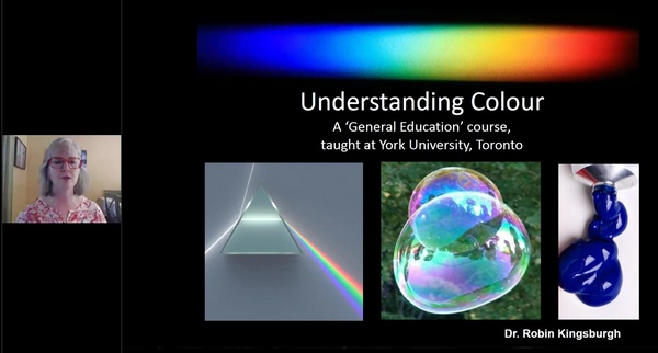
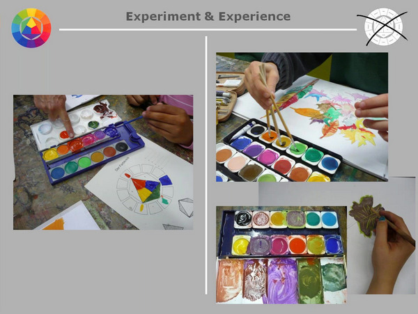
Astronomer, painter and educator Robin Kingsburgh outlined her full-year course Understanding Colour offered by the Division of Natural Science in the Faculty of Science at York University, Toronto. This general education course presumes no prior background in science or art. although many students taking the course are enrolled in various fine art programmes, including painting, and stage lighting. The course, offered since 2000 and now taken by more than 700 students annually, examines colour from perspectives including history, physics, chemistry, biology and astronomy as well as art. The course begins with fundamentals consisting of the physics of light and materials followed by perception including colour constancy and adapatation, followed by various colour applications that may include paints and pigments, biological colour, colour in astronomical images, minerals and gemstones, fluorescence and luminescence and so on. Experiments involving paint mixing, spinning discs, dyeing and so on are used as a stimulus for simple critical thinking questions.
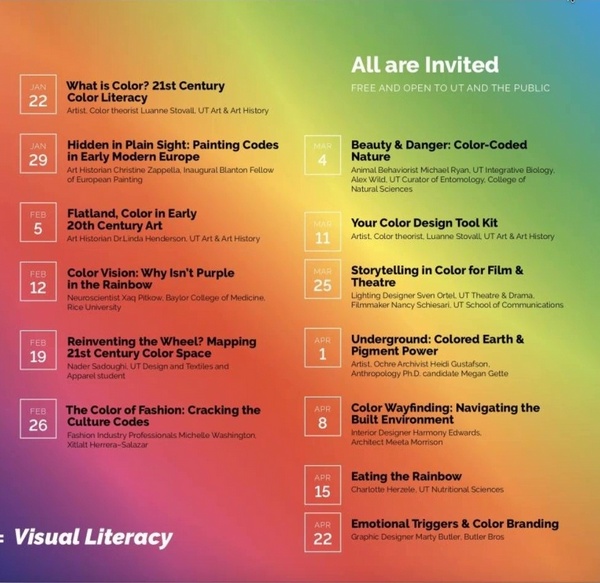
Artist, designer and lecturer Luanne Stovall began by recalling her experience in 2002 of being asked to teach a new course on colour at the Museum of Fine Arts school in Boston, and to make it relevant to students who were increasingly working in mediums other than paint on canvas, including installation, video, sculpture and photography. She then went on to describe her course at the University of Texas, Austin called The New Color, which like Robyn’s is highly interdisciplinary in character, and includes an affiliated program of thirteen weekly guest lectures called “Wednesday Evening Color Salons”, which are open to the public free of charge. Speakers at the salons included an artist, two art historians, a pigment specialist, a neuroscientist, a zoologist, a design student, and lighting, fashion, graphic and interior designers. Major topics covered in the course itself include colour perception, colour order systems, additive, subtractive and optical “colour mixing”, colour psychology and colour design.
After the four General Session presentations, Colour Literacy Project committee member Paul Green-Armytage conducted the first of two sessions of hands-on and interactive colour activities. In Paul’s game Colour Clues, pairs of adult participants attempt to correctly select colour chips from a collection based on each other’s verbal descriptions. Paul then described an activity using the Colour Sorting Set he is developing with Colour Literacy Project Chair Maggie Maggio for children who might be thought to be too young to use terms like hue, lightness, chroma and NCS nuance. Colour chips are sorted according to “family” (meaning hue) and within hue according “character” related to the traditional colour theory concepts of tints, shades and tones. In this first session Paul demonstrated using an interactive poll the simplest version of the activity, in which there are just four characters, “light”, “dark”, “muted” and “vivid”.
The Point/Counterpoint Debate that followed began with presentations on A Defence of Traditional Colour Theory and Widening Our Vision respectively. The most conspicuous lack of agreement seemed to be over the scope of the term “traditional colour theory”, which the first participant* characterized as having evolved “as a foundational component of art and design education” but also showed as including works like the Handbook of Color Psychology of Elliot et al. (2015), an excellent compendium of current colour science. This latter content had of course not attracted criticism from the Colour Literacy Project. What had come in for criticism is what the second participant, Maggie Maggio, characterized as the cornerstone of traditional colour theory, namely the simplistic “rehash” of red, yellow and blue primary colours, secondary and tertiary colours, and so on, content that in the first participant's view was something that traditional colour theory has “moved beyond”. The exchange brought out the need for participants in such debates to begin with an agreed set of criteria defining which theories among the multitude involving colour are to be included in the category “traditional colour theory”, to prevent the debate being at cross purposes and to clarify whether the positions being defended by the participants are internally consistent. Robert Hirschler as Chair neatly summed up the consensus expressed by both participants as follows: “Yes, we don’t need that fossilized, simplistic, oversimplified colour theory but we do need to know more about colour so that the exploration and experimentation can be explained somehow”.
*The first participant subsequently launched an extraordinary series of attacks on my personal and professional reputation on her website beginning on 28/08/2020 (preserved on the archive.org Wayback Machine here), ostensibly in response to my brief review of the debate, which she incorrectly claimed was biased and defamatory against her. The disparity between my tactful comments here and the far-fetched accusations and abusive retribution they were met with can be confirmed by inspecting the archives of the original and all later versions of our pages preserved on the Wayback Machine.
In subsequent revisions the participant very wisely removed her most defamatory statements about me, but persisted in playing the victim, expressing the hope that I "can find a way to treat other academics with respect – as do most within the global academic community – and refrain from denigrating ad hominen commentary when academic perspectives differ", while continuing on the same page her denigrating ad hominem commentary directed at me, including for some time the tag "DAVID BRIGGS COLOUR FRAUD" (preserved here). The participant continues to oblige me to provide these links as evidence to separate fact from projection in our respective conduct, but as a courtesy to a colleague of long standing I've removed her name from this page.
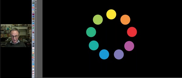
In his second session of hands-on activities Paul demonstrated a more elaborate version of the Color Sorting Set for more advanced students, and comparable in difficulty with some existing exercises for sorting colours according to NCS nuance. Categories of “very light”, “light muted”, “dark muted”, “very dark” and a weakly chromatic “grey” to the original four, producing a regular grid of nine tint-shade-tone “characters” for each hue, corresponding to relative white, black and colour content rather than lightness and chroma. The Color Sorting Set uses a new hue scale of nine named hues: red, orange, yellow, lime green, green, blue green, blue, violet and magenta. These named hues lack any hierarchy among themselves and each sits opposite an interval between two named hues, two features that might make the circle more difficult to memorize and hold in the mind than the familiar opponent, traditional, additive-subtractive and Munsell hue circles, but which are employed deliberately with the intention of avoiding commitment to any one of the latter hue scales.
Next, Luanne Stovall hosted a panel discussion Expanding the Focus of Art and Design Education involving Leslie Mutchler, Chair of the Foundation Department at the Pratt Institute, Nader Sadoughi, a BFA Design student at The University of Texas at Austin, and Alicia Keshishian, who leads the multidisciplnary education program of the Color Marketing Group. (The fourth scheduled panellist Richard Mehl of the School of Visual Arts, NYC, was unable to participate).
The three speakers each described new ways in which colour education is being expanded beyond what is normally included in traditional colour theory, from the point of view of a teacher, a student, and an educator in industry. Leslie described how she had taught colour in different institutions “in a myriad of ways, but always focussed on the spiritual, the slippery and the emotive along with the formal, the scientific, and the concrete”, and emphasized the mutual interaction and enhancement of her teaching and her artistic research and productions, such as Intermediate Geochromatic Studies (2020) with Jason Urban. Nader described what he saw as a crisis in colour education around the world resulting from an over-reliance on the flawed texts of Albers and Itten and the traditional red-yellow-blue colour wheel, and enthusiastically advocated the application of modern colour order systems such as CIE L*a*b* in classroom education. Alicia described co-teaching multidisciplinary classes for industry professionals addressing colour through design, science and technology, and recorded her astonishment to discover when first teaching these classes that only about 10 percent of colour professionals had an understanding of the basics of the subject. In the ensuing discussion there was agreement with the view that higher education in the United States is generally failing colour professionals (the fully interdisciplinary colour programs at the Pratt Institute and the University of Texas among the few exceptions), and with the observation of a current college student that colour classes are the “bad maths” of most colleges.
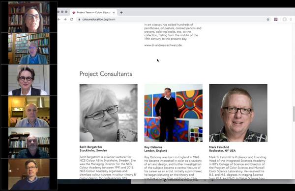
In the final segment Maggie Maggio introduced the ISCC/AIC Colour Literacy Project and its new website, https://colourliteracy.org/. The Colour Literacy Project was formed in the wake of the Munsell 2018 symposium to “identify and address the most basic, current misconceptions and misinformation about colour while building a bridge between the art and science of 21st century colour education”. Maggie gave participants a tour of the new website, which is still in its early stages but gives an explanation of the specific objectives of the project, a listing of the team members and project consultants, and two examples of prototype modules for early school level teaching. A page of educator resources is currently under construction but already includes a link to Colour Online, a curated collection of some 500 links to useful colour-related resources prepared specifically for the Project by David Briggs, as well as resources previously produced by team members Stephen Westland, Harald Arnkil and Andreas Schwarz.
Color Impact 2020 presented a strong challenge to the status quo in colour education, with calls to present colour in new and engaging ways as a fully interdisciplinary subject bridging many areas of the sciences and the arts. Such calls have been made many times in the past and will no doubt be made many times in the future in the ongoing battle against outdated, formulaic and uninspiring “rehash” in colour education.
David Briggs,
Vice President and NSW Divisional Chair,
Colour Society of Australia