
The Dimensions of Colour
Basics of Light and Shade
Basics of Colour Vision
Additive Mixing
Subtractive Mixing
Mixing of Paints
Hue
Lightness and Chroma
Brightness and Saturation
Principles of Colour
Afterthoughts
Glossary
References
Links
NEXT COLOUR

11.3 TRADITIONAL AND MODERN COLOUR THEORY PART 2: TRADITIONAL COLOR THEORY STRIKES BACK!
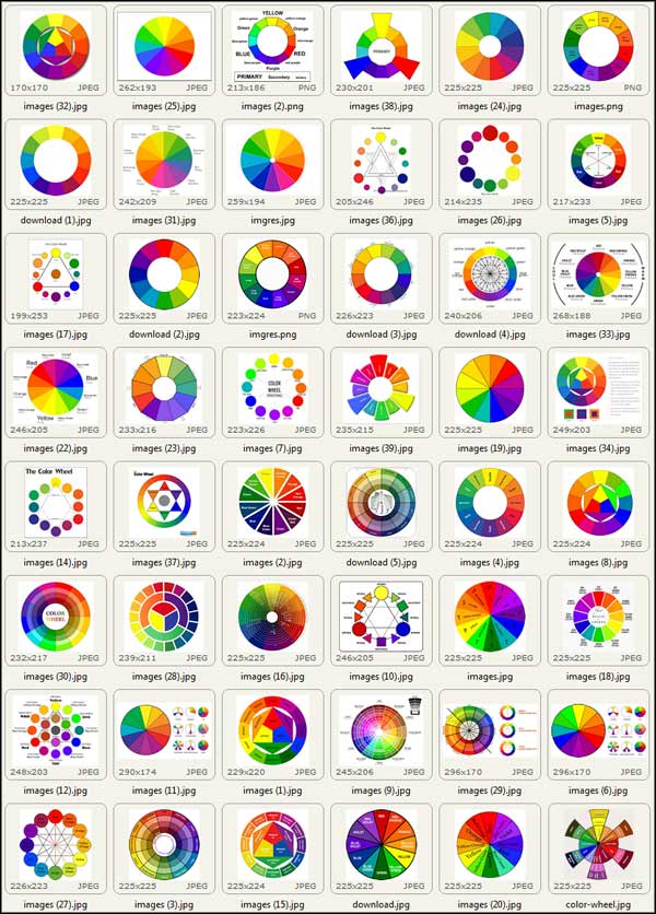
Figure 2.1. Forty eight traditional colour theory diagrams from a Google image search for "colour wheel", All forty eight would have been found to include some highly inaccurate complementary pairs if they had been checked using the simplest of tests, as in Fig. 2.3 A,B.
Although textbooks for academically trained artists ably explained modern colour theory from its beginnings, traditional colour theory persisted into the 20th century in other texts, especially those written for amateur painters, and in the thinking of other artists, notably some of the pioneers of abstraction (Kandinsky, Mondrian) and expressionism. Throughout the first half of the century fully modern and fully traditional colour theory texts coexisted, and many texts presented both approaches. Since the 1960s however, traditional colour theory has had a renewed and dominant influence on art education, even at tertiary level, very largely in the form set down in Johannes Itten's book The Art of Color (1961). Itten's book has been so influential that it defines the limits of artistic colour theory for the majority of sources on the internet today (Fig. 2.1): a symmetrical traditional colour wheel, schemes of "objective" colour harmony, dictionary meanings of colours, the limited subset of colour phenomena known to early 19th century science (mainly successive and simultaneous contrast), and very little on colour in relation to representation of light and atmosphere. Traditional colour theory has entered the digital realm in the form of apps like the widely used Adobe Color CC (formerly Kuler), which calculates complementary and triadic colour sets using a modified digital hue circle in which the hue angles are intended to conform to the traditional colour wheel (Fig. 2.3B). As a result of its half century of ascendancy, many artists today assume that traditional colour theory has dominated art education continuously since its origins, and assume modern colour theory is a very recent intrusion.
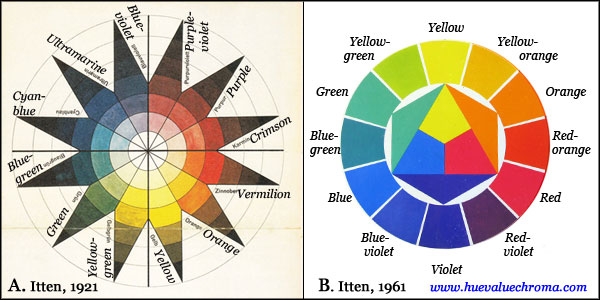
Figure 2.2. A. Colour star used by Itten as the basis of his teaching at the Bauhaus c. 1921, showing English translations of the 12 hue divisions he derived from his teacher Adolf Hoelzel. Notice the symmetrical placement of yellow, cyan blue, and a "Purple" (magenta) intermediate between "Crimson" and "Purple violet". B. Traditional hue divisions adopted in The Art of Color.
Itten took many elements of his colour theory from that of his teacher Aldof Hoelzel, but in his book of 1961 he left out almost all of the elements that Hoelzel had derived from late 19th and early 20th century science, and presented a version of traditional colour theory and classification almost entirely fixated at an early 19th-century stage of development. Thus although his "colour star" lithograph of 1921 (Fig. 2.2A), which he had used as the basis of his teaching of colour at the Bauhaus (Itten, 1975, p. 33), follows Hoelzel's 12-hue system derived from the scientist Wilhelm von Bezold, in The Art of Color he reverted to a traditional system comprising evenly-spaced historical primaries and secondaries, with six intermediates (Fig. 2.2B).
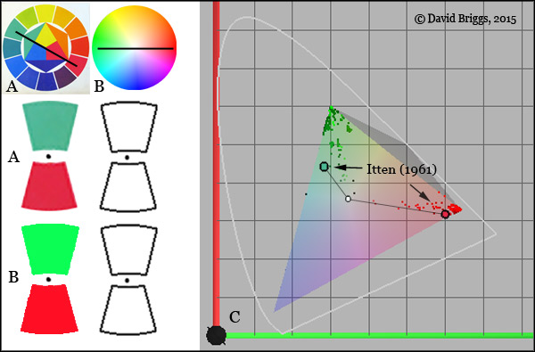
Figure 2.3. A,B. Supposedly complementary red-green pairs from the first edition of Itten's The Art of Color (A) and from the online Adobe Color CC (formerly Kuler) colour circle (B). To see the true afterimage complementary of each colour, focus on the central dot on the left for ten seconds and then immediately focus on dot on the right. Most observers will see that the afterimage complementary of the reds as more cyan, and the afterimage of the greens as more magenta, than the supposed complement. C. CIE xyY plot of the primary red and opposing secondary green colours from the 48 online colour wheels shown in Fig. 2.1, using the program ColorSpace by Philippe Colantoni. Additive complementaries fall on a straight line through the central white point. Both sets show a broad scatter of chromaticities but are centred near the green and red additive primary hues, placing them even further from being additive complementaries than Itten's 1961 pair.
Itten's three primary colours are defined in his text as perceptually pure hues, oddly enough in terms of the names of the four psychological primaries of modern science, which otherwise escape mention: "a red that is neither bluish nor yellowish; a yellow that is neither greenish nor reddish; and a blue that is neither greenish nor reddish" (emphasis mine; see Fig.1.1 on preceding page). Secondary colours "contain" two primary colours and "must not lean towards" either of their "components", and these secondaries are held to be complementary to the remaining primary in paint mixing, in additive mixing, in simultaneous contrast, as negative afterimages, and even in expressive interpretation (Itten, 1961, p. 137). Thus according to the logic of the system, primary red must be complementary in all of these ways to a middle green that does not lean towards either yellow or blue. In reality, as we saw previously, the additive and afterimage complements of a middle (5R) red are bluish-green (about 5BG) rather than middle green (5G), and a very similar relationship applies to afterimage complements (Fig. 2.3 B). Yet accurate complementaries - the colour that "the eye demands" after seeing another colour - are accorded enormous significance in Itten's theory as the basis of what he considered to be "objective" colour harmony, which in all its forms depends on a balance of complementary opposites. Most online examples of traditional colour wheels, including Adobe Color CC, place the red-green pair close to the additive primaries called "red" and "green", giving even more inaccurate additive and afterimage complementaries (Fig. 2.3 C).
Itten does include two elements of modern colour theory on a single page entitled "Color Physics" early in his book, but these are puzzling to reconcile with the rest of his text. The two elements are the continuous spectrum (described by Newton but in question until upheld by Helmholtz against Brewster) and the idea that the mixing of paints is "governed by the rules of subtraction". Itten's account of the spectrum makes it clear that he considered spectral green to be uncompounded and not a physical mixture of yellow and blue rays (as Brewster and Goethe had supposed), but if the mixing of paints is subtractive, and a mixture of yellow and blue paints, like other green materials, reflects only uncompounded green wavelengths, how then does green "equal" yellow plus blue? The only reconciliation I can think of is that Itten harboured the 19th century idea that colour vision involves cells "tuned to receive" red, yellow and blue wavelengths (as Josef Albers would offer as a part of a "plausible explanation" for afterimages in Interaction of Color in 1963), and that green wavelengths stimulate the yellow and the blue receptors to create a mixed sensation of green - an unorthodox view that might have motivated Itten's statement that "how we discriminate these light waves is not yet well understood". However it is likely that most adherents of traditional colour theory instead think of the colours yellow and blue as residing and mixing in the paints themselves, though some may also hold completely incompatible scientific ideas about light and colour in quarantine alongside this idea in their minds.
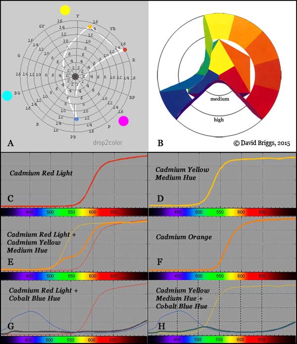
Figure 2.4. A. Mixing paths of a set of red, yellow, and blue paints (Cadmium Red Light, Cadmium Yellow Medium and Cobalt Blue Hue. B. Ittten colour wheel transformed to show chroma of primary paint mixes. C-H. Spectral mixtures calculated using the program drop2color by Zsolt Kovacs Vajna.
The other problem is how can primary red paints, if these pass on only the red rays of the spectrum, subtractively generate full-colour mixtures with paints extending around two-thirds of the colour wheel? In terms of modern colour theory they can only make high chroma mixtures with paints as far away as the nearest subtractive primaries, yellow and magenta, which share their high reflectance of red wavelengths. Inevitably, paints of Itten's "primary" red hue make very high-chroma mixtures with his "primary" yellow, but only very low-chroma mixtures with his "primary" blue (Fig. 2.4 A,B,E,G,H). "Primary" blue and "primary" yellow are essentially opposite in terms of light mixing and opponency, but as we've seen the former nevertheless reflect enough green wavelengths to cause mixing paths with yellow paints (all of which reflect large amounts of green wavelengths) to curve outwards through medium-chroma green (Fig. 2.4A, 1.8G).
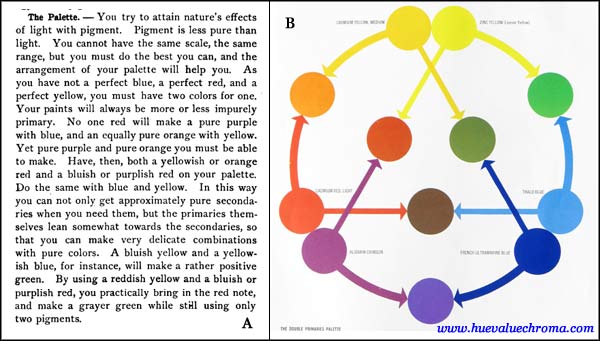
Figure 2.5. A. Recommendation of a palette with two of each (historical) primary from Parkhurst's The Painter in Oil (1900). B. Illustration of a "double primaries palette" from The Art Of Color Mixing (M. Grumbacher Inc, 1966).
The impossibility of mixing purples above a very low chroma from a perceptually pure red and blue paints is a very well-known problem with trying to use a palette of the traditional primaries. A practical workaround that dates back at least to the end of 19th century is the double or split primaries palette, consisting of a "warm" and a "cool" version of each historical primary (Fig. 2.5). The revival of traditional colour theory in the 1970's was almost inevitably followed by the revival of this double-primaries strategy, most famously in the best-selling book Blue and Yellow Don't Make Green by Michael Wilcox (1987). Wilcox attached to this traditiuonal double primary strategy a new formulation of traditional colour theory that incorporates a model of subtractive mixing without the subtractive primaries. In Wilcox's 1987 formulation the wavelengths said to be passed on by a paint correspond directly to its colour, so that for example a lemon yellow paint is said to reflect a large amount of the yellow part of the spectrum and a small component or "impurity" from the green part. Colour mixing of two paints is said to require having a quantity of this secondary colour impurity or "bias" in common.
Thus while in Itten's colour theory we get orange from mixing red and yellow paints because "yellow + red = orange", in Wilcox's theory the red and yellow components neutralize each other, and the mixture reflects just the orange wavelengths that the paints have in common. In modern colour theory, all yellow paints reflect most of the red, orange, yellow and green parts of the spectrum (Fig. 2.4C,D), so that a subtractive mixture with red paint reflects a large component of red wavelengths and a smaller component of the wavelengths through to green, which combine additively to make orange light (Fig. 2.4E), much as they do in a single-pigment orange paint (Fig. 2.4F). While each explanation "works" in the context of its assumptions, only modern colour theory can account for the particular effectiveness of just one 'impure' blue (cyan), one 'impure' red (magenta) and just one yellow paint in mixing an optimally large gamut of colours (Fig. 2.6A). The traditional double primaries palette works in practice because it includes good subtractive primaries as the three "cool" primaries, while the three "warm primaries" are useful high-chroma pigments that access higher chroma reds to orange-yellows and blues outside the subtractive-primary gamut (Fig. 2.6B).
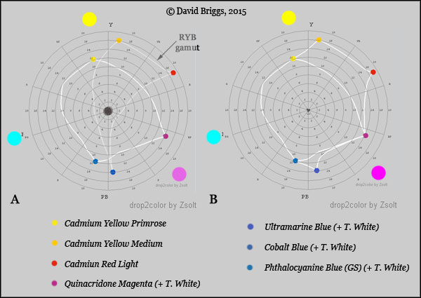
Figure 2.6. A. Comparison of approximate gamut of cyan-magenta-yellow (CMY) primaries with historical red-yellow-blue (RYB) primaries. B. Gamut of "cool" (=CMY) primaries plus "warm" primaries of a double primaries palette.
Traditional colour theory refers to a scale of value or "tone" as well as the "colour wheel", but these dimensions are generally either treated in isolation or integrated only superficially. As a three-dimensional framework Itten dismissed the Ostwald system, which had been widely used in other classes at the Bauhaus, and ignored the Munsell system, which by that time was very widely used in art, science and industry, and reverted to a simplistic spherical model (Fig. 2.7D-F) externally like that developed by Runge in 1810 (Fig. 2.7A-C).. These spherical models express the way object colours become more restricted in chroma as they approach black and white, but their vertical dimension (which Itten termed "brilliance") only superficially represents value, in that colours of different greyscale value (e.g. primary red, yellow and blue) are forced to lie at the same vertical level (Fig. 2.7 G-I). Itten uses the term "saturation" for both purity of colour of lights (at a maximum for the "prismatic hues" - Itten, 1961, p. 96) and for relative chroma of object colours.
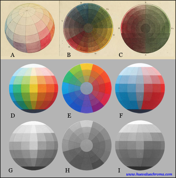
Figure 2.7. A-C. Spherical colour order system published by Runge (1810). D-F. Spherical system published by Itten (1961). G-I. Itten's sphere illustrations converted to greyscale.
The colour teaching of Josef Albers is sometimes lumped with that of Itten, but was quite different in many ways. Albers included the Ostwald and Munsell systems (favouring the latter) in his courses, ignored Itten's colour circle and sphere, and was skeptical of schemes of "objective" colour harmony. Albers did treat red, yellow and blue as the painter's primaries, but he also discussed the psychological and additive primaries, and his teaching can certainly not be said to be founded on the historical primaries. Unfortunately but perhaps inevitably, his much less dogmatic and more experience-based approach ultimately had less influence on art and design curricula than Itten's formulaic and self-contained system, which in effect insulates the teacher and the student from the last century and a half of developments in our understanding of colour.
The revival of traditional colour theory since the 1960s was not based on a successful challenge to the truth of modern colour theory, but must be understood in the context of the concurrent reduction and elimination of other technical elements, such as traditional drawing skills, anatomy and perspective, in art education over the same period. Traditional colour theory anachronistically maintains views of the nature of colour that prevailed before the late 19th century Helmholtz-Maxwell-Hering revolution, and its relationship (or lack of relationship) to modern colour theory is in some ways like that of so-called "Creation Science" to modern biology. The difference is not between science and art, but between the sciences of different eras. Perhaps its most unfortunate effect is that students can become “adapted” to simplistic treatments of colour, making modern colour theory seem unnecessarily complicated. If 90 percent of books treated anatomy or perspective in an extremely simplistic way, you would get a similar shock the first time you saw some real artistic anatomy or perspective.
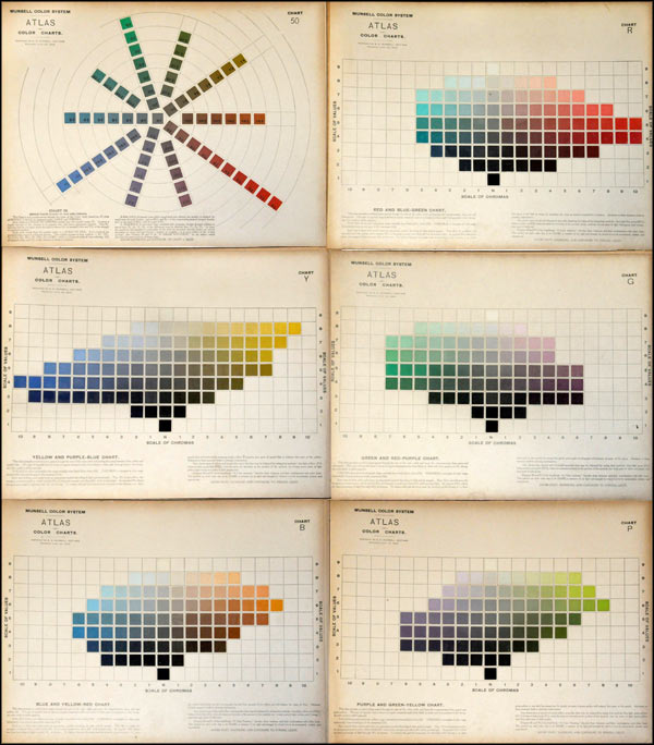
Figure 2.8. A, value 5 plane and B-F, the five hue pages from Albert Munsell's Atlas of the Munsell Color System (1915), the forerunner of the modern Munsell Book of Color.
Art and design teachers educated in the age of Itten now occupy positions of authority and influence, and it is understandable that many of them are not planning to give up their attachment to simplistic traditional colour theory any time soon. Nevertheless, there are encouraging signs that some teachers are beginning to question the ethics of presenting colour theory that is obsolete in itself and entirely incompatible with their students' digital studies. However the most powerful force for change will probably come from students, who pay a lot for their education these days, and in many institutions have considerable power to penalize outdated teaching through student feedback surveys. The current situation among art teachers is especially disappointing when we recall that a century ago it was, not a scientist, but an artist and art teacher who published the system that would become a cornerstone of modern colour theory.
Published June 30, 2015.
Next: Part 1: Introduction