
my colour short course is
now offered online through
Australia's National Art
School in Sydney! There's
a choice of two sessions to
suit every time zone. LINK
Home
The Dimensions of Colour
Basics of Light and Shade
Basics of Colour Vision
Additive Mixing
Subtractive Mixing
Mixing of Paints
Hue
Lightness and Chroma
Principles of Colour
Afterthoughts
Glossary
References
Contact
Links
NEXT COLOUR
WORKSHOPS

PART 8. LIGHTNESS AND CHROMA
Please note: The pages forming Part 8 were part of the original Dimensions of Colour site uploaded in 2007 and have not been updated recently. They are left here for the moment because some of the diagrams have been linked to by other sites or reproduced in publications. For much more recent discussions of lightness and chroma please see:
Section 1.3 The Dimensions of Colour: Lightness
http://www.huevaluechroma.com/013.php
Section 1.5 The Dimensions of Colour: Chroma
http://www.huevaluechroma.com/015.php
THE DIMENSION OF LIGHTNESS
Lightness is technically defined as the perceived brightness of an object compared to that of a perfect white object (Kuehni, 2005). Lightness refers specifically to object colours, not colours seen as independent lights, and ranges between black and white through the various shades of grey.
The lightness of a light-reflecting surface depends on the proportion of light energy reflected from a surface, but scale of lightness have a nonlinear relationship to the amount of visible light energy (luminance). A middle grey surface that looks as many steps away from white as it does from black reflects only about 18% of the light energy reflected by a white surface. Charles Poynton has emphasized the importance of distinguishing beween between linear and nonlinear scales. Linear scales, such as radiance and CIE luminance, called Y (= radiant energy or radiance weighted wavelength by wavelength to the spectral sensitivity of a standard human observer), are proportional to light energy. Nonlinear scales, such as CIE lightness (L*) and video luma (confusingly, also designated Y and often referred to as luminance), are intended to be proportional to the scale of human perception. Digital artists will know of CIE lightness (L*) from its utilization in Lab colour space at the core of programmes such as Photoshop.
CIE lightness is normally measured on a scale of 100, and is derived from CIE luminance by a modified cube root relationship (Yn= luminance of white standard):
L = 116 (Y/Yn)1/3 - 16; 0.008856 < Y/Yn
CIE lightness is a psychometric scale based on colourimetric measurements, and may not quite coincide with lightness as experienced by an observer, even under ideal conditions. In particular, certain colours can give the impression of being lighter than a grey of the same CIE lightness, an effect known as the Helmholtz–Kohlrausch Effect (Figure 8.1). In Photoshop, this can result in some surprises when converting images to greyscale mode, which translates all colours to a grey of the same value of CIE lightness.
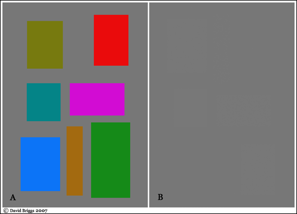
Figure 8.1. Helmholtz–Kohlrausch Effect. A: Various colours on a grey background, all measuring L = 50 in Photoshop. B: same image converted to greyscale mode.
Artists painting in traditional mediums generally use other scales of lightness. Many painters use the system promoted by Denman Ross (1907), consisting of nine tonal levels from black to white (inclusive). Such a scale can be created by mixing a medium grey visually halfway between white and black, a light and a dark grey halfway between medium grey and white and black respectively, and intermediate greys in the four intervals so created. Ross designated these levels by a system of letters: Blk, LD, D, HD ,M, LLt, Lt, HLt, and Wt. The system of seventeen levels that would result from adding the next generation of intermediates is too unwieldy to use widely as a basic scale, although of course refined tonal painting ultimately requires discrimination of half steps and smaller intervals on the nine-level scale.
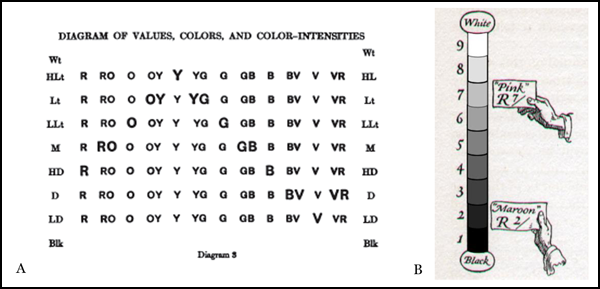
Figure 8.2. Lightness scales of Denman Ross and Albert Munsell. A, Lightness ("value") and hue ("color") scales of Denman Ross, showing location of highest chroma (color-intensity") versions of each hue in bold (Ross, 1907). B, Value scale of Munsell, from Cleland (1921).
When physically creating a lightness scale in this way one soon becomes aware that the perception of relative lightness is rather strongly dependent on background lightness (Figure 8.3). This effect of background lightness is called "crispening", and is a specific instance of simultaneous contrast, which tends to intensify lightness differences either side of the greyscale value of the background. The degree of illumination in which the scale is viewed also seems to strongly affect the apparent spacing of the values.
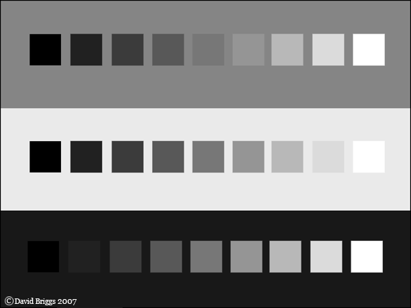
Figure 8.3. Effect of background on perceived lightness. This lightness scale created in Photoshop may not be perfectly even, but where is the biggest jump? The phenomenon of "crispening" makes lightness intervals close to the background lightness look relatively great.
Albert Munsell described a perceptually uniform lightness ("value") scale as a part of his invention of the first quantitative classification of colour in terms of three perceptual dimensions. Munsell (1905) described a scale of eleven levels (and thus ten intervals), from black at zero to white at ten. In his Atlas of the Munsell Color System (1915) this was interpreted as a nine level scale of actual paint between "unattainable" black and "unattainable white on one and ten respectively (Cleland, 1921). The resulting scale, with actual black paint on one and white paint on nine (Figure 8.2B), was effectively identical to that of Ross. In the modern Munsell system, most black paints have a value of about 2 (though a glossy black paint can be as low as 0.5), and most white paint has a value of about 9 (Luke, 2001). Other painters however, including the influential American teacher Frank Reilly, have expanded Munsell's scale to eleven levels of paint values, with black and white paint on zero and ten respectively.
Some painters active today are strongly committed to the use of the Munsell system as a framework for seeing and mixing colour. These artists in effect train themselves to see the hue, brightness and colorfulness of the light from their subjects in terms of the Munsell hue, value and chroma of the paint that they will use in their paintings. Other painters, while thinking of colour in terms of the conceptual dimensions of hue, lightness, and chroma, do not use the specific framework of Munsell units. Whatever one decides regarding the need to use Munsell's specific scales of hue and chroma, the use of some sort of absolute scale of lightness is of great value as a framework for the controlling values in painting.