
my colour short course is
now offered online through
Australia's National Art
School in Sydney! There's
a choice of two sessions to
suit every time zone. LINK
Home
The Dimensions of Colour
Basics of Light and Shade
Basics of Colour Vision
Additive Mixing
Subtractive Mixing
Mixing of Paints
Lightness and Chroma
Brightness and Saturation
Principles of Colour
Afterthoughts
Glossary
References
Contact
Links
NEXT COLOUR
WORKSHOPS

PART 6. PAINT MIXING
6.1 MIXING PAINTS
Paint mixing processes
Artists who use physical paint media mix their colours in three basic ways:
1. by physical mixing,
2. by glazing (using superimposed transparent paint layers), and
3. by interspersing small patches of colour that optically blend completely or partially at the intended viewing distance.
The physical mixing of paints is often described simply as subtractive, but in reality a component of additive-averaging mixing is usually also involved. In a physical mixture of paints, most light bounces around and interacts with grains of all components in the mixture before emerging, so that each component has the opportunity to influence the colour of the light. However, unless the paints involved are perfectly transparent, some light will be back-scattered off grains of one or other component alone (Fig. 6.1.1). The first process is subtractive, whereas the second by itself would result in additive-averaging mixing. Thus even if two opaque paints reflect no wavelenghths in common, their mixture will still reflect some light because of the contribution of the additive-averaging component, which is why it is impossible to mix a deep black from them.
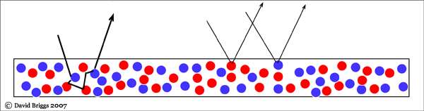
Figure 6.1.1. Physical mixing of artists' paints. Physical mixing of opaque paints involves a substantial component of additive-averaging as well as subtractive mixing. With transparent pigments the process is more purely subtractive.
Figure 6.1.2A compares the physical mixing path of two near-complementary paints with the paths of additive, additive-averaging, and subtractive mixing of their RGB colours. (Remember from Section 4.5 that the linear RGB values of a paint's colour constitute a simple graph of the spectrum of light that the paint reflects). For the opaque paints used in this illustration, the paint-mixing path is intermediate bewteen the subtractive and the additive-averaging path. For more transparent paints, the path would be closer to the subtractive path. When grains of the same pigments are not enclosed in a medium, as for example when colours are blended in pastel, the mixing path is visually closer to the additive-averaging path (Fig. 6.1.2B). This is because an enclosing medium makes the pigment grains more transparent, and also, due to internal reflection within the medium, increases the amount of multiple reflection among the grains, two factors that favour the subtractive component.
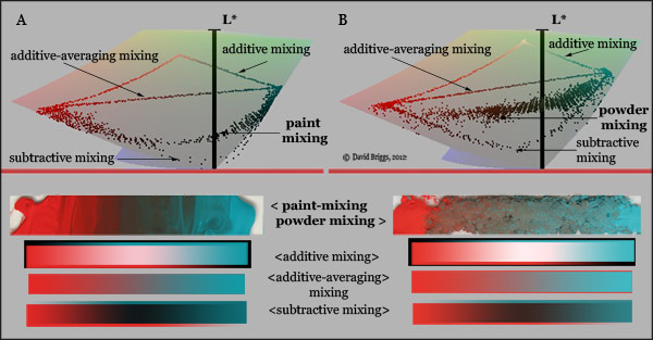
Figure 6.1.2. Mixing paths of two near-complementary opaque pigments, cadmium red and cobalt green, (A) ground in linseed oil, and (B) mixed as dry powders, compared with the paths of their RGB colours mixed on additive, additive-averaging and subtractive principles. The latter were calculated in Photoshop using opacity gradients in Linear Dodge, Normal and Multiply layer mixing modes respectively, blended at a gamma of 1.0. Notice that the pigment-mixing paths are a compromise between subtractive and additive-averaging mixing, visually closest to the subtractive path in paint mixing, but to additive-averaging path in powder mixing.
In glazing (Fig. 6.1.3), most light will pass through both layers, resulting in subtractive mixing. However some light will be scattered by the top layer unless the latter is perfectly transparent, and because of this a red glaze over blue looks different to a blue glaze over red.
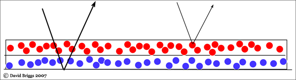
Figure 6.1.3. Glazing of imperfectly transparent paints. Mixing of overlaid glazes is primarily subtractive, but a minor additive-averaging component is supplied by the upper layer.
Use of minute interspersed colour areas (Fig. 6.1.4) results in primarily additive-averaging colour mixing. Thus, even though physical paints are involved, an area of yellow and ultramarine blue dots in the right proportion will make a neutral grey, rather than the green that would result from subtractive mixing. However if there is any overlapping of transparent component colourants (as occurs extensively in halftone printing), or mutual reflection between the coloured areas, subtractive mixing will also be involved.
The pointillist painting technique of applying separate dots of colour that partially fuse optically at the intended viewing distance was advocated by Ogden Rood (1879) as a means of producing a "soft" but vibrant visual effect. There are rather widespread notions that in the work of Neoimpressionist Georges Seurat this technique produces, or was intended to produce, brighter and/or more intense colours than could be obtained from "palette mixtures". This is a misunderstanding of both Rood and Seurat. Seurat in fact employed optical colour mixing most elaborately in the most neutral areas of his paintings, where it allowed the painter to produce low-chroma colour fields while still employing high-chroma visual components. Related effects of colour "noise" are also be obtained by letting colour show through discontinuities in an overlying paint layer, or in watercolour by using washes containing a mix of granulating and staining components.
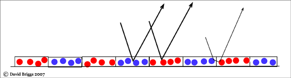
Figure 6.1.4. Mixing of minute interspersed colour areas. This kind of mixing is mainly additive-averaging, with a subtractive component if the components interact by overlap or inter-reflection.
Paint-mixing primaries
We saw in Section 5.3 that in the relatively simple subtractive mixing seen in digital colours, the full-chroma additive and subtractive primaries each mix with other full-chroma hues in a distinctive pattern of mixing paths (Fig. 6.1.5).
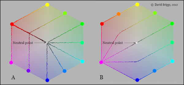
Figure 6.1.5. Subtractive mixing patterns of (A) full-chroma subtractive primaries and (B) full-chroma additive primaries in a plan view of YCbCr space, which provides a regular hexagonal representation of the hue-chroma plane of the RGB gamut (see section 5.3).
Mixing of artists' paints is more complex, both because the subtractive result depends on the actual spectra of the pigments involved, and because of the additional additive-averaging component discussed above. Despite these "substance uncertainties", the two basic patterns delineated in the simplest kind of subtractive mixing are still prominent in the mixing paths of artist's paints (Figs 6.1.6, 6.1.7, 6.3.1A-G). Paints that are distant from the ideal subtractive yellow, magenta and cyan hues, for example cadmium red, make high-chroma mixtures with only a few close hues, and have near-complementaries among a surprisingly wide range of hues, such that several paints may serve as paint-mixing complements for them. Mixing paths funnel towards these colours in a pattern that I liken to an introverted octopus (Fig. 6.1.6). In contrast, paints that are close to ideal yellow, magenta or cyan hues follow mixing paths shaped like an extroverted octopus: they make high-chroma mixtures with distant hues, and are directly neutralized by only a very narrow range of paint hues (Fig. 6.1.7). If an exact mixing complementary is needed for one of these subtractive primaries, it will often need to be mixed, as there is a comparatively low probability that the precise hue required will be found at hand in a given paint selection..
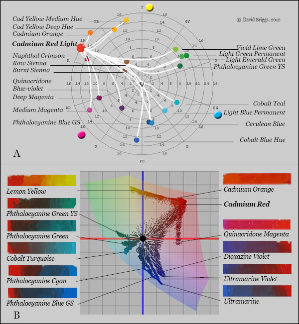
Figure 6.1.6. Mixing paths of artist's paints close to the additive primary hues. (A) Mixing paths of Liquitex Acrylic Cadmium Red Light with other paints in the range, modelled using the program drop2color by Zsolt Kovacs. (B) Mixing paths of Art Spectrum Cadmium Red oil paint with other paints of various brands; all paints raised to approximate maximum chroma point with added white. RGB image colours plotted in CIE L*a*b* space using the program ColorSpace by Philippe Colantoni.
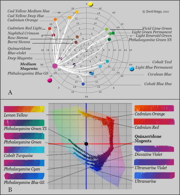
Figure 6.1.7. Mixing paths of artist's paints close to ideal subtractive primary hues. (A) Mixing paths of Liquitex Acrylic Medium Magenta with other paints in the range, modelled using the program drop2color by Zsolt Kovacs. (B) Mixing paths of Art Spectrum Quinacridone Magenta oil paint with selected other paints of various brands; all paints raised to approximate maximum chroma point with added white. RGB image colours plotted in CIE L*a*b* space using the program ColorSpace by Philippe Colantoni.
Because paints close to the ideal subtractive primary hues mix along lines that bend outwards, staying high in chroma, any set of three such paints yields a particularly large gamut or range of colour mixtures (Fig. 6.1.8). Yellow, magenta and cyan are thus the optimal primary hues for paint mixing, just as they are for standard colour printing and photographic prints and slides. The growing realization of the particular effectiveness in colour mixing of three such colours among painters and dyers of the early sixteenth century inspired the concept of primary colours, although historically these primaries were generally identified by the names yellow, red and blue (Section 6.2).
Ideal yellow, magenta and cyan colourants would be the optimal primaries for paint mixing, if such pigments existed. However, even today our best magenta and cyan pigments are well towards red and blue respectively, compared to the ideal magenta and cyan subtractive primaries. No high-chroma pigments are very close to an ideal magenta hue; the closest high-chroma oil painting pigment is quinacridone magenta (PV 19), which is distinctly redder than ideal magenta. The closest popular oil painting pigment to an ideal cyan is the green shade variant of phthalocyanine blue (PB 15.3), which similarly is distinctly bluer than an ideal cyan. Cobalt green is closer to ideal cyan in hue, and does mix some blue-green colours not obtained using phthalocyanine blue alone as the primary, but yields fewer colours in the bluish range. It is also more expensive, and being opaque is less suited to mixing dark colours. Yellow pigments are available in an essentially continuous range of hues, and a pale or lemon yellow seems to provide the optimal gamut of colours.
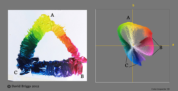
Figure 6.1.8. Mixtures of (A) Lemon Yellow (B) Quinacridone Magenta and (C) Phthalocyanine Blue (Green Shade) oil paints. Photographed colours in a*b* plane of L*a*b*space. Each pair of paints mixes along a line that is convex outwards, keeping relatively high in chroma.
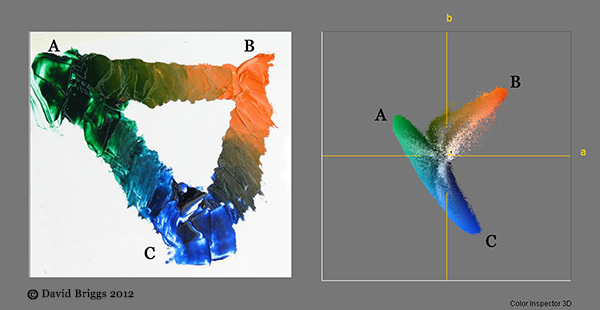
Figure 6.1.9. Mixtures of (A) Phthalocyanine Green (Yellow Shade) (B) Cadmium Orange, and (C) Ultramarine Blue oil paints. Photographed colours in a*b* plane of L*a*b*space. Colours on each mixture line move away from high chroma.
Modified 2nd November, 2012. Original text here and here.