
my colour short course is
now offered online through
Australia's National Art
School in Sydney! There's
a choice of two sessions to
suit every time zone. LINK
Home
The Dimensions of Colour
Basics of Light and Shade
Basics of Colour Vision
Additive Mixing
- Additive primaries
- Additive mixtures
- Additive complementaries
- Additive-averaging & pointillist mixing
- Object colours
Mixing of Paints
Hue
Lightness and Chroma
Brightness and Saturation
Principles of Colour
Afterthoughts
Glossary
References
Contact
Links
NEXT COLOUR
WORKSHOPS

4.5 ADDITIVE MIXING AND OBJECT COLOURS
We all know that additive mixing applies to colours of lights, but it is also intimately involved in the colours of objects, including the "colours" we paint with in traditional as well as digital media. In terms of physical stimulus, our digital colours are additive mixtures of highly saturated red, green and blue lights, and in the same sense, paint and other object colours are additive mixtures of the spectral wavelengths that the object is disposed to reflect or transmit. In each case the combination of wavelengths in the mixture determines the hue, value and chroma of the colour.
To have high chroma, the light remitted by an object must combine high saturation with a high level of brightness (section 1). Digital colours are simpler than paint colours in that for each hue there is a specific colour that combines the maximum possible HSB saturation (S= 100) and brightness (B= 100), and can therefore be called the highest chroma or "full-chroma" representative of that hue. We've seen that these two conditions respectively require that one of the RGB components is at zero while another is at the maximum (i.e. 255); the third component can be anywhere in between. In contrast, low-chroma digital colours are additive mixtures of three RGB components that are all similar in relative brightness.
Among physical paints the highest-chroma representatives of each hue may seem to form a set of colours that are uniformly "pure", or "fully saturated" in the loose sense of the word. In reality they are a miscellaneous collection of substances united only by the fact that the combination of saturation and brightness of their reflectances gives the highest chroma known for their hue among acceptably lightfast materials. These substances all fall short of the maximum chroma that is theoretically possible, and much more so for blues, greens and purples than for reds, oranges and yellows. If these substances look uniformly pure in colour, it is because they are all at the limits of the range of chromas we have learned to expect for each hue from our experience of the world. Materials beyond these usual limits tend to appear fluorent (fluorescent-looking) to us: they include certain intensely coloured dyes, as well as materials that are actually physically fluorescent.
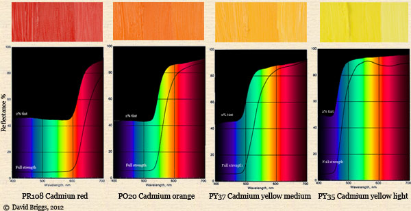
Figure 4.5.1. Reflectances of high-chroma red, orange and yellow paints at full strength and as 2% tints with white. The reflectance graphs in these figures (from Mayer, 1991) illustrate typical curves for each pigment, and are not based on the specific images (from the Dick Blick website) used here to illustrate each paint.
High-chroma red pigments mainly reflect light from the red part of the spectrum, perhaps accompanied by some from the orange or blue-violet parts. A relatively large number of substances are known that selectively reflect red light, but even so, our highest chroma red pigments such as cadmium red reflect less light from the red part of the spectrum than does a bright white pigment like titanium white (Fig. 4.5.5). Because chroma depends on the amount of light reflected, those variants of cadmium red that reflect less light ("cadmium red deep" etc) are reduced in chroma as well as value.
All high-chroma yellow materials reflect most of the red, orange, yellow and green parts of the spectrum, and much more of their yellow colour is due to additive mixture of the red and green wavelengths than to the wavelengths that are yellow in themselves (Fig. 4.5.1). You will see that such materials closely approach an optimal yellow colour, in that they would pass on nearly all of the red and green spectral bands, and absorb almost all of the blue-violet. Because wavelengths between extreme spectral red and yellowish green mix additively along a straight line in the CIE chromaticity diagram (Fig. 4.1.2), all mixtures of these wavelengths remain at full saturation, and so bright yellow materials, which reflect the whole of this range, are the lightest of all high chroma materials. If less of the green part of the spectrum is reflected, a lower-value and more reddish colour results, as in cadmium yellow deep or cadmium orange. Conversely, if the reflectance extends into the blue-green and cyan parts of the spectrum, these wavelengths begin to neutralize the components at the red end, producing a yellow that is greenish in hue and lighter-valued, but also somewhat whitish and thus reduced in chroma (e.g. "lemon yellow").
Please note carefully that no bright yellow or orange substances reflect or transmit mainly the yellow or orange wavelengths of the spectrum, and absorb all other wavelengths. You may find quite a number of websites and recent books on colour that get this wrong! The notion that greenish-yellow and orange-yellow paints mainly reflect yellow wavelengths, mixed with "impurities" or "traces" of green and orange wavelengths respectively, is an old misunderstanding that has been revived in recent years by a series of popular books that claim to reveal "what really does happen when colors are mixed". No paints that actually do this exist, and if they did they would reflect much less light than a bright yellow paint, and so would be dark brown or olive in appearance. It should really be clear that a bright yellow paint must reflect most of the spectrum, because it is so close to white in value. The green and orange wavelengths reflected by a yellow paint are not impurities in the yellow; they are additive components of the yellow.
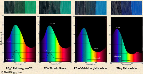
Figure 4.5.2. Reflectances of high-chroma green to blue paints at full strength and as 2% tints with white.
While many different substances selectively absorb short-wavelength- and reflect long-wavelength light, substances that do the reverse are fewer in number and less effective in their action. None of our green or blue paints attain the near-optimal plateau-shaped reflectance curves seen in many red, orange and yellow paints. Our strongest and most widely used green and blue pigments, the phthalocyanines, reflect light of high saturation but very low brightness at full strength, and higher brightness but compromised saturation when mixed with white (Fig. 4.5.2). At an optimal level of white content a maximum chroma of about 12 Munsell units is reached, but this is moderate compared to the chroma of 14 to 16 of many red, orange and yellow paints.
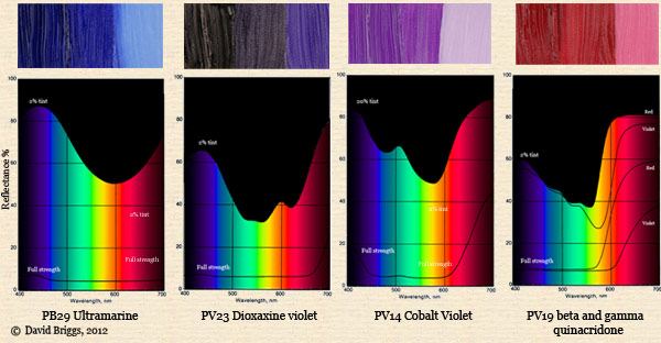
Figure 4.5.3. Reflectances of high-chroma violet-blue to magenta paints at full strength and as 2% tints with white.
The difficulty in finding substances that selectively reflect short-wavelength light also affects the range of available pigments in the purple range. Magenta pigments such as quinacridone magenta that have good reflectance in the red region have at best moderate reflectance in the blue-violet region, and are therefore distinctly redder than the equally blue and red digital magenta. More equal red-blue reflectance is found only in substances reflecting much less red light.
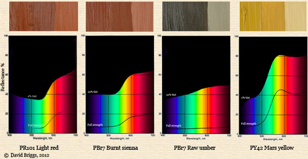
Figure 4.5.4. Reflectances of moderate- to low-chroma earth pigment paints at full strength and as 2% tints with white.
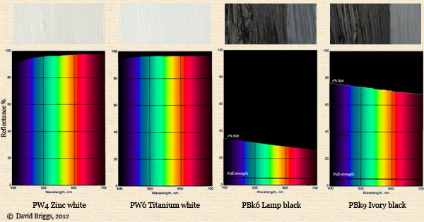
Figure 4.5.5. Reflectances of two white paints and two black paints, the latter at full strength and as 2% tints with white.
Low-chroma substances generally have relatively flat reflectance curves, in which all wavelengths are reflected to about the same level. As with digital colours, the horizontal band spanning from the lowest to the highest wavelength reflectance may be thought of as the coloured "component" of the reflectance (for most actual substances, at least), lying between a white component below and a black component above. A large white component means that the object reflects light of low saturation; a large black component means that the object reflects light of low brightness; both these factors combine to lower the chroma.
It may be of interest to compare the spectral reflectance graphs of some low-, medium- and high-chroma paints with the actual RGB values of some images of those paints (Fig. 4.5.6). The RGB levels are shown in linear units (proportional to light energy), obtained by raising the standard nonlinear fractions to the power 2.2. For example a standard (e.g Photoshop) R value of 128, or half of 255, becomes 0.5 to the power 2.2, or 0.22. These linear RGB values in effect display a simple spectral power distribution of the reflectance of the paint, in which the spectrum is divided into just three bands.
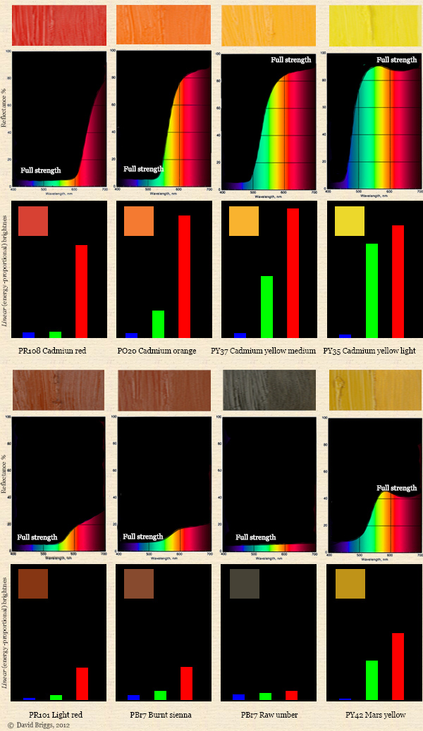
Figure 4.5.6. Comparison of spectral reflectance curves of selected paints with the actual linear RGB values of their colours on the screen.
Page added August 5, 2012.
Next: Part 5: Subtractive Colour Mixing