
my colour short course is
now offered online through
Australia's National Art
School in Sydney! There's
a choice of two sessions to
suit every time zone. LINK
Home
The Dimensions of Colour
Basics of Light and Shade
Basics of Colour Vision
Additive Mixing
- Additive primaries
- Additive mixtures
- Additive complementaries
- Additive-averaging & pointillist mixing
- Object colours
Mixing of Paints
Hue
Lightness and Chroma
Brightness and Saturation
Principles of Colour
Afterthoughts
Glossary
References
Contact
Links
NEXT COLOUR
WORKSHOPS

PART 4. ADDITIVE MIXING
4.1 ADDITIVE PRIMARIES
- Introduction: does additive mixing matter to painters?
- Do additive primary colours exist?
- Different additive primaries for different methods of mixing
Introduction: does additive mixing matter to painters?
By beginning this account of colour mixing with the topic of additive mixing, I have already aligned the approach taken here with modern as opposed to "traditional" colour theory. In the decades following the mid-19th century revolution in our understanding of colour, most scientists accepted the Young-Helmholtz model in its original form, which held that colour perceptions were mixtures of the "fundamental sensations" red, green and violet/blue. Understandably, these three came to be regarded as the "true" primary colours, displacing red, yellow and blue, which had until then been widely regarded as the three fundamental colour sensations and even the three physical components of white light. Those writers on painting who continued to base colour theory on the older primaries often felt obliged to justify their course in the face of current scientific opinion, and many did so with an argument to the effect that the mixing of light was irrelevant to painters, who must work with paint where the old primaries still applied. Similar statements have continued to appear in "traditional" colour theory down to the present.
This argument has lost relevance in that many painters now paint with light (i.e. digitally), but for many reasons it was also never valid in relation to physical media. To begin with, the colours of artists' paints (Section 4.5) are the result of additive mixing of the wavelengths the paints reflect. (Many "traditional" colour theory writers, including Wilcox and Feisner, miss this point and completely misrepresent the physical origin of colour when they endeavour to explain it). Second, when paint colours combine optically (Section 4.4), for example when interspersed as fine dots, the result follows the rules of a kind of additive mixing called additive-averaging, even though physical paints are involved. And even when paints are physically mixed (Section 6.1) , although the result depends to a large degree on subtractive mixing, it generally also involves a significant component of additive(-averaging) mixing. In any case, subtractive mixing (Section 5) can not be correctly explained until additive mixing is understood, and it was the discovery of the connection between these two that led to the realization that the ideal primaries for colourant mixing are not in fact yellow, red and blue, but yellow, magenta and cyan. Finally, since paintings are experienced by the light reflected from them, there is a strong argument that additive complementaries (Section 4.3) are relevant to "colour harmony" and the visual impact of paintings.
Do additive primary colours exist?
We saw earlier that the three cone types effectively divide the visible spectrum into three bands, in each of which the response of one cone type predominates over the other two, so that by mixing lights from each of these three bands we can produce light stimuli invoking strong cone-opponent signals, and thus strong colour signals, throughout the 360 degree range of possible combinations. This is how the colours on your computer screen are generated, from phosphors of just three colours, a red or orange-red (R), a yellowish green (G), and a blue or violet-blue (B). All of the colours that you have ever seen on a normal computer or television screen, including white and grey, were created by mixtures of lights of three such colours (Fig. 4.1.1).
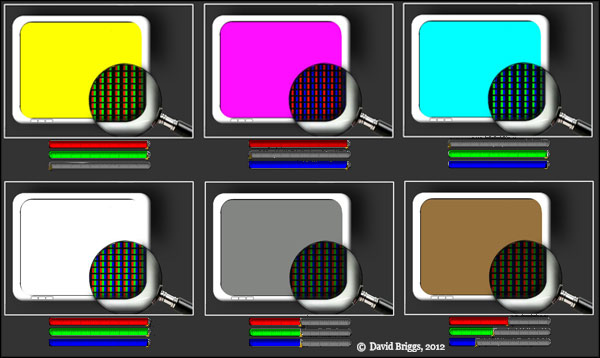
Figure 4.1.1. Generation of screen colours from different combinations of RGB lights.
Any three coloured lights have a range or gamut of colours that they can produce by mixing, and are unable to mix colours outside this gamut. In common speech this process of "mixing colour" by combining coloured lights is called additive mixing, and the hues of the lights that yield the largest gamut of additive mixtures are called the additive primary colours. This usage of the term "primary colours" is in accord with the original meaning of the term, as introduced in English by Robert Boyle, for the general hue categories of physical paints and dyes that yield a surprsingly large gamut of mixtures, though not all hues at their maximum chroma. This usage should not be confused with another usage of the term "primaries" found in scientific and technical literature, for any specific lights used in additive mixing, and even for mathematical combinations of positive and negative quantities of such lights that do not correspond to any physically possible light.
It is a mistake to equate the additive primary colours with the hues of any specific R,G and B primaries, but it is equally mistaken to overstate the arbitrariness of these hues. Although the precise hues are flexible, to be effective as additive primaries the three stimuli must remain within the basic hue categories of red to orange-red, yellow-green to green, and blue to violet respectively, depending in part on the exact kind of additive mixing involved (see below). The additive primary colours are not perfect, in the sense that we could mix a full range of hues at maximum saturation, but neither are they arbitrary; they are optimal. If we instead were to define primary colours as colours from which we can mix all other colours (an assumption of most "traditional" colour theory), then it would of course be true that additive primary colours do not exist, as Bruce MacEvoy has argued. In short, additive primary colours are real if we define that term realistically, and not real if we do not.
It is tempting but fallacious to slip from the observation that light of a wide range of colours can be made from lights of three colours, to the assumption that it is the colours themselves that are mixing, that the colours obtained are therefore made of the colours of the component lights, and that the additive primary colours are thus the ultimate components of all colours. It's true that for some combinations of lights this assumption (that additive mixing is literally colour mixing) appears to hold: R and B lights mix to make a colour that is reddish and bluish (magenta), and G and B lights make a colour that is greenish and bluish (cyan). But mixing R and G lights can make a pure yellow colour that isn't reddish or greenish! This apparently anomalous failure of the colour of the mixture to contain the colours of its components is one reason why this combination of lights is always so surprising. (The stark difference from the behaviour of paint mixtures is another). In its original form the Young-Helmholtz trichromatic model assumed that all colour sensations are indeed composed of red, green and violet fundamental sensations associated with the three retinal receptors, and thus that yellow is a "compound sensation" made of red and green fundamental sensations, and white is a compound sensation made of red, green and violet fundamental sensations. This view is still widely held among the general public today, in part because most popular science explanations of colour vision explain the trichromatic model of sampling by three cone types, but completely ignore the opponent model, which is an equally important component of the modern zone theory of colour vision.
According to the zone theory, every coloured light has a disposition to create cone-opponent responses in the retina that are indirectly translated into red/green and yellow/blue colour signals experienced in the mind. The colour yellow is an independent opponent colour created by the visual system, and does not "contain" the colours red and green. We can loosely think of additive mixing as a vector addition in which these colour-invoking dispositions either add together or cancel out. For example, in mixing R (orange-red) and G (yellowish-green) lights, the red- and green-invoking components cancel out, while the yellow-invoking components in both colours reinforce, although as you may notice the resulting yellow light is somewhat less saturated than either of its component lights. Similarly, although white light from a computer screen is a mixture of physical components that separately appear red, green and blue, the white colour we perceive is not a mixture of colours; rather, the red/green- and yellow/blue-invoking dispositions of the three component lights cancel out to leave the light mixture colourless.
Different additive primaries for different methods of mixing
Which precise hues are optimal as additive primaries depends on the nature and purpose of the device doing the mixing:
1. For additive mixing of monochromatic lights: spectral red, green and violet.
2. For efficient additive mixing of lights on a monitor or TV screen: red or orange-red, yellowish green and violet-blue or blue
3. For additive-averaging mixing of object colours, as in spinning-disc mixture (ideal): optimal orange-red, green and violet-blue
For mixing monochromatic lights (lights of a single wavelength), the approximate maximum gamut of natural object colours is said to be generated by lights that are extreme spectral violet, slightly yellowish green and extreme spectral red. Fig. 4.1.2 shows this gamut on a CIE xyY or chromaticity diagram. On this diagram the horseshoe-shaped line represents the monochromatic lights of the spectrum, the straight line represents mixtures of extreme spectral red and violet, and saturation increases outwards from a "white point" to these absolute limits. A property of the CIE chromaticity diagram is that additive mixing paths follow straight lines, so the gamut forms a straight-sided triangle. It will be evident that no combination of three real lights, which must lie within the rounded horseshoe shape, can have a gamut that encloses the entire shape.
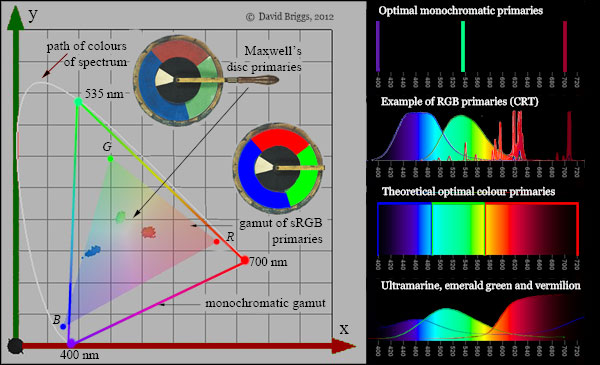
Figure 4.1.2. CIE 1931 chromaticity diagram showing the approximate maximum gamut of natural object colours obtainable with three monochromatic lights (Hardy and Wurzburg, 1937), a representative RGB gamut called sRGB, and colours of the three primaries on one of James Clerk Maxwell's 19th century spinning disc devices. (Maxwell's pigments, particularly the vermilion, may have dulled with time). Beside actual pigments, the theoretical optimal colours would have a fluorent appearance, much like the RGB primaries in the second version of the disc. Spectra of CRT screen primaries are from Wikipedia.
400 nm and 700 nm lights have low brightness for their physical energy, so using these monochromatic lights would be a very energy-inefficient way of creating colour on a computer screen. The primaries used on monitors are chosen as a compromise between an acceptably broad gamut on the one hand and energy efficiency on the other. The compromise that is chosen varies greatly among different manufacturers, particularly for laptop screens where energy efficiency directly impacts on battery life. Figure 4.1.2 shows a standard colour space called sRGB as a representative RGB gamut. Laptop screens may have a smaller or larger gamut than sRGB.
Surfaces that reflect monochromatic light would be extremely dark in appearance and thus completely ineffective for additive processes such as spinning discs, which involve averaging of light stimuli over an area. Here the biggest gamuts in theory would be obtained from orange-red, yellow-green, and violet-blue optimal colours, each completely reflecting about a third of the spectrum, and completely absorbing the rest. In the mid-nineteenth century James Clerk Maxwell approximated these colours in his spinning disc experiments using the pigments vermilion, emerald green and ultramarine. Beside actual pigments the theoretical optimal colour primaries would be extremely high-chroma and fluorent (fluorescent-looking), closely resembling the RGB screen primaries in the second disc in Fig. 4.1.2.
Page modified August 5, 2012 and July 23, 2014. Original text here.