
my colour short course is
now offered online through
Australia's National Art
School in Sydney! There's
a choice of two sessions to
suit every time zone. LINK
Home
The Dimensions of Colour
Basics of Light and Shade
Basics of Colour Vision
Additive Mixing
Subtractive Mixing
Mixing of Paints
Lightness and Chroma
Brightness and Saturation
Principles of Colour
Afterthoughts
Glossary
References
Contact
Links
NEXT COLOUR
WORKSHOPS

6.2 PRIMARY COLOURS
Theories of primary colours
The expression "primary colour" has its origin in the historical concept that yellow, red and blue, initially alongside white and black, were the "simple", "primitive" or "primary" colours from which all others could be derived by mixing. The idea that painters can mix all colours except three can be traced back to Aristotle in his Meteorologica [c. 350 B.C.], but surprisingly Aristotle (Fig. 6.2.1A) gives these colours as the same three he saw in the rainbow: red (phoinikoun), green (prasinon) and blue/violet (alourgon). Yellow, red and blue are placed between white and black in a linear scale mentioned in a commentary on the Timaeus of Plato from the fourth/fifth century CE (Kuehni, 2003), and the same scale also appears in the first visual representation of the concept of primary colours, a diagram in Francois D'Aguilon's Opticorum Libri Sex of 1613 (Fig. 6.2.1B).
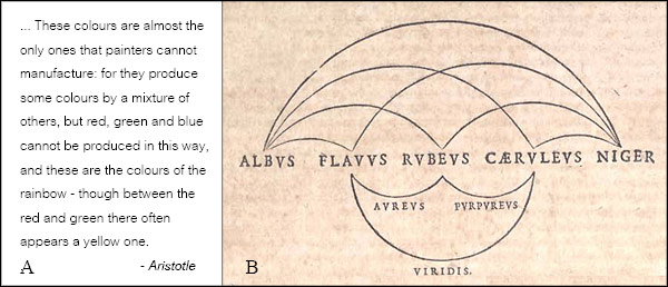
Figure 6.2.1. A. Extract from the Meteorologica of Aristotle (tr. H. Lee, 1952, Loeb Classical Library). B. From Francois D'Aguilon, Opticorum libri sex of 1613. The "simple" colours albus, flavus, rubeus, caeruleus and niger (white, yellow, red, blue and black) are placed on a linear scale, and aureus, viridis and purpureus (gold, green and purple) are generated from mixtures of the middle three. Picture credit: Institute an Museum of the History of Science, Biblioteca Digitale
The yellow-red-blue primaries seem to have rapidly gained popularity in the practice of artists and dyers in the first decades of the seventeenth century, and are increasingly recorded in print over the course of the century (Shapiro, 1994; Kuehni, 2010). Robert Boyle (1664) introduced the term "primary colour" in English for these colours in a statement that shows an awareness of the concept of a gamut: while the primary colours suffice to mix colours of a full range of hues, some colours will, by their greater "splendor" (we would say chroma), lie outside this gamut (Fig. 6.2.2).
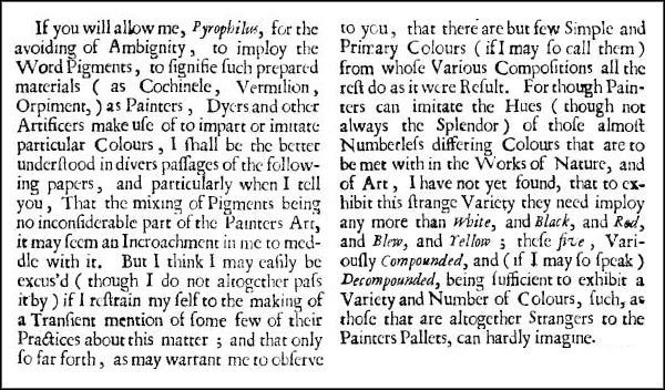
Figure 6.2.2. From Experiments and Considerations Touching Colours (1664) by Robert Boyle.
It is a small and slippery step from the observation that all hues can be made from three primary colours, to the assumption that all hues are made of those three colours. This latter belief, which I call here the intermixture model of primary colours, rests on what some philosophers call the "commonsense" view of colour, that colours are physical properties residing in objects, combined with the further "commonsense" assumption that these physical properties themselves intermix when colourants are mixed, i.e., that "colour mixing" is literally mixing colours. On these assumptions, the observation that green paint results from mixing yellow and blue paint leads to the interpretation that green is a secondary/ compound/ mixed colour that is "made of" yellow and blue. If bright yellow paint can not be made by mixture, then that is because yellow is a primary/ simple/ pure colour that can not be compounded from other colours. If a secondary colour and the remaining primary together "contain" all three primaries, then so must any mixture made from them. Grey, black, and all greyed colours are therefore held to contain all three primaries (hence the term "tertiary" colour in its original sense). If all colours are compounds of the three primaries, then "in theory" we ought to be able to mix all colours at full chroma from these primaries. The fact that we can not is interpreted to mean that our paint primaries must be imperfect, or biased with impurities of other primaries; when mixed these impurities supposedly combine to constitute a black or grey component that dulls the mixture.
Figure 6.2.3. Extracts from Johannes Itten's The Art of Color (1973, pp. 34, 78 and 22). Although Itten acknowledges Newton and the spectral decomposition of light in an introductory page, this does not disturb the intermixture model that prevails throughout the rest of the book, where green is a "mixed color" that is "composed of" or "contains" yellow and blue. Later in the book (p. 137) he maintains that the expressive meanings he attaches to colours compound in the same way: e.g. compassion (green) = knowledge (yellow) + faith (blue).
It is not always possible to be certain what a historical writer actually believed about colour mixing, but the intermixture model is likely to have been widely assumed by the early proponents of terms like "primary"/ "primitive" and "secondary", "simple" and "compound", and "pure" and "mixed" colours. In 1613 D'Aguilon had distinguished three types of intermixture, "real" (compositio realis), for the mixing of materials such as paints, "intentional" (compositio intentionalis), for mixing involving a transparent medium, such as glazing, and "notional" (compositio notionalis) for what we would call optical mixing (Kemp, 1990, p. 276). In 1708, the anonymous author of the first hue circle of artists' paints divided colours into primitive colours ("Couleurs Primitives") "that cannot be composed of other colors", mixed colors that are mixed from these primitive colors, and other colours "that are composites of the primitive colors and the mixed colors" (translated Kuehni, 2010). The intermixture model of primary colours is explicit in the works of nineteenth century theorists such as Goethe and George Field, and is alive and well in art and design circles today. In many minds it exists in quarantine alongside knowledge of Isaac Newton and the spectrum, without any apparent awareness of the inconsistency, as it does in Johannes Itten's (1961) The Art of Color (Fig. 6.2.3).
Newton proved that the intermixture model of primary colours was untenable as a physical explanation by showing that light of all hues except extraspectral purple could be either simple (monochromatic) or compound. Further, he showed that compound light is always compounded from the innumerable but five- or seven-named rays of the spectrum, and that objects of all hues reflect compound light containing more of some of these spectral rays than others. Although Newton explicitly stated that colour itself is a mental perception, he pictured these physically simple and compound lights as quite directly evoking simple and compound colour sensations in the observer via "vibrations" in the optic nerve. He therefore regarded the colours of the spectral rays as the fundamental components of all colour experience, and hence considered these to be the true primary colours (Fig. 6.2.4A).
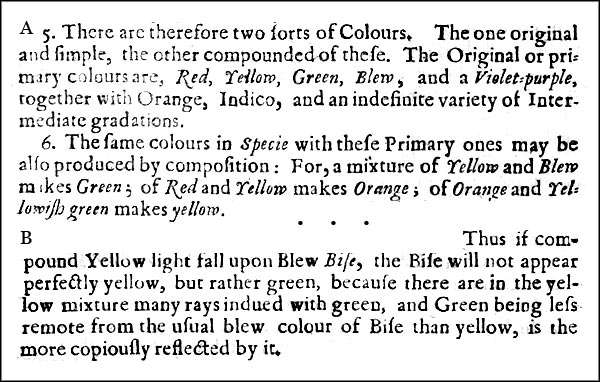
Figure 6.2.4. Two extracts from Newton's New Theory (1672).
Though often criticized for failing to distinguish between additive and subtractive mixing, Newton in fact gave the first correct explanations of subtractive processes, for example explaining that a blue powder under a "compound" yellow light (Fig. 6.2.4B) looks green because green rays are the element in common between the light and the reflectance of the powder, and thus not because the green is "made of" yellow and blue. (D'Aguilon had specifically given the green appearance of a blue powder by candle light as an example of compositio intentionalis). However in describing the mixing of coloured powders Newton accounted for the darkness of the neutral mixtures he obtained with an explanation essentially in terms of additive-averaging (each grain absorbs some light, even of its own colour, whereas in a white powder all grains reflect all of the light). Additive-averaging actually is the dominant process involved in the mixing of powders (Fig. 6.1.2), but a secondary role is played by subtractive mixing, which Newton did not invoke here, and Newton said almost nothing about paint mixing, where the subtractive process is dominant. Newton's theory of continuous spectral primaries therefore left a major problem untouched: if the spectrum was continuous, how could we explain the three primary colours of the painters and dyers? Why should three particular colours in that continuum be optimal for mixing colourants?
One plausible solution was that Newton was wrong, and that the apparently continuous spectrum was actually made up of red, yellow and blue rays that overlapped to produce the intermediate hues by intermixture. This theory of three spectral primaries incorporated Newton's discoveries of the spectral decomposition of white light and the role of selective absorption in causing object colours, while providing a simple rationalization for the three colourant primaries that left the intermixture model intact. For example, a paint mixture containing yellow and blue particles could be assumed to reflect yellow and blue rays that intermix to make green, just as they were thought to do in the spectrum. This theory was held by many 18th and 19th century innovators in the field of colour, including Mikhail Lomonosov and George Palmer (both of whom proposed the existence of three types of colour vision receptors based on the assumption of three spectral rays), astronomer Tobias Mayer (who invented the first fully described colour space based on the same assumption), and Ducos du Hauron (inventor of the first subtractive colour photographs). The discoverer of the additive primaries of light, Christian Ernst Wunsch, proposed a second theory of three spectral primaries, in which the spectrum was instead held to be made of overlapping red, green and violet rays (Wunsch, 1792).
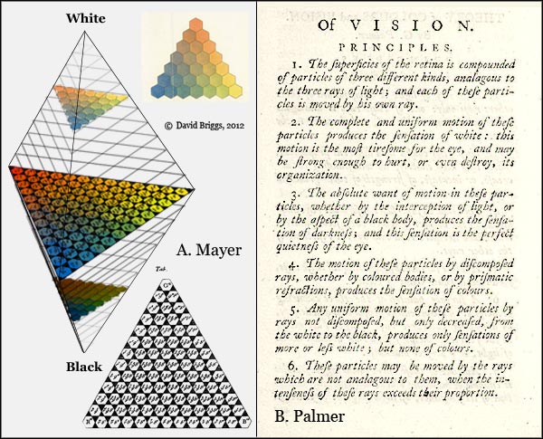
Figure 6.2.5: A. Colour space in the form of a double pyramid devised by Swedish astronomer Tobias Mayer, alongside Mayer's diagram of the triangular red-yellow-blue basal plane, and a hand-coloured copy of one of Mayer's planes by Lichtenstein. B. George Palmer's theory of three visual receptors, based on assumption of three "rays of light" (Palmer, 1777).
In his monumental Zur Farbenlehre (1810), the German poet Johann Wolfgang von Goethe ridiculed the spectral primary theories of both Newton and Wunsch. For the origin of colours he proposed a theory reviving the idea that colours are formed by modification of white light at boundaries between light and darkness. His theory invoked two elementary primaries, yellow and blue, both of which "augment" or intensify in the direction of pure red. When "arrested" in the physical state, yellow, red and blue form the painter's three "primitive" colours (ibid., 705). Unlike Newton, Goethe considered colours, excluding "physiological" and related colours, to be physical properties residing in ("arrested in") objects and light, and held that these colours themselves combine by intermixture. Goethe included processes now regarded as additive, subtractive and perceptual in a category he called "real intermixture", while classifying optical mixing and tentatively pigmentary mixing as "apparent intermixture" (ibid., 551-571). Finally, in his discussion of the nomenclature and "moral associations" of colours, Goethe devised a framework based on what might be called his four nomenclatural primaries, yellow, blue, red and green (ibid., 610-611).
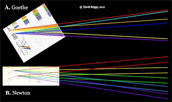
Figure 6.2.6. A. A beam of light emerging from a prism exhibits a yellowish and a bluish coloured fringe separated by a short wedge of white light. Goethe (1810, pl. 5) maintained that the two coloured fringes were created at the boundaries of light and darkness, and subsequently mixed in the middle of the spectrum to make green, while each "augmented" outwards towards red. B. Newton had already explained in the Opticks (Book I, Part II, Fig. 12) that this white wedge was formed by additive mixing of the overlapping spectra formed by successive rays within the beam. If Goethe was right, the coloured rays should continue crossing over further from the prism, while if Newton was right the rays should become more and more cleanly separated. Newton's experiments used spectra projected over distances that were very long (up to 22 feet) compared to the length of the white wedge, and thus disproved Goethe's theory of the origin of colours before Goethe was born.
The theory of three spectral primaries reached its peak of influence in the early 19th century through the efforts of the formidable Scottish physicist David Brewster (1781-1868), who convinced himself he could see the red, yellow and blue components of light by viewing the solar spectrum through coloured filters (Fig. 6.2.7). Brewster's dogmatic advocacy of his idea made the theory of three spectral primaries into something of a roadblock that needed to be demolished before progress in colour research could proceed (Sherman, 1981). This demolition was accomplished, elegantly and finally, by Helmholtz (1852b), who accounted for Brewster's observations in terms of a combination of imperfect experimental conditions and visual contrast effects. The theory of red, yellow and blue spectral primaries nevertheless remained current in artistic circles well into the twentieth century, and strongly influenced the thinking of several early abstractionists. As late as 1975 Josef Albers still thought it was regarded as a "plausible theory" (Albers, 1975, p. 23).
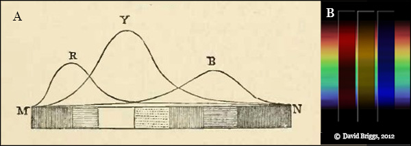
Figure 6.2.7. A. Brewster's (1831) interpretation of the solar spectrum in terms of overlapping red, yellow and blue rays. B. Simulation of Brewster's purported observation.
Fifty years before Helmholtz's demolition of Brewster's theory, a solution to the problem posed by the three-fold nature of the primaries had been offered by Thomas Young, who suggested that it reflects the structure of human colour vision and not the physical structure of light. Young's held that Newton was correct about the continuous spectrum, and that the number of primaries might be giving us a clue to the number of types of colour vision receptors (now called cone cells) in the eye, which after all would surely have to be finite. At first (Young, 1802) he suggested that the three types of receptors were tuned to the "principal colours" red, yellow and blue, but within months he switched to the spectral additive primaries, red, green and violet. As he later explained (Young, 1807, p. 439), since it was known that yellow light could be mixed from red and green light, and blue from green and violet, the simplest solution was that red, green and violet were the fundamental sensations from which all other colour sensations were compounded (Fig 6.2.8A). Helmholtz (1852a) initially questioned this and held that there would actually need to be at least five simple colours, but later (Helmholtz, 1866) realized that there could be just three receptors if these had overlapping sensitivities. In his 1866 visualization of the theory (Fig 6.2.8B) the receptors responsible for the red and violet "sensations" have their peak sensitivities in parts of the spectrum that are seen as red-orange and violet-blue respectively (due to admixed green "sensation").
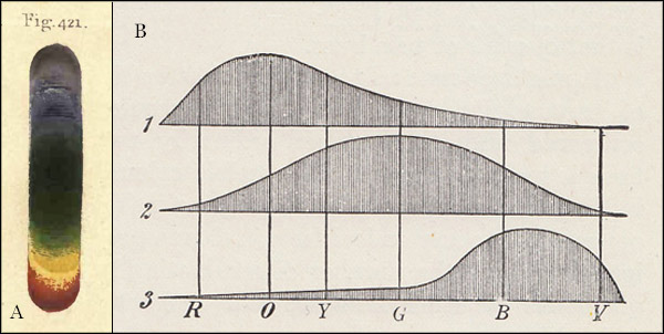
Figure 6.2.8. A. Thomas Young's (1807) diagram of the spectrum. B. Helmholtz's (1866) depiction of Young's theory.
The Young-Helmholtz theory of three fundamental sensations was supported and greatly refined in experimental colour-matching studies by James Clerk Maxwell and Arthur Konig among others, which led utimately to the development of modern colourimetry. The modern CIE system defines three specific additive primaries, the CIE 1931 Standard Primaries, consisting of narrowband light sources of wavelength 700 nm (red), 546.1 nm (green) and 435.8 nm (violet). These are converted mathematically to three purely theoretical lights, X, Y and Z, that allow all colour stimuli to be matched mathematically without needing to use negative values; these CIE "primaries" do not correspond to actual colours or components of colours. Both the monochromatic standard primaries and the imaginary X,Y and Z "primaries" are convenient but ultimately arbitrary choices.
Young and Helmholtz, like Newton, pictured a quite direct relationship between visual stimulus and colour sensation, and for adherents of the Young-Helmholtz theory, red, green and violet or blue replaced the "Brewster primaries" of yellow, red and blue as the "true" primary colours, which created all other colour experiences by intermixture. Even today, either the additive primaries or the three cone responses are still often assumed to be the "real" primary colors. However, as we have seen in the section on colour vision, the Young-Helmholtz theory is now combined with Ewald Hering's opponent theory as the zone theory, which holds that our colour vision involves trichromatic input from three cone cell types, and opponent output consisting of yellow/blue and red/green opponent signals. According to the zone theory, the three cone types do not "detect" red green and blue, but instead each responds to most or all of the spectrum to varying degrees, and the brain creates red/green and yellow/blue colour perceptions based indirectly on differences in cone responses. Hering's four opponent hues (Fig. 6.2.9) are often called the four psychological primaries because they are the only hue perceptions that can exist in a "unique" (pure) state, all other hues being mental mixtures of adjacent pairs of these hues. They are thus the true primary colours in the most literal sense. This set of four hues was anticpated in the much earlier systems of Leonardo and Forsius, and both the hues and their oppositions were anticipated in Goethe's concepts of two elementary and four nomenclatural primaries (see above).
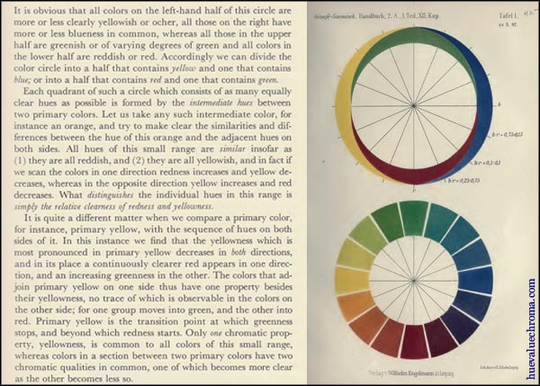
Figure 6.2.9. Ewald Hering's analysis of the hue circle into red/green and yellow/blue components. His four primaries of colour experience are now reconciled with Helmholtz's three primaries of colour stimulus in the zone theory of colour vision.
Helmholtz's (1852a) explanation of the role of subtractive processes in paint mixing, and the recognition of the inverse relationship between additive and subtractive primaries, allowed the definition of three optimal subtractive primaries, under such names as yellow, pink and seagreen (Benson, 1868), yellow, magenta and cyan blue (Hatt, 1908), or Zanth, Achlor, and Syan (Ives, 1935). Yellow, magenta and cyan, which are still sometimes known as the Ives primaries, have long been accepted as the optimal primary hues for three-colour printing and photographic prints and slides, although in these fields they often remained known up to the mid-20th century by the names of the historical primaries, yellow, red and blue. The latter are still taught as the primary colours in many art and design classes today.
Figure 6.2.10. A. Inverse relationship of additive and subtractive primaries, from Benson (1868). B. Hue circle based on yellow, magenta and cyan blue primaries, from Hatt (1908).
The historical primaries: yellow, red and blue
We've seen that the expression "primary colour" is currently applied in several contexts1 beyond the original one of colourant mixing, and that these primaries are different in each case:
- Y, B, R, G: the four psychological primaries. These result from the opponent output of our visual system as yellow/blue and red/green signals. We experience these and only these as pure hues, and all other hues as mixtures of these.
- "R" (red/ orange-red), "G" (green/ yellow-green), "B" (blue/ blue-violet/ violet): the three additive primaries, i.e. hues of lights giving a large gamut of additive mixtures. These primaries reflect the trichromatic input into our visual system: "R", "G" and "B" lights each stimulate one of the three cone types more than the other two.
- Y, BR (ideal magenta), GB (ideal cyan): the three theoretical optimal subtractive primaries. These have a direct, complementary relationship to the additive primaries.
- Y, bluish-R (process magenta*), greenish-B (process cyan*): the three best primary colourant hues actually available. These primary hues apply equally to inks and to paints, though different substances may or may not be involved. (*Before the 20th century, Prussian blue and insect or madder crimson respectively).
The historical primaries, Y, R and B are the three names that we generally applied to our best primary colourant hues when we first discovered them, before it occurred to us that the hues we mentally experience as pure and primary might not be the same as the optimal primary hues for colourant mixing. (And this is the point that has still not occurred to a lot of art and design teachers!). The notions of "purity" and "bias" associated with the intermixture model of primary colours (see above) reinforce this unconscious conflation. For example, these notions would lead us to see a greenish blue or cyan as a blue that "contains" some yellow, and so must be an imperfect primary; the perfect primary blue would surely be a visually pure blue that is neither greenish nor purplish.
The three historical primaries are thus a confusion of, but also in a sense the ancestors of, both the three subtractive colourant primaries and the four psychological primaries (Fig. 6.2.11).
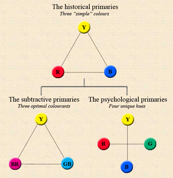
Figure 6.2.11. The historical primaries as ancestors of both the modern opponent and subtractive primaries.
"Split-primary" palettes
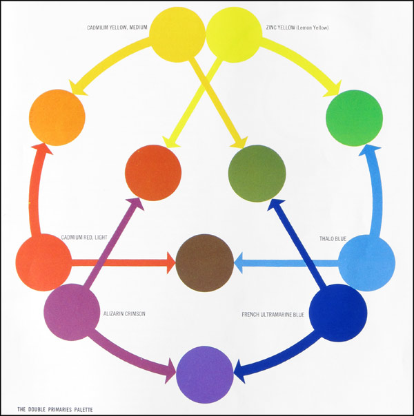
Figure 6.2.12. Illustration of a "double primaries palette" from The Art of Color Mixing (M. Grumbacher Inc, 1966).
A difficulty that immediately arises from trying to use a palette consisting of the three historical primaries is that if the red paint is a psychologically pure red (as it is depicted and/or described in many traditional colour theory texts including Itten's), this red is so remote from the subtractive primary magenta that it is found to be impossible to mix purples above a very low chroma, if at all. This difficulty, which long ago led printers and photographers to refine their primaries and give us modern three-colour printing, colour photographs and colour transparencies, is instead evaded even today by many teachers of simplistic "traditional" colour theory, by means of a so-called "split-primary" palette consisting of a "warm" and a "cool" version of each historical primary.
The rationale offered in a series of books by Michael Wilcox is that our theoretical paint primaries are in fact yellow, red and blue, but all of our actual paint primaries contain impurities of a secondary colour, and colour mixing depends on having a quantity of this secondary colour impurity or "bias" in common. Thus for each theoretical primary it is necessary to have two paints, one biased in each direction, to mix the complete hue circle. While this rationale appears to explain why just three yellow, red and blue paints do not mix the full range of hues, it is at a loss to explain how just three yellow, magenta and cyan paints do.
Wilcox's explanation of how a split-primary palette works is not consistent with a modern understanding of subtractive mixing, and is entirely discredited. According to Wilcox, a theoretical "perfect" primary would reflect only wavelengths of its own hue (i.e. about a sixth of the spectrum, rather than about two-thirds of the spectrum), and actual paint primaries reflect mainly wavelengths of their own hue, plus a subordinate impurity of a single adjacent hue (rather than up to two-thirds of the spectrum in large amounts). For example, Wilcox pictures a lemon yellow paint as reflecting just the yellow part of the spectrum with an impurity of green, and a cadmium yellow as similarly reflecting just the yellow part with an impurity of orange. In reality, all yellow paints reflect most of the red, orange, yellow and green parts of the spectrum. Blue and yellow make green not because some blue and yellow paints contain "impurities" of green, but because subtractive mixing exposes the substantial green-wavelength reflectance that is a major and essential contributor to the colour of all blue and yellow paints.
As Bruce MacEvoy has shown, Wilcox's rationale can be traced back to early nineteenth century writers, particularly Chevreul. The split-primary strategy is explicitly recommended by Parkhurst (1898), although the earliest specific palette that I am aware of is that suggested by Loomis (1947, p. 163), who listed alizarin crimson, cadmium red or vermilion, cadmium lemon, cadmium yellow, cobalt or cerulean blue (+ viridian) and ultramarine. Of course, six such paints in practice actually do yield an improved gamut of mixtures over three (Fig. 6.2.13A), but this is mainly because the modern subtractive primaries (the so-called "cool primaries") are now included. The so-called "warm primaries" are three high-chroma pigments that extend the gamut of the subtractive primary mixtures, but would not give a large gamut of colour mixtures by themselves. With six pigments a similar or greater gamut could be obtained from many other combinations, such as a well-spaced pair of pigments near each of the yellow, magenta and cyan primaries, for example lemon yellow and cadmium orange, quinacridone magenta and dioxazine violet, and phthalocyanine blue and cobalt green. Another option would be to choose three subtractive primaries and their paint-mixing complements, for example, yellow and ultramarine violet, cadmium red light and phthalocyanine blue, and a quinacridone magenta and phthalocyanine green YS. It should be emphasized however that the importance of the true subtractive primary hues in painting is not merely as the basis for a limited palette, but mainly because awareness of them enables the painter to anticipate mixing paths.
The apparent value of the split-primary system is that it evades the difficulty that a psychologically pure yellow, red and blue palette can not mix a full range of hues. If students were taught from the start that the optimal colourant-mixing primaries are yellow, magenta and cyan, and confirmed for themselves that just three such paints actually do mix a full range of hues at moderate chroma, they would have no reason to engage with the split-primary mumbo-jumbo in the first place. One seriously has to question of the ethics of teachers loading up innumerable beginning art and design students, not only with obsolete theory, but also with the expense of buying six coloured paints when three (a) might be all they need, and (b) would relate directly to their digital studies, instead of to a groundless, irrelevant fabrication.
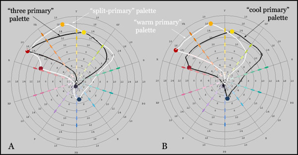
Figure 6.2.13. Mixing paths of six ApA Ferrario pigmented inks on the Munsell hue-chroma plane, Permanent Yellow ("warm" yellow), Lemon Yellow ("cool" yellow), Cyan Blue ("cool" blue), Ultramarine Blue ("warm" blue), Carmine Red ("cool" red), and Vermilion ("warm" red), calculated in the program drop2color by Zsolt Kovacs. (The actual gamuts would of course be three dimensional, and would be extended to higher chromas in some areas by the addition of white).
One misunderstanding that is sometimes associated with the "split-primary" palette is the idea that you can mix an entirely different set of colours using just the three "warm" primaries or just the three "cool" primaries. The three so-called cool primaries - a bluish red, a greenish blue and a lemon yellow - being the three closest to the ideal subtractive primaries, yield a relatively evenly balanced gamut. Compared to this, the three "warm" primaries yield higher chroma mixtures in the yellow to red range, and generally lower chroma mixtures elsewhere. The two gamuts of course have a large core of relatively neutral colours in common that can be mixed equally well with either set (Fig. 6.2.13B).
1To these we could add three additional conceptions of "primaries" from Bruce MacEvoy's site handprint.com: (1) the L, M and S "cone fundamentals", which MacEvoy maintains are the "real" primary colours (though he is well aware that they are not actually colours at all); (2) the quasi-opponent colours on the orthogonal axes of the CIECAM system (yellow, vs violet blue and crimson red vs bluish green), which MacEvoy deems to be the "modern" primaries; and (3) the "palette primaries" by which MacEvoy means any paint included on the artist's palette. MacEvoy's so-called "artists' primaries" (the "simple" chromatic colours of Leonardo, Forsius and, in MacEvoy's opinion, Alberti) are identical to Hering's opponent hues.
Modified 2nd November, 2012. Original text here and here.