
my colour short course is
now offered online through
Australia's National Art
School in Sydney! There's
a choice of two sessions to
suit every time zone. LINK
Home
The Dimensions of Colour
Basics of Light and Shade
Basics of Colour Vision
Additive Mixing
Subtractive Mixing
Mixing of Paints
Hue
- Aristotle to Newton
- The Artist's Colour Wheel
- Hue Circles Based on Opponent Colours
- Hue Circles Based on Additive Complementaries
- Hue Circles Based on Pigment-mixing Complementaries
- Orthogonal Systems
- Warm and Cool Hues
Brightness and Saturation
Principles of Colour
Afterthoughts
Glossary
References
Contact
Links
NEXT COLOUR
WORKSHOPS

7.2 THE RYB HUE CIRCLE OR "ARTISTS' COLOUR WHEEL"
The RYB hue circle or "artists' colour wheel" is a hue system structured around the three historical primary colours, red, yellow and blue, and the historical complementary relationships red-green, yellow-violet/purple, and blue-orange. This hue system, though founded on a scientific understanding of colour that was comprehensively overturned in the second half of the 19th century, is still used as the basis for colour education in many art and design classes today, even at tertiary level.
- Origins of the "artists' colour wheel"
- What colour are yellow, red and blue?
- Itten's colour theory and hue system
Origins of the "artists' colour wheel"
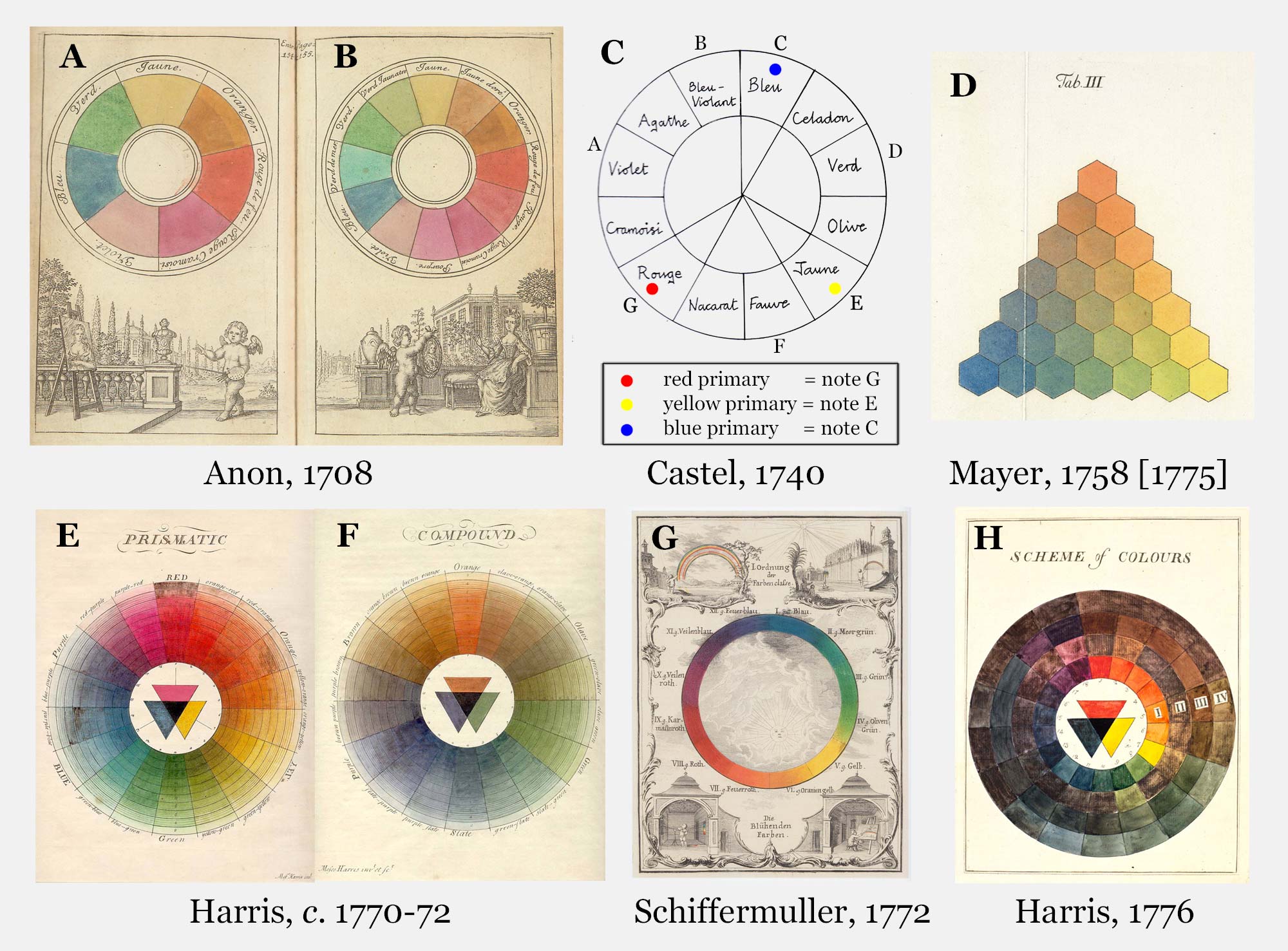
Figure 7.2.1. Eighteenth century hue sytems (click to enlarge). A, B, Hand-painted colour circles from the 1708 edition of the Traite de la peinture in mignature. C, Louis-Bertrand Castel, 1740, L'Optique des couleurs, as illustrated by Kemp, 1990. D, Tobias Mayer, 1758, De affinitate colorum commentatio, as illustrated by Georg Christoph Lichtenberg in 1775. E, F, Moses Harris, c. 1770-72, The natural system of colours. G, Ignaz Schiffermuller, 1772, Versuch eines Farbensystems. H. Moses Harris, 1776, Exposition of English insects [1782 edn]. For details of these publications see Kuehni and Schwarz (2008).
After Newton introduced the circular dimension of hue in his Opticks of 1704, it was only a small step to arrange the three hues of the seventeenth century artists' linear scale around a circle. This step was first taken in an anonymous chapter on pastel painting added to the 1708 Hague edition of the anonymous Traite de la Peinture en Mignature, in a pair of hand-coloured circles showing seven and twelve equal-sized divisions respectively (Fig. 7.2.1A, B). In the text the anonymous author hesitates over whether there are really three "primitive" colours or four (yellow, blue and two reds - "fire red" or vermilion, and crimson ), but interestingly the primary status of "red" ultimately survives the fact that it had to be mixed here from two pigments. The seven-hue circle shows the four pure pigments, plus three mixtures respectively of yellow, blue and the reds, while the twelve-hue version adds further mixtures, to place yellow, the mixed "primary" red and blue evenly spaced around the circle. In both diagrams the clockwise sequence of hues follows the order of the seventeenth century linear scale (yellow-red-blue), and so is reversed compared to Newton's spectral order (red-yellow-blue).
This twelve-hue circle is the earliest example of the so-called "artists' colour wheel", an arrangement of regularly spaced hue divisions structured around the three historical primaries. While it incorporated Newton's discovery that hues form a closed loop, the "artists' colour wheel" was otherwise an implicit rejection of the assumption that Newton's circle and rules of additive mixing (in which all spectral hues are "primary") also applied to paints. Despite this early example, published circular systems are few in number until the first decades of the nineteenth century, and in this early period triangular systems such as those of Mayer (1757) and Sowerby (1809) are just as prominent. (These triangular systems also arrange hues in a closed loop, but designate colours by the proportions of their yellow, red, and blue "components", rather than by hue as such). Nineteenth century "colour wheels" are very diverse geometrically, and incorporate variously subdivided triangles, hexagons, and 6- to 24-pointed stars, either in combination with a circle, or alone (Figs 7.2.2, 7.2.3, 7.2.4).
Several of the systems shown here follow Moses Harris (c. 1770-72) in consisting of two or even three diagrams, in order to display hue categories specifically for low-chroma colours, designated as tertiary colours by Field (1817). These low-chroma yellows, reds and blues were respectively known as olive, brown and slate (following Harris) or citrine, russet and olive (following Field). This use of the word "tertiary" persists today alongside an entirely different usage, which can be traced back at least to Ruskin (1877), for third-order hues located between adjacent primary and secondary hues. In the context of the assumptions of traditional colour theory, tertiary colours of the first kind "contain" all three historical primaries, while those of the second kind "contain" two primaries in unequal proportions.
When our anonymous author of 1708 wrapped the primary hues of the linear scale symmetrically around a circle, the "secondary" or "composite" hues, now designated purple, green and orange, were each placed equidistant between their two "component" primaries, and therefore directly opposite the third primary. As in our naming of the historical primaries, the unconscious influence of the psychological primaries can be seen in our choice, out of the continuous sequence of hues obtained by mixing yellow and blue paint, of the simple name "green" for the colour automatically placed opposite "red". In the 1708 text, no significance whatsoever was attached to pairs of opposing colours, beyond a general recommendation that colours distant on the circle should not be mixed. However when Harris published his colour circles in c. 1770-72, opposing colours on his circle were claimed to reveal colours of maximum visual contrast, colours of afterimages, and colourant-mixing complements. This assumption of the "all-purpose" nature of complementary pairs remains typical of simplistic traditional colour theory today.
During the late nineteenth century revolution in our understanding of colour, it progressively became evident that several fundamentally different kinds of opposing relationships exist among hues, including opponent relationships (Section 7.3), additive complements (Section 7.4), and colourant-mixing complements (Section 7.5), and that the hues that oppose each other are somewhat different in each case. In reality we need somewhat different hue circles to represent each set of relationships accurately. Which one we use depends on what kind of question is being asked. After this revolution, authors who continued to use the historical primaries mostly felt obliged to justify their position, given that the red, green and blue/violet primaries of Helmholtz and Maxwell were now widely regarded as the "true" primary colours by scientists. Their standard argument ever since has been that artists must work with pigments, and therefore their colour classification must be constructed in terms of the mixing of pigments rather than light. This argument neglects three crucial points:
1. Artists may also be said to work with the light reflected by their artworks, and when the question concerns this visual stimulus (as in simultaneous contrast), the appropriate framework is one based on light mixture.
2. Most fundamentally, artists work with the perceptions of their audience, and hue perceptions are structured around the four psychological primaries.
3. The clarification of the theoretical basis of subtractive mixing had revealed that the optimal primaries for colourant mixing were not in fact yellow, red and blue, but yellow, magenta and cyan, the complements of the additive primaries.
What colour are yellow, red and blue?
The "artists' colour wheel" can now be seen as an unconscious compromise, developed on the assumption that only a single hue circle was needed, at a time when the different kinds of opposite or complementary relationships were not understood. While they are unanimous in designating the primary colours as "yellow", "red" and "blue", such diagrams show far less unanimity in the paint or ink colours used to illustrate these primaries (e.g. Figs 7.2.2, 7.2.3, 7.2.4). This variation reflects the nature of the historical primaries as a conflation of the four psychological primaries - yellow (Y), red (R), blue (B) and green (G) - and the three subtractive primaries, yellow (Y), magenta (BR) and cyan (GB), additionally complicated by the relative chroma of the available pigments. Thus, nineteenth century "primary" reds range from the the bluish red pigments closest to the ideal subtractive magenta primary (insect, madder or alizarin crimsons, all around Munsell 2.5R) through psychologically middle reds (around 5R) to the highest-chroma available red (vermilion, around 7.5R). Nineteenth century "primary" blues range from the best available subtractive primary (Prussian blue, around 7.5B-10B) and psychologically middle blue (around 10B) to the highest-chroma available blue (ultramarine, around 5PB). Nineteenth century "primary" yellows span the range of the then available high-chroma yellow colourants (roughly 7.5YR-5Y), which includes middle yellow (around 5Y). In the twentieth century the invention of phthalocyanine and quinacridone pigments respectively expanded the ranges of "primary" blues and reds closer to the ideal subtractive primaries.
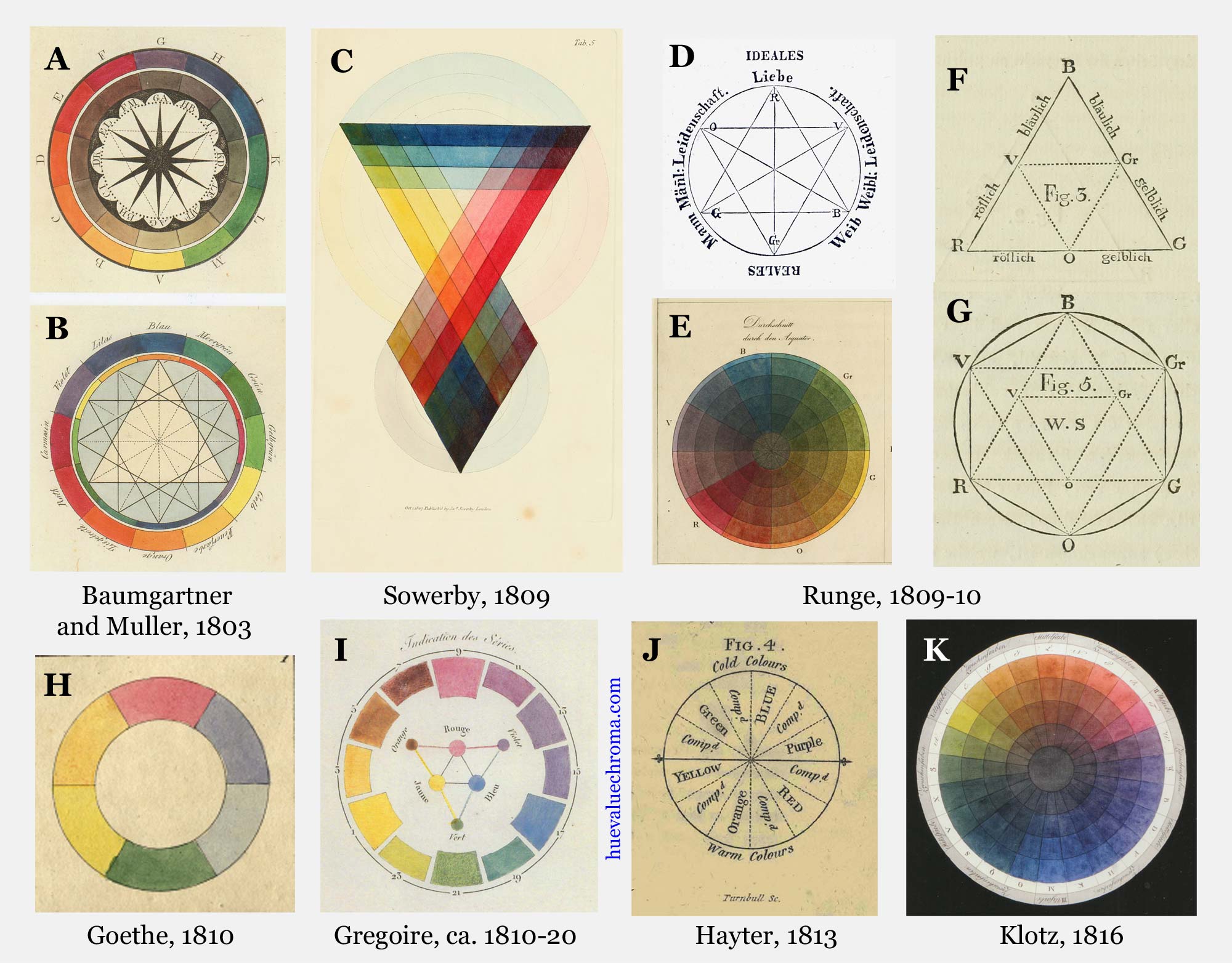
Figure 7.2.2. Selected nineteenth century hue systems, part 1 (click to enlarge). A, B, Baumgartner and Muller, 1803, Esthetique de la Toilette. C, Sowerby, 1809, A new elucidation of colours. D, Runge, 1809, in Runge, 1840, Hinterlassene Schriften. F-G, Runge, 1810, Farben-Kugel. H, Goethe, 1810, Zur farbenlehre. I, Gregoire's c.1810-1820 system, from Gregoire, 1820, Tables des couleurs sur trois feuilles. J, Hayter, 1813, An introduction to perspective, drawing, and painting. K, Klotz, 1816, Gruendliche Farbenlehre.
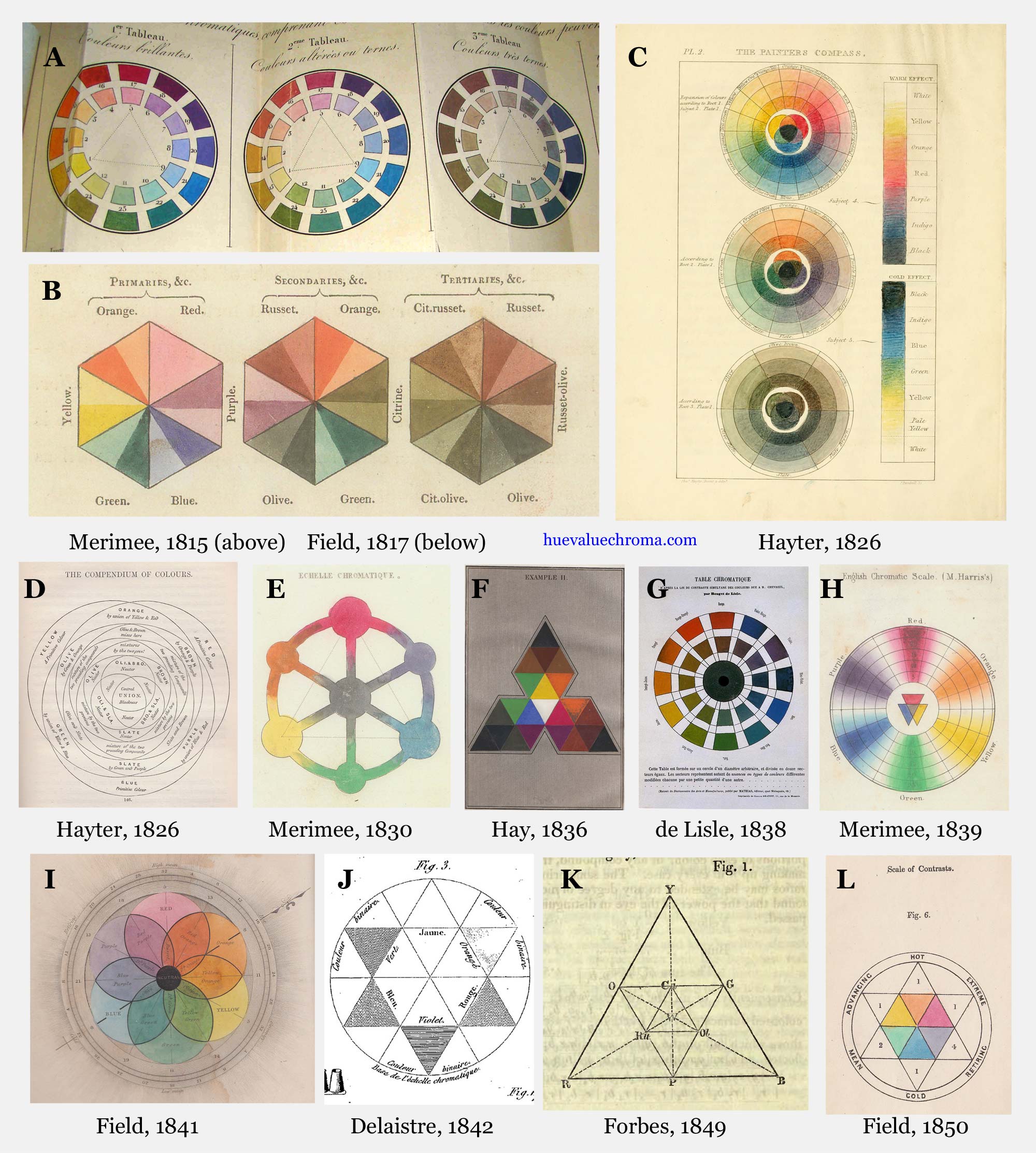
Figure 7.2.3. Selected nineteenth century hue systems, part 2 (click to enlarge). A, Merimee, in Brisseau-Mirbel, 1815, Elemens de physiologie vegetale et de botanique. B, Field, 1817, Chromatics [1st edn]. C, D, Hayter, 1826, A new practical treatise on the three primitive colours. E, Merimee, 1830, De la peinture a l'huile. F, Hay, 1836, The laws of harmonious colouring [3rd edn]. G, de Lisle, 1838, Chromagraphie. H. Merimee, 1839, The art of painting in oil, and in fresco. I, Field, 1841, Chromatography [2nd edn]. J, Delaistre, 1842, Cours methodique du dessin et de la peinture. K, Forbes, 1849, On the classification of colours. L, Field, 1850, Rudiments of the painter's art.
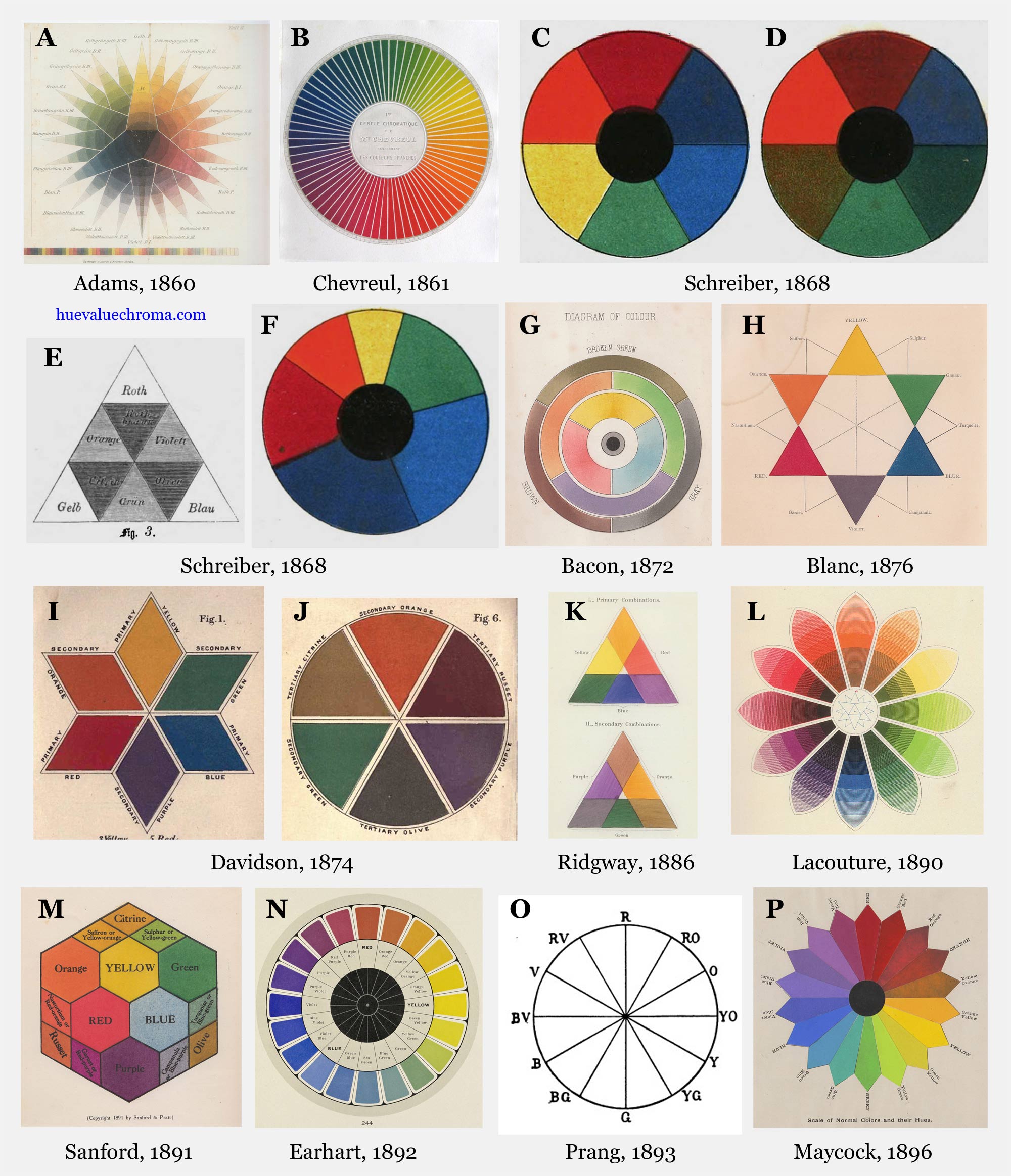
Figure 7.2.4. Selected nineteenth century hue systems, part 3 (click to enlarge). A, Adams, 1860, Die Farben-Harmonie in ihrer Anwendung auf die Damentoilette. B, Chevreul, 1861, Expose d'un moyen de definir et de nommer les couleurs. C-F, Schreiber, 1868, Die farbenlehre. G, Bacon, 1872, The theory of colouring. H, Blanc, 1876, Grammaire des Arts du Dessin. I, J, Davidson, in Field & Davidson, 1874, A grammar of colouring, applied to decorative painting. K, Ridgway, 1886, A nomenclature of colors for naturalists. L, Lacouture, 1890, Repertoire chromatique. M, Sanford, copyright 1891, in Sanford, 1910, Sanford's manual of color. N, Earhart, 1892, The color printer. O, Prang system, in Prang, Clark and Hicks, 1893, Suggestions for a course of instruction in color for public schools. P, Milton Bradley system, in Maycock, 1896, A class book of color.
The need for a system of fixed standards for hue terms such as "yellow", "red" and "blue" was recognized as early as 1810 by Gaspard Gregoire, who published an atlas of 1,351 coloured samples arranged according to hue (Fig. 7.2.2I), value and relative chroma, but the work apparently had little impact, and no copies survive today (Kuehni and Schwarz, 2008, pp. 82-3). Two colour classifications published in the United States in the late 19th century by the printer Louis Prang and the games manufacturer Milton Bradley were also structured around the traditional primary and secondary hues, although in Bradley's system these were known as the six spectral primaries. Prang's system involved scales of twelve hues (designated R, RO, O, YO, Y, etc.) and 24 hues (R, RRO, RO, ORO, O, etc), while Bradley's system had 18 hues (R, OR, RO, O, etc.) for high chroma or "pure spectrum" colours and 12 hues (R, OR, O, YO, Y, etc.) for low chroma or "broken spectrum" colours (Fig. 7.2.4). Denman Ross (1907) used Prang's 12-hue system of hue designation for his own colour order system, and Albert Munsell used a similar lettering code for the five-hue system of his Atlas of 1915.
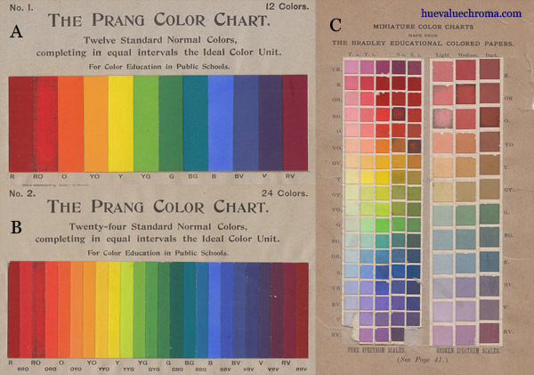
Figure 7.2.5. A, B, Standard colour chips representing the Prang system, from Prang, Clark and Hicks, 1893, Suggestions for a course of instruction in color for public schools. C, Colour chips of the Bradley system, from Bradley, 1895, Elementary color [3rd Edn]. The chips in A to C are glued-in painted cards, as in Munsell's Atlas. Collection of the author.
Itten's colour theory and hue system
The "artists' colour wheel" has persisted alongside more sophisticated hue systems, and is still widely taught in art and design courses today. This persistence, and the corresponding exclusion of modern colour theory, are associated more than anything else with the extraordinary influence of one book, The Art of Color (1961) by Johannes Itten (1888-1967). Both the abridged 1970 edition by Faber Birren and the mass-produced second edition of 1973 have been widely used as textbooks, and many later texts and websites recycle the approach to colour theory presented in Itten's book. Itten's reputation derives ultimately from his association with the German Bauhaus, which has been enormously influential in art and design education since the mid-20th century. Itten was responsible for implementing the widely copied Preliminary Course (Vorlehre) at the Bauhaus, and taught there for three and a half years until the "mystical" elements in his teaching, the disunity caused by his continuing efforts to "rule the Bauhaus", and his habit of coming into the craft workshops giving instructions on technical matters he did not understand (Forgacs, 1995) lost him the support of some of the staff and students, including the director, Walter Gropius.
Colour was taught at the Bauhaus by artists successively including Itten, Ludwig Hirschfeld-Mack, Paul Klee, and Wassily Kandinsky, as well as by various masters in the specialized workshops such as wall-painting, weaving, etc. (Gage, 1993, pp. 259-263; Poling, 1973). The dominant influence on colour theory initially was the former mentor/teacher of Itten and Hirschfeld-Mack, the painter Adolf Hoelzel (1853-1934), who also devised virtually the entire structure of the Preliminary Course implemented by Itten (Parris, 1979). Hoelzel's approach to colour was relatively broadly based, and although he attached prime importance to Goethe, he also incorporated a wide range of other influences including the scientists Wilhelm von Bezold (1837-1907), Ogden Rood (1831-1902) and Wilhelm Ostwald (1853-1932). Hoelzel used different colour diagrams for different purposes, six of which were printed in a 1919 publication by the Pelikan Company (Fig. 7.2.6A-F). The first four of these are structured around the historical primaries, secondaries and tertiaries, and are derived from a colour theory manual of 1868 by Guido Schreiber (Fig. 7.2.4C-F). They consist of two symmetrical six-hue colour circles showing the primaries and secondaries, and secondaries and tertiaries respectively (Fig. 7.2.6A, B, cf. Fig. 7.2.4C-D), a circle divided into six unequal hue sectors calculated from the ratios of the "proportional activity of the retina" that Schopenhauer (1788-1860) had asserted to be the basis of colour perception (Fig. 7.2.6C, cf. Fig. 7.2.4E), and a triangle, often known today as the "Goethe triangle" and incorrectly attributed to Goethe himself, but actually devised by Schreiber on the basis of the systems of Tobias Mayer and George Field (Fig. 7.2.6D, cf. Fig. 7.2.4F). The fifth and sixth diagrams are circles using more modern hue systems devised by Bezold (Fig. 7.2.6E, F). These "diatonic" (8-hue) and "chromatic" (12-hue) circles formed the main framework for Hoelzel's schemes of colour harmony, which included complementary, split-complementary, triadic, tetradic and "irrational" schemes. In the 12-hue circle (Fig. 7.2.6F, G), based on hue divisions Bezold had regarded as perceptually equidistant, an equilateral triad connects the modern subtractive primaries ("purple"1, cyan-blue and yellow), leaving the historical primaries unequally spaced. Klee and Kandinsky emphasized the historical primaries/secondaries in their teaching and, like Hoelzel, held Goethe's colour writings in extraordinarily high regard, but Kandinsky also incorporated the work of scientists including Helmholtz and Ostwald. Outside their classes the main emphasis was placed on the practical aspects of colour in relation to the materials being used, and the colour system that had greatest currency was that of Ostwald (Poling, 1973).
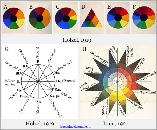
Figure 7.2.6. A-F, Six colour theory diagrams by Hoelzel from Wollner, 1919, Farbkreisen zu den Vortragen von Adolf Holzel, Pelikan Co., Stuttgart. G, 12-hue or "Chromatic" colour wheel from Hoelzel, 1919, Einiges uber die Farbe in ihrer bildharmonischen Bedeutung und Ausnutzung, with English translation of German colour names. H. Itten's color star of 1921 (lithograph on paper), with English translations of the German colour names. The hue sequence is essentially that of Hoelzel's 12-hue circle, but is reoriented to place Itten's preferred division between "warm" and "cool" hues, at the yellow/yellow-green and blue-violet/purple-violet boundaries, vertically. The very uneven hue steps in the red-blue sector might indicate alteration of some of the colours.
In The Art of Color of 1961 Itten still derived much of his teaching from Hoelzel's theories of colour harmony and contrast, and even appropriated some of Hoelzel's diagrams, including the circle based on Schopenhauer's ratios, which Itten mistakenly thought were Goethe's (Itten, 1961, pp. 104-5). However, while explicitly critical only of Ostwald, Itten's post-Bauhaus book also eliminates almost all of the other elements Hoelzel had derived from late 19th and early 20th century science. Thus although his "colour star" lithograph of 1921 (Fig. 7.2.6H), which he had used as the basis of his teaching of colour at the Bauhaus (Itten, 1975, p. 33), follows Hoelzel's 12-hue system derived from Bezold, in the colour star and other diagrams in The Art of Color Itten reverts to a system comprising evenly-spaced historical primaries and secondaries, with six intermediates. (Additionally, he flipped the hue sequence vertically, reversing the hue order and placing primary yellow at the top centre). This post-Bauhaus version of Itten's star is thus only a variation on its 19th century forerunners such as that of Lacouture (Fig. 7.2.4L). For a three-dimensional framework Itten (like Klee) rejected the Ostwald system used fairly widely in the Bauhaus and simply ignored the Munsell system, reverting instead to a simple spherical model externally like that of Runge (1810), but internally subdivided in a manner suggested by Brucke (1866). Itten's sphere places the strongest colours of all hues on the equator, ignoring their different value and absolute chroma, and thus lacks a consistent representation of the dimension of value that is vital to most painters.
The printed colours used to illustrate the 12 hues of Itten's post-Bauhaus system vary between different editions, and even between different diagrams in the same copy, but his three primary colours are defined in the text as perceptually pure hues, oddly enough using the names of the four psychological primaries of modern science, which are otherwise completely ignored in the book: "a red that is neither bluish nor yellowish; a yellow that is neither greenish nor reddish; and a blue that is neither greenish nor reddish" (Itten, 1961, p. 34; emphasis mine). Itten's secondary colours, designated orange, green and violet, are also defined perceptually, as not leaning towards either primary "component", but are claimed to be also exactly complementary to the third primary in paint-mixing, in simultaneous and successive contrast, and even in expressive interpretation (Itten, 1961, p. 137). Itten designates as tertiary six third-order hues located between adjacent primary and secondary hues; these are given compound names consisting of the primary followed by the secondary, e.g. yellow-orange, red-orange, etc., as in Prang's 12-hue system. Mainly because it is structured symmetrically around just three of the four psychological primaries, Itten's hue circle is uneven perceptually, with relatively large hue steps in the yellow-green-blue sector.
Many of Itten's explanations of colour theory are as retrograde as his classification. His explanations of successive and simultaneous contrast echo Goethe's invocation of a mysterious "eye animism" ("the eye demands the complement..."), like Goethe completely ignoring the hypothesis of photoreceptor adaptation already suggested by Palmer and Young. His discussion of colour mixing in paints is framed in terms typifying the intermixture model that had been rendered finally obsolete by Helmholtz. No mention is made of the subtractive primaries cyan and magenta, and Itten's primaries are so remote from ideal cyan and (especially) magenta that paints of these hues make a poor set of colourant-mixing primaries, quite unsuitable for mixing purples or strong middle greens. Subtractive mixing is mentioned on the single page on "Color Physics", but how is this to be reconciled with statements throughout the rest of the book that "yellow + blue = green"? Itten is also said to have "vastly simplified" Hoelzel's system of seven contrasts of colour in his own version of that system (Parris, 1979, p. 99).
The Art of Color embodies an approach to colour theory and classification fixated at a stage at least seventy years before the founding of the Bauhaus, and fabulously anachronistic at the present time. In several ways it is the colour theory equivalent of so-called "creation science". Whatever one's opinion of other aspects of the Hoelzel-Itten innovations in art and design education, the teaching in many institutions of a near monoculture of Itten's simplistic post-Bauhaus colour theory has been disastrous for the general level of public understanding of colour today.