
my colour short course is
now offered online through
Australia's National Art
School in Sydney! There's
a choice of two sessions to
suit every time zone. LINK
Home
The Dimensions of Colour
Basics of Light and Shade
Basics of Colour Vision
Additive Mixing
Subtractive Mixing
Mixing of Paints
Hue
- Aristotle to Newton
- The Artist's Colour Wheel
- Hue Circles Based on Opponent Colours
- Hue Circles Based on Additive Complementaries
- Hue Circles Based on Pigment-mixing Complementaries
- Orthogonal Systems
- Warm and Cool Hues
Brightness and Saturation
Principles of Colour
Afterthoughts
Glossary
References
Contact
Links
NEXT COLOUR
WORKSHOPS

HUE CIRCLES BASED ON PIGMENT-MIXING COMPLEMENTARIES
We noted previously that pigmentary mixing differs from ideal subtractive mixing in three main ways:
- ideal pigment primaries do not exist
- our best pigmentary primaries differ in hue from ideal magenta and cyan, and
- the complementary relationships are different, especially in the yellow-blue direction
Quinacridone magenta/"Permanent Rose", Pthalocyanine blue (green shade), and any bright yellow such as a "Lemon Yellow" mix about the greatest gamut that can be obtained from just three artists' paints (Figure 7.12).
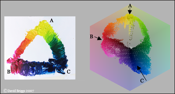
Figure 7.12. Mixtures of Art Spectrum Lemon Yellow (A), Quinacridone Magenta (B), and Pthalocyanine Blue GS (Green Shade) (C) on a white ground, showing general extent of gamut.
Without doubt the main reason why most artists look at a colour wheel is as a guide to the mixing of paints. Strictly speaking, no precise hue circle showing pigmentary complements can be drawn up, because the results of subtractive mixing of actual colourants depend on the details of their absorption curves, and can not be predicted exactly from visual inspection of hues. Nevertheless, most artists will prefer a tolerably accurate diagram to a precise table. One option is to base a pigment mixing circle on our actual best primary colours, which we may as well place symmetrically, and opposite their actual pigmentary complementaries (Figure 7.13). Phthalo blue GS can be thought of as the pigmentary complement of "scarlet", meaning the orange extreme of red, between cadmium scarlet and cadmium orange. Quinacridone magenta, has for its pigmentary complement pthalocyanine green (yellow shade). Neutralizing yellow paints generally requires a carefully balanced mix of blue and violet or magenta paints. Ultramarine violet is produced by heating ultramarine blue and contains a residue of the latter in varying amounts in different brands; the bluer variants may work as a mixing complement for yellow paints.
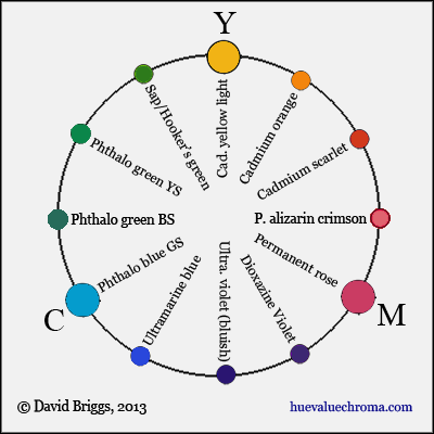
Figure 7.13. A simple conceptual layout of hues for pigment mixing based on our best pigmentary primaries and their complements.
In placing the range of reds opposite the interval from green and blue, this arrangement is more accurate than the conventional artists colour wheel, which seems to have been influenced here by the psychological opponency of red and green. Stephen Quiller has already published what is essentially this arrangement in his book Color Choices. This hue circle strictly applies only for questions involving the subtractive interaction of artists paints, which includes both physical mixing and glazing of paints, but not optical mixing. Interestingly however, afterimage complementaries show a similar pattern, in that they also tend to be offset from the additive complementary near the yellow-blue axis.