
I'm proud to announce that
my colour short course is
now offered online through
Australia's National Art
School in Sydney! There's
a choice of two sessions to
suit every time zone. LINK
my colour short course is
now offered online through
Australia's National Art
School in Sydney! There's
a choice of two sessions to
suit every time zone. LINK
- Colours in Space
- Dimensions of What?
- Lightness
- Hue
- Chroma
- Brightness and Colourfulness
- Saturation
- Blackness and Brilliance
Basics of Light and Shade
Basics of Colour Vision
Additive Mixing
Subtractive Mixing
Mixing of Paints
Hue
Lightness and Chroma
Brightness and Saturation
Afterthoughts
Glossary
References
Contact
Links
NEXT
COLOUR
WORKSHOPS

1.2 The Dimensions of What, Exactly?
- What is a Colour? Perceived Colour and Psychophysical Colour
- The Attributes or Dimensions of Perceived Colour
- Primary and Secondary Qualities: An Evolutionary Perspective
What is a Colour? Perceived Colour and Psychophysical Colour
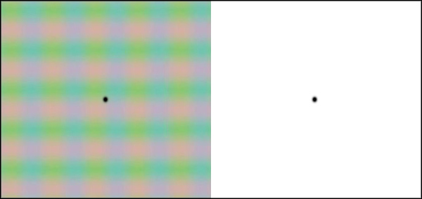
Figure 1.2.1. By concentrating alternately on the vertical and horizontal elements in the square on the left the viewer will see the same "RGB colours" evoke different perceived colours. Similar colour changes can be seen in the afterimage observed by focusing on the black dot on the left for ten seconds and then immediately focusing on the dot on the right. While colour perception generally begins with a physical stimulus, it is not simply "detection" of a physical property: here the same physical stimulus evokes different colour perceptions depending on the attention of the viewer. Graphic on left after Figure 4A of Anstis, Vergeer and Van Lier, 2012, Luminance contours can gate afterimage colors and "real" colors, Journal of Vision (2012) 12(10: 2, 1-13).
Questions about whether or in what sense colours "exist" belong to the field of philosophy called colour ontology. When we perceive a light or an object to be red we have the impression that this colour is intrinsic in the light or object, but what is not immediately clear is whether this red hue and other attributes of the perceived colour are (1) physical properties residing in the light or object that our visual system detects, or (2) ways of seeing certain properties of the light or object that our visual system creates.
Scientific consensus is firmly with the second alternative and thus current colour science (though not every colour educator) makes a distinction between colour as a perception and those properties of lights and objects that we see as their colours. The International Lighting Vocabulary of the International Commission on Illumination (CIE)1, whose terminology is widely accepted as standard in science and technology, defines two distinct concepts of "colour", perceived colour and psychophysical colour:
Perceived colour: "characteristic of visual perception that can be described by attributes of hue, brightness (or lightness) and colourfulness (or saturation or chroma)" (CIE, 2011, 17-198).
Psychophysical colour: "specification of a colour stimulus in terms of operationally defined values, such as 3 tristimulus values" (CIE, 2011, 17-197). A familiar example of a set of three tristimulus values is a specification such as R159 G170 B65 in a given RGB colour space , which specifies a colour stimulus on a screen in terms of amounts of specific "red", "green" and "blue" component lights.
These two definitions correspond to two distinct ways in which the word "colour" can be used in common speech. Demonstrations of contrast phenomena such as Fig. 1.2.2 below can be described either by saying that the surround changes the colour of the squares, or by saying that on the different surrounds the squares appear to be different colours, but are actually the same colour. In the first description the word "colour" is used for an aspect of immediate visual perception (the perceived colour) while in the second it refers to the shared colour specification (the psychophysical colour), one of the 16.7 million "colours" available on an RGB screen. Applying CIE terminology to Fig. 1.2.2, the same psychophysical colour evokes two different perceived colours.

Figure 1.2.2. The central squares on either side are physically identical - they have the same RGB specification (R159 G170 B65) and would match the same Munsell chip placed against them - but they are perceived to differ in colour. Should we describe this by saying that the colour of the square changes on different surrounds, or should we say that although they appear to be different colours, the squares are actually the same colour? The answer depends on in which sense we are using the word "colour".
The view of colour reflected in these standard definitions can be elaborated as follows:
1. Hue along with brightness, lightness, colourfulness, chroma and saturation are attributes of visual perception, not physical properties of lights or objects.
2. The property of a light or an object that we see as its particular colour is not purely physical but psychophysical, meaning that it involves the perceiver as well as the stimulus in its specification2. For humans with normal colour vision this property is the balance of long-, middle and short-wavelength components in the spectral composition of a light relative to daylight, or for an object the balance of these components in its intrinsic spectral reflectance. The number of components - three - arises from the number of receptor types involved in human colour vision. Lights whose balance of long-, middle- and short-wavelengths evoke the same relative response of the three cone cell types are indistinguishable to the human observer, irrespective of any smaller scale differences in their spectral compositions (e.g. Fig. 1.2.3, below). We call members of a class of visually matching but physically diverse colour stimuli metameric.
3. The balance of long-, middle- and short-wavelength components in a light, as detected by the human visual system, can be specified by a set of three numbers called tristimulus values, defined as the "amounts of the 3 reference colour stimuli, in a given trichromatic system, required to match the colour of the stimulus considered" (CIE, 2011, 17-1345). CIE XYZ tristimulus values use three mathematically defined virtual "primaries" to psychophysically specify the colour of any light. As colour perception varies somewhat among individuals with "normal" colour vision, these tristimulus values use the necessary assumption of a mathematically defined "standard" human observer. When X=Y=Z the long-, middle- and short-wavelengths components are evenly balanced and the light in isolation will appear white, but note carefully that the X, Y and Z values do not individually specify the three wavelength components. Lights with the same XYZ tristimulus values match in colour when viewed together in the same viewing conditions, but the perceived colour of the matching pair will vary depending on those conditions (just as does the perceived colour of R159 G170 B65 in Fig. 1.2.2).
4. A set of CIE XYZ tristimulus values specifies the psychophysical colour of a light stimulus including the intensity of the light (called luminance), just as a set of RGB values does for a colour on a screen. We can also specify the colour of a light stimulus considered separately from its intensity by using the ratio of the X, Y and Z components, which can be represented on a two-dimensional diagram called a chromaticity diagram (Fig. 1.2.3, right).
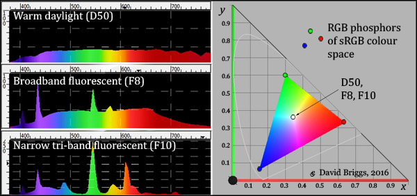
Figure 1.2.3. Left: Spectral power distributions of three standard white illuminants (light sources). Though very different physically, these three lights have the same chromaticity (psychophysical colour considered separately from light intensity) and thus match in colour, appearing a warm white when viewed in isolation. Right: CIE xy chromaticity diagram showing chromaticities of the RGB lights of a specific RGB colour space (sRGB) and of the three illuminants on the left at a single point. The faint horseshoe-shaped line shows the chromaticities of the monochromatic wavelengths of the spectrum. All images derived from the program ColorSpace by Philippe Colantoni.
5. Light stimuli that match in isolation can evoke very different colour perceptions in different parts of the visual field due to the capacity of our visual system to separate effects of illumination from colours seen as belonging to objects, called an object colours (CIE e-ILV 17-831). For example neutral light of a given brightness may evoke a perception of a dimly lit white object in one part of the visual field and a strongly lit dark object in another (Fig. 1.2.4 below). An object colour is the way in which we perceive an object's intrinsic spectral reflectance, or rather its overall long, middle and short wavelength components. When an object can be freely inspected in daylight its perceived object colour is a very good indication of the latter, and object colour perception achieves a considerable level of colour constancy in illumination of varying intensity and (to a point) of varying colour. Object-colour perception relies on unconscious processing that is rapid, automatic and seemingly effortless, creating the impression that object colours reside outside us and are directly perceived. Although not perfect the relative constancy of object colour perception is sufficient to maintain the impression that these perceptions generated in the brain are intrinsic properties residing in objects themselves.
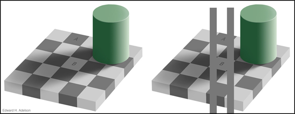
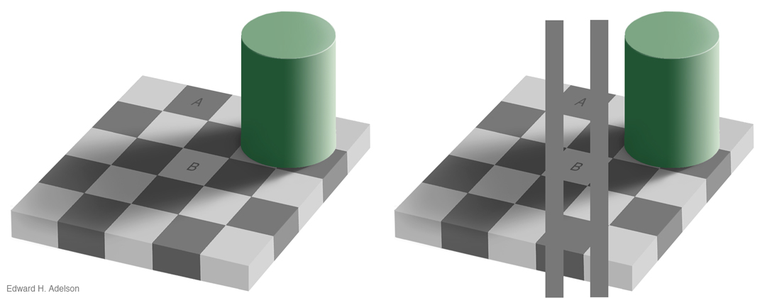
Figure 1.2.4. Checker shadow illusion created by Edward H. Adelson. (click to enlarge) Source: http://web.mit.edu/persci/people/adelson/checkershadow_illusion.html. Neutral light of a given brightness evokes object-colour perceptions of a dimly lit light grey object in one part of the visual field (B) and a strongly lit dark grey object in another (A), and without assistance it is very difficult to see that these lights match physically (right). We find this alarming because we normally assume that our visual system should be simply detecting the physical properties of the image itself.
6. The colour of an object is specified psychophysically by the XYZ trismulus values of the light it reflects under a standard daylight illuminant, and these XYZ values together record the object's disposition to reflect a particular balance of long, middle and short wavelengths. (Once again, the X, Y and Z values do not individually specify these three components).
7. A trio of XYZ tristimulus values does not correspond to absolutely fixed perceived colour attributes such as a particular hue, lightness and chroma because these will vary depending on the viewing conditions, but can be converted to perceived colour attributes if a set of viewing are specified as standard, as for example in the 1943 renotation of the Munsell system. Colour order systems generally use some form of daylight illumination as standard for this conversion, so that the colour attributes obtained acceptably describe the colour perceived to be intrinsic in the object itself.
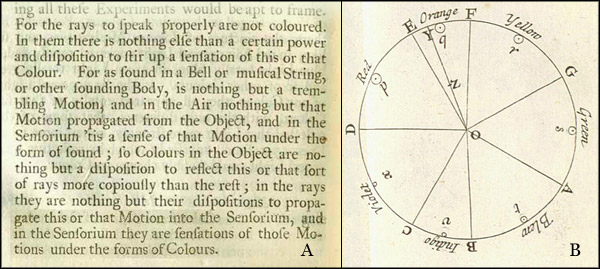
Figure 1.2.5. A. Extract from Newton's Opticks (1704, p. 90). B. Newton's colour circle from the Opticks (1704, Book I, Part II, Pl. 3), illustrating his "center of gravity" principle for predicting the colour of a mixture of lights. Unequal amounts of red, orange, yellow, green, blue, indigo and violet "rays", indicated by the relative sizes of the small circles (p, q, r, s, t, u, and x), mix to make light of colour z between spectral orange (Y) and white (O), seen as whitish orange.
Elements of this scientific view of colour can be traced back to antiquity via Descartes and Galileo, but began in substantial detail with Sir Isaac Newton's researches into the physical basis of colour. In the well-known passage from his Opticks (1704) shown in Fig.1.2.5A Newton explicitly distinguished between colour as a psychological "sensation" residing "in the Sensorium" and what he called colours "in the rays" and colours "in the object". For Newton colour in light is the "power" or "disposition" of the light to be seen as this or that perceived colour, and he demonstrated that for an isolated light this power or disposition depends on the relative balance of the component "rays", represented approximately by their "center of gravity" in a two-dimensional system, his colour circle (Fig. 1.2.5B). We now understand that this system is two-dimensional because it results from the relative responses of the three cone cell types on which our colour vision depends (Section 1.4). Newton's diagram is a precursor of a modern chromaticity diagram, and already implies that most colours of light can be evoked by many different combinations of "rays" having the same centre of gravity, and thus correspond to a whole class of combinations of "rays" (we would now say metameric spectral power distributions) that are indistinguishable to the human visual system. As for what he called "Colours in the Object", Newton recognised that these are the object's "disposition to reflect this or that sort of rays more copiously than the rest", that is the wavelength balance of its intrinsic spectral reflectance (Fig. 1.2.5A).
The Attributes or Dimensions of Perceived Colour
The six attributes of perceived colour listed in the CIE definition quoted above - hue, brightness, lightness, colourfulness, saturation and chroma - are defined perceptually, that is, as attributes of visual perception rather than as physical properties of lights or objects, though each can be characterized as the way in which we perceive an aspect of those physical properties3.
- Hue is defined perceptually as the "attribute of a visual perception according to which an area appears to be similar to one of the colours: red, yellow, green, and blue, or to a combination of adjacent pairs of these colours considered in a closed ring" (CIE, 2011 17-542). Hue is the way in which we perceive a direction of bias among the long-, middle and short-wavelength components of the spectral power distribution of a light relative to daylight, or of the spectral reflectance of an object relative to a spectrally neutral reflector.
- Brightness is defined perceptually as the"attribute of a visual perception according to which an area appears to emit, or reflect, more or less light" (CIE, 2011, 17-111). Brightness is the way in which we perceive visible energy of light or luminance (= radiant energy of light, weighted wavelength-by-wavelength by the response of the human visual system).
- Lightness (= greyscale value) is defined perceptually as the "brightness of an area judged relative to the brightness of a similarly illuminated area that appears to be white or highly transmitting" CIE 2011, 17-680). Lightness is the way in which we perceive an object's efficiency as a diffuse reflector of light (called its diffuse luminous reflectance).
- Colourfulness is defined perceptually as the "attribute of a visual perception according to which the perceived colour of an area appears to be more or less chromatic" (CIE, 2011, 17-233). Colourfulness is the way in which we perceive the absolute amount of bias between the long-, middle and short-wavelength components of a light, relative to daylight.
- Saturation is defined perceptually as the "colourfulness of an area judged in proportion to its brightness" (CIE, 2011, 17-1136), which amounts to the perceived freedom from whitishness of the light from that area. Saturation is the way in which we perceive the proportional amount of bias between the long-, middle and short-wavelength components of a light, relative to daylight. In a given setting light of a given saturation exhibits greater colourfulness as it becomes brighter.
- Chroma is defined perceptually as the"colourfulness of an area judged as a proportion of the brightness of a similarly illuminated area that appears white or highly transmitting" (CIE, 2011, 17-139). Chroma is the way in which we perceive an object's efficiency as a spectrally selective reflector/transmitter of light , or specifically the absolute amount of bias between the long-, middle and short-wavelength components of its reflectance/transmission.
- Brilliance, a seventh attribute not currently defined by the CIE but appearing in some other systems as clearness or its converse, blackness. Brilliance is the relative brightness of an area judged on a scale of appearance proceeding from black through decreasing blackness (or "greyness") to fluorent (fluorescent-looking) and then self-luminous. Brilliance is our perception of the brightness of an object relative to the maximum brightness possible or at least commonly encountered for a similarly illuminated object of the same hue and saturation