I'm proud to announce that
my colour short course is
now offered online through
Australia's National Art
School in Sydney! There's
a choice of two sessions to
suit every time zone. LINK
my colour short course is
now offered online through
Australia's National Art
School in Sydney! There's
a choice of two sessions to
suit every time zone. LINK
- Colours in Space
- Dimensions of What?
- Lightness
- Hue
- Chroma
- Brightness and Colourfulness
- Saturation
- Blackness and Brilliance
Basics of Light and Shade
Basics of Colour Vision
Additive Mixing
Subtractive Mixing
Mixing of Paints
Hue
Lightness and Chroma
Brightness and Saturation
Principles of Colour
Afterthoughts
Glossary
References
Contact
Links
NEXT
COLOUR
WORKSHOPS

1.7 The Dimensions of Colour: Saturation
Saturation
The word "saturation" is widely used today as a generic term for chromatic intensity in contexts where chroma, colourfulness, saturation and other aspects of chromatic intensity are not distinguished, including a diverse array of measures in digital colour spaces and applications (see below). The concepts of saturation and chroma in particular were long confused even in scientific literature, and interestingly it was the art and design teacher Arthur Pope (1929, pp. 53-58) and the sculptor Morton C. Bradley Jr (1938) who showed that scientists had been repeatedly confusing these concepts. The role of artists in establishing the modern terminology of colour is not surprising, because as Bradley pointed out, artists are vitally interested in colour relationships, while scientists were content with colour specification.
In current standard terminology saturation refers specifically to the perceived concentration of chromatic as opposed to white light in the light coming from an area, or in other words the freedom from whitishness of that light. For lights of a given brightness, colourfulness increases as white content decreases, so saturation can be defined in terms of colourfulness and brightness as:
Saturation: "colourfulness of an area judged in proportion to its brightness" (CIE e-ILV 17-1136).
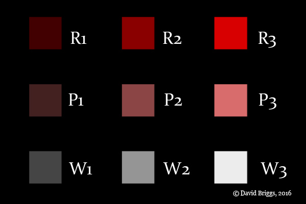
Figure 1.7.1. Three series of RGB colours each of uniform saturation: R1-R3 (high saturation), P1-P3 (medium saturation) and W1-W3 (zero saturation). Although R1 and R3 have the same saturation, R3 emits a greater amount of equally saturated red light, perceived as brighter and more colourful, and as an object colour is seen as having higher chroma than R1 when viewed as here in the same context (but see also Fig. 1.5.2!).
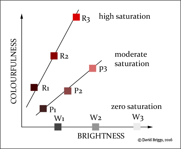
Figure 1.7.2. Illustration of the CIE definition of saturation. R1-R3 have high saturation, P1-P3 have moderate saturation and W1-W3 have zero saturation.
In Fig. 1.7.1 the series of RGB colours R1-R3 and P1-P3 each increase progressively in brightness and colourfulness from left to right, and judged as object colours they similarly increase in lightness and chroma. Yet each series is also perceived to have a chromatic attribute in common: R1-R3 are perceived to emit relatively pure red light, while P1-P3 are perceived to emit whitish red light in which the white and red components are in a fixed balance. This shared chromatic attribute is saturation. Within each series colourfulness increases in step with brightness, but because of their greater purity of light, R1-R3 are more colourful at a given brightness, and thus higher in saturation, than P1-P3.
Saturation is the way in which we perceive the proportional imbalance of the long-, middle- and short-wavelength components of a light relative to daylight, an imbalance measured by the psychophysical quantities of colorimetric purity or excitation purity (CIE e-ILV 17-195, 17-408). In its modern standard definition, saturation aligns with the use of the term by Helmholtz (1866) when he showed that the colours of lights could be specified by their hue, brightness and saturation. Relative saturation first emerges as Newton's (1704) concept of "the Fulness or Intenseness of the Colour, that is to its distance from Whiteness", as represented by the distance from the centre of his circle of hues.
Saturation behaves differently from brightness and colourfulness, in that it remains essentially constant for a given object under different levels of illumination unless the brightness is very high (CIE, 2011, 17-1136, note). When a chromatic object is increasingly strongly lit by the same illuminant, the spectral power distribution of the light it reflects should remain the same while its brightness increases, and we would therefore expect the saturation or perceived spectral imbalance of this light to tend to also remain the same. Because objects are perceived to reflect light of about the same saturation through a wide range of illumination levels, object colours can also be characterized as saturated (for example both vermilion and dark ruby red) or variously desaturated. Objects can therefore be characterized by the saturation and relative brightness of the light they reflect, as an alternative to using their chroma and lightness.
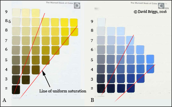
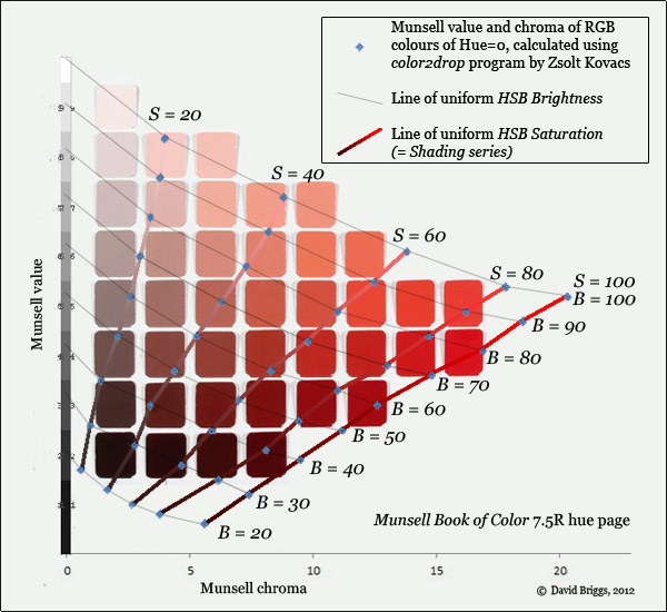
Figure 1.7.3. Lines of uniform saturation on Munsell Book of Color, Glossy Edition (A) 5Y and (B) 5PB hue pages. The 5PB chips attains higher saturation but lower chroma than the 5Y chips.
Because chroma and lightness are colourfulness and brightness judged relative to the same thing, their ratio reduces to the ratio of colourfulness to brightness, that is, to saturation. So on a Munsell hue page, colours of uniform saturation lie along lines that radiate from near the zero point on the value (lightness) scale, in contrast to lines of uniform chroma which are of course vertical (Fig. 1.7.3).
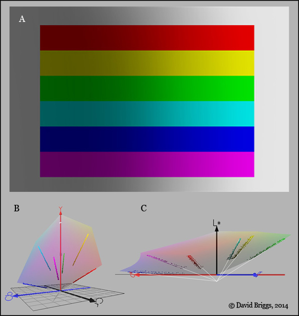
Figure 1.7.4. A. Seven uniform saturation series (including the achromatic surround) perceived as uniformly coloured objects under varying illumination. David Briggs, 2007, Photoshop CS2. B. Colours from A plotted in YCbCr space. C. Colours from A plotted in L*a*b* space. B and C plotted using the program Colorspace by Philippe Colantoni.
Similarly, if the ratio of the RGB components of a series of digital colours is maintained as their brightness increases, we would also expect their spectral power distribution and saturation to stay the same (as each of the series in Fig. 1.7.1). Figure 1.7.4A shows how readily our visual system reads uniform saturation series as an array of uniformly coloured objects under varying illumination, provided that the arrangement permits such a reading. These radiating lines of uniform saturation, in which chroma increases steadily in step with lightness, are sometimes called shadow or shading series, and are very important to painters because they define the paint or digital colours that create the appearance of a uniformly coloured diffusely reflecting object turning under a light source.
As saturation is defined as a function of two attributes of the colour appearance of a single area, it depends entirely on the appearance of the light from that area, and not on "judgements" in relation to other areas of the visual field, as do the object colour attributes lightness and chroma. Since saturation and colourfulness are not independent, we can describe colours of light either in terms of hue, brightness and colourfulness or in terms of hue, brightness and saturation.
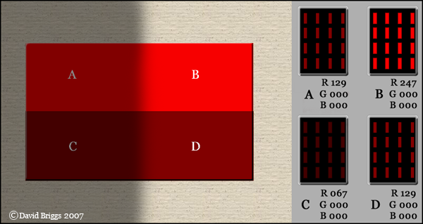
Figure 1.7.5. Is A the same colour as B or D? It all depends on how you look at it, which is why we need to be so careful about terminology. Viewed as objects in a scene, we see two strips, AB and CD, each of uniform lightness and chroma, AB lighter and higher in chroma than CD. Seen as image colours, however, A and B are surfaces of different lightness and chroma, and emit light of different brightness and colourfulness. They have been painted this way in order to represent the brighter and more colourful light that a surface of uniform chroma reflects where it is more strongly lit. Seen as light, all four areas emit light of the same saturation - in each area, only the red phosphors are glowing (right). Areas A and D emit light of the same hue, saturation and brightness - that is, they are identical image colours, even though they are perceived as very different object colours in the scene. Indeed, because these perceived object colours are so visually insistent, it may be very difficult to see these image colours as identical without in some way breaking the representational spell of the image. Image: David Briggs, 2007.
Measures of Saturation
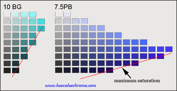
Figure 1.7.6. Munsell hue pages of digital colours from www.andrewwerth.com/color/. Quantified as chroma relative to lightness, the maximum saturation attained by digital colours of different hues varies greatly.
Different colour appearance models use a variety of formulae working from different parameters to quantify saturation (Fairchild, 2013). The simplest formulae quantify saturation as the ratio of chroma to lightness (RLAB, ZLAB). Quantified in this way, different pages of the Munsell Book of Color attain different maximum saturations, as well as different maximum chromas, on different hue pages (Fig. 1.7.6, 1.5.5). Digital colours are even more varied in the maximum absolute saturation they attain at different hues (Fig. 1.7.6, 1.5.6).
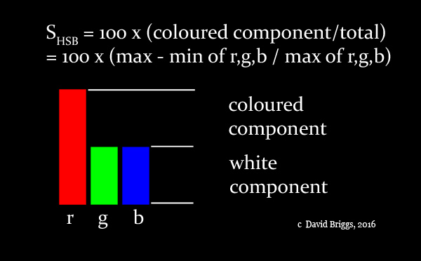
Figure 1.7.7. RGB components of digital colour P3 from Fig. 1.7.1. P3 has an HSB saturation of 100 x 0.5 = 50.