I'm proud to announce that
my colour short course is
now offered online through
Australia's National Art
School in Sydney! There's
a choice of two sessions to
suit every time zone. LINK
my colour short course is
now offered online through
Australia's National Art
School in Sydney! There's
a choice of two sessions to
suit every time zone. LINK
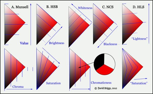
- Colours in Space
- Dimensions of What?
- Lightness
- Hue
- Chroma
- Brightness and Colourfulness
- Saturation
- Blackness and Brilliance
Basics of Light and Shade
Basics of Colour Vision
Additive Mixing
Subtractive Mixing
Mixing of Paints
Hue
Lightness and Chroma
Brightness and Saturation
Principles of Colour
Afterthoughts
Glossary
References
Contact
Links
NEXT
COLOUR
WORKSHOPS

1.4 The Dimensions of Colour: Hue
The Circuit of Hues
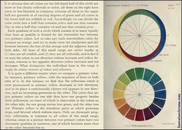
Figure 1.4.1. Ewald Hering's analysis of the hue circle into red/green and yellow/blue components, from Outlines of a Theory of the Light Sense (1964), an English translation of his posthumous Grundzuge der Lehre vom Lichtsinn (1920). Hering's colour-opponent model was adopted very early in psychology, but was not generally accepted in vision science until the mid 20th century, when models showing it could be reconciled with the trichromatic input at the retinal level gained widespread support.
The hue of any colour is its closest match in the circuit of "pure" or "saturated" colours known to artists as the colour wheel. Thus the hue of a brown object is the particular orange-yellow to orange-red that it most closely resembles.
A perennial question from students in classes and on internet forums runs along the lines of "why do we bend the linear scale of colours in the spectrum into a circular colour wheel?". The assumption is that hues reside in the linear sequence of wavelengths of the spectrum and must be bent into a circle, but according to the widely held model of colour vision called colour opponency, proposed in the late 19th century by Ewald Hering, hues are produced by the visual system with an intrinsically circular range, only part of which can be evoked by single wavelengths of light. But before the recognition of colour opponency the question was indeed a baffling one, and the best explanation that Newton could offer was his rather optimistic suggestion of an analogy with a circle of musical notes.
The scientific definition by the CIE attributes the cycle of hues to successive combinations of four hues identified in a separate definition as the "unique" or "unitary" hues in acknowledgment of the concept of colour opponency. Colour opponency is also explicitly acknowledged in the hue circle of the Scandinavian Natural Colour System (NCS).
Hue: "attribute of a visual perception according to which an area appears to be similar to one of the colours: red, yellow, green, and blue, or to a combination of adjacent pairs of these colours considered in a closed ring" (CIE, 2011 17-542).
Unique hue: "hue that cannot be further described by the use of hue names other than its own. Equivalent term: "unitary hue". NOTE There are 4 unique hues: red, green, yellow and blue forming 2 pairs of opponent hues: red and green, yellow and blue." (CIE, 2011, 17-1373).
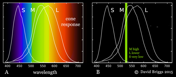
Figure 1.4.2. A. Normalized responses of human S, M and L cone types to different wavelengths of light. Note that the M and L cones do not "detect" green and red wavelengths respectively, as is often claimed in popularized explanations. They both respond to photons through virtually the entire spectrum, and if they are hit by a photon they can not distinguish what part of the spectrum it came from, they simply respond more strongly to photons from some parts than others. B. The mixture of wavelengths in daylight stimulates all three cone types strongly, and the light is seen as colourless (white), but any single wavelength must result in unequal cone responses, which are experienced as different hues.
Hue is how we perceive the direction of bias of the spectral power distribution of a light (its distribution of energy through the spectrum) or of the spectral reflectance of an object (its reflectance through the spectrum). Conversely, absence bias in either of these is perceived as absence of hue. Perception of a circle of hues is specific to organisms whose colour vision involves three receptor (cone cell) types processed in a cone-opponent fashion, that is, by comparing the responses of the three cone cell types with each other at an early stage of visual processing. When the energy of an isolated light is distributed throughout the spectrum in a balance similar to that of daylight, the responses of our long-, medium- and short-wavelength (L, M and S) cone cell types are mutually balanced and cancel each other out chromatically, and the light is perceived as colourless , that is, "white" (Fig. 14.4.2A)1. Single wavelengths on the other hand necessarily evoke an unequal response from the cone cell types (Fig. 1.4.2B). Beginning at the short wavelength end these unequal cone responses are successively S, S+M, M, M+L and L dominant. An L+S dominant response, which completes the cycle of possible cone responses, can be evoked only by lights containing mixed wavelengths predominantly from the two ends of the spectrum.
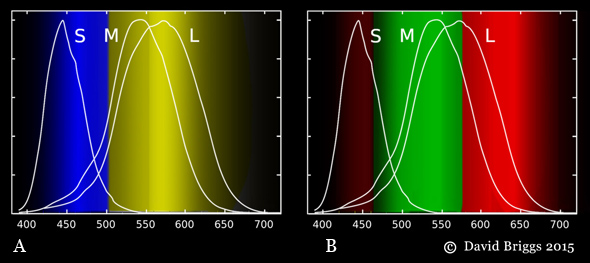
Figure 1.4.3. (A) yellow/blue and (B) red/green colour-opponent hue perceptions evoked by different wavelengths, based on the hue cancellation experiments of Hurvich and Jameson (see Fig. 3.3, Section 3.2).
We perceive this cycle of possible cone responses as a cycle of hues comprising successive combinations red, yellow, green and blue, apparently organized as a yellow or blue and a red or green colour-opponent pairs (Fig. 1.4.3A,B). It remains controversial how these colour-opponent perceptions (or "signals") arise from the circuit of trichromat cone-opponent responses (Hardin, 2014), but in general terms a yellow vs blue perception is evoked by long or middle vs short wavelength dominance, while a red vs green perception is evoked by long OR short vs middle wavelength dominance (Fig. 1.4.3B). Note that by this model, "red" is not a property of light that our visual system detects, it is a perception that our visual system creates in response to two distinct bands of wavelengths that have nothing in common except that they occupy opposite ends of the range visible to humans. For a dichromatic species having only two cone types, say L and S cones, the range of relative responses is confined to just L dominant and S dominant, which can be perceived as just two hues. Human dichromats are believed to perceive colour something like this, though there is evidence that colour perception in dichromatic-testing individuals of a trichromatic species can be more complex.
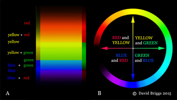
Figure 1.4.4. Spectral hues explained as successive combinations of yellow/blue and red/green colour-opponent hue perceptions.
The cone responses evoked by single wavelengths (S, S+M, M, M+L and L dominant) are experienced as successive combinations of these colour-opponent pairs, forming the the spectral hues spectral red, orange, yellow, green, cyan, blue, and violet (Fig. 1.4.4A,B). Middle ("pure") yellow and blue are experienced where the red/green perception is at zero, and middle green is experienced where the yellow/blue perception is at zero. The non-spectral S+L dominant response, requiring mixtures of wavelengths from the two ends of the spectrum, is seen as the range of non-spectral hues from purple to magenta and middle red. Broadband lights containing a mixture of wavelengths evoke a cone response and perceived hue that depends on the overall balance of wavelengths present.

Figure 1.4.5.Comparison of spectral reflectance curves of Gamblin Cadmium Yellow Light, Cadmium Yellow Medium and Titanium White oil paint. Munsell plot and spectral reflectance curves for Gamblin Conservation Colours from drop2color by Zsolt Kovacs Vajna; paint sample photos from dickblick.com.
The colours we see as belonging to objects at least to a degree relate to their characteristic spectral reflectance, rather than to the wavelengths that they happen to reflect under a particular illuminant, and the hues of these object colours depend on the the direction of bias of these spectral reflectances. Paints that strongly reflect the middle and long wavelength parts of the spectrum (Fig. 1.4.5) are seen as strongly yellow (Fig. 1.4.3A), and either slightly greenish, slightly reddish, or neither depending on the relative size of the middle and long wavelength contributions (Figure 1.4.3B). In Gamblin Cadmium Yellow Light these contributions are approximately evenly balanced and the paint is seen as middle yellow, neither greenish nor reddish, while in Gamblin Cadmium Yellow Medium the contribution from the middle (green-evoking) part of the spectrum is smaller, and so the paint colour is seen as having a red component (Fig. 1.4.5). Titanium White is seen as being white because its spectral reflectance has no substantial bias.
Despite a broadly based scientific consensus to the contrary, the view that hues like red and green are properties or "things" physically residing in objects is still alive and well in traditional colour theory accounts of "colour mixing", which take the seemingly logical additional step of assuming that when we mix paints the hues residing in the paints themselves mix. The traditional doctrine that red, yellow and blue are primary colours that "can't be mixed from other colours" proceeds from these assumptions: we can't make a red mixture without using paint that already "contains red" (such as magenta), similarly we can't make a yellow or blue mixture without using paints that already "contain" yellow and blue respectively, but the colour green is not a primary colour but a mixture of colours because we can make a green mixture from middle yellow and middle blue paints that don't "contain" green. (For the scientific alternative to this impeccable phenomenology see Section 5:Subtractive Mixing).
Unfortunately, many popularized explanations of colour vision also encourage the idea that hues exist outside us by speaking of cone cell types that "detect red, green and blue wavelengths" respectively (which is absolutely incorrect, See Fig. 1.4.2A), especially when they take this to mean that humans really only see red, green and blue, that mixtures of red and green lights just "make you think you're seeing yellow", or that the colour magenta/pink/purple alone is "made up" by our brain, because it doesn't "exist" in the spectrum! Although the colour-opponent model has been widely accepted alongside trichromacy in vision science and psychology for many decades, most popularized explanations of colour vision still omit it completely and explain only the trichromatic model at the level of the retina.
Measures of Hue
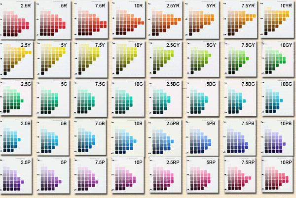
Figure 1.4.6. The forty hue pages of the Munsell Book of Color (glossy edition).
Hue systems differ among themselves by the criterion used for placing hues opposite each other, which affects the spacing of the hues, and by which hues that are treated as "primary" or principal in anchoring the circular scale. More incidental differences are the sequential direction of the hues (i.e. clockwise or counterclockwise spectral sequence), whether the continuous loop of hues is represented the form of a circle, hexagon, triangle, star, or other closed geometrical figure, and the conventional orientation (i.e. a specific hue placed at the top of the figure or treated as the first in the sequence). Hue systems are classified on this site according to the criterion used to place hues opposite each other, and hue systems based on the historical primaries and their complementaries, opponent hues, additive complementaries, colourant-mixing complementaries and perceptually-equal spacing respectively are discussed in more detail on later pages.
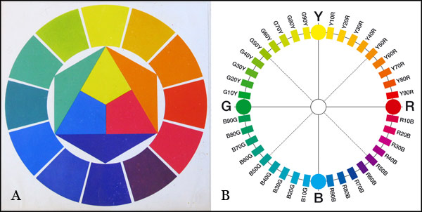
Figure 1.4.7. A. Hue circle based on the historical primaries red, yellow and blue from The Art of Color (1961) by Johannes Itten. The graphic visually encapsulates Itten's view that his secondary colours green, orange and violet each "contain" two of the primaries. B. Hue circle based on opponent hue relationships from the Natural Colour System (NCS) by the Scandinavian Colour Institute.
Hue systems based on the historical primaries are organized around the conventional complementary pairs red-green, orange-blue and either yellow-purple or yellow-violet. They include numerous 18th-21st century examples of the "artists' color wheel" of traditional colour theory. These hue systems reflect historical confusion of colourant-mixing and opponent hue relationships.
In traditional colour theory the concept of warm and cool colours is commonly used to label distinctions of hue, for example warm yellow for reddish yellow and cool yellow for greenish yellow. These warm/cool associations could be considered a mild but widespread form of synesthesia. As is typical of that condition, individuals who perceive warm/cool associations of colours can be adamant that the association they perceive is objective and obvious, yet other individuals can perceive the precisely opposite association. A striking example concerns the colour blue, where different camps within traditional colour theory regard a reddish blue like ultramarine as a warm and a cool blue respectively. Even if one feels strong warm/cool associations of colours, in the interests of clear communication it is wiser to speak of reddish or greenish blue rather than warm or cool blue, and so on.
Hue systems based on opponent hue relationships are organized around the opponent hue pairs red-green and yellow-blue, and include some historical examples and the modern Natural Colour System or NCS (Fig. 1.4.7B). Different individuals show a rather wide range of variation in the colour chips they select as representative of the four opponent hues, but the averages for most studies show a reasonable range of 2 or 3 Munsell pages (Fig. 1.4.8). These studies show that the average determinations for the unique hues are not perceptually equally spaced.
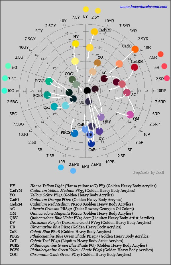
Figure 1.4.8. Munsell hue-chroma plane showing colours for sixteen common artists' pigments as pure paints and as 1:1 mixtures with Titanium white paint, calculated using Zsolt Kovacs-Vajna's program drop2color. The coloured circles around the circumference show average determinations of positions of unique red, yellow, green and blue from four studies using Munsell chips cited by Kuehni (2012); studies involving conversion from spectral data, NCS hues etc show further spread.
Hue systems based on perceptually uniform spacing oppose hues that are separated by an equal number of perceptual steps in either direction around the hue circle. They include the Munsell system and CIE L*a*b* system. Broadly speaking, opposite hue pairs in these systems are close to additive complements, especially compared to other systems. The Munsell hue circle (Figs 1.4.6, 1.4.8) is based on five principal hues, red, yellow, green, blue and purple (R, Y, G, B and P) and five intermediate hues (YR, GY, BG, PB and RP). Each of these ten hues was originally intended by Albert Munsell to have ten numbered divisions, with the fifth division, for example 5R, being regarded as the typical version of the hue. The Munsell Book of Color however has always had only four hue pages for each principal and intermediate hue, for example 2.5R, 5R, 7.5R and 10R, making a total of 40 hues.
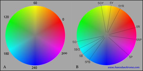
Figure 1.4.9. Hue circle showing hue angle (H) used to specify hue in HSB, HLS and HSI digital colour spaces. The circle arranges the additive complementary pairs digital red-cyan (0o-180o) , yellow-blue (60o - 240o) and green magenta (120o-300o) opposite each other. Note however that opposite colours are not complementary away from these three axes. The hue spacing is far from perceptually even, as can be determined both by visual inspection and by the approximate positions of the Munsell principal and intermediate hues (source).
Hue systems based on additive complements oppose hues of lights that make white light when mixed. They include systems by Newton, Helmholtz, Rood and Ostwald, and the CIE L*u*v* system. Examples of additive complementary pairs are familiar to many from the major hue axes in the HSB hue system used in graphics programs: the digital hues going by the names of magenta/green, red/cyan, and yellow/blue. HSB hue angle (H) is calculated from the ratios of the (nonlinear) RGB primaries by a simple formula, and is highly uneven perceptually (Fig. 1.4.9).
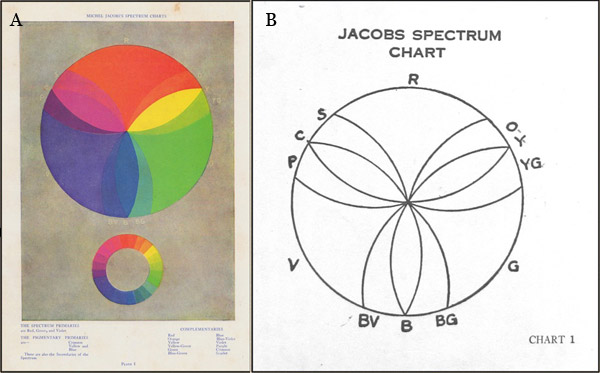
Figure 1.4.10. Colour circle diagrams by Michel Jacobs from (A) The Art of Colour (1923) and (B) The Study of Colour (1925).
Hue systems based on colourant-mixing complementaries oppose hues of paints or dyes that make a neutral grey or black when mixed. The regular succession of hues in the traditional artists colour wheel (e.g. Fig. 1.4.6A) promotes the assumption that paint-mixing complementary pairs succeed each other in an orderly succession of straight lines forming diameters of the hue circle. Many painters evidently paint for years without questioning this assumption, but in reality mixing paths show markedly different patterns for paints that are close to the ideal subtractive primary hues compared to paints that are far from these hues. Paints close to orange-red, yellow-green and blue-violet in hue each neutralize or nearly neutralize paints of a remarkably large spread of opposing hues, so that to make a hue circle that places paint-mixing complementaries approximately opposite each other it is necessary to expand the sectors occupied by these hues and contract the ranges of the remaining hues. Michel Jacobs used a diagram of precisely this sort (Fig. 1.4.10) in his once popular books The Art of Colour (1923) and The Study of Colour (1925), both of which were republished in numerous editions until 1956.
Subdividing the Hue Page