I'm proud to announce that
my colour short course is
now offered online through
Australia's National Art
School in Sydney! There's
a choice of two sessions to
suit every time zone. LINK
my colour short course is
now offered online through
Australia's National Art
School in Sydney! There's
a choice of two sessions to
suit every time zone. LINK
- Colours in Space
- Dimensions of What?
- Lightness
- Hue
- Chroma
- Brightness and Colourfulness
- Saturation
- Blackness and Brilliance
Basics of Light and Shade
Basics of Colour Vision
Additive Mixing
Subtractive Mixing
Mixing of Paints
Hue
Lightness and Chroma
Brightness and Saturation
Principles of Colour
Afterthoughts
Glossary
References
Contact
Links
NEXT
COLOUR
WORKSHOPS

1.3 The Dimensions of Colour: Lightness
- Lightness, Value, Greyscale Value and Tone
- Seeing Lightness
- Measures of Lightness
- "Lightness", "Brightness" and "Value" in Digital Colour Spaces
Lightness, Value, Greyscale Value and Tone
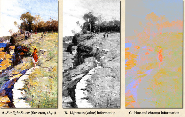
Figure 1.3.1. A. Sunlight Sweet, Coogee (1890) by Arthur Streeton. B, lightness/value information and C, hue and chroma information.
The terms lightness, value, greyscale value and tone are all closely related or identical in meaning, and refer to the attribute or dimension of colour consisting of a scale between black and white through various shades of grey. Lightness, value and greyscale value all increase from black to white, while tone as used by painters (in this sense) is more often deemed to increase from white to black. All of these terms are most commonly applied to colours of objects seen as reflecting light, although the standard definition of lightness also allows for light-transmitting objects:
Lightness: "brightness of an area judged relative to the brightness of a similarly illuminated area that appears to be white or highly transmitting" (CIE 2011, 17-680)
where brightness is the amount of light perceived to be emitted or reflected by an area (see Section 1.6).
Notice that the phrase "of a similarly illuminated area" implies that the area being judged is also illuminated. Lightness does not apply to areas perceived as a primary light source because such areas are not judged relative to a definite upper limit perceived as being white. Primary light sources perceived as such can be compared as brighter or dimmer, but not as lighter or darker grey, and can not be said to have, for example, a middle grey value. However, colours of luminous computer and television screens are seen as having greyscale value when the screen is perceived, as it normally is, as an illuminated page instead of as a primary light source. Here the finite range of brightnesses of the pixels (at a given brightness setting of the display) creates a context within which greyscale value is perceived.
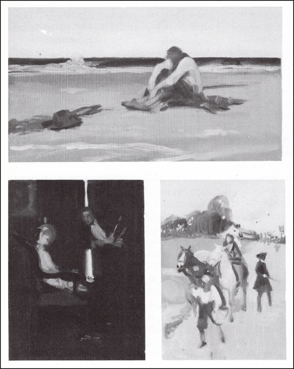
Figure 1.3.2. Value sketches of three of Howard Pyle's illustrations, from Andrew Loomis' Creative Illustration (1948).
In artworks and in perception of images in general, lightness is the pre-eminent attribute or dimension of colour (Fig. 1.3.1). If the lightness information in an image is isolated from the chromatic information, remarkably large amounts of the legibility and compositional structure are preserved (Fig. 1.3.1B). In art and design education, lightness (generally under the name "value" or "tone") is very often treated separately from and earlier than "colour" (meaning only hue and chroma) as one of the fundamental elements of composition, alongside line, shape, mass, rhythm etc. Manipulating the lightness structure of a picture by "massing" values into a striking arrangement of shapes, and choosing the distribution of values through the scale to establish an expressively appropriate value "key" (Fig. 1.3.2), are well-known traditional compositional strategies.
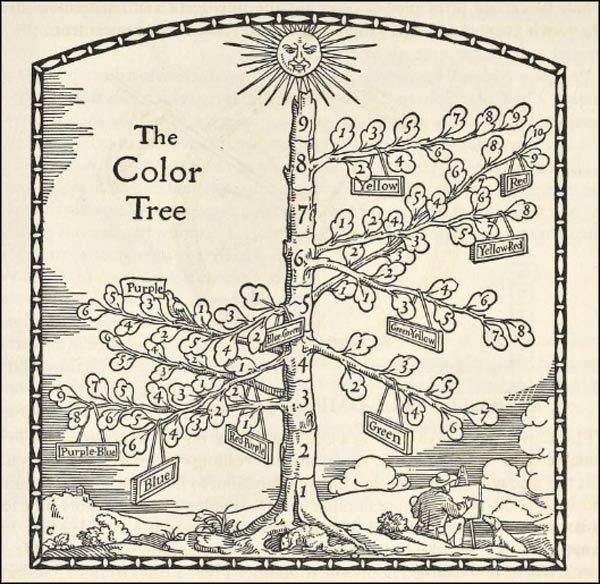
Figure 1.3.3. Cleland's (1921) illustration of Munsell's conception of his system as a tree of colours.
In an early exposition of the Munsell system Cleland (1921) expressed Albert Munsell's explanation of the central importance of value with an image of a "Color Tree" (Fig. 1.3.3), in which the value scale forms the central trunk . For the painter and designer, value is to colour as tree trunks are to trees.
Seeing Lightness
By the definition cited above, the lightness of a light-reflecting object is our perception of the amount of light it reflects relative to a white object under similar illumination. Lightness is thus "perceived reflectance" (an alternative definition of lightness used by Arend, 1993), or more precisely, perceived diffuse luminous reflectance. The adjective diffuse is needed because lightness depends specifically on the amount of diffuse reflection only, not specular reflection (shiny highlights). The adjective luminous is added because what is relevant is not the total physical reflectance of all wavelengths of electromagnetic radiation, but only the reflectance of light, that is, of radiation in the range of wavelengths visible to humans, to the extent that these wavelengths are visible.
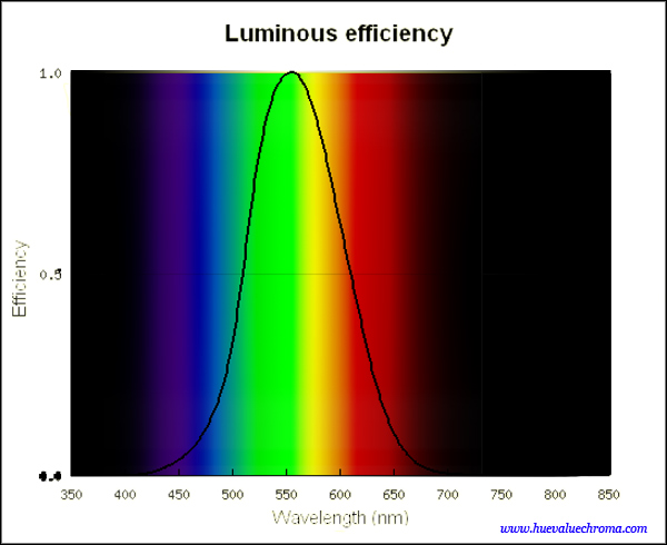
Figure 1.3.4. CIE 1931 luminous efficiency function, showing the relative response of the human visual system to light at each wavelength of the spectrum. The luminance or visible energy of a light can be calculated by weighting its spectral power distribution with this function, or measured directly using a photometer equipped with a filter that transmits each wavelength in these proportions. Curve from http://www.cvrl.org/, which also illustrates important subsequent refinements of the 1931 function.
We think of visible light as being radiation in the range from about 400 to about 700 nanometers, but wavelengths of the extremes of this range are barely visible, and the visibility for a given amount of energy increases up to a maximum for wavelengths in the middle of the spectrum, which we see as greenish-yellow (Fig. 1.3.4). For a given light if we multiply the amount of each wavelength present by its visibility given by this curve and add up the products we obtain a number for luminance or energy of light as visible to a standard human eye. Diffuse luminous reflectance is the ratio of the luminance of an object to the luminance of a reference white under similar illumination, and ranges from a few percent for glossy black oil paints to around 90% for titanium white oil paint and up to 99% for a matte magnesium oxide coating.
By varying the lighting under carefully controlled conditions it's possible to make the same object appear anything from black to white. Nevertheless when we examine most objects* freely in daylight we perceive them as having a relatively constant intrinsic lightness despite large variations in brightness as the object catches more or less light, and this perceived intrinsic lightness gives a quite reliable indication of the diffuse luminous reflectance of the object. This remarkable capacity of our visual system to perceive diffuse luminous reflectance instantly, reliably and without conscious effort is called lightness constancy, and is one aspect of object-colour constancy. Without object-colour constancy we would perceive objects as having endlessly changing colour depending on the light they are under, but not any intrinsic lightness (or chroma).
*A notable exception consists of areas of images of illuminated objects, where our attention can be so firmly held by the colours of the virtual objects depicted in the image that it can be very difficult to see colours associated with the image surface itself. This can cause us to experience the image as a colour constancy illusion, for example the Adelson checker shadow illusion.
Measures of Lightness
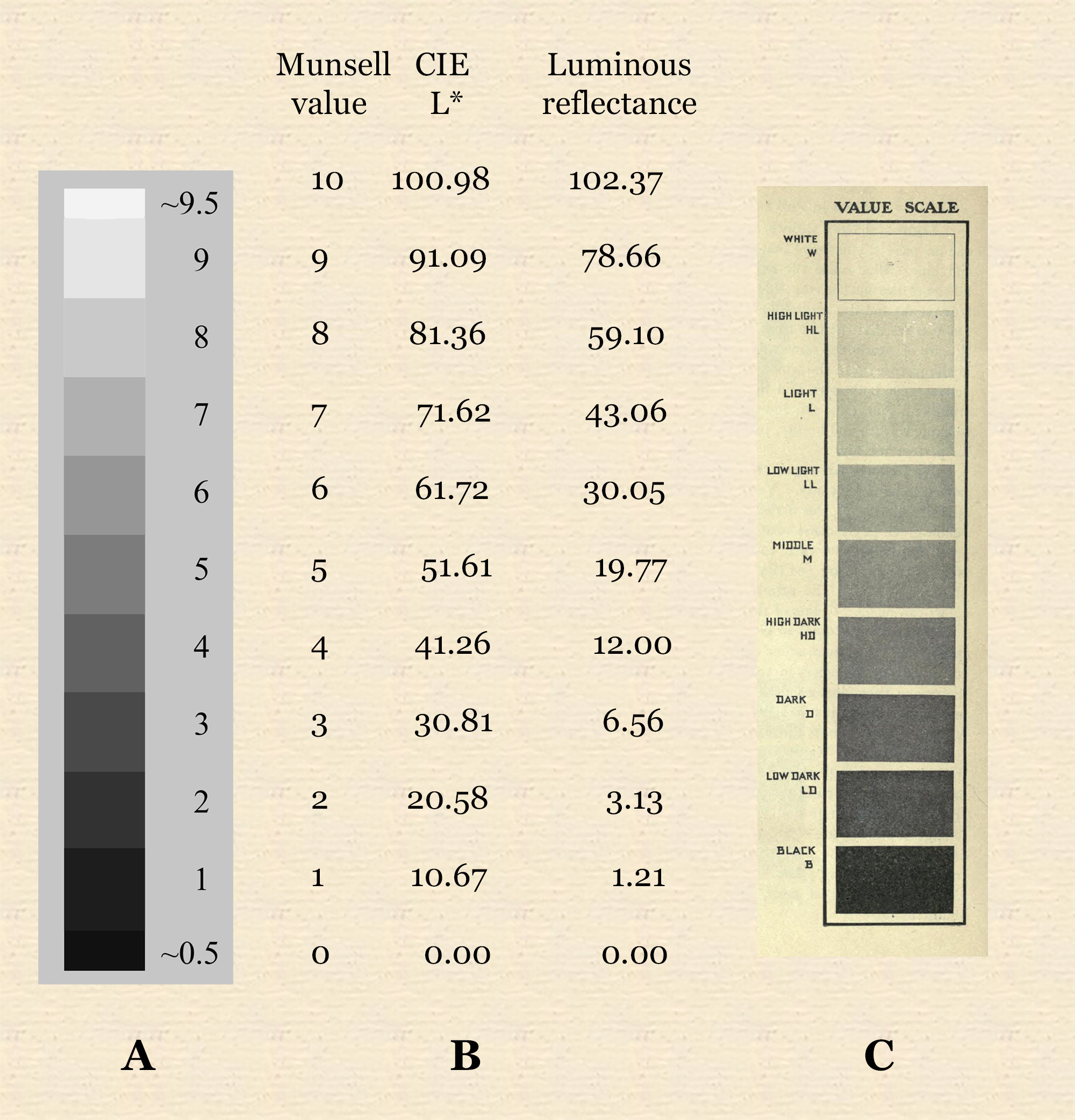
Figure 1.3.5. A. Munsell value scale for my painting classes, designed to print accurate Munsell values on a specific printer (2012 version). B. Comparison of Munsell value with CIE lightness (L*) and percentage luminous reflectance. Munsell value 10 applies to a theoretical perfect diffuse reflector, while CIE lightness L* is based on luminance relative to an actual similarly illuminated standard white reflector. This almost but not quite perfect reflector is assigned a CIE lightness of 100, and consequently Munsell value 10 has a CIE lightness greater than 100 and a nominal reflectance greater than 100%. C. Value scale of Denman Ross, as illustrated by Froelich and Snow (1905).
The lightness scales most commonly used by painters and designers are the Munsell value scale (0-10) and CIE lightness (L*, 0-100) , the latter appearing as the "L" of Lab space used in Photoshop and other graphics programs. Lightness scales such as these are designed to make the perceived contrast between adjacent steps appear equal throughout the scale. Such scales have a nonlinear relationship to diffuse luminous reflectance, because a much greater absolute increase in luminance is needed to create the same amount of contrast near the top of the scale as near the bottom. As a result, a middle grey object on such scales (5 on the Munsell scale, 50 on the CIE L* scale) has only around 20% of the diffuse luminous reflectance of a similarly illuminated white object. CIE lightness (L*) uses a different nonlinear transformation to the Munsell system, giving numbers roughly but not exactly ten times the Munsell value of the same grey (Fig. 1.3.5B).
A middle grey object appears to be about as many steps away from black as from white, but it should not be inferred from this that human perception of relative luminance is nonlinear to this extent. If asked how much light appears to be coming from a middle grey area compared to a nearby white area, most painting students estimate something much closer to 20% than 50%.
In Albert Munsell's original value scale of 0 to 10, actual black and white paints had values of 1 and 9 respectively, giving the same number of steps as in the slightly earlier system by Denman Ross (Fig. 1.3.5C). Some painters working in traditional media today continue to use an informal scale of five or nine evenly spaced values between black and white inclusive. In the modern ("renotated") Munsell system, black and white glossy oil paints attain values of about 0.5 and 9.5 respectively, leaving nine intermediate values for chromatic paints.
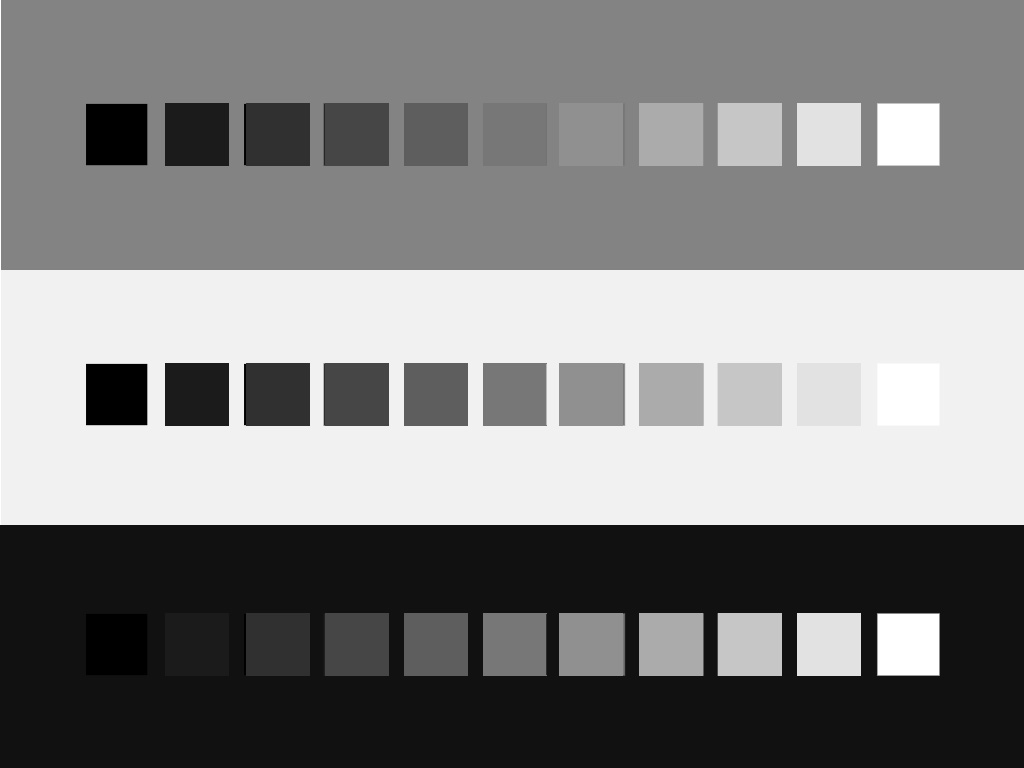
Figure 1.3.6. Effect of background on lightness perception and lightness scales. The lightness scale in each case is identical and consists of an even scale of L= 0, 10, 20, 30, 40, 50, 60, 70, 80, 90, 100, but where is the biggest jump? The phenomenon of "crispening" makes lightness intervals spanning the background lightness appear relatively large.
When physically creating a lightness scale in this way one soon becomes aware that the perception of relative lightness is rather strongly dependent on background lightness (Fig. 1.3.6). This effect of background lightness, an instance of simultaneous contrast, tends to intensify perceived lightness differences either side of the lightness of the background (crispening). Because of this, no scale can look perfectly even irrespective of background. The degree of illumination in which a scale is viewed also affects the apparent spacing of the steps.
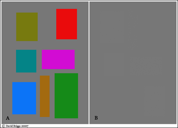
Figure 1.3.7. Helmholtz-Kohlrausch Effect. A. Various digital colours on a grey background, all measuring L = 50 in Adobe Photoshop, and thus in theory of equal luminance. The strongly coloured areas show a kind of glow that can make them seem brighter and lighter than the equiluminant grey. Actual equiluminance depends on the display settings, but may be obtained by varying the angle of view. For each colour vary the angle of view until it seems equiluminant to the grey background (judged by squinting) then open you eyes to see the effect in the strongly coloured areas. B, same image converted to greyscale mode.
A substantial ambiguity of the term "lightness" arises from the fact that strongly coloured objects are perceived to have a certain chromatic "glow" or brilliance that can create the impression that they are lighter than the grey that would be measured to be equal in luminance under similar lighting. This equiluminant grey would nevertheless show the least contrast with the object at their border when placed in contact. In some colour appearance models this colour glow, called the Helmholtz-Kohlrausch effect, is included as a legitimate component of an area's lightness and brightness, whereas in colour order systems such as the Munsell system and CIE L*a*b* it is not, and the criteria of least-contrast and equality of luminance apply in judging lightness. The painter's trick of squinting (viewing through the eyelashes of nearly closed eyes) diminishes this colour glow and is extremely useful for comparing luminance/ CIE lightness/ Munsell value. An excellent way to learn to recognize equality of value/ luminance in colours of different chroma is by doing the hue page exercise included in the New Munsell Student Color Set. Some online versions of this exercise have been created using Flash by Orian Lima.
"Lightness", "Brightness" and "Value" in Digital Colour Spaces
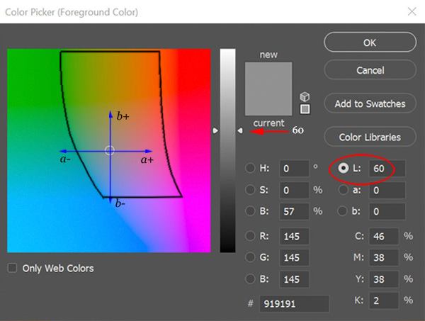
Figure 1.3.8. Colour picker from Adobe Photoshop CC, showing the L, a and b windows of Lab space in the upper right. Here L is set to 60 (on a scale of 0 to 100, as in L*) and colours of L=60 can be selected within the square window on the left. Note however that for each value of L, the gamut of available colours is restricted to a very indistinctly visible area towards the middle of the square, delineated by the black outline here. Unfortunately, if colours are picked outside this area they will still show a value of 60 in the L window but will be found to differ in value if applied and subsequently sampled.
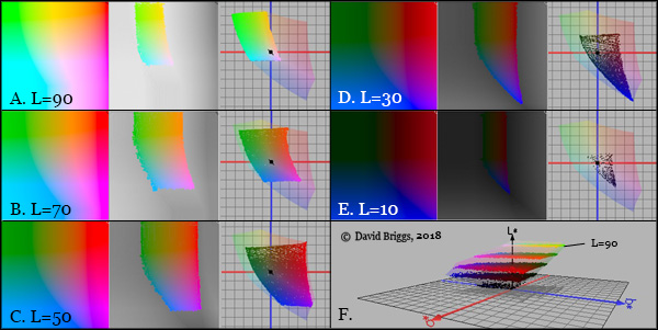
Figure 1.3.9. A-E, colour squares from Photoshop colour picker for L=90, 70 50, 30 and 10 respectivel, the gamut of available sRGB colours within this squarey, and the location of this gamut in CIE L*a*b* using Philippe Colantoni's program ColourSpace. F, Gamuts A-E in CIE L*a*b*, oblique view.
Lab space, found in the colour picker and as an image mode in Adobe Photoshop, is an implementation of CIE L*a*b* space customized to sRGB colour space, and its lightness dimension L is the most reliable measure of greyscale value for digital colours. Any adjustment in which it is desired to keep lightness constant or to change lightness in a predictable way is best done in Lab mode. For example, using either the "Desaturate" adjustment or the "Saturation" slider in the HLS adjustment panel keeps the L of Lab constant, and thus preserves perceived greycale value well; the same operations performed in RGB mode instead maintain the L of HLS space (see below), and can result in substantial changes in greyscale value.
Lab parameters appear in the upper right of the Photoshop colour picker, and by setting the L window at a given value it is possible to select digital colours of that value from the colour square on the left , varying hue by moving around the neutral point in the centre of the square, and varying chroma by moving in and out from this point (Fig. 1.3.8). In doing so however it is important to stay within the very idistinctly visible gamout of available digital colours (Fig. 1.3.9), otherwise the colour sampled will not have the required value.
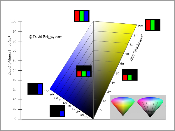
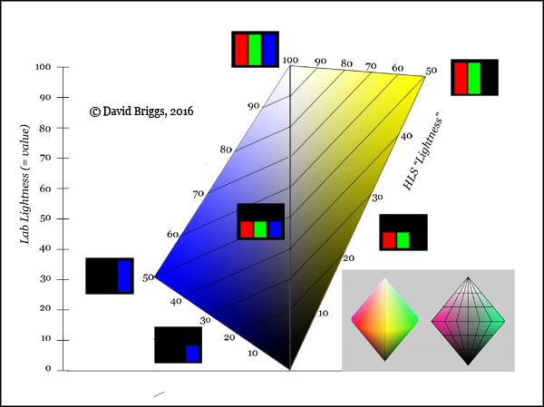
Figure 1.3.10. Relationship of HSB "brightness" B to Lab lightness L. Inset: external and cross-sectional views of HSB colour space represented as a cone, the latter showing lines of equal HSB "brightness" B (horizontal) and HSB saturation S (radiating from black).
The parameter of so-called "brightness" B in HSB colour space, also known as "value" V in the alternative name of this space, HSV, is neither absolute brightness nor lightness, but is a measure of brightness or lightness relative to the maximum possible for RGB colours of a given HSB hue angle H and saturation S. RGB colours with an HSB "brightness" of 100 range from 30 to 100 in Lab lightness (Fig. 1.3.10).