I'm proud to announce that
my colour short course is
now offered online through
Australia's National Art
School in Sydney! There's
a choice of two sessions to
suit every time zone. LINK
my colour short course is
now offered online through
Australia's National Art
School in Sydney! There's
a choice of two sessions to
suit every time zone. LINK
- Colours in Space
- Dimensions of What?
- Lightness
- Hue
- Chroma
- Brightness and Colourfulness
- Saturation
- Blackness and Brilliance
Basics of Light and Shade
Basics of Colour Vision
Additive Mixing
Subtractive Mixing
Mixing of Paints
Hue
Lightness and Chroma
Brightness and Saturation
Principles of Colour
Afterthoughts
Glossary
References
Contact
Links
NEXT
COLOUR
WORKSHOPS

1.6 The Dimensions of Colour: Brightness and Colourfulness
Dimensions of Colours of Light
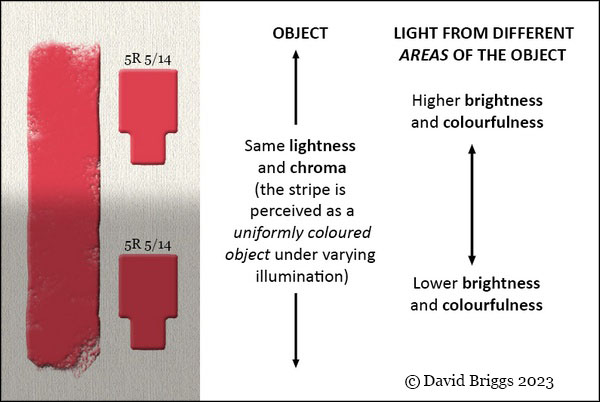
Figure 1.6.1. Digital painting of a stripe of red paint passing between shadow and light.
Consider a stripe of red paint passing between shadow and light (Fig. 1.6.1). By virtue of the unconscious processes that equip our vision with a high degree of object-colour constancy under varying intensities of the same illumination, we instantly, effortlessly and automatically see the stripe as being the same colour, that is, as having the same red object colour, over its whole length. This red colour can be specified more precisely in terms of an object colour notation such as Munsell hue, value and chroma, and we could confirm that the stripe matches the same Munsell chip placed beside it in the shadow and in the light. Nevertheless, the stripe appears brighter and more colourful in the light than in the shadow. This difference in brightness and colourfulness relates to the appearance of the light reaching our eyes from different areas of the object.
The CIE definitions of brightness and colourfulness are:
Brightness: "attribute of a visual perception according to which an area appears to emit, or reflect, more or less light. NOTE The use of this term is not restricted to primary light sources" (CIE, 2011, 17-111).
Colourfulness: "attribute of a visual perception according to which the perceived colour of an area appears to be more or less chromatic" (CIE, 2011, 17-233).
In our example of the red paint stripe the colour attributes of brightness and colourfulness pertain to the perceived colour of the light reaching our eyes from different parts of the stripe, rather than to the object colour seen as belonging to the stripe itself. So while perceived colours of objects can be described in terms of just three dimensions such as hue, lightness and chroma, perceived colours of lights are described in terms of different sets of three dimensions, such as hue, brightness and colourfulness, or alternatively as discussed in the next section, hue, brightness and saturation. Describing the colour appearance of an illuminated object involves both types of colour, and so requires more than three dimensions.
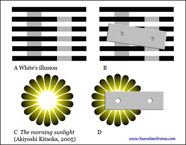
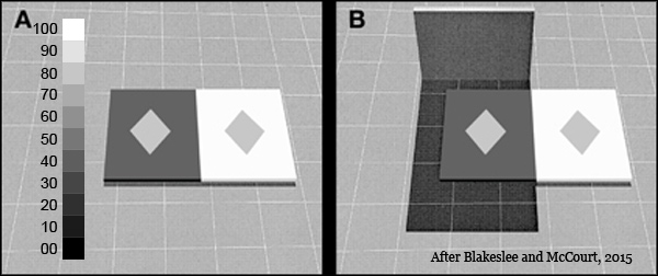
Figure 1.6.2. A White's illusion: the grey bars all have the same physical luminance, but are perceived to differ in brightness and lightness. B. Fig. 1.6.2A viewed through a screen with two apertures. C. Light-shedding illusion by Akiyoshi Kitaoka from his website Akiyoshi's Illusion Pages: the central area is identical in luminance to the white surrounding the figure, but appears brighter and thus luminous. D. Fig. 1.6.2C viewed through a screen with two apertures.
Brightness is our perception of luminance (visible light energy), whether of a primary light source or of a light-reflecting or light-transmitting object. Perception of absolute luminance is strongly influenced by the state of brightness adaptation of the observer: for example, your laptop screen is comfortably bright when viewed indoors but very dim outdoors, even though it has exactly the same physical luminance. Perception of the relative luminance of a given area in the visual field is influenced by the luminance of the immediate surround (contrast phenomena) and of finely interspersed areas (assimilation). Contrast phenomena (e.g. simultaneous contrast and Mach bands) tend to push the brightness and other perceived colour attributes of an area away from those of the immediate surround, while assimilation tends to move the perceived colour attributes of an area towards those of finely interspersed areas. In some carefully contrived examples like White's illusion (Fig. 1.6.2A) and light-shedding illusions (Fig. 1.6.2C) effects of this kind can result in particularly large misperceptions of relative luminance. Misperceptions of this kind are not eliminated by "squinting" (which actually increases effects involving assimilation like White's illusion), and in general observers can only perceive relative luminance veridically (that is, as being equal in the areas concerned) by using an opaque screen with two small apertures (Fig. 1.6.2.B,D).
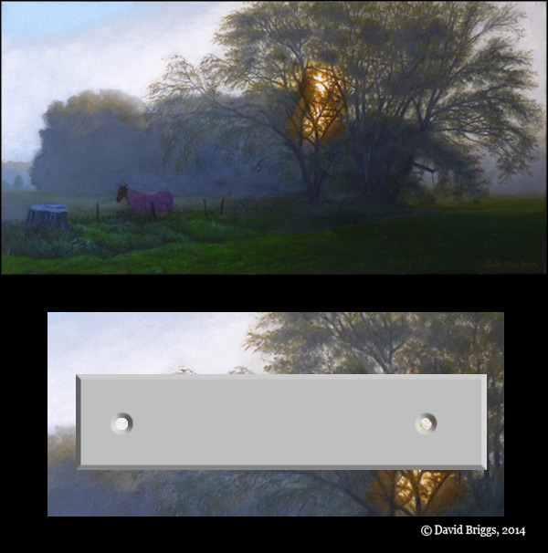
Figure 1.6.3. Above: Sunrise, Blayney. David Briggs, 2014, oil on canvas, 12" by 24". Below: detail of Sunrise, Blayney viewed through a screen with two apertures, showing approximate equality of brightness of the areas depicting the sun and the brightest parts of the clouds.
In the landscape painting Sunrise, Blayney an attempt was made to use the image colour relationships built into light-shedding illusions to create an impression of luminosity in the area depicting the sun, even though this area is painted with the same white paint as the brightest of the clouds on the left.
A variety of sophisticated quantitative measures of brightness and colourfulness have been devised in modern colour appearance models, including the Nayatani et al., Hunt and CIECAM02 models (see Fairchild, 2013 for detailed accounts). Painters however measure variations in brightness and colourfulness in a real or imagined scene in terms of the lightness and chroma of the paints they will use to represent that scene. Indeed, looking a scene like that depicted in Fig. 1.6.1, many painters would simply say that the lightness and the chroma of the stripe increase from left to right, automatically thinking in terms of the colours of the paints they would use. However the painter's representation of brightness and colourfulness as lightness and chroma, like the photographer's, involves choosing consciously or otherwise from a range of possible scaling strategies, for example "crowding" the lights or the darks (Pope, 1922).
Seeing Brightness
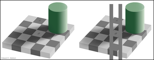
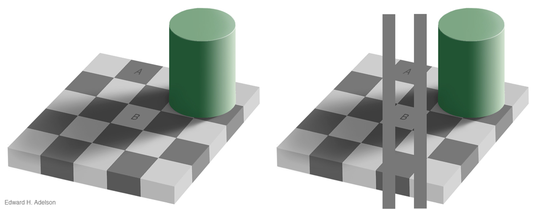
Figure 1.6.4. Checker shadow illusion created by Edward H. Adelson. (click to enlarge) Source: http://web.mit.edu/persci/people/adelson/checkershadow_illusion.html. Adelson's caption on the preceding web link ("The squares marked A and B are the same shade of gray") slyly misdirects us. The squares marked A and B "exist" only in the scene depicted in the image, where they have different object colours; it is the rhomboidal image areas labelled A and B that have the same colour and luminance, difficult as it may be to attend to this until the representational spell of the image is broken (right).
Perceiving brightness is not as straightforward a task as it might first appear. By virtue of the pre-conscious processes responsible for object-colour constancy, our perception of lightness is normally immediate, effortless and automatic. We clearly also have an immediate sense of variations of brightness within the visual field in a general way, but the task of making precise comparisons of brightness between different parts of the visual field proves to be surprisingly difficult. We discover this both when we are learning to paint and when we look at optical illusions such as Adelson's well-know checker shadow illusion (Fig. 1.6.4, left). The image areas A and B have the same luminance, but because we automatically see A as a dark surface and B as a light surface it is extraordinarily difficult to see and compare the colours of the image in these areas. Even if we consciously observe that B is a light coloured surface in a shadow and that A is a dark coloured surface in light, and therefore rationally infer that the two areas must at least be more similar in brightness than they are in lightness, it remains stubbornly difficult to see this similarity, let alone to see that they are identical in brightness. Our attention is so firmly held by these pre-consciously inferred differences in lightness that we literally cannot see the identical brightness of the areas until we break the spell of the image by connecting them up (Fig. 1.6.4, right).
It is commonplace in teaching painting that beginning students paint objects in something closer to their local colour than to the colour that they need to be to look to have this local colour in the painting. As non-painters, our conscious visual perceptions primarily track properties of objects like reflectance rather than properties of the visual field like luminance. There is nothing peculiar about this: in evolutionary terms the primary value of our visual system is in providing information about objects in the world rather than raw information about the visual field. Our visual system clearly collects information about relative luminance accurately enough to permit pre-conscious "inference" of reasonably stable object colour properties (however this is done!), but we are not accustomed to accessing this relative luminance information consciously. We do not need to do so until we start to paint.
Faced with this difficulty, painters have developed various strategies to help them to make more accurate judgements of relative brightness. One of the best known is "squinting", that is, viewing through the eyelashes of nearly closed eyes. This has the effect of flattening the 3D model of object colours and illumination that our brain has so cleverly disentangled for us into a blurred two-dimensional array of light (watch how things jump back in space the instant you open your eyes!). Alternative techniques that work for some observers include staring at a fixed point and making comparisons using peripheral vision, or letting the eyes wander casually around the visual field. ("unfocussing the eyes"). With a little persistence at least one of these methods allows most students to perceive (often quite suddenly) the equality of luminance of A and B in Fig. 1.6.4. Even if all of these strategies fail, the use of a screen with two apertures allows every student to perceive the relative luminance of the two areas veridically.
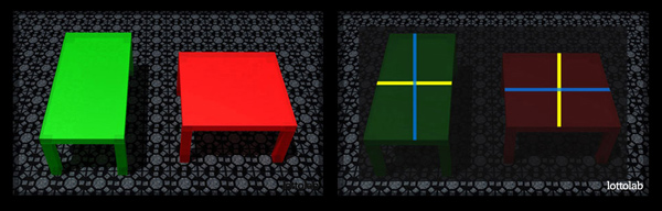
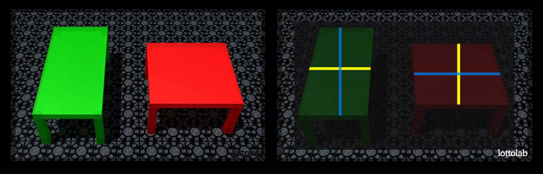
Figure 1.6.5. Form illusion by R. Beau Lotto (click to enlarge).. The two image shapes depicting tables have the same proportions measured through the middle . For an interactive version of this and many other illusions visit Lotto's website at http://www.labofmisfits.com/articles/illusionsoflight.asp
An analogous situation exists with shape constancy. In Fig. 1.6.5 we can see without difficulty that both of the rectangular tables depicted present a trapezoidal shape in the visual field, but it is extraordinarily difficult to attend to these areas as flat shapes in the picture plane enough to see that they have exactly the same proportions measured through their centres. For misperceptions like this induced by shape constancy it is the artists's strategy of measuring with a pencil or paintbrush that comes to the rescue, allowing proportions in the picture plane to be determined veridically.
Alternative Definitions and Usages
The current CIE definition of brightness explicitly states that the term is not restricted to primary light sources. Previously the 1970 edition of the CIE International Lighting Vocabulary (as quoted by Wyszecki and Stiles, 1982) had defined brightness as "the attribute of a visual sensation according to which a given visual stimulus appears to be more or less intense, or according to which the area in which a visual stimulus is presented appears to emit more or less light". While the word "emit" here might be interpreted to imply a primary light source, this clearly was not the intended meaning because the same word is used in the accompanying definition of lightness as the extent to which an area "appears to emit more or less light in proportion to that emitted by a similarly illuminated area perceived as a 'white' stimulus".
Arend (1993) published more concise definitions of brightness and lightness characterized by the author as "similar to the CIE and OSA definitions, but slightly clarified and simplified". Brightness was defined as "apparent luminance, the apparent amount of light coming from a visual direction" and lightness as "apparent reflectance". The simplified definition again does not restrict the term "brightness" to primary light sources.
In contrast, Marr (1982) and Palmer (1999) have used "brightness" and "lightness"to refer to perceptions of primary light sources and of light-reflecting objects respectively in the context of certain stages of visual perception. I am grateful to Anthony Waichulis for drawing my attention to these non-standard usages.