
my colour short course is
now offered online through
Australia's National Art
School in Sydney! There's
a choice of two sessions to
suit every time zone. LINK
Home
The Dimensions of Colour
Basics of Light and Shade
Basics of Colour Vision
Additive Mixing
Subtractive Mixing
Mixing of Paints
Hue
Lightness and Chroma
Brightness and Saturation
Principles of Colour
Afterthoughts
Glossary
References
Contact
Links
NEXT
COLOUR
WORKSHOPS

PART 12. GLOSSARY
Abney phenomenon. “change in hue produced by decreasing the purity of a colour stimulus while keeping its dominant wavelength and luminance constant” (CIE e-ILV 17-22-070). Because of the Abney phenomenon, the additive complementary of a given light stimulus can vary noticeably in hue depending on saturation.
Achromatic colour. 1. Of a perceived colour, achromatic means "devoid of hue" (CIE e-ILV 17-22-049). The achromatic colour terms white, grey and black apply to diffusely reflecting objects and can apply to transparent and metallic objects, although achromatic transparent and metallic objects of high lightness are more commonly described as colourless. Light perceived to be achromatic is commonly described as white light. See also neutral.
2. In the psychophysical sense, an achromatic stimulus is a "stimulus that, under the prevailing conditions of adaptation, gives rise to an achromatic colour" (CIE e-ILV 17-23-009).
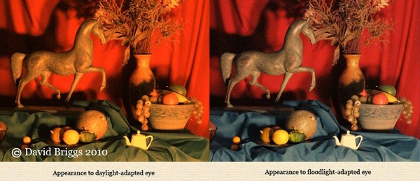
Adaptation. Adaptation refers to a "process by which the state of the visual system is modified by previous and present exposure to stimuli that can have various luminance values, spectral distributions and angular subtenses" as well as "specific spatial frequencies, orientations, sizes, etc. (CIE e-ILV 17-22-12), or more simply, any process by which perception is influenced by previous and present exposure to stimuli. Light adaptation and dark adaptation refer to states of adaptation to moderate (and greater) and very low illumination levels respectively (CIE e-ILV 17-22-15), and can be collectively included under brightness adaptation. Chromatic adaptation is the "visual process whereby approximate compensation is made for changes in the colours of stimuli, especially in the case of changes in illuminants" (CIE e-ILV 17-22-13). Together, brightness and chromatic adaptation normalize to a degree the overall appearance of the visual field relative to the unadapted eye, assisting the (separate) visual task of parsing the visual field into object colours and illumination. See Part 3.3.
Additive mixture of colour stimuli. “stimulation that combines on the retina the actions of various colour stimuli in such a manner that they cannot be perceived individually”(CIE e-ILV 17-23-030). Often loosely called "additive colour mixture". Additive mixture includes both simple additive mixture of superimposed light beams or of light from the RGB subpixels on a screen in which the stimuli are seen as being summed, and additive-averaging mixture in which the component stimuli are seen as being averaged over an area. See Part 4.
Additive-averaging mixture. “a form of color-stimulus synthesis in which the result is an average of the components rather than the sum” as in simple additive mixing (Burnham et al., 1963, as averaging color-stimulus synthesis). Examples include reflective stimuli that are moving too fast (e.g. spinning discs) or too finely interspersed to be distinguished. See Part 4.4.
Afterimage. An afterimage is a visual perception persisting after cessation of the stimulus. The most commonly recognized kinds are negative afterimages, reversed in brightness orientation and roughly complementary in hue to the inducing stimulus, and the relatively fleeting positive afterimages of bright stimuli, having the same brightness orientation as the inducing stimulus.
Demonstration of negative afterimages: stare at the black spot at the centre of the figure on the left and then stare at the corresponding spot in the figure on the right.
Analogous colours. In traditional colour harmony, colours similar to each other in hue.
Assimilation. Convergence of perceived colour observed when small coloured areas are finely interspersed but still distinguishable. See Part 3.5.
Atmospheric perspective. Progressive change in appearance of objects with increasing distance, due to increasing thickness of air intervening between the object and the observer. See Part 10.8.
Attribute (of perceived colour). Colour attributes are qualities of perceived colours that can be used to classify these colours. The CIE currently defines six attributes of perceived colour: hue, brightness, lightness, colourfulness, saturation and chroma. Other perceived colour attributes include chromaticness (relative chroma), blackness and whiteness as defined in the NCS, and vividness, depth and clarity as defined by Berns (2004, 2019). Three attributes suffice to classify colours in a single mode of colour appearance: for example, hue, lightness and chroma or hue, blackness and chromaticness suffice to classify object colours, which can therefore be represented in colour spaces whose three dimensions correspond to these attributes.
Bezold-Brücke phenomenon. “change of hue produced by changing the luminance (within the range of photopic vision) of a colour stimulus while keeping its chromaticity constant”(CIE e-ILV 17-22-071). For example, single wavelengths of the spectrum shift in hue towards either blue (below 500 nm) or yellow (above 500 nm) as they become brighter.
Blackness/black content. Blackness or black content refers to the amount of black in an object colour, considered as a proportion of the whole. In both the Natural Colour System (NCS) and the historical Ostwald system, object colours are considered to be resolvable into black, white and full-colour components. In the terminology of the NCS, blackness is defined perceptually, as "the perceived amount of black in the colour relative to pure black" (NCS Glossary), while in the Ostwald System black content was defined psychophysically, based on nonlinear measures of the proportions of the black, white and coloured areas on a matching spinning disc. Colours are specified using blackness and chromaticness (full-colour content) in the NCS, and using white content and colour content in the Ostwald system, specification of the third component in each case being redundant. Blackness also figures in defining the attribute of brilliance of Evans (1974), who referred to the same concept as greyness.
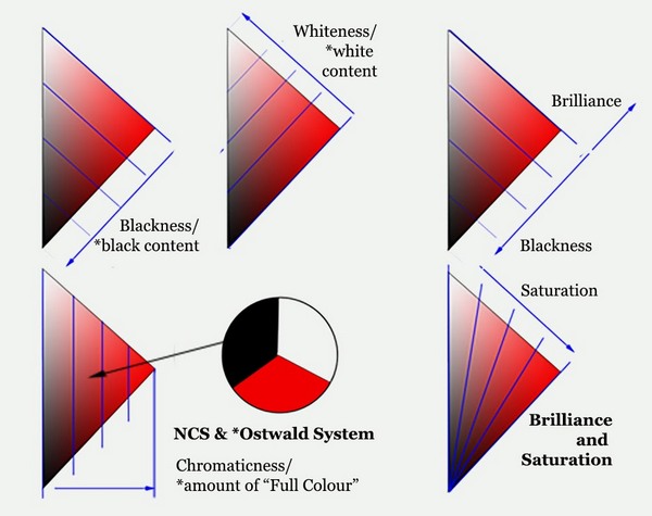
Geometry of subdivision of hue plane into blackness/black content, whiteness/white content and chromaticness or "Full Colour" content. Note that these measures are defined in different ways in the NCS and the Ostwald system.
Brightness. 1. “attribute of a visual perception according to which an area appears to emit, or reflect, more or less light. NOTE The use of this term is not restricted to primary light sources”(CIE e-ILV 17-22-059). Brightness judged by some techniques such as a minimally-distinct border is our perception of luminance, but in addition to this luminance-related brightness, high chromatic intensity can add a chromatic component to perceptions brightness (see Helmholtz-Kohlrausch effect). Brightness perceptions are influenced by the brightness adaptation of the observer and by contrast phenomena and assimilation. See Part 1.6.
2. With respect to object colours, commonly used in the sense of brilliance or freedom from blackness. White, peak-chroma colours and all tints in between are all described as "bright" in this sense.
3. Brightness “B” in HSB colour space is a simple computation of brightness relative to the maximum possible for digital colours of a given hue and saturation.
Brilliance. A scale of colour appearance along which related colours pass with increasing brightness from the black threshold through decreasing degrees of black content through a point of zero blackness (or “zero greyness”) to a fluorent (fluorescent looking) and ultimately self-luminous appearance. See Part 1.8.
Broken colour. 1. Paint application displaying visible colour variants, as opposed to solid or uniform colour.
2. Partly neutralized paint colour.
“Chalky” colour. In painting, a colour felt to exhibit too much whiteness for its context (compare "muddy" colour).
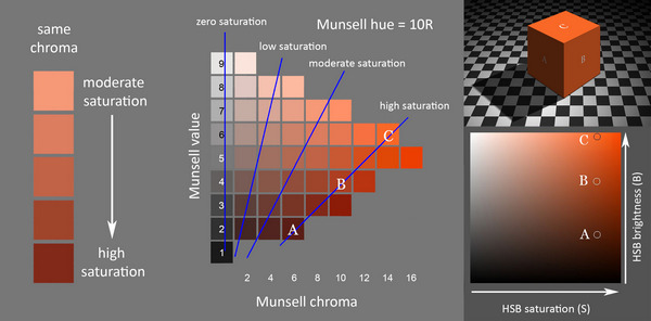
Chroma. Chroma is the chromatic intensity of an object colour (in everyday terms, the "strength of colour" of an object) and amounts to "the degree of departure of the color from a neutral color of the same lightness" (ASTM E284-17). The CIE definition of chroma as the “colourfulness of an area judged as a proportion of the brightness of a similarly illuminated area that appears grey, white or highly transmitting” (CIE e-ILV 17-22-074) can be understood by reference to the diagram below. Chroma is our perception of an object’s efficiency as a spectrally selective reflector or transmitter of light, and is perceived as relatively invariant under varying intensities of illumination (which changes its colourfulness). Chroma is commonly called saturation in contexts where different kinds of chromatic intensity are not distinguished. Measures of chroma include Munsell chroma, C* in CIE L*C*h, and various predictors of chroma used in colour appearance models. In the NCS, chromaticness is a measure of relative chroma, specifying chromatic content as a proportion of what is deemed to be the maximum possible for the hue.
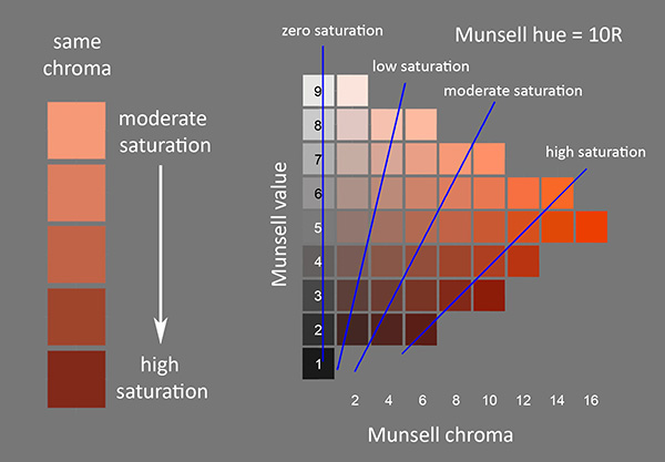
Chroma and saturation. Left: Swatches in a column from a Munsell hue page exhibit uniform chroma (chromatic intensity), but increase in saturation (emit progressively less whitish/ more saturated light) going down the column. Right: swatches exhibiting similar saturation are arranged along lines that radiate from near (actually about one value step below) zero on the value scale.
Chromatic colour. 1. A chromatic colour is a "perceived colour possessing hue" (CIE e-ILV 17-22-050). A note accompanying the definition acknowledges that in everyday speech the word "colour" is often used to specifically mean chromatic as opposed achromatic colour, and that the adjective "coloured" usually refers to chromatic colour. The expression chromatic intensity (or in everyday speech, intensity or strength of colour) is suitable as an umbrella term for the degree of departure of a perceived colour from being achromatic, in contexts where chroma, chromaticness (relative chroma), colourfulness and saturation are not distinguished.
2. In the psychophysical sense, a chromatic stimulus is a "stimulus that, under the prevailing conditions of adaptation, gives rise to a chromatic perceived colour" (CIE e-ILV, 17-23-010).
Chromatic induction. Chromatic induction is the "modification of the visual response that occurs when two colour stimuli (of any spectral irradiance distribution) are viewed side-by-side, where each stimulus affects the appearance of the other" (CIE e-ILV 17-22-075), or more simply, a change in the perceived colour of an area when placed beside areas of other colours. The definition evidently includes modification of brightness alone (brightness induction). Also known as simultaneous contrast.
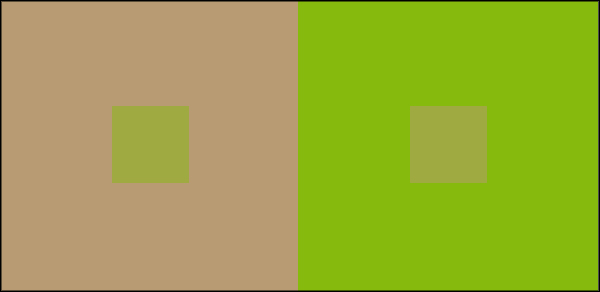
Chromatic induction (or simultaneous contrast): The physically matching central squares have the same psychophysical colour specification but evoke different perceived colours against different backgrounds.
Chromaticity. 1. In CIE terminology “property of a colour stimulus defined by its chromaticity coordinates, or by its dominant or complementary wavelength and purity taken together” (CIE e-ILV 17-1444). Chromaticity describes the psychophysical colour of a light, independent of its intensity (luminance)..
2. Occasionally seen used for chromatic intensity.
Chromaticness. In NCS terminology, the degree of resemblance of an object colour to a pure chromatic colour, specified as the perceived proportion of the pure chromatic component in the colour. See Part 1.8.
Chromostereopsis. Perception of depth evoked by differently coloured areas on the same plane (Wikipedia). Most observers see red objects “advance” and blue object “recede”, although a minority see the reverse.
CIE (Commission Internationale de l' Eclairage). The International Commission on Illumination or Commission Internationale de L'Eclairage was founded in 1913 and is the organization responsible for the international coordination of lighting-related technical standards. In the field of colour the CIE established the fundamental framework of modern colorimetry including the CIE 2o and 10o standard observers, the CIE standard illuminants (Illuminants C, D50, D65 etc), various widely used colour spaces including CIE XYZ, CIE xyY and CIE L*a*b*, colour difference formulae (CIEDE94, CIEDE2000), and colour appearance models including CIECAM02. Its International Lighting Vocabulary, freely available online as the e-ILV, lists definitions over 1400 terms and is by far the most comprehensive and authoritative source on the scientific terminology of light and colour.
CIE L*a*b* colour space. Three-dimensional, approximately uniform colour space produced by plotting in rectangular coordinates L* (CIE lightness) and a* and b* (chromatic coordinates corresponding roughly to reddishness/greenishness and yellowishness/bluishness respectively). See CIE e-ILV 17-23-076. An implementation of CIE L*a*b* called Lab space is of central importance in Photoshop and some other graphics programs.
CIE L*u*v* colour space. Three-dimensional, approximately uniform colour space produced by plotting in rectangular coordinates L* (CIE lightness) and u* and v* (chromatic coordinates corresponding roughly to reddishness/greenishness and yellowishness/bluishness respectively). See CIE e-ILV 17-23-074.
CIE xyY colour space. Colour space produced by combining the dimension of relative luminance (Y) with the CIE x,y chromaticity diagram.
Colorant. Dye, pigment, or other agent used to impart colour to a material (CIE e-ILV 17-22-076).
Colour (in the perceptual sense), perceived colour. Colour in the perceptual sense, or perceived colour, is defined as the “characteristic of visual perception that can be described by attributes of hue, brightness (or lightness) and colourfulness (or saturation or chroma)” (CIE e-ILV 17-22-040). These six attributes are in turn each defined, either directly (hue, brightness, colourfulness) or indirectly (lightness, chroma, saturation), as attributes of a visual perception. "Perceived colour" thus refers to our perceptions of colour in lights or objects, as opposed to those measureable, human-perceiver-dependent properties of lights or objects that dispose them to match in perceived colour (see psychophysical colour).
Note 1. In addition to its spectral properties, the perceived colour of an object or a light depends "on the size, shape, structure and surround of the stimulus area, on the state of adaptation of the observer's visual system, and on the observer's experience of the prevailing and similar situations of observation" (note to CIE e-ILV 17-22-040). It is not difficult to demonstrate that the impression we commonly have that colours are fixed physical properties of objects and lights is an illusion. For example, a laptop screen may appear white indoors but dark grey in sunlight, and it is clearly nonsense to maintain that only one of these two colours is the "inherent" or "physical" colour of the screen. Nevertheless, the word "colour" is often used in everyday speech in senses that reflect this mistaken impression. When we speak of paints, or paint formulations, or spectral distributions (including individual wavelengths) as being colours, we are using the word "colour" in the senses that Green-Armytage (2006) identified as "substance colour", "formula colour" and "spectral profile colour" respectively.
Note 2. The CIE ILV includes as "colours" both perceptions having hue (chromatic colours) and perceptions lacking hue (achromatic colours), but acknowledges that in everyday speech the word "colour" is often used specifically for chromatic colour, and that the adjective "coloured" usually refers to chromatic colour (note to CIE e-ILV 17-22-050).
Colour (in the psychophysical sense), psychophysical colour. Colour in the psychophysical sense is defined as a “specification of a colour stimulus in terms of operationally defined values, such as 3 tristimulus values” (CIE e-ILV 17-23-001). These psychophysical or colorimetric specifications are designed to capture the properties of physically diverse lights and objects that dispose them to appear the same colour to a human observer, and to ignore physical differences that are not perceived as colour differences. When we speak of “colour measurement”, “colour difference formulae”, many “colour spaces” and the 16.7 million RGB “colours” on our screens, we are using the word “colour” in this psychophysical sense. Psychophysical colour is also known as colorimetric colour (ASTM E284-17).
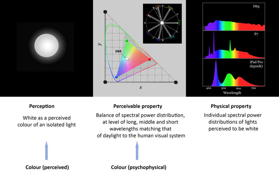
A perceived colour (white as a colour of light) correlates with a psychophysical property (an overall balance of long, middle and short wavelengths like that of daylight, specified by a set of x,y chromaticity coordinates) that in turn correlates with a great variety of physically different but visually indistinguishable spectral distributions of light.
Colour appearance model. Mathematical model designed to predict various attributes of the perceived colour of an object from its colorimetric specification, using various assumptions and various kinds of information about the viewing conditions.
Colour atlas. A "collection of colour samples arranged and identified according to specified rules" (CIE e-ILV 17-23-044). The colour samples are symbols of the colours of a colour space and illustrate the intended space only when viewed under the prescribed conditions by an average colour normal observer (Kuehni and Schwarz, 2008, p. 381).
Colour constancy. 1. Colour constancy in its broad sense refers to perceptual constancy of object colour, that is, the capacity of an organism to perceive an object as having a relatively stable object colour despite variations in environmental factors. An object having a given spectral reflectance exhibits varying degrees of stability of object colour under varying intensities of the same illumination, under varying kinds of illumination, against varying backgrounds, and through varying media and atmospheric conditions. Colour constancy is generally imperfect to a greater or lesser extent; for example chromatic induction or simultaneous contrast is a partial failure of colour constancy with respect to variations in background.
2. The term "colour constancy" is sometimes restricted to perceptual constancy exclusively in respect to variations in colour of illumination, for example in the FSCT Glossary of Color Terms (1981): "relative independence of perceived object color to changes in color of the light source", and in ASTM E284-17: "the general tendency of the colors of an object to remain constant when the color of the illumination is changed", and is sometimes even taken to be a synonym of chromatic adaptation (e.g. Xiao in Luo (ed.) 2016, p. 281).
Colour harmony. Relationship among colours deemed to be aesthetically pleasing. Historically various colour order systems have been promoted as providing guides to colour harmony involving two- or three-dimensional colour relationships,but in traditional or naive "colour theory" today, colour harmony is primarily framed in terms of various patterns of hue relationships (analogous, complementary, split complementary, triadic etc.) deemed to be harmonious.
Colour mixing. Colloquial term for light or colorant mixture, including additive, additive-averaging and subtractive processes, carrying the unfortunate connotation that colours themselves reside and mix in lights and colorants.
Colour model. Widely used term for non-colorimetric colour spaces such as generic "RGB" (e.g. Wikipedia).
Colour space. 1, In CIE terminology a colour space is a "geometric representation of colour in space, usually of 3 dimensions" (CIE e-ILV 17-23-041). and a colorimetric colour space is a "colour space defined by 3 colorimetric coordinates" such as CIE XYZ or sRGB (CIE e-ILV, 17-23-042).
2. An alternative usage restricts the term "colour space" to colorimetric colour spaces and refers to non-colorimetric colour spaces as colour models.
Colour string. A sequence of paint mixtures on a palette varying systematically in colour in some way, for example of increasing white content, or of successive value steps for a given hue and chroma.
Colour symbolism. The use of color as a symbol in various cultures (Wikipedia). Most colours have a wide range of often contradictory associations, generally both positive and negative, even within a single culture.
Colour temperature. 1. “temperature of a Planckian radiator whose radiation has the same chromaticity as that of a given stimulus” (CIE e-ILV 17-23-067). In this sense, reddish and yellowish lights have low temperatures and bluish lights have high temperatures.
2. Sometimes used in traditional colour theory for the classification of colours into "warm" and "cool". These psychological associations have a broadly opposite polarity to Planckian colour temperature (reddish and/or yellowish colours are generally considered warm and bluish. greenish and greyish colours usually considered cool) but are subjective and inconsistent: the warmest hue ranges from yellow to red and the coolest hue ranges from blue-green to violet in different traditions (Part 7.7).
Colour wheel. Term used in traditional colour theory for a circular diagram of hues.
Colourfulness. “attribute of a visual perception according to which the perceived colour of an area appears to be more or less chromatic”(CIE 17-22-072). See Part 1.6.
Complementary. Complementary colour stimuli are "two colour stimuli for which it is possible to reproduce the tristimulus values of a specified achromatic stimulus by a suitable additive mixture of these two stimuli" (CIE e-ILV 17-23-013), or more simply, two coloured lights that mix additively to make white light. Such lights have an exactly opposite direction of wavelength bias relative to daylight as detected by the human visual system. Because of the Abney phenomenon the concept of an additive complementary hue is inexact on a very fine grained level, but precise additive complementaries usually lie less than one Munsell 40-hue step away from the opposite Munsell hue. See Part 4.3. Complementary hues in this original and standard sense are sometimes called "additive complementaries" to distinguish them from so-called "afterimage complementaries" (afterimage colours), so-called "paint-mixing complementaries" (neutralizing colours) and the so-called "complementaries" of traditional colour theory (the opposite colours of an RYB colour wheel).
2. A so-called "afterimage complementary" is the hue of the negative afterimage of a colour stimulus. Afterimage hues of yellowish hues are more purplish and of orangeish hues less greenish than the true complementary, whereas in other hue sectors the two essentially coincide (Wilson and Brocklebank, 1955).
3. So-called "paint-mixing complementaries" are the hues of two paints that physically combine to make a neutral (black or grey) mixture. See Part 7.5.
Complementary, split. In traditional colour theory, combination of a colour with two near complementaries, often the two colours adjacent to the complementary on a 12-hue “colour wheel”.
Context. Context refers to the setting of a colour stimulus, sometimes divided into the immediately surrounding background and the remainder of the viewing environment, called the surround (see stimulus). NOTE: Purves and Lotto employed the term "context" as a "general term referring to the information provided by the surroundings of a target; sometimes used to indicate juxtaposition in time as well as in space" (Purves and Lotto, 2003, p. 232), regardless of whether these surroundings consisted of a uniform background or an elaborate depiction of an illuminated three-dimensional scene.
"Cool" colours. Colours deemed in traditional colour theory to have a psychological association with coldness (see "colour temperature"). In various accounts the coolest hue ranges from violet through blue to blue-green.
Cyan. 1. The greenish blue hue of cyan printer's inks and ink jet printing inks, obtained using phthalocyanine pigments and dyes respectively. This hue, often called process cyan, can be broadly correlated with Munsell hue 5B.
2. Among digital colours, commonly used for R 000 G 255 B 255, distinguished on this website as digital cyan. This blue-green digital colour (Munsell notation 6.6BG 9/10 in sRGB) is distinctly greener in hue than process cyan.
3. Commonly used to designate the blue-green optimal subtractive primary, which is about the same hue as digital cyan (roughly 5BG. see Fig 5.2.5). Although cobalt teal (PG50) is closer to this hue, painters much more commonly use the bluer but cheaper, non-toxic and transparent phthalocyanine pigments PB15.3 or PB16 as their cyan primaries.
[Historical note: "Cyan" is derived from the Latin cyaneus and the ancient Greek kyanos, meaning dark/blue. The modern connotation of relatively greenish blue dates from Helmholtz (1866), who suggested renaming Newton's "blue" and "indigo" as "cyan-blue" and "indigo-blue" respectively.]
Divisionism. Painting style in which colour is “broken” into dots etc. of saturated or “spectral” components.
Dominant wavelength. "wavelength of the monochromatic stimulus that, when additively mixed in suitable proportions with the specified achromatic" (white light) "stimulus, matches the colour stimulus considered in the CIE 1931 x, y chromaticity diagram" (CIE e-ILV 17-23-062). In the case of purple stimuli, the dominant wavelength (λd) is replaced by the wavelength of the complementary (green) monochromatic stimulus (its complementary wavelength, CIE e-ILV 17-23-063). Any mixture of wavelengths can be specified by its dominant/ complementary wavelength and its purity.
Dye. Soluble colorant (as opposed to insoluble colorants, called pigments).
Edge spectra. Spectra produced by progressively removing wavelengths of light beginning at the short- (white-yellow-orange-red) or the long- (white-cyan-blue-violet) wavelength end.
Fluorent. Having the appearance of physical fluorescence See Part 1.8.
Fluorescence. "emission of optical radiation (light) when a substance is exposed to any type of electromagnetic radiation, where the emitted radiation generally appears within 10 ns after the excitation"(CIE e-ILV 17-24-023). When invisible ultraviolet radiation is absorbed and the energy re-emitted as light an anomalously bright appearance results. When the emitted radiation appears after a greater delay the phenomenon is known as phosphorescence.
Gamut. "volume, area, or solid in a colour space, consisting of all those colours that are either: (a) present in a specific scene, artwork, photograph, photomechanical, or other reproduction; (b) capable of being created using a particular output device and/or medium" (CIE e-ILV 17-32-007), for example, the range of colours obtainable by mixing a given set of paints.
Glaze. A transparent layer of paint used to modify the colour of an area.
Grayscale/greyscale. 1. "In digital photography, computer-generated imagery, and colorimetry, a grayscale image is one in which the value of each pixel is a single sample representing only an amount of light; that is, it carries only intensity information" (Wikipedia).
2. "Greyscale value" is a commonly used synonym of lightness, especially in digital imagery.
Grisaille. Painting or paint layer using only more or less achromatic paints of different values.
Halation. Appearance of light spreading out, for example from a light source viewed in dark surroundings.
Half light. Planes moderately to strongly inclined to the light source, between the full light and the terminator, and thus reflecting noticeably less light than the full light. See Part 2.2.
Helmholtz-Kohlrausch phenomenon (or effect). "change in brightness of perceived colour produced by increasing the purity of a colour stimulus while keeping its luminance constant within the range of photopic vision"(CIE e-ILV 17-22-066). For example on a Munsell hue page a horizontal row of chips has the same Munsell value and reflects light of the same luminance, but the higher chroma chips can give an impression of higher brightness and lightness than the lower chroma chips. This impression may be associated with the higher brilliance of the high-chroma chips (See Part 1.8).
Highlight. Specular reflection of a light source. See Part 2.1.
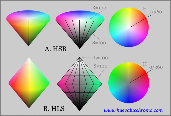
HLS. Digital colour space classifying RGB colours according to hue angle (H), and rather arbitrary dimensions called “lightness” (L) and “saturation” (S) but unrelated to the standard definitions of those terms. Also called HSL. See Part 1.3.
HSB. Digital colour space classifying RGB colours according to hue angle (H), relative saturation (S) and relative brightness (B). See Part 1.3.
HSV. Digital colour space classifying RGB colours according to hue angle (H), relative saturation (S) and so-called "value" (V). Original name for HSB space of Photoshop. See Part 1.3.
Hue. 1. Hue is defined by the CIE as the “attribute of a visual perception according to which an area appears to be similar to one of the colours: red, yellow, green, and blue, or to a combination of adjacent pairs of these colours considered in a closed ring” (CIE e-ILV 17-22-067). Colours such a brown, olive and pink are not hues; in each case their hue would be the most similar colour in the cycle red-yellow-green-blue-red; for example the hue of a yellow ochre paint might be a particular degree of orangish yellow. Hue is the way in which we perceive a direction of bias at the level of the long-, medium- and short-wavelength components of the reflectance of an object, or of the spectral power distribution of a light relative to daylight. This direction of imbalance is measured by the psychophysical quantity of dominant wavelength (specified as the negative of the complementary wavelength for purplish lights).
2. Of artists' paints, the term "Hue" at the end of the name signifies a paint offered by a manufacturer as a substitute for a similar-looking but more expensive pigment, as in "Cadmium Red Hue" for a substitute for a genuine cadmium red paint.
3. In everyday speech, a colour or colour variant.
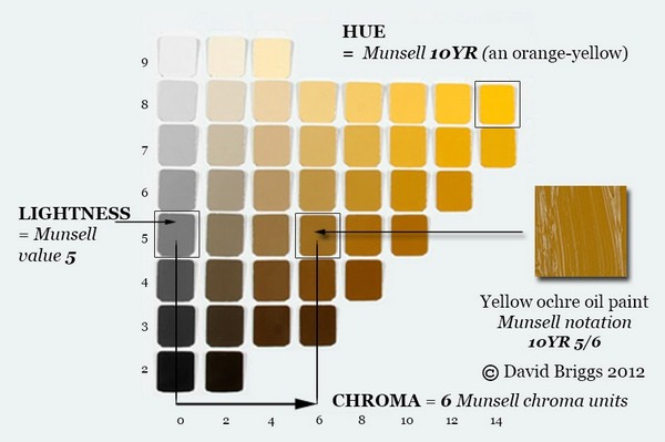
10YR hue page from the Munsell Book of Color, Glossy Edition, showing scales of lightness and chroma.
Hue angle. Specification of hue in some colour spaces, including the digital colour spaces HSB and HLS, and in many colour appearance models.
Hue page. Array of colours of a single hue, arranged according to colour attributes such as lightness and chroma or blackness and chromaticness.
Hue shift. In painting, tendency of a paint to change visibly in hue as a result of thinning or the the addition of white, black or grey paint etc. Also described as an undertone.
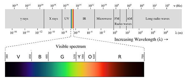
Hues, spectral. Hues evoked by single wavelengths, in the sequence spectral red, orange, yellow, green, blue, violet. Extra-spectral hues including purple, magenta and middle red.are evoked only by mixtures from the two ends of the spectrum. See Part 1.4.
Hue, unique. “hue that cannot be further described by the use of hue names other than its own. There are 4 unique hues: red, green, yellow and blue forming 2 pairs of opponent hues: red and green, yellow and blue”(CIE e-ILV 17-22-068). Also known as opponent hues, unitary hues, or psychological primaries.
Illuminant. 1. In a restricted sense, "radiation with a relative spectral power distribution defined over the wavelength range that influences object colour perception", for example the various CIE standard Illuminants such as D55, D65 etc.
2. More broadly, "any kind of light falling on a body or scene" (CIE e-ILV 17-23-018).
Isoluminant. Equal in luminance. A pattern of two or more isoluminant but chromatically contrasting colour fields can be visually disturbing.
Light. Light In CIE terminology the word "light" has two alternative definitions, corresponding to (1) electromagnetic radiation in the range of wavelengths visible to humans, and (2) the visual experience that usually is evoked by this radiation:
1. "radiation that is considered from the point of view of its ability to excite the human visual system" (CIE e-ILV 17-21-012, CIE e-ILV 17-12-013). (By this usage the expression "visible light" is redundant, because all light is visible by definition).
2. "characteristic of all sensations and perceptions that is specific to vision", including primarily our visual perception of electromagnetic radiation, sometimes distinguished as perceived light (CIE e-ILV 17-22-039). |
3. In writing for the general public, astronomers and physicists sometimes include as "light" electromagnetic radiation of all wavelengths, or otherwise "visible light", ultraviolet "light" and infrared "light", but not radio waves, microwaves, X rays and gamma rays. These usages are discouraged by the CIE (see notes to CIE e-ILV 17-21-012, CIE e-ILV 17-12-013). Objects may emit, reflect or transmit light, and both reflection and transmission can be either diffuse (involving scattering) or regular (not involving scattering). See reflection, diffuse and reflection, regular/specular.
Lightfastness. Resistance to colour change on exposure to light.
Lightness. 1. Lightness is formally defined as the "brightness of an area judged relative to the brightness of a similarly illuminated area that appears to be white or highly transmitting" (CIE e-ILV 17-22-063). This amounts to our perception of how much light an object reflects compared to a white object, or in other words, our perception of the object's reflectance. Note that this definition implies that perception of lightness depends on comparisons within the visual field, and is therefore confined to related colours, and that the areas concerned are seen as being illuminated. The lightness of a given colour is the least contrasting step on a scale from black through a series of greys to white. Measures of lightness include Munsell value and CIE 1976 lightness, L*. Lightness is also known as greyscale value or tone.
2. So-called "lightness" (L) in the digital colour space HLS is a kind of relative lightness in which the highest-chroma colour at each hue angle has L=50.
Luminance. Visible energy of light, that is, physical light energy weighted according to the wavelength-by-wavelength response of the human visual system. For technical definition see luminance (CIE e-ILV 17-21-050) and luminous flux (CIE e-ILV 17-21-039). Since the 1943 renotation, Munsell chips of a given value are designed to reflect light of equal luminance under a standard daylight illumination (Illuminant C).
Luminous colour. “colour perceived to belong to an area that appears to be emitting light as a primary light source, or that appears to be specularly reflecting such light”(CIE e-ILV 17-22-045).
Lustre. Appearance of a material related to the way light interacts with its surface. Terms used to describe lustre include glossy, matte (dull), vitreous (glassy), adamantine (sparkling), metallic, greasy, waxy and silky.
Masstone. 1. Colour of a paint when applied thickly (as opposed to undertone).
2. In paint technology, masstone is "a pigment-vehicle mixture containing a single colorant only" (ASTM E284-17).
Memory colour. A memory colour is the "color of an object that, according to the judgment of the observer, would match the color of another object previously seen by that observer" (ASTM E284-17).
Metameric colour stimuli. “spectrally different colour stimuli that have the same tristimulus values in a specified colorimetric system”(CIE e-ILV 17-23-008). Metameric lights that evoke an identical white perceived colour can have wildly different spectral compositions. Paint mixtures that match under one illumination but are made from different pigments may have different spectral reflectances and may not match under a different illumination. This breakdown of colour matching between physically different materials under different illuminations is called metameric failure.
Monochromatic. 1. Radiation characterized by a single wavelength or a very small range of wavelengths (CIE e-ILV 17-21-014).
2. Colour scheme of an image or design made up of colours of a single hue but usually varying in other colour attributes.
“Muddy” colour. Colour felt to exhibit too much blackness for its context in a painting (compare "chalky" colour).
Munsell system. A classification of object colours in terms of specific scales of hue, value (lightness) and chroma, originally devised by Albert Munsell and now fully integrated with CIE colorimetry. See Part 1.1.
Neutral. 1, Achromatic, in the sense of being either a colorimetric neutral ("having the same chromaticity as the adopted white", CIE e-ILV 17-32-001) or spectrally neutral ("exhibiting reflective or transmissive characteristics, which are constant over the wavelength range of interest", CIE e-ILV 17-24-122).
2. In interior design, colours in the achromatic to low chroma range are classed as neutrals.
Non-luminous colour. "colour perceived to belong to an area that appears to be transmitting or diffusely reflecting light as a secondary light source" (CIE e-ILV 17-22-046).
Object colour, object mode of colour appearance. Object colours are colours (in the perceptual sense) that are "perceived as belonging to an object" (CIE e-ILV 17-22-042), as opposed to colours perceived as belonging to light (for example, illuminant and illumination colours). Such a colour perception "seen as ascribed to an object" is said to be seen in the object mode of colour appearance (CIE e-ILV 17-23-029). Object colours can be described in terms of the CIE-defined attributes of hue, lightness and chroma or the NCS-defined attributes of hue, blackness and chromaticness. These colour attributes are perceived as belonging to an object because they exhibit a tendency towards stability, called colour constancy, under varying viewing conditons, especially varying intensity of the same illumination. (In contrast, the varying brightness and colourfulness exhibited by different areas of an unevenly illuminated object are normally perceived as being imposed by the illumination rather than as belonging to the object itself). Nevertheless, despite being perceived as belonging to an object independent of viewing conditions, object colours vary like all perceived colours depending on these conditions and on the individual observer.
Note 1. The painter's term "local colour" is equivalent.
Note 2. If an object colour is "perceived as belonging to a surface from which the light appears to be diffusely reflected or radiated" it is called a surface colour (CIE e-ILV 17-22-043), whereas if the colour is "perceived as belonging to the bulk of the substance" it is called a volume colour (CIE e-ILV 17-22-054).
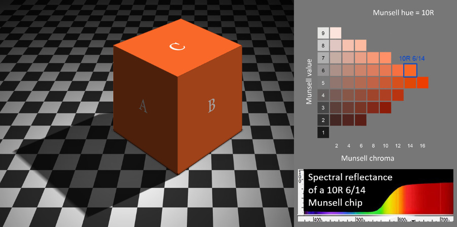
In the image on the left we perceive a cube exhibiting a uniform orange object colour, as if it were painted all over with an orange paint of uniform hue, lightness and chroma around Munsell 10R 6/14, even though planes A to C respectively appear progressively higher in brightness and colourfulness. Similarly, we perceive the lighter-coloured areas of the floor as being white things of uniform lightness, even though these areas exhibit great variation in brightness. Although they are perceptions, we perceive object colours to be located outside us in objects themselves, even when, as here, these objects are physically non-existent. When we can freely examine an object in daylight, the colour we see as belonging to it is usually a good indication of its overall spectral reflectance at the level of its long-, middle and short-wavelength components.
Opponent hues. See Hues, unique.
Optical mixing. Appearance of two or more coloured stimuli as a single colour because they cannot be separately distinguished, for example due to small size or rapid motion. See Part 4.4.
Optimal colour stimuli. These are as set of purely hypothetical spectral reflectances that define the outer limits of the object colours that are theoretically possible for light-reflecting objects. "object colour stimuli corresponding to objects whose luminance factors have maximum possible values for each chromaticity when their spectral luminance factors do not exceed 1 for any wavelength. ... For a given luminance factor, these colour stimuli define the maximum purity possible for non-fluorescent objects” (CIE e-ILV 17-23-005).
Paint-mixing path. Path of a mixture of paints through colour space. See Part 6.3.
Palette. 1. Surface used for paint-mixing.
2. The set of paints used by a painter.
Palette, double or split primary. Palette consisting of six paints corresponding to a “warm” and a “cool” version of each of the three historical primaries, red, yellow and blue. See Part 6.2.
Palette, limited. Palette chosen to provide a deliberately restricted gamut of colours.
Penumbra. Transitional zone at the edge of a cast shadow, typically broadest where it is furthest from the object casting the shadow. See Part 2.3.
Permanence. Resistance to colour change on exposure to light and atmosphere.
Primaries. 1. Abbreviation of the expression "primary colours".
2. In additive colour technology and colorimetry, “primaries” include both specific physical lights and virtual lights derived mathematically from these (e.g. CIE XYZ).
Primary colour. Primary colours are colours, identified by hue names, that are considered in some context to be the ultimate components of all other colours.
1. In traditional colour theory the traditional primary colours identified as red, yellow and blue (often implicitly and sometimes explicitly defined in the manner of the unique hues of those names) are regarded as the ultimate, simple components of all other colours, including those designated as secondary and tertiary colours.
2. In additive (RGB) technology the colours of the physical components used to generate other colours are by extension sometimes called additive primaries.Optimal hues of lights in additive mixing technology: typically orange-red, yellowish green and blue or violet-blue, but generally known simply as "red", "green" and "blue". See Part 4.1.
3. In subtractive (CMYK) technology the colours of the physical components used to generate other colours are sometimes called subtractive primaries. Optimal hues of colorants for subtractive mixing processes. These coincide broadly with digital cyan, magenta and yellow (Part 5.2).
4. Because the four unique hues of Hering were accepted very early by psychologists as the ultimate components of all other hues they are sometimes known as the psychological primaries.
5. Less commonly, the specific paints of a painter’s palette may be called palette primaries.
Reflectance. Ratio of the reflected radiant flux or luminous flux to the incident flux in the given conditions (CIE e-ILV 17-24-064). Luminous relectance = reflectance of visible radiation i.e. light. Diffuse reflectance = ratio of the diffusely reflected flux to the incident flux of radiation (CIE e-ILV 17-24-068).
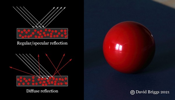
Reflection. diffuse. Diffuse reflection is “scattering by reflection in which, on the macroscopic scale, there is no regular reflection”(CIE e-ILV 17-24-054), for example the red reflection from the sphere in the accompanying image. Most materials exhibit diffuse reflection from within the body of the object and regular reflection from the interface of the object simultaneously, called mixed reflection (CIE e-ILV 17-24-056). Diffuse reflection also occurs at the surface of an object when this is rough on a microscopic scale. The colour of the diffuse reflection from within the body of an object commonly differs from the colour of the light source, due to selective absorption.
Reflection, regular/specular. Regular or specular (mirror-like) reflection is “reflection in accordance with the laws of geometrical optics, without scattering” (CIE e-ILV 17-24-052), and occurs on a smooth surface of a glossy, glassy or metallic object (see image), With a few exceptions like gold and copper, the specular reflection retains the colour of the light source.
Related colour. "colour perceived to belong to an area seen in relation to other colours" (CIE e-ILV 17-22-047). This includes almost all colours seen in everyday life (see unrelated colour).
Saturation. 1. “colourfulness of an area judged in proportion to its brightness” (CIE e-ILV 17-22-073), in effect the perceived concentration of chromatic as opposed to white light in the light coming from an area. Saturation is thus the inverse of whitishness of a light. As objects are perceived to reflect light of about the same saturation through a wide range of illumination levels, object colours can also be characterized as saturated (for example both vermilion and dark ruby red) or desaturated to various degrees. Saturation is the way in which we perceive the psychophysical quantities of colorimetric purity or excitation purity, which measure in different ways the proportional imbalance of the long-, middle- and short-wavelength components of a light relative to daylight. See Part 1.7.
2. Widely used as a generic term for chromatic intensity in contexts where chroma, colourfulness, saturation and other aspects of chromatic intensity are not distinguished, including various digital colour spaces and applications (3-5 below). .
3. Saturation S in HSB (=HSV) colour space (for example in the Photoshop colour picker) is a simple index of saturation (with meaning 1 above) relative to the maximum saturation possible for colours of the same hue angle H. Digital colours having the same HSB saturation have the same ratio of R/G/B components. See Fig. 1.7.9A
4. Saturation S in HLS (=HSL) colour space, used in some adjustment controls in Photoshop, is chroma relative to the maximum chroma possible for a given "L", such that even pale tints can have an HLS saturation of 100. See Fig. 1.7.9B
5. In the definitions of the Hue, Saturation, Color and Luminosity layer modes in Photoshop,"saturation" means either Lab chroma (when used in Lab mode) or YCbCr chroma relative to the maximum possible for colours of the same hue angle (when used in RGB mode).
Scattering. “process by which the spatial distribution of a beam of radiation is changed when it is deviated in many directions by a surface or by a medium, without change of frequency of its monochromatic components” (CIE e-ILV 17-24-049). Also called diffusion.
Secondary colour. In traditional colour theory, a hue considered to contain two of the three historical primary hues (red, yellow and blue) and placed midway between those hues on a colour wheel.
Shade. 1. Paint mixture made from a colorant or colourants plus black paint, without any white paint.
2. Object colour perceived to consist of a full colour and black, without any white content (whiteness).
Shading series (or shadow series). Series of colours of uniform hue and saturation, but differing in lightness and chroma. Appropriately arranged in an image, such colours will be seen as a uniformly coloured object under variable lighting (see Part 10.1).
Simultaneous contrast. Perceived increase in colour difference when coloured areas are juxtaposed. See Part 3.5.
Spectral power distribution. Spectral distribution of light expressed as power per wavelength interval. Spectral distribution can also be expressed in terms of luminous or photon quantity per wavelength interval (CIE e-ILV 17-21-029).
Spectral reflectance curve. Graph showing the reflectance of an object at each wavelength of the spectrum.
Spectrum. "display or specification of the monochromatic components of the radiation considered" (CIE e-ILV 17-21-015). Term originally introduced by Newton for the rainbow-like band of light produced by splitting a beam of sunlight using a prism, but see also edge spectra.
Stimulus (colour). 1. A colour stimulus is defined as "visible radiation entering the eye and producing a sensation of colour, either chromatic or achromatic" (CIE e-ILV 17-23-002). 2. In colour appearance models the colour stimulus typically is taken to be a uniform patch subtending an angle of about 2°, surrounded by a background extending for about 10° from the edge of the stimulus, beyond which lies the rest of the viewing environment or surround. A proximal field is sometimes distinguished immediately surrounding the stimulus (Fairchild, 2013, pp. 143-146).
Subtractive mixture. Process in which two or more colorants or filters each remove wavelengths from the same light. Thus mixing coloured paints involves subtractive mixing, but spinning painted discs does not. Subtractive mixture is a major factor in paint mixing but is usually accompanied by additive-averaging mixture.
Successive contrast. Influence of a negative afterimage on the perceived colour of an area.
Terminator. The limit of the direct fall of light on an object. See Part 2.2.
Tertiary colours. Historical term now restricted to traditional colour theory, where it has two conflicting meanings. 1. Three-component colours, meaning greyed (low-chroma) colours, considered in traditional colour theory to “contain” all three of the historical primary colours, red, yellow and blue. First employed for such colours by Field (1817).
2. Third-order colours, that is the six colours that lie between adjacent primary and secondary colours in a 12-hue traditional colour wheel, and considered in traditional colour theory to “contain” just two primaries in unequal proportions. First employed in this sense by Ruskin (1877).
Tint. 1. Paint mixture made of a colorant or colourants plus white paint, without any black paint.
2. Object colour perceived to contain a full colour and white, without any black content (blackness).
Tinting strength. Power of a paint to influence the colour of mixtures.
Tone. 1. Colour attribute related in meaning to lightness/value, but commonly held to increase with decreasing lightness.
2. In traditional colour theory, an object colour perceived to consist of a pure colour plus black and white, that is, all colours on a hue page except the tints and shades.
Tonal massing. Traditional compositional strategy of grouping values into distinctive shapes in order to create a more striking or expressive composition (for example, see Loomis, 1947, Part 2, Tone).
Trichromatic model. Model of human colour vision postulating three types of receptors in the retina.
Undertone. Colour of a paint when spread thinly over a light ground or mixed with white.
Unrelated colour. An unrelated colour is a "colour perceived to belong to an area seen in isolation from other colours" (CIE e-ILV 17-22-048). NOTE: Hunt and Pointer (2011, pp. 12, 329) held that light sources, for example traffic lights, are perceived as unrelated colours because they cannot be compared with a similarly illuminated white, and therefore are not perceived to exhibit lightness or chroma, but Fairchild (2013) restricts the term "unrelated" to colour stimuli viewed in physical isolation from other light stimuli, notably colours seen through an aperture against a dark background, as is usual in colorimetry. Traffic lights are thus classed as exhibiting related luminous colours.
Value, or greyscale value. 1. Alternative name for lightness.
2. Lightness measured on the Munsell value scale.
Value, home. Value at which a hue reaches its maximum chroma; also known as peak chroma value. Mainly a painters term used in relation to the gamut of paint mixtures.
Vividness, vivid (of colour). 1. In the terminology of Berns (2014, 2019), vividness is formally defined as "an attribute of color used to indicate the degree of departure of the color from a neutral black color", and is thus the reverse of blackness.
2. Kelly and Judd (1976) used the adjective "vivid" for the highest degree of chroma on each Munsell hue page, at the culmination of the sequence grayish-moderate-strong-vivid.
Note 1. The terms "vivid"/"vividness" are not defined in the ILV, but in the online Cambridge Dictionary "vividness" is defined as either (1) "the quality of being very clear, powerful and detailed in your mind" or (2) "the quality of being very brightly coloured", the latter potentially meaning either high in chroma (as used by Kelly and Judd) or low blackness (as in the terminology of Berns).
Note 2. The adjective "vivid" is also applied to strikingly intense whites (for example, the house paint Dulux Vivid White) and blacks (for example in automotive paints, marker pens and velvet fabrics).
"Warm" colours. Colours deemed in traditional colour theory to have a psychological association with warmth (see colour temperature). In various accounts the warmest hue is usually at or near orange but ranges from yellow to red.
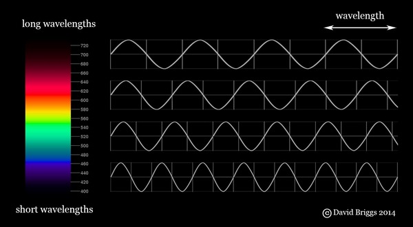
Wavelength (λ). Wavelength is the "distance in the direction of propagation of a periodic wave between two successive positions at which the phase is the same" (CIE e-ILV 17-21-025), i.e. the distance between corresponding points in a series of waves, including light waves. For light the units nanometre (nm, 1×10⁻⁹ metre) and micrometre (μm, 1×10⁻⁶ metre) are generally used.
Whiteness, white content. 1. In the Natural Colour System (NCS), whiteness is the perceived amount of white in an object colour, relative to pure white, when an object colour is considered to be made up of white, black and chromatic components. In the Ostwald System the corresponding concept was called white content and was defined psychophysically rather than perceptually.
2. The CIE whiteness formula was defined by the CIE in 1986 as a measure of whiteness intended for commercial use (see Westland in Luo, 2016, pp. 188-191). A perfect white reflector would have a CIE whiteness of 100, but for many white papers the CIE whiteness is between 130 and 170 due to the presence of fluorescent brightening agents that convert invisible ultra-violet radiation into light.