
my colour short course is
now offered online through
Australia's National Art
School in Sydney! There's
a choice of two sessions to
suit every time zone. LINK
Home
The Dimensions of Colour
Basics of Light and Shade
Basics of Colour Vision
Additive Mixing
Subtractive Mixing
Mixing of Paints
Lightness and Chroma
Brightness and Saturation
Principles of Colour
Afterthoughts
Glossary
References
Contact
Links
NEXT COLOUR
WORKSHOPS

6.3 PAINT-MIXING PRINCIPLES
- Mixing with white paint
- Mixing with grey paint
- Mixing with black paint
- Mixing paints of differing hues
- Mixing of transparent paints
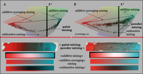
The concept of a three-dimensional space of hue, value and chroma provides a vital framework for practical colour mixing, but to make use of this framework a painter must be able to anticipate the approximate paths in colour space that paint mixtures are likely to follow. Fortunately, despite the potential complexity of colour mixing involving physical colourants, paint-mixing paths in practice display patterns of considerable regularity, which can be usefully summed up in a few simple principles. Many of these principles can be traced back individually as far as the eighteenth century.
Mixing with white paint
(1) Mixing a dark transparent colourant paint with increasing amounts of white paint increases the chroma of the mixture up to a certain point, beyond which the chroma diminishes (Fig. 6.3.1A).
(2) Thinning a layer of a dark transparent colourant paint over white paint also increases the chroma up to a certain point, beyond which the chroma diminishes. The maximum chroma attained by this transparent layer is higher than that attained by physical mixture with white paint (Fig. 6.3.1B).
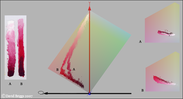
Figure 6.3.1. Effect of lightening permanent alizarin crimson by adding white paint (A) and by glazing over white (B). The second method attains a higher maximum chroma. Both processes also involve a counterclockwise shift in hue towards magenta (right). Photographed colours plotted in YCbCr colour space using the program ColorSpace by Philippe Colantoni. (www.couleur.org).
(3) Mixing an opaque colourant paint with increasing amounts of white paint tends to steadily reduce the chroma as the value increases (Fig. 6.3.2).
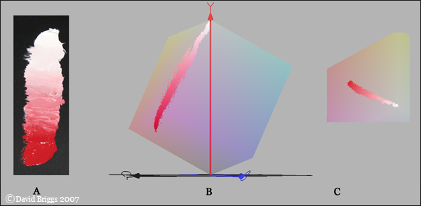
Figure 6.3.2. Effect of adding white to opaque paints. Unlike transparent pigments, addition of white to an opaque pigment like cadmium red deep does not initially increase the chroma, but steadily reduces it. This mixture also shows a slight drift towards crimson on the CbCr plane (C). Photographed colours plotted in YCbCr colour space using the program ColorSpace by Philippe Colantoni. (www.couleur.org).
Mixing either transparent or opaque paints with white paint is commonly also accompanied by a slight to dramatic shift in hue (Fig. 6.3.3A). The direction of this hue shift depends on the undertone of the coloured pigment, which is the hue of the pigment when it is thinned out, and so absorbs proportionately less light. For example a magenta pigment that absorbs 10% of the red light and 50% of the blue light as a thin film will absorb 19% of the red light (10% + 10% of 90%) and 75% of the blue light (50% + 50% of 50%) when twice as thick, and so will be seen as relatively bluish when thin and reddish when thick. The most conspicuous shifts are: red > magenta > purple, and red > orange > yellow > green; additionally some greens and blues shift a little towards blue-green. Thus the hue shifts, if present, are generally away from red and towards cyan, or (apart from red towards orange) in the direction of what would generally be deemed the "cooler" hue. (Undertones should not be confused with colour "bias" of traditional colour theory, which is the departure of the hue of a paint from the assumed "perfect" primary).
Figure 6.3.3. Mixing paths of various Liquitex acrylic colourant paints with white, grey and black paints, modelled using the program drop2color by Zsolt Kovacs. For identity of colourant paints see Fig. 6.3.6.
Mixing with grey paint
(4) Adding grey paint to a paint of low to moderate chroma and the same greyscale value diminishes the chroma with little effect on the value; adding grey paint to a high-chroma paint of the same value diminishes the chroma and reduces the value more noticeably.
Figure 6.3.4. Mixing paths of Liquitex acrylic Cadmium Red Light (A) and a Cadmium Red Light-Titanium White-Ivory Black mixture (B) with a mixed grey (Titanium White + IvoryBlack) of the same value (C), modelled using the program drop2color by Zsolt Kovacs
Mixing with grey paint is a commonly used strategy for reducing chroma without changing value; when applied to high chroma paints some adjustment is needed to counter the small darkening that occurs. Mixing with grey is commonly also accompanied by a shift in hue (Fig. 6.3.3B), generally in the same direction as that seen in mixing with white paint. These shifts are accentuated if the grey is somewhat bluish, as results from mixing most black paints with white. A perfectly neutral grey (made for example using raw umber plus a black as the darkener) will eliminate this latter component of the shifts, but not the hue shifts that are due to the undertones of the coloured paints. Using a grey to reduce chroma is an important tool that keeps the painter in control of the value of the mixture, whereas the traditional recipe of mixing with the complementary tends to surrender control of the value to the paint.
Mixing with black paint
(5) Adding black paint to a coloured paint mixture generally reduces chroma more rapidly than value, drawing the mixture along a curved path in colour space (Fig. 6.3.5). Adding extra colourant paint is needed to restore the mixture to the straight path of a shading series.
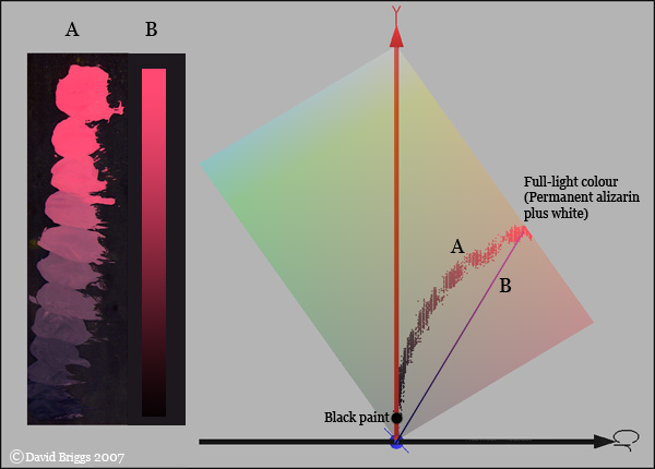
Figure 6.3.5. Effect of progressively adding black paint to a mixture of W&N Permanent Alizarin Crimson and Flake White (A) compared to an ideal shading series (line of uniform saturation) from the same mixture (B). Photographed colours plotted in YCbCr colour space using the program ColorSpace by Philippe Colantoni. (www.couleur.org).
Uniformly coloured surfaces passing into lower levels of illumination are represented by image colours that decrease in value and chroma along a line of uniform saturation (Fig. 6.3.5B). Adding black paint alone to a paint mixture typically reduces saturation as well as chroma and value, and thus yields shadow colours that are too low in chroma to be correctly related to the lights. The mixing paths typically curve in towards the neutral axis, which shows that this loss of saturation does not simply result from the fact that the black paint is not a "true" black but a very dark grey. (I suspect that the main reason is that the addition of light-absorbing particles reduces the average number of times that light is reflected between pigment grains, making the same ratio of colourant to white particles less effective in colouring the darker mixtures).
This tendency is the reason for black's reputation for "muddying" colours, and for the characteristic rule of simplistic colour instruction to not use black. With a little experience however this tendency can be easily corrected by adding some more of the colourant(s) used until the required chroma is restored. The "colourant" in the example of Fig. 6.3.5 should be understood to mean Permanent Alizarin Crimson alone, and not the original full-light colour (crimson plus white). If the colourant is the full-light colour (i.e. if the latter lacks any added white or black paint), the tendency to lose saturation is usually much less marked than for mixtures containing white, but if necessary the chroma can be boosted using a transparent paint of similar hue.
Strongly coloured objects remain at high saturation even at their lowest values, which may need to be painted using a very high proportion of colourant; pure black paint, being a very low value neutral (grey), is unsuited to represent the lowest values of such objects.
Darkening with black may also cause a hue shift that needs correction (Fig 6.3.3C), but this problem occurs with any darkener. The main shifts are red > purple, and orange > yellow> green, both of which can be corrected by dragging the hue back with a trace of a strong orange or scarlet colourant.
Mixing paints of differing hues
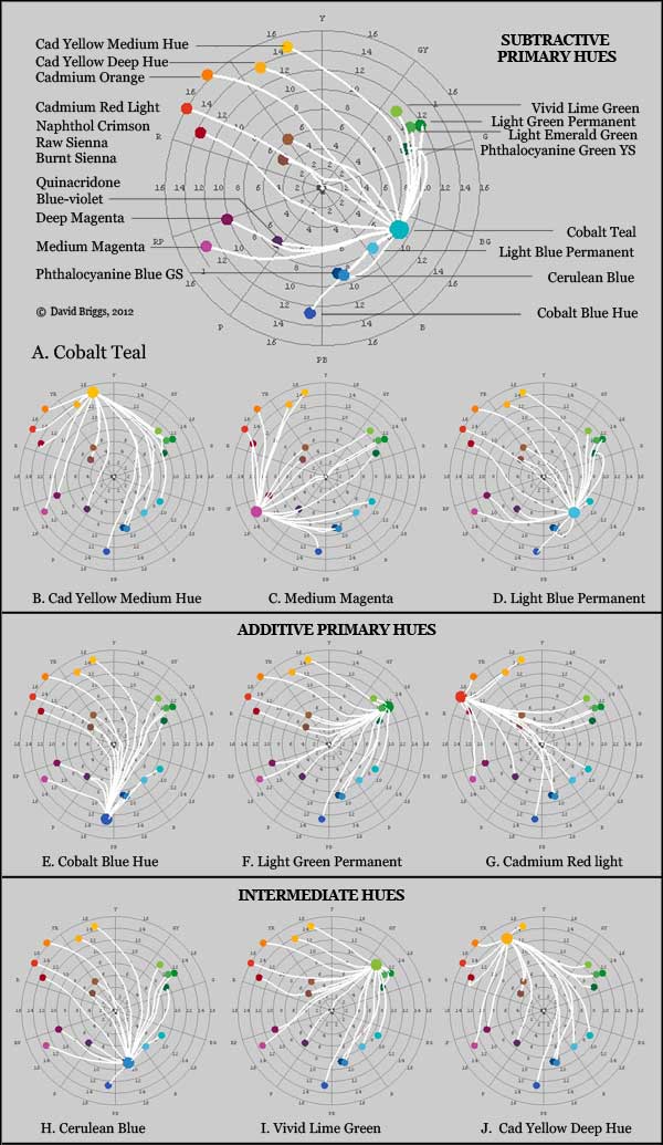
Figure 6.3.6. Mixing paths of various Liquitex acrylic paints with other paints in the range, modelled using the program drop2color by Zsolt Kovacs.
Most mixing paths of paints of differing hues do not follow straight lines on the hue-chroma plane, and the assumption that they should - the so-called "color wheel fallacy" - has never been an actual component of traditional colour theory. In fact, the notion of primary colours requires that paint-mixing paths do not follow straight lines, but instead follow very different paths depending on the hues involved: paints of the primary hues should mix along lines that stay high in chroma, following lines that bow outwards on the "colour wheel", while paints far from the primary hues should mix along lines that keep low in chroma while passing through the primary hues, following lines that bow inwards on the "colour wheel". These assumptions are in fact valid, as long as we understand by "primary colour" a paint close to the ideal subtractive (CMY) primaries, rather than to the historical primaries red, yellow and blue. They are corollaries of the first two of the principles set out below:
(6) Paints that are close to the ideal subtractive primaries, yellow, magenta and cyan, make high-chroma mixtures with distant hues (Fig. 6.3.6 A-D).
(7) Paints that are far from the yellow, magenta and cyan primaries (e.g. cadmium red and cobalt blue) make high-chroma mixtures with only a few adjacent hues (Fig. 6.3.6 E-G).
Paints intermediate in hue between these two groups have mixing patterns that are intermediate in character (Fig. 6.3.6H-J).
(8) Paints close in hue to the ideal subtractive primaries have a relatively restricted range of paint-mixing complementaries, whereas paints far from the hue of the ideal subtractive primaries have complements and near-complementaries of a surprisingly wide range of hues (Fig. 6.1.6, 6.1.7, 6.3.1).
(9) The most direct paint-mixing complementary of most paints is roughly opposite in hue on the Munsell hue circle, except close to the Y-PB axis, where mixing paths systematically curve through middle chroma greens.
The exception noted under principle 9 results from the fact that yellow and blue pigments overlap in reflectance in the green part of the spectrum (Fig.6.3.7).
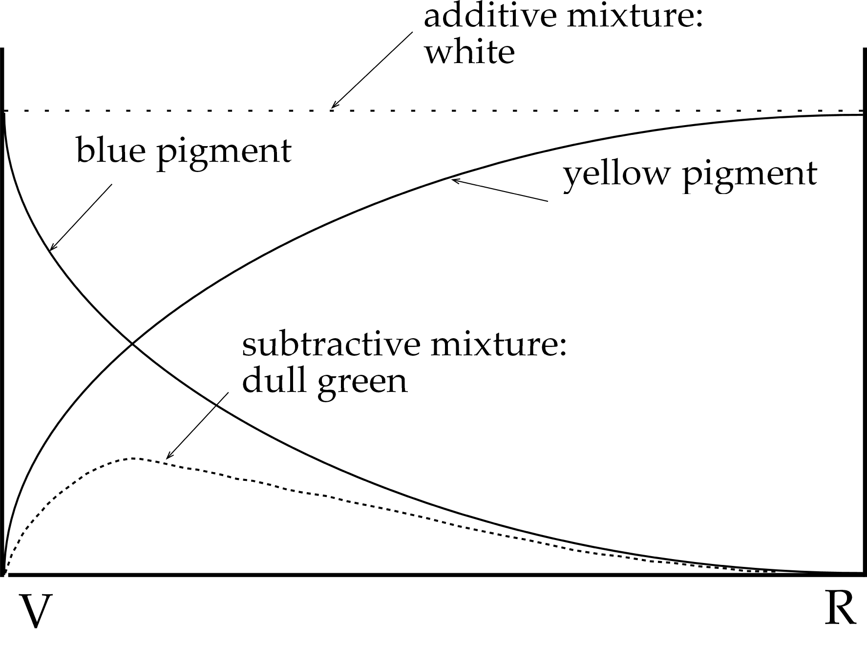
Figure 6.3.7. Spectral transmission curves for two hypothetical colourants. Two artist's pigments can be complementary in terms of the light they reflect, but far from complementary when mixed together. After diagrams by Pope and Luckiesh.
Figure 6.3.8 demonstrates the same effect with actual pigments: lemon yellow and ultramarine blue give off light that is complementary (as can also be demonstrated with spinning discs), but when physically mixed together they make a distinctly green mixture.This drift in the direction of green means that we need to look for mixing complements of ultramarine blue among pigments that are more orange than lemon yellow, and several yellow-orange pigments are in fact found to be paint-mixing complements. Similarly we should expect the paint-mixing complement of lemon yellow among pigments more purplish than ultramarine blue (ultramarine violet is about right).
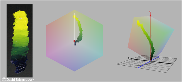
Figure 6.3.8. Ultramarine blue and lemon yellow, physically mixed. These colours, though additive complementaries (white line), physically mix to make a series of dull greenish colours. Photographed colours shown on CbCr plane and in side view of YCbCr space. Photographed colours plotted in YCbCr colour space using the program ColorSpace by Philippe Colantoni. (www.couleur.org).
(10) Whether they are close to or distant from the subtractive primary hues, paints generally yield higher-chroma mixtures with paints that are close in hue than with paints that are more distant in hue in the same direction.
This is another traditional principle that is supported reasonably well in practice, with occasional exceptions. Paint-mixing paths for a given paint mostly fan out in a fairly orderly fashion, and many of the apparent crossings of paths are connected with the mixing of pairs of transparent paints, whose paths in the absence of white tend to pass very close to the neutral axis, largely because the mixtures are very dark.
(11) Mixing with a complementary-coloured paint usually causes value to decrease as well as chroma, but at a rate that depends on the pigments involved, and is likely to follow a shading series only up to a point, if at all.
In the example of the paint-mixing complementaries cadmium red and cobalt green, the paint-mixing path is close to the general direction of a shading series for both paints for a short distance (two or three Munsell value units) before drifting off towards the neutral axis (Figure 6.1.2A). You may also notice here that the common assumption that when complementary paints mix, the most neutral mixture must be the darkest, is also incorrect.
Mixing of transparent paints
(12) Opaque colours may lighten or darken a mixture, but transparent colours always darken.
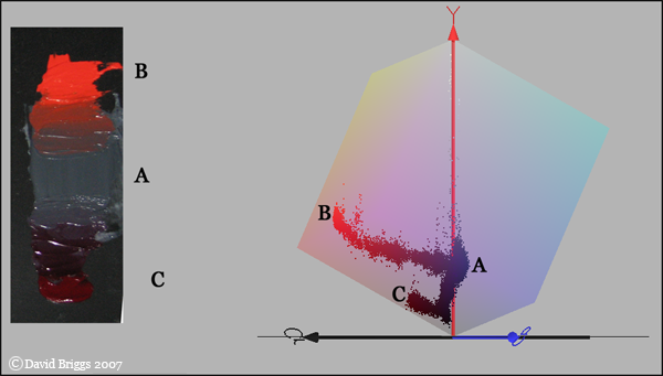
Figure 6.3.8. Effect of adding cadmium red (B) and permanent alizarin crimson
(C) to a dark grey mixed from flake white and charcoal grey. Photographed colours plotted in YCbCr colour space using the program ColorSpace by Philippe Colantoni. (www.couleur.org).
Transparent paints allow light to pass through without scattering; they always darken mixtures, because they work by simply removing light. Opaque paints scatter light; they can lighten a darker paint when added to it, but their effect is conditional, depending as it does on the balance of their effect of absorbing some wavelengths with their effect as adding reflectors of the remaining wavelengths (Fig. 6.3.8).
Painting in transparent layers takes different ways of thinking about colour manipulation to those that work for opaque paint. A paint used transparently does not have a single Munsell notation, and glazed over white can have any value from its body colour (very dark for most of them) up to near white (Principle 8, above). Transparent layers are inclined to show colour variations that follow short segments of this path, though these variations can be eliminated if necessary by building up to the required colour in a few light layers. The basic technique needed is to mentally analyze each colour into a set of subtractive "components", i.e. to assess how much of each transparent paint is needed to arrive, whether by mixing or glazing, at the required hue, value and chroma.
Modified 2nd November, 2012. Original text here.
Next: Part 7: Hue