I'm proud to announce that
my colour short course is
now offered online through
Australia's National Art
School in Sydney! There's
a choice of two sessions to
suit every time zone. LINK
my colour short course is
now offered online through
Australia's National Art
School in Sydney! There's
a choice of two sessions to
suit every time zone. LINK
- Colours in Space
- Dimensions of What?
- Lightness
- Hue
- Chroma
- Brightness and Colourfulness
- Saturation
- Blackness and Brilliance
Basics of Light and Shade
Basics of Colour Vision
Additive Mixing
Subtractive Mixing
Mixing of Paints
Hue
Lightness and Chroma
Brightness and Saturation
Principles of Colour
Afterthoughts
Glossary
References
Contact
Links
NEXT
COLOUR
WORKSHOPS

PART 1. THE DIMENSIONS INTRODUCED
1.1 Colours in Space
Hue, Lightness and Chroma
All painters, whether working in traditional or digital media, are in a real sense navigators in space. Whether they are aware of it or not, each touch of colour they apply can be considered, using various systems, as a point within a space defined by three dimensions.
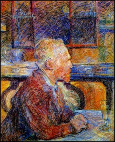
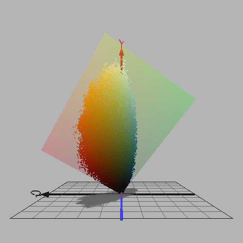
Figure 1.1.1. Left: Portrait of Vincent Van Gogh by Henri Toulouse Lautrec. Pastel, 1887. Right: RGB colours from this image, plotted in YCbCr colour space using the program ColorSpace by Philippe Colantoni. (www.couleur.org).
The three-dimensional system most familiar to painters is the classification of colours of objects according to dimensions of hue, lightness (= value or greyscale value) and chroma or relative chroma (often loosely referred to as "saturation". Hue refers to the circular scale of "pure" or "saturated" colours formed by the colours seen in the spectrum (red, orange, yellow, green, cyan, blue and violet), together with the non-spectral colours like magenta, seen when the two ends of the spectrum are mixed. Lightness refers to the scale from black to white; tone, value, and greyscale value are synonyms or very closely related. Chroma or colour strength refers to the amount of visual difference from a grey of the same value. In short then, the system may be said to classify any object colour according to the closest full or "saturated" colour, the closest grey, and the visual difference from that grey (Fig. 1.1.2). Because the maximum chroma attainable with any set of paints varies with value, a hue page that shows all variations of value and absolute chroma attainable for a given hue has an irregular right margin (Fig. 1.1.2), and because this margin varies for each hue (Fig. 1.1.3), a hue-lightness-absolute chroma space has an irregular, tree-like shape. Simpler systems arbitrarily treat the maximum chroma attainable for each hue as uniform, resulting in a circular "colour wheel" and a cylindrical colour space.
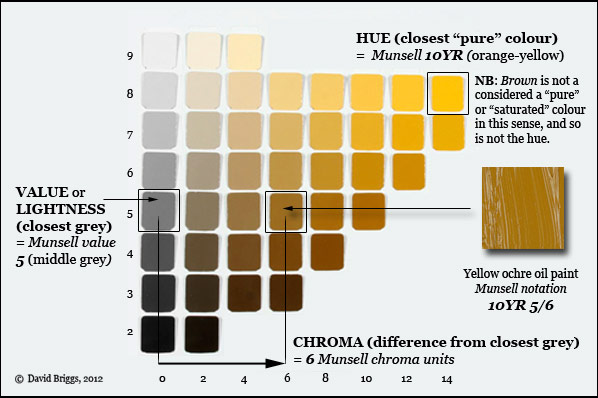
Figure 1.1.2. Explanation of the dimensions of hue, value/ lightness and chroma in the Munsell system. Grey scale and 10YR hue page from the Munsell Book of Color, Glossy Edition.
Colour order systems based on hue, lightness and relative chroma first appeared in the early 19th century, but the key concept of absolute chroma was devised by the American artist and art teacher, Albert Munsell (1858-1918), and published in a small book entitled A Color Notation (Munsell, 1905). Munsell published quantitative scales of hue, value and chroma in an Atlas of physical colour chips (Munsell, 1915), which after his death was elaborated by the Munsell Color Company (directed by his son Alex) as The Munsell Book of Color (1929). This was further refined and developed by the Optical Society of America, culminating in the "renotation" published in 1943, which related the Munsell System to the world standard system of colorimetry developed by the International Commission on Illumination or CIE (the abbreviation is based on the title in its French form, Commission Internationale de L'Eclairage). This 1943 "renotation" forms the basis of all subsequent editions. The Munsell Book of Color has 40 hue pages (Fig. 1.1.3), and is available in a choice of editions having either matte or glossy colour chips. An alternative hue-lightness-chroma system, CIE L*H*c space, is also available as a physical atlas of colour chips, the RAL Design Atlas. Hue, lightness and chroma are included by the CIE as three of the six defined attributes of perceived colour, of which the Munsell and CIE L*H*c systems provide two alternative sets of quantitative measures.
Figure 1.1.3. The forty hue pages of a modern edition of the Munsell Book of Color, Glossy Edition. Click on each hue page to enlarge, and scroll down for more pages. In the matte edition the range of colours tends to be a little greater among the light colours and a little less among the dark colours.
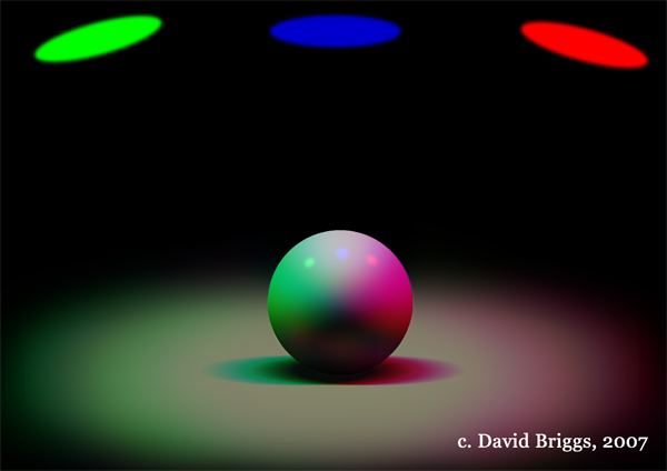
The dimensions of lightness and chroma apply specifically to colours perceived as belonging to objects, as opposed to lights. Colours perceived as belonging to lights (Fig. 1.1.4B) can be described in terms of three dimensions of hue, brightness (perceived amount of light) and either saturation (colour purity, i.e. perceived freedom from admixed white light) or colourfulness (colour strength, a function of both brightness and saturation).
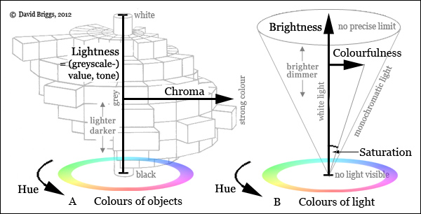
Figure 1.1.4. Attributes for colours perceived as belonging to (A) objects and (B) light. Saturation refers to purity of colour of light, and can vary throughout its range (white to monochromatic) at any level of brightness; it is represented in B by the angle from the neutral axis. Colourfulness refers to strength of colour of light, and can be thought of as saturation times brightness; it is represented in B by the distance from the neutral axis. Chroma (strength of colour of objects) depends on the colourfulness (saturation and brightness) of the light given off by an object for a given level of illumination. Chroma is necessarily zero at maximum and minimum value (white and black respectively), and reaches its maximum range at intermediate value levels.
Lightness and chroma apply to colours of objects seen in nature or depicted in an image, as well as to colours of an image itself. This is true whether the image surface reflects light (e.g. a photograph, painting, or projector screen), transmits light (e.g. a stained glass window) or emits light (e.g. a computer monitor or TV screen). However, areas of the visual field occupied by objects can also be seen as light, and thus the dimensions of brightness, saturation, and colourfulness apply not only to primary light sources but also to the light remitted by non-luminous objects to our eyes.
Painting Colours in Space
Traditional colour theory discusses the "colour wheel" and the tonal scale, but these are either not related to each other, or they are integrated in a very simplistic way, as in the colour sphere of Johannes Itten. Many painters thus spend much time making up elaborate paint mixing charts without attempting to visualize the series of mixtures they generate as paths through colour space, and so tend to rely colour "recipes" obtained by examining their mixing charts to see how they mixed a particular colour previously. Lacking a conscious three-dimensional conceptual framework for colour, many painters vaguely think of colours being "warmer" or "cooler", without troubling to consider what they mean in terms of the more precise attributes of hue and chroma.
Traditional colour theory also typically offers little guidance on the physical principles involved in creating effects of light and shade, which require the framework of colour space for their full explanation and visualization. Instead it tend to rely on crude rules and recipes, such as "get the shadow colour by adding the complementary colour" and so on. A hallmark of traditional colour theory is the admonition "Don't use black!". The real problem is not the black paint, but the painter's inability to visualize an unintended effect of adding black paint as an easily corrected shift within colour space (Fig. 1.1.5).
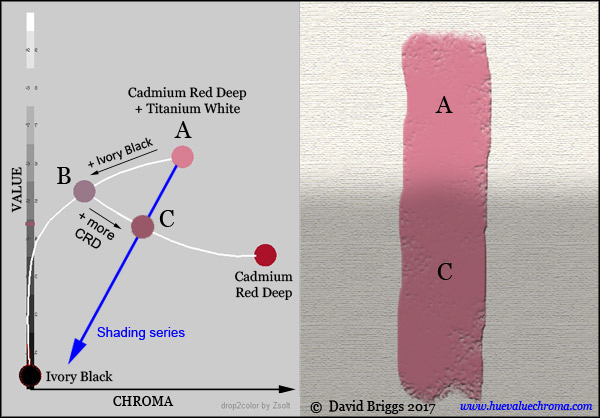
Figure 1.1.5. When a mixture of a colourant such as Cadmium Red Deep with white paint (A) is darkened using Ivory Black, the paint mixture decreases rapidly in chroma (B), whereas the paint mixtures needed to represent an object of colour A in shadow decrease less rapidly in chroma (blue arrow). The required shadow colour (C) can be obtained by adding just enough of the the original colourant (Cadmium Red Deep) to restore the required amount of chroma. (Adding black may also result in a hue shift, which can be rectified by adding a small amount of paint of an appropriate hue and the same value). Mixing paths calculated using drop2color by Zsolt Kovacs-Vajna.
Students who have previously been exposed only to traditional colour theory are frequently astonished when they first learn to think consciously of their colouring activities as maneuvering through a three-dimensional colour space. A three-dimensional conception of colour assists painters by providing a framework (1) for observing colour relationships, (2) for selecting and mixing colours, and (3) for creating colour relationships from the imagination.
1. As a framework for observing colour relationships.
Painters trained in the concept of colour space do not try to copy each colour in their subject in isolation (the strategy of every beginner). Instead, they use the concept of colour space as a frame of reference for grasping the relationship of each colour to the totality of colours present. Tonal realist painters, for example, typically observe colour relationships in the light from their subject, and then, by a process of either conscious or unconscious translation, identify each individual colour in terms of the hue, value and chroma of the paint colour they will need to use in order that the whole ensemble replicates the visual appearance of the subject as closely as possible. In practice, this usually involves first selecting the most important ten or so colours in the subject, and finding the place of these in relation to each other (Fig. 1.1.6). This begins the process of building what I call a scaffolding for progressively finding the place of all remaining colours, most of which can usually be considered as variations on, or intermediates between, these scaffolding colours.
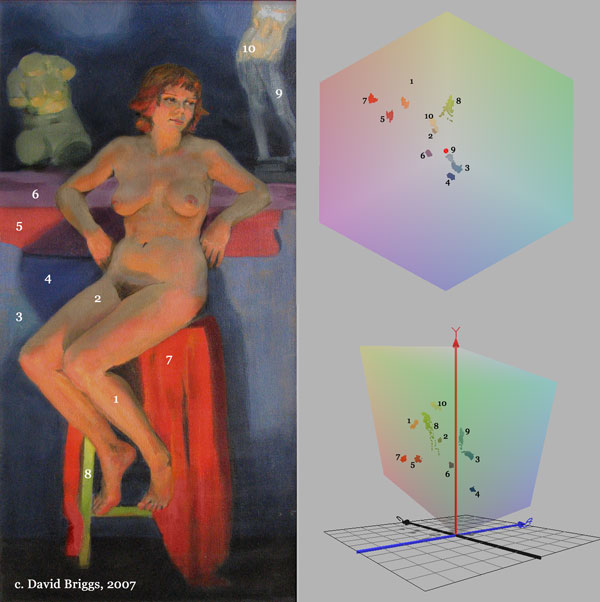
Figure 1.1.6. : Left: Lyndall by David Briggs, 2005, oil on canvas. Right: plan view (above)
and side view (below) of ten selected colours from the image plotted in YCbCr space using
the programme ColorSpace by Philippe Colantoni.
2. As a framework for selecting and mixing colour.
Artists who think in terms of colour space do not need to remember recipes for mixing colours: they understand that most colours can be mixed from any number of combinations of paints, as long as the target colour is within the three-dimensional gamut of those paints. They literally visualize colour mixing as moving colour from place to place through colour space. They decide on the changes in hue, chroma and lightness required, and predict in advance what effect various additions are are likely to have. These crafty painters can mix every colour they want very quickly and accurately, particularly if they equip their palette with a series of strings of pre-mixed pools of colours at various values. This approach to colour mixing was developed to an elaborate degree by the influential mid-20th century American teacher Frank Reilly, whose approach has been described in books by his ex-students including Apollo Dorian, Frank Covino, Jack Faragasso and Angelo John Grado.
3. As a framework for creating colour relationships from the imagination.
The dimensions of colour form an essential conceptual framework for any kind of activity that involves creating colour relationships from the imagination. In the nineteenth and early twentieth centuries, much thought on colour spaces (including Munsell's own writings) was directed towards discovering rules of "colour harmony", and there are still many echoes of this kind of investigation today. On this site however I am much more concerned with the application of colour space to the creation of convincing effects of light. The concept of colour space provides a quantitative framework for applying the simple physical laws that govern the behaviour of light and colour, some of which were understood in a qualitative way as far back as Leonardo. If the artist gets these relationships right in a painting, the payoff is not merely technical correctness but can be a vivid glow of light and feeling of atmosphere. And, just as with, for example, perspective and anatomy, having the understanding that allows you to do something from the imagination makes working from nature far more efficient.