
my colour short course is
now offered online through
Australia's National Art
School in Sydney! There's
a choice of two sessions to
suit every time zone. LINK
Home
The Dimensions of Colour
Basics of Light and Shade
Basics of Colour Vision
Additive Mixing
Subtractive Mixing
Mixing of Paints
Hue
Lightness and Chroma
Brightness and Saturation
Principles of Colour
- Shading Series
- Consistency of Relative Brightness
- The Scale of Brilliance
- Effect of Coloured Illumination
- Effect of Multiple Light Sources
- Effect of Distance From Light
- Effect of Inclination to Light
- Effects of Atmosphere
- Applying the Principles in Paint
Afterthoughts
Glossary
References
Contact
Links
NEXT
COLOUR
WORKSHOPS

Part 10. PRINCIPLES OF COLOUR FOR PAINTERS
- 1. Shading series
- 2. Consistency of relative brightness
- 3. The scale of "brilliance"
- 4. Effects of coloured illumination
- 5. Effects of multiple light sources
- 6. Effect of distance from light source
- 7. Effect of inclination to light
- 8. Effects of atmosphere
- Applying the principles in paint
The dimensions of saturation and relative brightness turn out to be vitally important when it comes to understanding colour and light, and when painting effects of light from the imagination. In the final section of this work I will summarize what seem to be the main considerations under eight major principles. Many of these principles have been set out somewhere or other before, most notably I believe in a series of papers by Arthur Pope (1922, 1931), but they deserve to be a lot better known than they are.
Edit, July, 2015: For an inexpensive and easy-to use app that models the effects on shading series of any combination of lighting and object colours, and outputs the results as swatches that can be imported into digital painting programs, please check out Murray Lancashire's Colour Constructor.
1. SHADING SERIES
Uniformly coloured surfaces passing between different levels of illumination
under a single light source are represented by image colours that move along a
line of uniform saturation, such that chroma increases as the value increases.
If a surface of uniform colour moves or turns steadily away from a single light source, it receives progressively less light per unit area, and so the light diffusely reflected from it decreases correspondingly in brightness. We would of course expect to paint this surface using a series of image colours that decrease in value (lightness), but what would happen to the chroma of these image colours?
Because the spectral make-up of the lighting and the spectral reflectance of the surface are both constant, the light reflected from the surface maintains the same relative proportion of wavelengths while its brightness decreases. The colours of such a series of lights are said to have the same chromaticity, which means that their hue and saturation remain approximately the same. (The actual hue perceived may shift slightly due to an effect called the Bezold-Brucke effect). To represent this series in paint, we need a series of image colours, here called a shading series, that follows this line of uniform saturation or chromaticity. In such a series, chroma decreases steadily as value decreases, at the precise rate needed to keep the saturation unchanged (please see Fig. 9.6 !). Such series form straight-line paths radiating from the point of zero light energy in simple colour spaces such as RGB and YCbCr (Fig. 10.1.1B).
In L*a*b* space these paths generally drift in hue, and for much of their length appear to radiate from a point 16 lightness units below zero on the 100-unit lightness (L*) scale (Fig. 10.1.1C). In Munsell space the paths both drift in hue and fluctuate somewhat in slope, but overall they also appear to radiate from a point below Munsell value zero (as first pointed out by Evans, 1974). I've speculated that this is because Munsell value zero represents the light energy at the visual threshold of blackness, while the chromaticity lines are radiating along much of their length from the actual point of zero light energy (Briggs in Flynt, 2010). Centore (2011) found that on fitting straight lines to these paths in Munsell space, the average position of their apparent point of origin was about one value step below zero on the Munsell value axis.
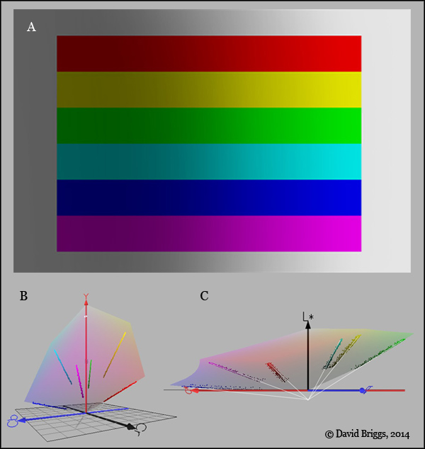
Figure 10.1.1. A, Six uniform saturation series arranged in rectangles with a greyscale surround, all organized to represent uniformly coloured fields under varying illumination. David Briggs, 2007, Photoshop CS2. B, The uniform saturation series from Fig. 10.1A plotted in YCbCr space, showing the pattern of radiation from the zero energy point. C, The uniform saturation series from Fig. 10.1A plotted in L*a*b* space, showing the pattern of apparent radiation from a point 16 lightness units below zero. Fig. 10.1.1B and C plotted using Colorspace.
It is remarkable that Figure 10.1.1A, which consists merely of an arrangement of seven uniform saturation series (including the neutral series), is sufficient to create a distinct visual impression of uniformly coloured surfaces under varying illumination. To me, this diagram in itself demonstrates the important role uniform saturation/chromaticity series play in object-colour constancy. Evidently at a subconscious level our visual system is attuned to recognizing these series within the visual field, and presents them to us as perceived gradients of illumination, though only when their spatial arrangement is consistent with this interpretation (cf. Fig. 10.1.2). As I sometimes say to my students: "You may not be interested in mathematics, but your visual system is".
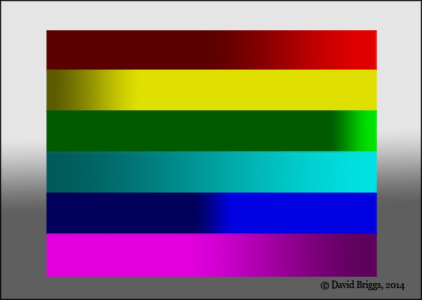
Figure 10.1.2. Another arrangement of the same colours as in Fig. 10.1A, this time appearing as non-uniformly coloured shapes without any clear pattern of illumination. David Briggs, 2014, Photoshop CS2.
In digital work we can easily create uniform saturation series by keeping the Hue angle (H) and HSB Saturation (S) constant (in effect keeping the R/G/B ratio constant), while the HSB brightness (B) decreases. Uniform saturation series are easily created in Photoshop using the colour picker, which allows S and B to be directly manipulated. In Photoshop shading series can also be created by various shortcut methods such as
- varying the opacity of a layer in normal mode over a layer of black, or
- varying the opacity of a layer of black in multiply mode over a layer
- by placing a coloured layer in multiply mode over a greyscale image.
The first two methods work in RGB mode but not Lab mode.
In Figure 10.1.3 the highlight retains the (white) colour of the light source. Around the fringes of the highlight, additive mixing of this white light with the red diffuse reflection creates intermediate colours, while the darker versions of the red are restricted to the crevice shadow.
Note that, contrary to a widespread "rule" among painters (e.g. Loomis, 1947), the richest colour here is in the full light rather than the half light. In the case of Loomis this rule is connected with his mistaken belief that the highlight coincides with the centre of the full light (link).
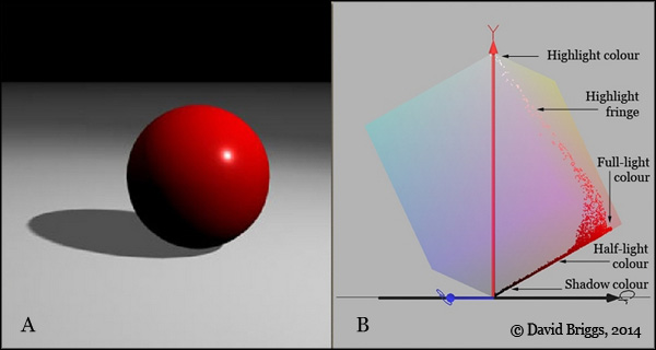
Figure 10.1.3. Colour relationships for a glossy red ball under a white light source. The diffuse reflection of the sphere moves along a line of uniform saturation between light and dark (Principle 1). At the centre of the highlight the bright specular reflection of the light source completely masks the red diffuse reflection, but around the fringes of the higlight a series of additive mixtures of white specular reflection and red diffuse reflection are seen.
In traditional paint mediums, the colour relationships discussed here need to be established by eye. With practice it is not difficult to create shading series in paint, and the inbuilt responsiveness of our visual system to uniform saturation series, as suggested above, probably helps here. Such series are not created by just adding black paint. Black pigment tends to reduce the chroma of mixtures more rapidly than the lightness, creating colours that are too neutral (grey) for their lightness level - hence "traditional" colour theory's insistence on not using black, because it "muddies" the colours. My advice is that anyone who doesn't understand colour should not use black, but now that you've got this far you're certainly ready to join the black-using party, who incidentally form the majority of painters throughout art history. You understand by now that painting is about creating colour relationships, not about following colour recipes. In this case, the solution is to add just enough of pure colour to get the mixture back onto a uniform saturation series (Fig. 10.1.4). Some fine hue adjustment may also be needed to counter any hue-shifting effects of the black, but the same is true whatever pigment is used for darkening.
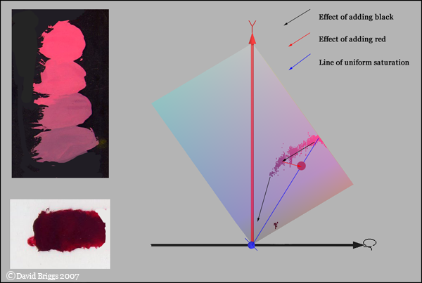
Figure 10.1.4. Adjustment of saturation with pure red pigment after adding black pigment. Adding black to a mixture of Permanent Alizarin Crimson and White draws the mixture away from the shading series into colours that are too low in saturation. The solution is to add just enough extra Permanent Alizarin Crimson to get the mixture back onto the line of uniform saturation. Some fine tuning of the hue is also generally needed.
Incidentally, adding the complementary colour, "traditional" colour theory's usual alternative to adding black for darkening, works tolerably well for some colours for a small amount of darkening and then starts drawing the mixture in the wrong direction; for other colours it draws the mixture in the wrong direction right from the start (Fig. 10.1.5).
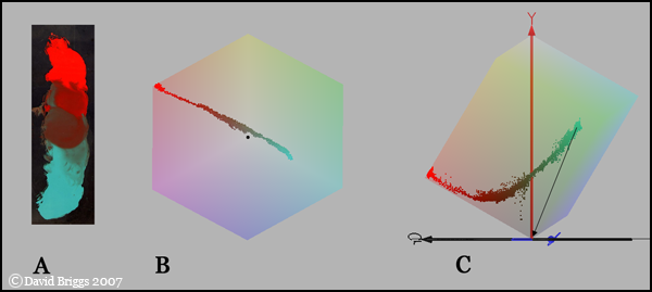
Figure 10.1.5. Mixing of Cadmium Red and Cobalt Green. Cadmium Red and Cobalt Green are near complementary in pigmentary mixing (B). Cobalt Green initially draws Cadmium Red along a line of uniform saturation, then begins drawing the mixture inward to less saturated colours; Cadmium Red however draws Cobalt Green away from the required shading series (black arrow) right from the start.