
my colour short course is
now offered online through
Australia's National Art
School in Sydney! There's
a choice of two sessions to
suit every time zone. LINK
Home
The Dimensions of Colour
Basics of Light and Shade
Basics of Colour Vision
Additive Mixing
Subtractive Mixing
Mixing of Paints
Hue
Lightness and Chroma
Brightness and Saturation
Principles of Colour
- Shading Series
- Consistency of Relative Brightness
- The Scale of Brilliance
- Effect of Coloured Illumination
- Effect of Multiple Light Sources
- Effect of Distance From Light
- Effect of Inclination to Light
- Effects of Atmosphere
- Applying the Principles in Paint
Glossary
References
Contact
Links
NEXT COLOUR
WORKSHOPS

APPLYING THE PRINCIPLES IN PAINT
These eight principles apply to painting in any medium where creating a sense of light is important, but they are easiest by far to put into practice in a programme like Photoshop, where parameters representing hue, saturation, lightness and relative brightness can be directly manipulated. They are far less easy to put into practice in traditional mediums, where these parameters must be manipulated indirectly by physically mixing coloured poisons, but this doesn't make them any less important to any tonal painter. To create effects of light from the imagination in paint, an option of course would be to first establish colour relationships in a sketch version in Photoshop, and to print this file as a guide to the colours needed.
I will not attempt, or presume, here to go on to present a complete guide to painting, although some of the basic effects to watch for in mixing paints have already been considered (link). (This of course is the point where I tell you - as the saying goes - that you would need to do one of my workshops in order for me to guide you through all of the practical issues involved). Instead I will content myself for now to conclude with some very brief remarks on some of the basic strategies used for organizing a palette that painters use to make colour mixing more efficient.
The most basic approach is simply to lay out colours straight from the tube, and to mix each required colour individually. Hopefully this mixing will involve visualizing the likely effect on hue, chroma and lightness of each pigment before it is added, and systematically guiding each colour through colour space to its target. There is nothing inherently wrong with this approach except for inefficiency and slowness.
A more efficient approach is to systematically pre-mix "strings" of colour mixtures in order to have available an array of pools of colours that can be used to draw a mixture through colour space in any required direction. A simple and popular approach is to add white progressively to each pigment (Figure 10.16). A more methodical version of this approach involves controlling the precise lightness of each of these steps, often in reference to the Munsell tonal scale.
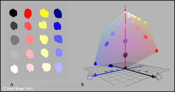
Figure 10.16. Simple example of a palette arrangement created by adding white progressively to black and several coloured pigments. Any required colour can by mixed from one or two coloured pools, adjusted for lightness and chroma using a grey pool.
My own preference is a variation on the set palette idea in which colours are mixed along shading series (Figure 10.17). This makes the mixing of the shading progressions needed in a tonal painting a lot more efficient. Intermediate colours can be cross-mixed from these pools, and additional shading series can be added for important coloured surfaces in the picture if needed. Mixing such a palette takes more time than the adding-white type, but once mixed the palette permits very fast and fresh painting.
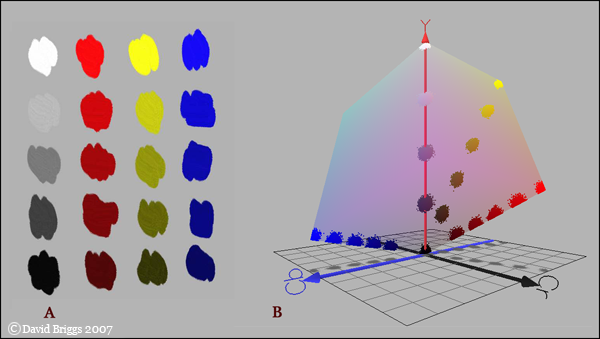
Figure 10.17. Simple example of palette arrangement created by mixing shading series from several pigments. Any required colour can by cross-mixed from one or two coloured pools and neutralized as needed using a grey pool.
ĀĀĀ
Next:References