I'm proud to announce that
my colour short course is
now offered online through
Australia's National Art
School in Sydney! There's
a choice of two sessions to
suit every time zone. LINK
my colour short course is
now offered online through
Australia's National Art
School in Sydney! There's
a choice of two sessions to
suit every time zone. LINK
- Colours in Space
- Dimensions of What?
- Lightness
- Hue
- Chroma
- Brightness and Colourfulness
- Saturation
- Blackness and Brilliance
Basics of Light and Shade
Basics of Colour Vision
Additive Mixing
Subtractive Mixing
Mixing of Paints
Hue
Lightness and Chroma
Brightness and Saturation
Principles of Colour
Afterthoughts
Glossary
References
Contact
Links
NEXT
COLOUR
WORKSHOPS

1.8 The Dimensions of Colour: Blackness and Brilliance
- Black and White Content (Ostwald System)
- Blackness and Chromaticness (Natural Colour System)
- Brilliance
Black and White Content (Ostwald System)
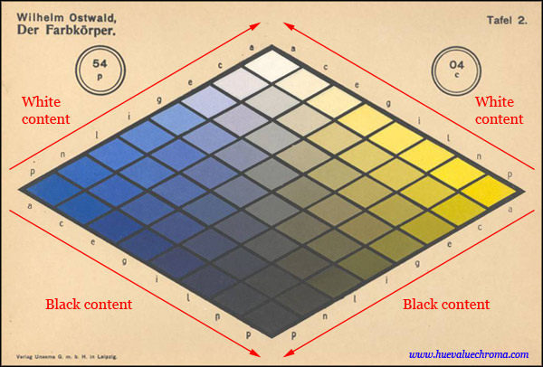
Figure 1.8.1. Plate from one of Wilhelm Ostwald's colour atlases (the Farbkoerper, 1919), with red arrows added to indicate increasing black and white content. This blue-yellow plate is one of twelve plates displaying 24 hues that together describe a colour space in the form of a symmetrical double cone. In the Ostwald system the "Full" (most chromatic) colour of each hue is located on the equator of the space, whose vertical dimension therefore does not represent absolute lightness.
The CIE International Lighting Vocabulary does not claim that hue, brightness, lightness, colourfulness, saturation and chroma are the exclusive or even the most "natural" attributes of colour, but states only that perceived colour can be described in terms of these six defined attributes. Another set of perceived colour attributes, not defined by the CIE, consists of proportions of black, white and colour content considered as components making up an object colour. This way of perceiving object colours was discussed by Ewald Hering (1878 [translated 1964]), who illustrated it in the form of a veiling triangle with points representing "completely pure white", "completely pure black" and the perfectly "clear" hue (e.g. red). Object colours could be compared in terms of the proportions of these components in various ways, for example in terms of the relative degree to which the clear hue was veiled by a grey containing black and white in a particular proportion. Hering noted several difficulties with using these attributes to describe colour in absolute terms, especially that the clarity of a chromatic colour cannot be determined exactly (ibid., p. 53).
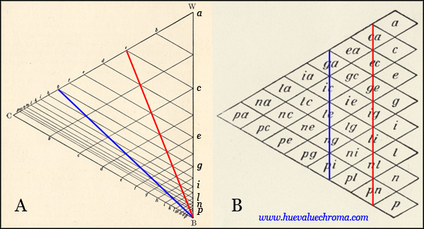
Figure 1.8.2: A. Ostwald's "Analytical Triangle" in which the position of a colour represents its implicitly physical content of black, white and full colour, presumably as determined by spinning-disc mixture. Internal lines show logarithmic subdivision of the white/black and the full colour/white ratio that Ostwald believed would result in psychologically equal spacing. B. Ostwald's "Logarithmic Triangle" showing the divisions used in his published atlases (Fig. 1.8.1), in which the internal divisions of the Analytical Triangle are spaced equally. The red and blue lines each represent colours of equal saturation. Both diagrams from Ostwald (1931).
The Ostwald system by Wilhelm Ostwald (1853-1952) was strongly influenced in its geometry by Hering's model of colour perception, though its detailed structure is based on spinning disc (additive-averaging) mixing. Ostwald believed he had solved the problem of defining the perfectly clear or "Full Colour" with his concept of a "semichrome", an optimal colour stimulus in which 100% of all wavelengths between two complementary wavelengths are reflected and all other wavelengths are completely absorbed. His "Analytical Triangle" represents colours according to their (implicitly physical) content of pure White (W), pure black (B) and "Full Colour" (C), but he considered that to create psychologically equidistant colours it was necessary to scale the sides of this triangle logarithmically in accordance with Fechner's Law. Equalizing the size of these divisions produces the "Logarithmic Triangle" used in the plates of his atlases, in which each colour has a two-letter designation representing logarithmic black and white content, the third (chromatic) component being redundant. In theory vertical series of colours in Ostwald's system ("isochromes") are uniform in saturation rather than chroma (Fig. 1.8.2). Ostwald published his system in several colour atlases, including the Farbkoerper of 1919 (Fig. 1.8.1), in which the Full Colour for each hue is represented by the nearest colour to the semichrome attainable at the time with colourants. Foss et al. (1944) showed that compromises in the ideal Ostwald system are necessary to produce a physical atlas, and that Ostwald's actual samples correspond poorly to the ideal Ostwald system. The influence of Ostwald system in art education was high in the first half of the twentieth century and continued to a lesser extent in the second half through the support of Faber Birren among others.
Blackness and Chromaticness (Natural Colour System)
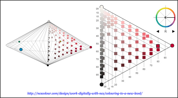
Figure 1.8.3. Screenshot of the online NCS Navigator, an interactive tool for exploring the NCS system, and for selecting palettes based on constant hue, whiteness, blackness, or chromaticness. This screenshot shows on the left the overall double-cone geometry, which can be tilted at any angle and filled in various ways, and on the right the one of the forty hue pages that can be selected.
The Scandinavian Natural Colour System (NCS) like the Ostwald system consists of triangular hue pages that together make up a double-cone space, although unlike the Ostwald system this space is only partly filled with colour samples. Colours are specified in terms of black content (blackness, s) and chromatic content (chromaticness, c), both expressed as percentages, followed by a hue designation. For example the designation 1050-R90B means the colour with a blackness of 10 and a chromaticness of 50 on the R90B hue page. The NCS differs from the Ostwald system in being based purely on colour perception, and the scales of black, white and chromatic content are based ultimately on averages of estimates reported by test subjects. The difficulty subjects experience in establishing maximum chromaticness can be alleviated in practice by showing them a highly chromatic sample of a specified c-value (Seim, 2013). The NCS atlas has 40 hue pages of matte samples, in the current edition ranging from 05 to 90 in blackness and up to between 55 and 85 in chromaticness depending on the hue. Lightness is not a fundamental dimension of the NCS system, but the current atlas incorporates lightness as variously sloping contours on each hue page.
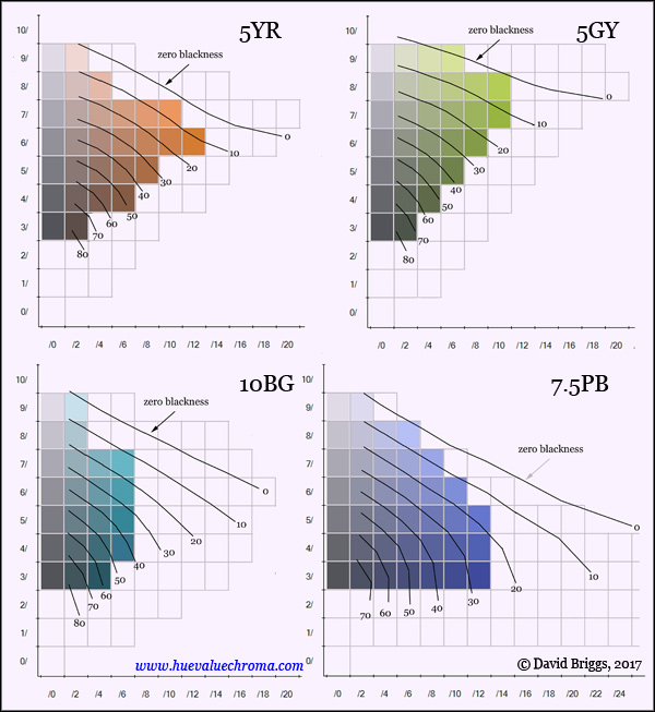
Figure 1.8.4. Lines of uniform blackness on the NCS Y50R, G50Y, B50G and R50B hue pages, each projected onto the nearest Munsell hue page, 5YR, 5GY, 5BG and 7.5PB respectively (after Billmeyer and Bencuya, 1987). Colours represented in the Munsell Book of Colour Matte Edition shown in colour (NCS chips are also matte); limits of optimal colours shown as grey grid.
Billmeyer and Bencuya (1987) examined the relationship between the NCS system and the Munsell system. Lines of uniform NCS blackness descend obliquely outwards on each Munsell hue page at an angle that varies according to hue. The zero blackness line passes just above the highest matte Munsell chips and thus describes an unevenly conical form in hue-value-chroma space.
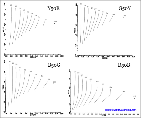
Figure 1.8.5. Munsell value and chroma of uniform chromaticness series on four NCS hue pages, Y50R, G50Y, B50G and R50B (after Billmeyer and Bencuya, 1987).
Based on the analysis by Billmeyer and Bencuya (1987), lines of uniform NCS chromaticness approximately track lines of uniform Munsell chroma (i.e. are subvertical) for light colours, but swing around to approximate lines of uniform saturation for colours of very low white content (Fig. 1.8.5).
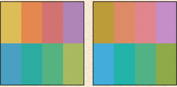
Figure 1.8.6. A. Eight colour swatches of identical NCS blackness (30) and chromaticness (30) from the NCS Digital Colour Atlas 1950 (2007). B. Eight colour swatches of identical lightness and chroma, with hues similar to, and Munsell value and chroma close to the average of, the swatches in A. After an experiment by Green-Armytage (2006).
Because of the primary importance of lightness in image perception and image making (Section 1.3), systems like the Ostwald and NCS that lack this dimension have found much less favour with painters than lightness-based systems such as Munsell and Lab space. The Ostwald and NCS systems however have had considerable influence in various fields of design such as environmental design. Sets of colours of equal NCS nuance (equal black/ white/ chromatic content) are reported to be more aesthetically-pleasing for many observers than sets of equal value and chroma (Fig. 1.8.6). In addition to the unity imparted by their shared black/ white/ chromatic content, these sets of colours maintain the relative lightness relationships shown by the full colours of each hue (yellow lightest, etc.). Sets of colours related in this way have long been labelled a "concord", in contrast to a "discord" where the "natural order" of lightnesses of the different hues is disrupted (Carpenter, 1915).
Brilliance
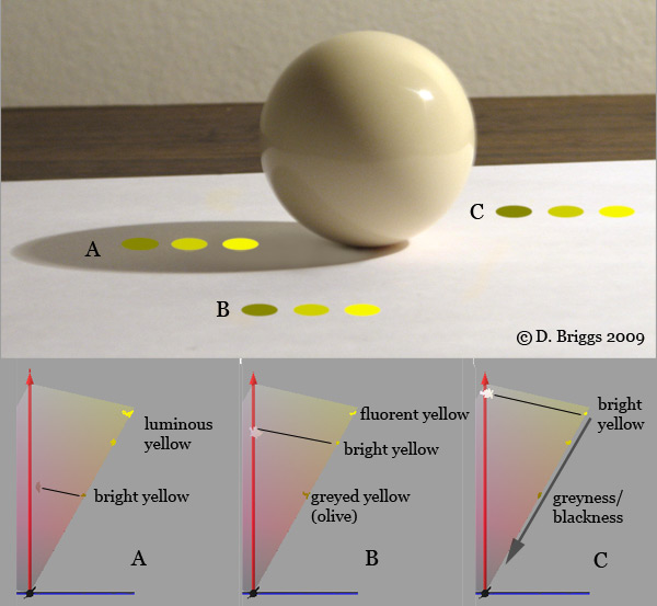
Figure 1.8.7. Identical sets of three ellipses of varying luminance overlaid on three differently illuminated areas of a photograph. In each case the dot that is close to the brightness of the surrounding white paper looks like a bright or zero-blackness yellow dot; the less luminant dots look olive-coloured, and the more luminant dots look fluorent or luminous.
Hering and Ostwald stressed that dark colours like brown and olive are not merely low in brightness, but have a distinct perceived attribute, blackness, that is only experienced when bright colours are simultaneously seen in other parts of the visual field. They also clearly understood that the perceived black content of a stimulus is a function of its brightness relative to that of the surround, and that as the relative brightness of a stimulus increases, the perception of blackness diminishes and is replaced by the perception of luminosity. Ostwald demonstrated this point by reference to an experiment by Hering that is well worth doing personally:
"The only materials required are a piece of strongly colored paper (ideally lemon yellow) and a larger piece of opaque white paper with an opening in the center of about 2 cm diameter. Place the [yellow] paper horizontally on a table, facing toward light and hold the white paper at a distance of 10 to 20 cm above the yellow paper so that for the eye the colored one is completely covered and the yellow color is only visible in the cut-out in the white paper. If the white paper is kept horizontal, the resulting yellow appears normal, i.e., just like that obtained by direct viewing of the yellow paper. If its angle toward the light is changed in a manner resulting in a steady increase of illumination, whereby it is important to assure that no shadow falls on the yellow paper below, the yellow in the opening changes. It becomes steadily grayer and its color can, with a properly selected arrangement, that is, when the illumination of the white paper in the optimal position is much stronger than that of the yellow below, appear different all the way to a blackish olive-green. If the white paper is angled in the other direction so that it is less illuminated the yellow paper at first assumes its normal appearance and with increasing shadowing of the white paper its appearance changes to a luminous light yellow, a yellow that cannot be produced with pigments.
In this situation, the composition and intensity of the light rays reflected from the yellow paper into the eye has not changed during the experiment; only the surround in which the yellow color appears has changed in its brightness. Nevertheless, the color of the objectively unchanged yellow has changed within very broad limits and in particular has demonstrated all those changes that can be experienced when the same yellow and a black are mixed in various ratios on a disk mixture apparatus." (Ostwald, 1916, tr. Kuehni, 2010).
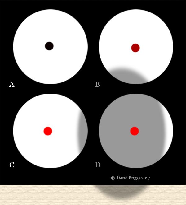
Figure 1.8.8. Illustration of Evans' experiments exploring the attribute of brilliance. Observers saw in isolation a bipartite field consisting of a central stimulus surrounded by a much larger achromatic stimulus that appeared white. The luminance of the central stimulus could be varied without changing its chromaticity. As its luminance was raised the central stimulus in turn reached the threshold of blackness (A), a series of colours with perceived black content (B), and then a colour that lacked perceived black content (C). With further increase in relative luminance (suggested in this illustration by shading the field), perceptions of fluorence (D) and eventually luminosity were reached.
In his book The Perception of Color (1974) and a series of earlier papers, Kodak scientist Ralph Evans introduced the term brilliance for this scale from blackness to luminosity. Evans devised a powerful variation on Hering's demonstration, in which observers saw a bipartite field consisting of central stimulus surrounded by a much larger achromatic stimulus that appeared white (Fig. 1.8.8). The central stimulus could be adjusted through a very wide range of luminances and chromaticities by using neutral and coloured filters, while the luminance of the surround was held constant. Evans found that provided that the central stimulus differs from the surround, this arrangement of just two stimuli is sufficient to evoke not just brightness perception, but two distinct additional perceptions, lightness (greyscale value) and brilliance. For a given surround luminance, any luminance of the central stimulus below a certain threshold (Evans' black point, B0) was perceived as being black, and increasing the luminance above this threshold evoked decreasing perceived black content (Evans' greyness) up to a point where perceived black content disappears (Evans' zero greyness, G0). This point of zero black content is independent of lightness, in the sense that it occurs at varying lightnesses for monochromatic stimuli of different hues and for stimuli of the same hue and different saturations. Increasing the luminance above this level results in the perception of a fluorescent object colour (Evans' fluorence) and eventually the perception of a light source. Evans (1974, p.167) considered that black content in the Ostwald system was equivalent to brilliance, and that colours of zero black content in the ideal Ostwald system were at his G0.
Like lightness, brilliance is a perception of relative brightness, but whereas lightness is brightness "judged" relative to the brightness of a similarly illuminated white object, brilliance is brightness "judged" relative to the maximum brightness possible or at least commonly encountered for a similarly illuminated object of the same hue and saturation (Fig. 1.8.7). The word "judged" should in neither case be taken to imply conscious reasoning: perception of brilliance/blackness, like lightness, is immediate and automatic. Brilliance is not currently defined or discussed in the International Lighting Vocabulary, but the following provisional definition can be offered based on Evans (1974).
Brilliance: relative brightness of an area judged on a scale of appearance proceeding from black through decreasing blackness (or "greyness") to fluorent (fluorescent-looking) and then self-luminous. Brilliance "may be considered negative for grayness and positive for fluorence, or simply continuous from the black point" (Evans, 1974, p. 100).
Lines of equal blackness descend steadily with increasing chroma for all hues to a greater or lesser extent (Fig. 1.8.4). Consequently in each horizontal row on a Munsell hue page brilliance increases to the right with chroma, least rapidly for yellowish colours, most rapidly for bluish colours. This increase in brilliance is perceived by many observers as an increase in brightness and lightness, an effect known as the Helmholtz-Kolrausch effect. However students quickly learn to distinguish this "colour glow" from luminance, and are able to correctly match colours of equal luminance and Munsell value through the hue page exercise in the New Munsell Student Colour Set and through practice matching paint mixtures to a Munsell grey scale.
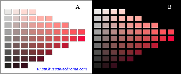
Figure 1.8.9. Munsell 5R digital hue page from http://www.andrewwerth.com/color/ against white and black backgrounds.
The perceived brilliance of an object, like its perceived lightness, is influenced by the lightness of its immediate background. A Munsell N9 chip appears white on a black background but appears light grey (that is, lower in lightness and higher in blackness) when viewed on an N9.5 (lighter white) background. In a Munsell hue page the highest chips in each chroma column appear "bright" with little black content on a white surface, but the same chips appear distinctly fluorent placed on a black surface (Fig. 1.8.9). In addition, most areas of the visual field can be made to appear self-luminous if they are viewed in complete isolation through a small aperture in a dark screen.