
my colour short course is
now offered online through
Australia's National Art
School in Sydney! There's
a choice of two sessions to
suit every time zone. LINK
Home
The Dimensions of Colour
Basics of Light and Shade
Basics of Colour Vision
Additive Mixing
Subtractive Mixing
Mixing of Paints
Hue
- Aristotle to Newton
- The Artist's Colour Wheel
- Hue Circles Based on Opponent Colours
- Hue Circles Based on Additive Complementaries
- Hue Circles Based on Pigment-mixing Complementaries
- Orthogonal Systems
- Warm and Cool Hues
Brightness and Saturation
Principles of Colour
Afterthoughts
Glossary
References
Contact
Links
NEXT COLOUR
WORKSHOPS

WARM AND COOL HUES
In traditional colour theory the adjectives "warm" and "cool" are very commonly used to label distinctions of hue, for example "warm yellow" for reddish yellow and "cool yellow" for greenish yellow. These associations of hue with perceived temperature clearly refer to psychological perceptions rather than physical properties. They can plausibly be explained in terms of correlations with natural phenomena, but when felt strongly could perhaps be considered a mild form of synesthesia. As is typical of that condition, an individual who perceives warm/cool associations of hues can be adamant that the association they perceive is objective and obvious, yet another individual can perceive a different or even precisely opposite association. The most striking instance concerns bluish hues. While there is a firm consensus that bluish hues as a whole are cool, one camp within traditional colour theory regards a reddish blue like ultramarine as clearly a warm blue and a greenish blue like phthalocyanine blue as clearly a cool blue, while another camp vigorously defends the obvious truth of the opposite associations. One can also find earnest though generally less strident disagreements on internet forums over which is the true warmest hue: yellow-orange, orange, or red-orange?
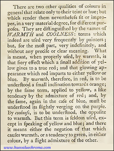
Figure 7.17. Extract from Robert Dossie's The Handmaid to the Arts (1758).
These divergent opinions have deep historical roots. In one sense the association of temperature with colours can be traced back through the Renaissance, Middle Ages and Classical Antiquity in the linking of various chromatic and achromatic colours with the four "elements" fire, air, water and earth. However an association specifically with hue had to wait until, thanks to Newton, artists first saw their range of hues laid out as a circle. John Gage (1999, p. 22, note 7) stated that the earliest example known to him was in a German lexicon from 1727 that records that painters call bluish colours cold and yellowish colours warm. Robert Dossie in The Handmaid to the Arts reveals that already by 1758 the terms "warmth" and "coolness" were "used very frequently by painters; but, for the most part, very indefinitely, and without any precise or clear meaning". Dossie however maintains that when "properly used" both terms refer to distinctions of hue in such a way that red, yellow or especially both incline a hue to warmth, and green inclines both blue and yellow to coolness (Fig. 7.17).
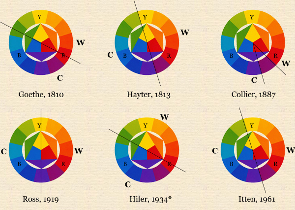
Figure 7.18. Six warm/cool classifications of the hues of a traditional 12-hue colour wheel (from Itten), showing the hues deemed warmest (W) and coldest/coolest (C) by their authors. [*Hiler (1934) states that his hue classification is based on unpublished presentations by the colour theorist Percyval Tudor-Hart].
In his Farbenlehre of 1810 Goethe correlated warmth/coldness (among many other associations) with his yellow/blue "polarity"; red was neither warm nor cool in itself but "augmented" or intensified both hues. Charles Hayter (1813) was the first to show a warm-cool division in a hue circle, placing the dividing line at yellow/yellow green and purple/red purple, the position also adopted by Itten (1961). Other authors have placed this division in relation to the hues of the traditional colour wheel anywhere from within red and green (e.g. Hiler, 1934) to within yellow and violet (e.g. Ross, 1919). Other classifications not shown in Fig. 7.18 divide the traditional hue circle unequally between warm and cool, or treat some hues as neither warm nor cool. Correlated with these variations, the coolest hue of the traditional 12-hue circle has been regarded as blue, blue green or blue-violet, and the warmest as orange, red-orange or yellow-orange. Additionally, a less common view based on the sequence of hues seen in the spectrum maintains that violet and red are the coolest and warmest hues respectively (e.g. Collier, 1887). Thus as a descriptor of hue distinctions, "warmer/cooler" is ambiguous in relation to six to eight hues of the traditional 12-hue circle.
This ambiguity is compounded when the expressions "warm" and "cool" are used in a vague way that might refer to either hue or chroma. In this quite common situation, when a painting teacher tells a student that "that reddish area needs to be warmer", the instruction could mean either that the hue is correct but the chroma is too low, or that the chroma is correct but the hue needs to be changed. Either way it probably means that the teacher is not thinking clearly in terms of a three-dimensional space of colours. The use of "warm"/ "cool" for distinctions of chroma also has a long history: Jacob le Blon's Coloritto of 1725 mentions that painters use the expression "cold" for flesh colours that are too neutral and need more of the principal colourant.
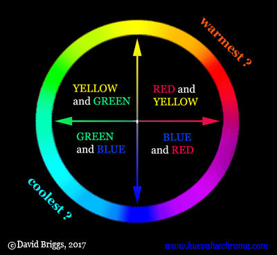
Figure 7.19. Interpretation of warmest and coolest hues suggested in the text based on the usual classifications of the four unique hues, yellow, red, blue and green. In modern colour science hues are not considered to reside in the wavelengths of the spectrum; rather, all hue perceptions are considered to be created by the visual system.as combinations of yellow/blue and red/green colour-opponent perceptions or "signals".
Of the four unique hues that are considered in modern colour science to be the fundamental components of our hue perceptions, yellow and red are usually both classified as warm in traditional colour theory, and green and blue are usually both classified as cool. (Exceptions are relatively few but include Goethe and Hiler, who aligned warm/cool with yellow/blue alone, and at the opposite extreme Ross, who deemed yellow to be neither warm nor cool). Thus the yellow/blue and red/green opponent pairs both have consistent warm/cool polarities in the majority of classifications. On this basis one could suggest that the warmest hue is the hue having both yellow warmth and red warmth (orange) and the coolest hue is the hue having both blue coolness and green coolness (blue-green). These two hues are only directly opposite on a hue circle structured according to hue opponency, such as the Scandinavian NCS hue circle. By this view a greenish blue would be a cool blue and a reddish blue would be a warm blue, as in many classifications going back to Dossie (1758).
Although this solution might be satisfying to some, examination of discussions on the internet shows that many painters nevertheless report that they feel greenish blue to be an unmistakably warm blue. This perceived warmth is sometimes attributed to the yellow that a greenish blue "contains" according to traditional colour theory (based on a failure to understand the concept of subtractive mixing). A different explanation, based on the assumption that hues are not a cycle of perceptions generated by an opponent process within the visual system (as modern colour science holds) but instead reside in the linear physical spectrum itself, maintains that greenish blue is warmer than reddish blue because the former hue is "located" closer to the red end of the spectrum (e.g. Hicks, 2013).
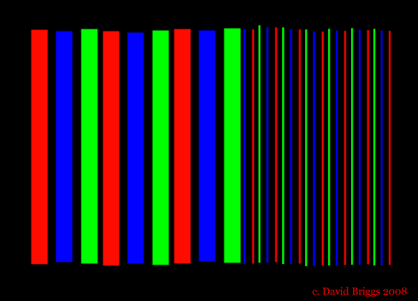
Figure 7.20. Simple demonstration of chromostereopsis. For many observers the red bars seem to be on a nearer plane than the blue bars.
Traditional colour theory teaches that warm colours advance and cool colours recede. This idea has a perceptual basis, particularly in the context of the spectral conception of the warm-cool polarity, in the phenomenon of chromostereopsis. This phenomenon results from the effect on our stereoscopic vision of the different focal points of long and short wavelength rays, causing a red object to appear to be on a distinctly nearer plane than an equidistant blue object for the majority of observers. Professor Akiyoshi Kitaoka has published some examples that will be quite striking for most observers on his website here, here and here. Some of the controversy over the contribution of hue to perceptions of advancing and receding colours may stem from the fact that not all individuals experience chromostereopsis. A second contributing factor (and the sole factor for individuals who do not experience chromostereopsis) is that areas that are relatively high in chroma and lightness can seem to "come forward" in the sense of being visually more insistent than other areas, and orange-red, orange and yellow paints attain higher chroma-lightness combinations than paints of other hues.
While "warm" and "cool" certainly refer to widely held psychological associations of colours, the inconsistent associations they hold for different individuals make them problematic for labelling hues in a classroom. Clearly it is important to avoid a situation where the teacher says "warm blue" and half the class thinks reddish blue and the other half thinks greenish blue. The teacher could try to legislate a position, such as defining the warmest and coolest hues as orange and blue green respectively, but no matter what choice is made, many in their audience will think the choice is crazy, at least in relation to blues. Even if one feels strong warm/cool associations of colours, in the interests of clarity it seems wiser to speak of reddish and greenish blue rather than warm and cool blue, and so on. The terms warm and cool remain useful however for labelling near-neutral colours of lights or objects where the precise hue is not obvious and either not yet determined or not important. The terms are of course also appropriate, provided their fine-grained ambiguity is acknowledged, for questions touching on the psychological associations of colour, including expression and composition.
Some painters refer to the warm/cool distinction as "colour temperature" but this invites confusion with the more common and CIE standard use of this term for colours of lights, in which red, orange and yellow lights have lower colour temperatures than bluish lights. Colour temperature in this usual sense refers to the temperature in degrees Kelvin of an ideal heated body (black-body radiator) that radiates light of a similar hue.
Modified May 30, 2017.