
my colour short course is
now offered online through
Australia's National Art
School in Sydney! There's
a choice of two sessions to
suit every time zone. LINK
Home
The Dimensions of Colour
Basics of Light and Shade
Basics of Colour Vision
Additive Mixing
Subtractive Mixing
Mixing of Paints
Hue
- Aristotle to Newton
- The Artist's Colour Wheel
- Hue Circles Based on Opponent Colours
- Hue Circles Based on Additive Complementaries
- Hue Circles Based on Pigment-mixing Complementaries
- Orthogonal Systems
- Warm and Cool Hues
Brightness and Saturation
Principles of Colour
Afterthoughts
Glossary
References
Contact
Links
NEXT COLOUR
WORKSHOPS

7.3 HUE SYSTEMS BASED ON OPPONENT-HUE RELATIONSHIPS
- Introduction
- Goethe's hue system
- Hering and Ostwald
- The NCS system
- An opponent-hue "artists' colour wheel"
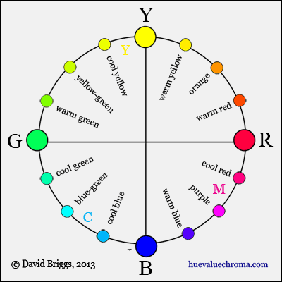
Figure 7.3.1. An opponent-hue "artists' colour wheel", showing the hue categories currently in wide use among painters arranged in a full opponent-hue framework with the green psychological primary included (see below). This arrangement restores the underyling symmetry of hue perceptions that is lost in the traditional "artists' colour wheel". C,M,Y = best available colourant-mixing primaries.
Introduction
According to the opponent theory proposed by the German physiologist Ewald Hering (1834-1918), all hues we experience are combinations of adjacent pairs of the four psychological primary or unique hues, red, yellow, green and blue, and no hues are combinations of yellow and blue, or red and green. In the widely accepted modern zone theory, which reconciles the opponent theory with the three-receptor theory of Young and Helmholtz, these unique hues originate as red vs green and yellow vs blue signals created by the brain indirectly from the relative responses of the three cone cell types. Thus while the number three is the key to questions involving colour stimulus (additive and subtractive mixing), four is the key to colour experience, and there is no simple relationship between these two kinds of "primary colour". The three historical primaries, red, yellow and blue, seem to represent an unconscious confusion of the two concepts (section 6).
An opponent-hue system is structured around the four psychological primaries and their opponent relationships. We automatically use an opponent-hue system as a frame of reference in everyday speech: when we say that a colour is a slightly yellowish green or greenish yellow, we are describing that colour in relation to an implicitly recognized unique hue. Notice that we never say "bluish yellow", even if we have been thoroughly indoctrinated with the historical primaries! Opposing hues in opponent-hue systems are opposite experiences having no perceptual components in common. Perhaps counterintuitively, the four unique hues are not equally spaced perceptually (see Fig. 7.3.8B below), and while unique yellow and unique blue are also near opposites in both additive and perceptually-spaced systems, unique red and unique green are not.
In addition to pure opponent-hue systems, a number of quasi-opponent systems have been devised in which the primaries or chroma axes coincide roughly but not exactly with the four psychological primaries. The historically important Ostwald system was strongly influenced by Hering, but also incorporated additive complementary relationships in its hue circle, which is structured around four primaries known as yellow, red, blue, and "seagreen". Later quasi-opponent hue systems are seen is the additive CIE L*u*v* system and the perceptually-spaced CIE L*a*b* system and CIECAM02 colour appearance model. In the Lab colour space used in Photoshop, the a axis represents crimson (+) vs green (-) chroma and the b axis represents yellow (+) vs blue (-) chroma.
An opponent-hue framework is especially relevant for questions involving our mental experience of colour, such as arise in the interrelated fields of:
- colour psychology: studies testing the mental and physiological effects of colours.
- colour symbolism: investigations of the symbolic use of colour in different historical and cultural contexts.
- colour expression: theories of the "meaning" of colours, often purporting to draw to some extent on studies of the first two types.
Goethe's hue system
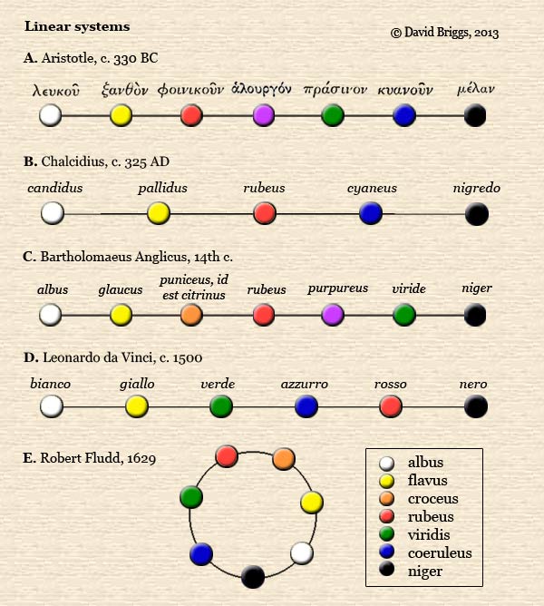
Given that the four psychological primaries are the basic building blocks of our experience of hue, it is not surprising that they turn up repeatedly in colour order systems long before their explicit recognition by Hering and his contemporaries. In the middle ages Theodoric of Freiberg saw these four hues as the colours of the rainbow (Kuehni and Schwarz, 2008, p. 36), and the same four appear alongside white and black as the simple colours in the systems of Leonardo (Fig. 7.1.2D) and Forsius (Fig. 7.1.3E) (section 7.1). (They have also been seen by some in the system of Alberti, though it seems more likely that his four simple colours were intended to be red, green, blue and grey). Credit for a major step towards the concept of opponency must go to Goethe, whose theory of the origin of colours is based on an explicitly opponent relationship of the yellow and blue primaries (Fig. 7.3.2A). For a very concise summary of the essence of this theory please see this paragraph.
Hooke and Huygens had previously suggested that yellow and blue were the two fundamental primary colours, but Goethe also came close to recognizing red and green as pure or simple colours, despite believing the latter to be a mixture of yellow and blue, and his theory indirectly contrasts pure red (his purpur), seen as the result of "augmentation" or reddening of both blue and yellow, with middle green, seen in his theory as a balanced, simple mixture of the two (Fig. 7.3.2B).

Figure 7.3.2. Quotes from Goethe's writings concerning yellow, blue, red and green.
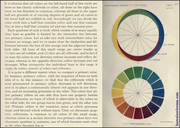
One might say that despite his theory of the origin of colour, which itself has no physical or psychological validity, our innate opponent framework of colour perception made its presence felt in Goethe's choice of hue terms to describe that theory. This opponent framework emerged most openly in his section on colour terminology, where he proposed a fully opponent system of 12 hue names formed as combinations of the four symmetrically arranged hues red, yellow, green and blue, in which no hue names are combinations of yellow and blue, or red and green (Fig. 7.3.3A, B). Goethe himself pointed out that this four-hue system is suggested by the German language itself.
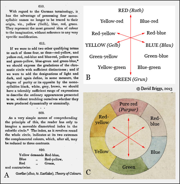
Figure 7.3.3. Goethe's 12-step opponent system of hue terminology (B) and its relationship to his three afterimage "complemental " pairs (C), indicated with red arrows in both.
Goethe's unique foreshadowing of opponency is sometimes confused with his discussion of afterimage complementary ("complemental") colours, which were already known in the eighteenth century. Goethe himself must have recognized that two different kinds of opposite relationship were involved, as two of his complemental pairs diverge from his primordial opposition of yellow vs blue (Fig. 7.3.3B,C). [In Goethe's theory these oppositions would be considered subjective and objective respectively]. The third complemental pair, recorded as "purpur"-green, on the other hand was made to align with the red-green axis by using the term "purpur" with two distinct meanings. Unique red and unique green are not additive or afterimage complements - the complement of middle green is magenta and vice versa. "Purpur" literally means "purple", and is the name Goethe used for the magenta afterimage-complement of "balanced" green, and also for a magenta colour appearing in edge spectra that, in modern terms, is the additive complement of spectral green (Fig. 7.3.4). However "purpur" also has an important place in Goethe's theory as the ultimate degree of the "augmentation" or reddening of both blue-red and yellow-red, and in this role is necessarily as well as explicitly described as an absolutely pure red, neither yellowish nor bluish (Figure 7.3.2B). Consistently with the latter, it is also described as being the colour of fine carmine, intermediate between the slightly bluish and slightly yellowish varieties of the colourant (Goethe, Theory of Colours, 796, 799-800). Goethe used "purpur" as a "weasel word" that could be defined as pure red (about Munsell 5R), but could be stretched where needed to include the distinctly bluish (magenta) afterimage and additive complements of green (roughly Munsell 10P to 5RP).
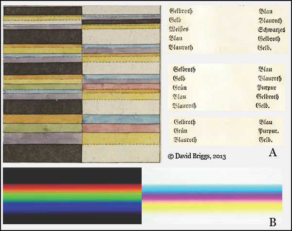
Figure 7.3.4. A. Goethe's illustrations of the edge spectra seen when a white band on a black background (left) and a black band on a white background (right) are observed through a glass prism from various distances (Theory of Colours, 243-6, pl. 2). In Goethe's view the green in the middle of the lower two light spectra is formed by mixing of the yellow and blue fringes seen separately in the upper view (see explanation to Fig. 6.2.6). The magenta colour labelled "purpur" in the middle of the corresponding 'dark spectra' is in modern terms the additive complement of this green. B. Simulation of Goethe's experiment.
Hering and Ostwald
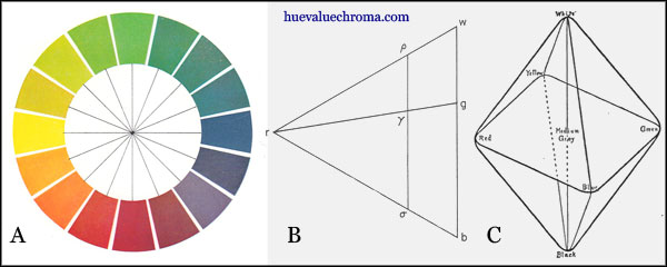
Figure 7.3.5. A, Hue circle and B, diagrammatic hue page showing a colour specified in terms of black (b), white (w) and full colour (r) components (Hering, Outline of a Theory of Light Sense, tr. Hurvich and Jameson, 1964). C. Hering's six fundamental colours arranged in a distorted octahedron, from Ebbinghaus' Psychology, an elementary text-book (1908), translated from his German text of 1897.
In the original opponent theory of Ewald Hering, white and black, together with red, yellow, green and blue, were regarded as the six fundamental colours of visual perception. In Hering's view, all colours could be considered as mixtures of full colour (pure hue), white and black components (Fig. 7.3.5B). This was a major departure from most other systems, which instead used relative or absolute lightness or brightness as an important dimension. Hering did not attempt to provide colour samples arranged according to his system, apart from his purely illustrative hue circle (Fig. 7.3.5A, Fig. 6.2.9).
As Hering himself noted, several other 19th century psychologists had already settled on red, yellow, green and blue as the four fundamental hues, and the four-hue system began to appear frequently in psychology texts from around the turn of the century, including those of both Hofler and Ebbinghaus in 1897 (Fig. 7.3.5C) and Titchener in 1901 (Kuehni and Schwarz, 2008, pp. 101-3). Nevertheless, Hering's theory was still often presented as a less likely alternative to the trichromatic theory of Helmholtz and others until the idea that the two could be combined in some form of zone theory eventually gained general acceptance, particularly through the efforts of Leo Hurvich and Dorothea Jameson in the 1950's. The four psychological primaries are now explicitly acknowledged in the official definition of the word "hue" by the Commission Internationale de L'Eclairage (CIE) as "the attribute of a visual sensation according to which an area appears to be similar to one of the perceived colours, red, yellow, green and blue, or a combination of two of them".
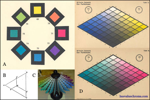
Figure 7.3.6. Ostwald system. A, Ostwald's four principal and four intermediate hues from his Die Farbenfibel (1917) . B, Analysis of a colour into white (d), black (e) and full colour (f) components, from his Einfuhrung in die Farbenlehre Vol 2 (1919). C, model of the Ostwald system showing double-cone form (wikipedia). D, Blue/yellow and seagreen/red hue pages from Ostwald's colour atlas, Der Farbkorper (1919).
Wilhelm Ostwald (1853-1932) published the first atlas of colour samples influenced by Hering's opponent theory. Ostwald followed Hering in classifying colour in terms of white/black/full-colour content, and structured his hue circle around four principal hues, but in order to make opposing colours additive complements, the place of the green psychological primary was taken by a bluish green known as "sea green". The Ostwald system was widely used in art education in the middle decades of the twentieth century, was the official system for all levels of art education in Great Britain between the wars (Fig. 7.3.7A), and was promoted worldwide in many popular books on colour for artists by authors such as Faber Birren. The system was gradually abandoned in the scientific community beginning in the 1940's, and by the time the quasi-opponent CIE L*a*b* and CIE L*u*v* systems were developed in the 1970's, the tide had turned strongly against the inclusion of techincal elements in general in art education. In recent decades the three primaries of "traditional" colour theory have become so prevalent in the education systems of most countries that many artists today assume that they have been used universally for centuries.
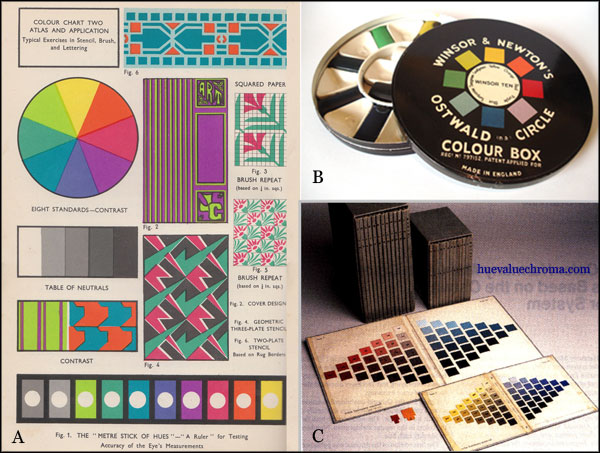
Figure 7.3.7. A. Colour plate from Colour Practice in Schools by O.J. Tonks, Winsor and Newton, London, 1934. B. An Ostwald watercolour box, by Winsor and Newton, c. 1930's. C. The Color Harmony Manual, a spectacular colour atlas based on the Ostwald system, sold by the Container Corporation of America from 1946 to 1972.
The NCS system

Figure 7.3.8. A. Opponent-hue circle from Johansson's Den allmanna farglarans grunder (1937). B, Hue circle from Hesselgren's Fargatlas (1953), structured around the psychological primaries, but also expressing perceptual hue spacing by placing varying numbers of hues in the four quadrants.
A different Hering-inspired approach was suggested in 1937 by the Swedish physicist Tryggve Johansson (1905-1960). Johansson designed an opponent hue circle (Fig. 7.3.8A) that could be used in three alternative systems in combination with dimensions of (1) chroma and lightness, (2) saturation and lightness, and (3) chroma and "cleanness" (a converse of black content). The Swedish architect Sven Hesselgren (1907-1993) produced an atlas of colour samples using the second of these proposals, but although Hesselgren's hue circle was likewise structured around purely opponent hue axes, it also expressed perceptually-equal spacing by placing varying numbers of hue divisions in the four quadrants (Fig. 7.3.8B). Later both Johansson and Heselgren contributed to the development of the Swedish NCS system, in which both the hue circle and the hue pages are structured in line with Hering's system (Kuehni and Schwarz, 2008).
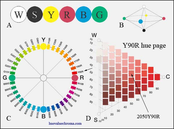
Figure 7.3.9. A, Elementary colours of the NCS System. B, Symmetrical double cone form of the NCS System. C, Hue circle of the NCS System. D, Y10R colour triangle, showing location of the colour 2050 Y90R. Source: http://www.ncscolour.com.
The Swedish Natural Colour System (NCS), first published as an atlas in 1978, is an important modern colour order system of the pure opponent-hue type, in which colours of each hue are classified according to Hering's system of pure hue/white/black content. The system is embodied in a commercially available atlas and other products in which Hering's opponent hues are displayed as specific "elementary" colours (Figure 7.3.9A). Hue is specified in terms of percentage steps around the NCS hue circle clockwise from the preceding elementary hue (Figure 7.3.9C). Variations ("nuances") in each hue are depicted on a triangular diagram in terms of white, black and coloured components, and specified in decimal amounts of black (S or "blackness") and of colour (C or "chromaticness") (Figure 7.3.9D). The third, "whiteness" component makes up the remainder and so does not need to be specified. The resulting system has the form of a symmetrical double cone (Figure 7.3.9B) in which all full colours are located on the equator. The system does not represent the dimension of lightness (value), which limits its usefulness for most painters, but it nevertheless enjoys wide popularity as a reference system for architects, designers and paint manufacturers (Kuehni and Schwarz, 2008, p. 110), and is the national standard in Spain, Sweden and Norway.
An opponent-hue "artists' colour wheel"
The four psychological primaries and their opponent relationships are central to our modern understanding of colour vision, but are ignored in most accounts of "traditional" colour theory for artists. Such accounts, however, commonly define or use the three historical primaries in the same way that the psychological primaries are defined, as perceptually pure hues, (e.g. in Itten's colour theory), and when painters think of their paint hues in terms of "warm" and "cool" reds, yellows and blues, they are actually using an incomplete opponent-hue framework, with the green psychological primary missing. This omission distorts the psychological opposition of yellow vs blue, and destroys the underlying symmetry of hue perceptions. Figure 7.3.1 (top of page) shows widely used painters' hue terms arranged in a full opponent-hue framework with the green psychological primary included. This arrangement offers some improvement over the hue spacing of the traditional colour wheel, restores the true psychological oppositions and the symmetry of hue perceptions, and clearly distinguishes the four psychological primaries from the three colourant-mixing primaries. In doing so it of course does not display exactly equal perceptual spacing, or colourant-mixing complementaries.
There is a good consensus among painters that a middle red lies between cadmium red (warm) and alizarin or quinacridone crimson (cool), middle yellow lies between cadmium yellow medium (warm) and lemon yellow (cool), and middle green lies between phthalocyanine green YS (warm) and phthalocyanine green BS (cool). These painters' conceptions of the psychological primaries lie at about 5R, 5Y and 5G respectively on the Munsell hue scale. There is also a good consensus that middle blue lies at about the hue of cobalt blue (Munsell 5PB), between the hues of ultramarine blue and phthlocyanine blue, although there are two opposed traditions regarding the warm-cool polarity of this pair. What I take to be the majority view regards ultramarine as the warm blue, and in Fig. 7.3.1 would align the warm-cool axis with the orange/blue-green direction, and place the warm-cool transition/ boundary/ no-man's land at right angles to this at purple/yellow-green.
Modified July 28, 2013. Original text here.