
my colour short course is
now offered online through
Australia's National Art
School in Sydney! There's
a choice of two sessions to
suit every time zone. LINK
Home
The Dimensions of Colour
Basics of Light and Shade
Basics of Colour Vision
- Introduction
- Trichomacy and Opponency
- Adaptation and Successive Contrast
- Colour Constancy
- Simultaneous Contrast and Assimilation
Subtractive Mixing
Mixing of Paints
Hue
Lightness and Chroma
Brightness and Saturation
Principles of Colour
Afterthoughts
Glossary
References
Contact
Links
NEXT COLOUR
WORKSHOPS

SIMULTANEOUS CONTRAST AND ASSIMILATION
Simultaneous contrast and assimilation refer to the tendencies of the visual appearance of a surface colour to be influenced by adjacent and interspersed colours respectively. The causes of both of these slight failures of colour constancy are still under active scientific investigation. Both may be broadly regarded as reflecting the fact that our visual system does not work like an objective measuring device, sending raw light and colour data to the brain. We see always by comparisons.
In simultaneous contrast the appearance of colours moves away from that of the surrounding colour in all three dimensions of surface colour - hue, chroma and lightness (Figure 3.8, 3.9, 3.10).
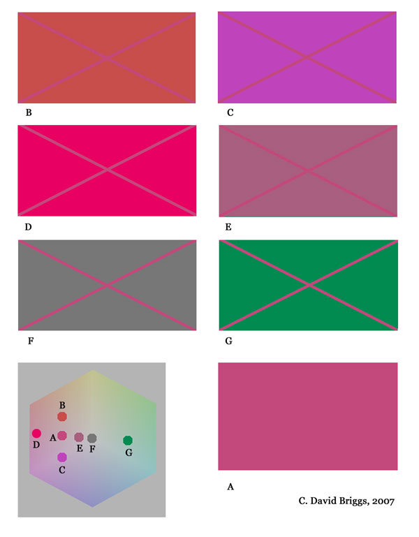
Figure 3.8. Simultaneous contrast of hue and chroma. The purplish-red colour (A) looks more purple against red (B), more red against purple (C), lower in chroma against bright purple-red (D), and progressively higher in chroma against dull red-purple (E), grey (F), and green (G).
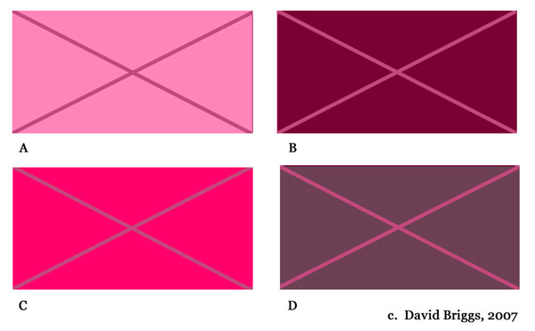
Figure 3.9. Simultaneous contrast of lightness and chroma. The same purple-red looks darker against a lighter (B) and lighter against a darker (C) colour of similar hue and chroma. The intensified change in appearance when combined with a contrast in chroma (D,E) was used in the well-known optical illusion of this form devised by Josef Albers.
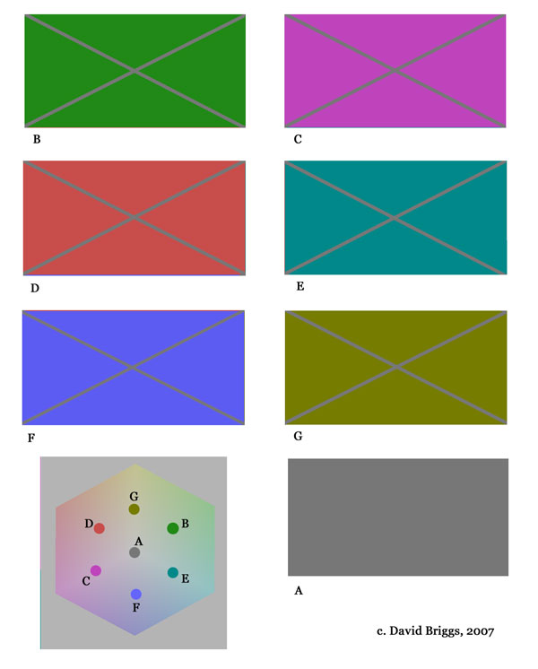
Figure 3.10. Simultaneous contrast of hue. A medium grey (A) is seen against a background of similar lightness and green (B), magenta (C), red (D), cyan (E), blue (F) and yellow (G) hue. In each case the appearance of the colour moves towards the hue of the additive complement.
An important special case of simultaneous contrast of hue is the phenomenon of complementary colours in shadows. When we have a strongly coloured main light and a neutral secondary light, the colours in the shadows of the main light shift in appearance towards the complementary of the colour of the light. (Do not confuse this phenomenon with the hobby painter's recipe of adding the pigmentary complementary of the colour of the object to get its colour in shadow). The induced complimentary effect is the basis of the artist's conventional rule of warm lights creating cool shadows and vice versa.
Simultaneous contrast is responsible for the well-known artists problem that paint mixtures may look quite different on the palette (especially a white palette) to their appearance on the painting. Experience and a growing capacity to see colours objectively can help here, as can devices such as mixing over a grey scale placed under a glass palette. The strategies of using a coloured ground closer to the tonal level of the finished painting than stark white, and of covering the canvas at an early stage with a mosaic flat colours can both minimize problems caused by simultaneous contrast on the canvas. The concept of a colour space reminds us that despite the shifting appearance of each of our colours in different surroundings, the colours in any painting nevertheless have a fixed relationship to each other (shifts due to different light sources excepted) - and it is the business of the painter to get these relationships right.
Assimilation is a phenomenon having the opposite effect to simultaneous contrast, and is seen when small areas of colour are closely interspersed. Examples include the illusions known as the Von Bezold spreading effect and neon colour spreading. In each case, surfaces change appearance by moving towards the colour of the interspersed areas.