
my colour short course is
now offered online through
Australia's National Art
School in Sydney! There's
a choice of two sessions to
suit every time zone. LINK
Home
The Dimensions of Colour
Basics of Light and Shade
Basics of Colour Vision
- Introduction
- Trichomacy and Opponency
- Adaptation and Successive Contrast
- Colour Constancy
- Simultaneous Contrast and Assimilation
Subtractive Mixing
Mixing of Paints
Hue
Lightness and Chroma
Brightness and Saturation
Principles of Colour
Afterthoughts
Glossary
References
Contact
Links
NEXT COLOUR
WORKSHOPS

COLOUR CONSTANCY
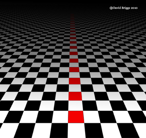
Figure 3.6. Colour constancy is a form of perceptual constancy by which we see all of the red squares depicted in this scene as having the same object colour, even though the image areas depicting them have different colours. Other forms of perceptual constancy include shape constancy, by which we see of the shapes as squares, even though none of the image areas are square, and size constancy, by which we see the all of the shapes as having the same size, even though the image areas vary in size.
A visual field generally consists of an array of light and dark areas, but which of the dark areas represent shadows, and which represent dark-coloured objects? Does a red area in the visual field represent a red object in white light, or a white object in red light? Is a particularly bright point in the visual image a light-valued surface, or a light source? We generally arrive at reliable answers to such questions instantly and automatically, without having to make a conscious effort through a capacity of our visual system known as colour constancy. Colour constancy is analogous to other kinds of perceptual constancy such as shape constancy and size constancy, by which objects are perceived to have consistent shape and size despite variations of viewpoint (Fig. 3.6).
When we look at most areas of the visual field we automatically see not a mere patch of light but a combination of an object colour (a "colour perceived as belonging to an object", CIE, 2011, 17-831) and an illumination with a certain hue, brightness and saturation, and perhaps also a modifying effect of atmosphere. This object colour is the way in which we perceive the object's material property of spectral reflectance. For example, a white sheet of paper viewed clearly under yellow illumination is usually perceived as being white, the yellowishness of the appearance being automatically and unconsciously attributed to the colour of the illumination. A white sheet of paper viewed clearly in dim illumination is also usually perceived as being white, the darkness of the appearance similarly being attributed to the level of illumination.
Whatever their (highly disputed) nature, these pre-conscious processes are effective enough to give object colours a high degree of stability under moderate variations of illumination and atmosphere. The combination of effortlessness and stability creates and maintains the illusion that object-colour attributes reside in objects themselves, where we directly and passively "see" them. Though they seem to be detected directly and passively, these mentally generated object-colour attributes are more like elements of a 3D computer model projected by our minds onto the external world.
Colour constancy is variably effective. Under weakly coloured illuminants, an array of object colours may seem to approximately maintain their perceived hues, but changes in lightness in relation to each other are inevitable (see Figure 10.8, slider near middle of scale). Object colours close to the hue of the illuminant tend to appear relatively lighter; while those of dissimilar hues tend to appear darker. Under monochromatic light and under very dim illumination colour constancy fails completely. In addition, two surfaces that match under a white light may not match under a coloured light, or even under another white light with a different spectral power distribution, a phenomenon known as metameric failure. These factors can substantially alter the tonal scheme of a painting, which is why it is recommended that paintings should be executed under similar lighting conditions to those under which they will be viewed.
Brightness adaptation and chromatic adapatation provide a degree of constancy to the appearance of the visual field as a whole but should not be confused with the process of parsing visual information into object colours and illuminant, although they presumably tend to assist the latter.
Several well known "optical illusions" dramatically demonstrate colour constancy processing in action. In the checkerboard illusion by Edward Adelson (Figure 3.7A), the two areas marked A and B are actually identical in value on the image (i.e. they are the same grey image colour), but our visual system calculates that in a shadow area this grey must represent a white surface, while in the lit area the same grey must represent a dark surface, and that is how we see them. In the same way, in the cube illusion by R. Beau Lotto (Figure 3.7B), we see the same image colour as being a dark brown object colour in the context of strong lighting, and a fluorent orange in a deeply shaded context. In the cross-piece illusion , also by Lotto (Figure 3.7C), the image colour at the intersection of the two rods is actually an identical middle grey in both cases, but in the apparent context of a yellow translucent filter on the left and a blue translucent filter on the right, this is judged to be the reflectance of a blue-grey object and a yellow object respectively seen through these coloure filters.
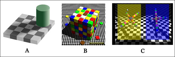
Figure 3.7. Three optical illusions demonstrating colour constancy in action (follow links for larger images). A. The checkerboard illusion of Edward Adelson. B. The cube illusion of R. Beau Lotto. C. The cross-piece illusion of R . Beau Lotto
In each case these comparisons are made unconsciously, and what we see in our normal way of looking is the inferred object colour (or "local colour"). Tonal painters have to learn above all to look at their subjects with a different attitude to normal viewing, in order to judge objectively the hue, "colorfulness", and brightness of the light coming to from each point in the subject. That is, we have to switch off one kind of processing - one that is built into our visual system, wherein each colour is compared with an inferred white - and learn a completely different kind of processing, where each colour is compared with the full range of colours in subject as a whole. With practice we can learn to switch at will between our normal mode of vision and this painter's way of seeing. But we always need to be on guard against the tendency to slip into judging colours in constancy mode, that is, to paint their perceived local colour, instead of the colour that we need to create the illusion of that colour. The problem is analogous to the difficulties encountered in foreshortening in drawing, where we also need to learn to see and draw what is actually in front of our eyes, and not what our brain works out for us.
At this point the beginning painter might ask: "well, if that's the way it looks to my eyes, shouldn't I paint it that way?" The answer to this is a definite no - if we can recreate the stimulus that created the appearance, we will create the effect the we see in our subject; if we instead chase the appearance, we will create something different.
Certain tricks or devices that are sometimes recommended for observing colour can be workable, though it is important to understand their limitations. For example, the idea that you can hold up paint on a brush, palette knife or other device and match it with your subject is in general workable only if you have some way of turning up the illumination on your brush until you can match the brightest highlight on your subject with the tone of your paint, and can keep the illumination at the same level while you compare the other colours. These methods of course eliminate the option of translating the tonal range of the subject into a your own choice of tonal level and range in your painting. Devices involving an aperture in a card that bears a greyscale or colour chips for comparison suffer from the same difficulties and limitations, and in addition run the risk of giving an excessive impression of the brightness and "colorfulness" of colours seen in isolation, though this can be avoided if the colours are continually compared with the brightest colours in the subject. The latter comparison can be made very effectively by using a blank card with two apertures, which can be moved towards or away from the observer in order to compare more and less separated points.
Other methods involve "squinting", "unfocussing the eyes" or using peripheral vision, or observing the darkened and reduced image of the subject in a flat or convex black mirror. Squinting is best understood as closing the eyes and then just opening them enough to allow a dim impression of the subject. It is generally said to work by eliminating details, allowing the artist to concentrate the relationships of the big masses of the visual field, although for myself at least, another important factor is its effect of flattening the visual field, helping me to view the subject in what psychologist David Katz called film mode, as opposed to surface mode.