
my colour short course is
now offered online through
Australia's National Art
School in Sydney! There's
a choice of two sessions to
suit every time zone. LINK
Home
The Dimensions of Colour
Basics of Light and Shade
Basics of Colour Vision
- Introduction
- Trichomacy and Opponency
- Adaptation and Successive Contrast
- Colour Constancy
- Simultaneous Contrast and Assimilation
Subtractive Mixing
Mixing of Paints
Hue
Lightness and Chroma
Brightness and Saturation
Principles of Colour
Afterthoughts
Glossary
References
Contact
Links
NEXT COLOUR
WORKSHOPS

ADAPTATION
We all know that the muscles of the iris can increase or decrease the size of the pupil in response to dimmer or brighter light respectively, but this mechanism is only a minor component of our ability to adjust to different light intensities. Alongside the shift between rod (low light) and cone vision, the main process involved is called adaptation, which refers to our ability to adjust the sensitivity of the receptor cells in the retina in response to the general level of illumination. On going into a darkened room we may at first see little or nothing, but as the sensitivity of our receptor cells slowly adjusts upwards, we begin to see more and more detail. On returning to a more brightly illuminated environment we much more rapidly (and sometimes painfully) adjust the sensitivity of those cells to the prevailing illumination.
The importance of adaptation to colour vision comes from the fact that the L, M and S cone systems can to a certain extent adapt independently to the prevailing illumination if one set of cones is more or less strongly stimulated than the others. For example under incandescent lighting, where the S cones are less strongly stimulated than the M or L cones, the former increase their relative sensitivity, causing the light to seem less strongly coloured than it otherwise would appear.
This adjustment of the input from the cones should not be (but often is) confused with colour constancy, which relates to the processing of that input into an interpretation as to the local colour of surfaces and the quality of the illumination.
AFTERIMAGES AND SUCCESSIVE CONTRAST
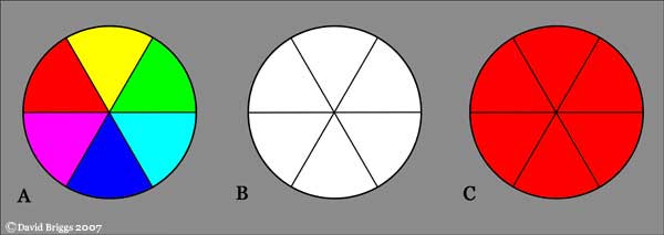
Figure 3.5. Afterimages and successive contrast. Stare fixedly at the centre of circle A for at least 20 seconds, then immediately look at the centre of circle B for about ten seconds, noting the changing afterimage. Each sector will display an afterimage the colour of the additive complement of the stimulus colour. Repeat the procedure, this time looking immediately at the centre of circle C. Now the colours of the afterimage in each sector will influence the appearance of the red colour in an example of successive contrast.
The coloured afterimages seen after exposing the eye to a coloured light for a period of time can be explained in terms of changes in the relative adaptation of the three cone types. After a period of exposure to coloured light, the cone type or types that are relatively weakly stimulated by that light, due to a paucity of certain wavelengths, become proportionately dark-adapted. When neutral light is restored, a temporary illusion of a light composed of the "missing" wavelengths is seen.
Ewald Hering discussed afterimages as evidence for his opponent model of colour vision, and very numerous subsequent authors down to the present have asserted that coloured afterimages take the colour of the opponent colour in Hering's system. They do not - they in fact take the colour of the additive complement - that colour of light that mixes with the stimulus to make white light. For example, the afterimage seen after viewing red is cyan, not green. Pridmore (2008) examines the history of this confusion, and points out that Hering himself never actually claimed that chromatic induction in coloured afterimages was an opponent process, only lightness induction. The afterimage takes the colour of the opposite stimulus, not the opposite colour experience.
The colour of an afterimage influences the apparent colour of objects viewed subsequently to the stimulus, a phenomenon known as successive contrast. For example in Figure 3.5C, the afterimages of red, yellow and magenta (the three colours that contain red light) dull the appearance of the red, while the afterimages of the other three colours intensifies it. Successive contrast thus also goes towards the additive complementary.
Successive contrast resulting from adaptation is the actual explanation of the phenomenon sometimes mislabelled "fatigue" of the eye - for example, the apparent dulling of a high-chroma red surface after being examined fixedly for a few seconds. In looking at a red object the L cones are not being "fatigued" any more than they are in looking at a white object - the effect is caused by the increased sensitivity of the other cone types.
For some effective demonstrations of coloured afterimages see here (link 1,2,3). The demonstration involving flashing colours (link 4) shows that a faint afterimage is noticeable even after a very short interval of viewing a high-chroma surface