
I'm proud to announce that
my colour short course is
now offered online through
Australia's National Art
School in Sydney! There's
a choice of two sessions to
suit every time zone. LINK
my colour short course is
now offered online through
Australia's National Art
School in Sydney! There's
a choice of two sessions to
suit every time zone. LINK
Home
The Dimensions of Colour
Basics of Light and Shade
Basics of Colour Vision
Additive Mixing
Subtractive Mixing
Mixing of Paints
Hue
Lightness and Chroma
Brightness and Saturation
Principles of Colour
Afterthoughts
- Purves and Lotto
- Modern Colour Theory
- Traditional Colour Theory
- What is Color?
- Answers
- Colour Constancy Illusions
- Colour Quiz
- What is a Colour?
Colour Education
Color Impact 2020 - Colour Attributes
- Shillito portfolio
- Dimensions Today
- Index of Works
- Psychophysical
- Shillito Paper
- Elements of Colour
- Objects and Light
-
Glossary
References
Contact
Links
NEXT COLOUR
WORKSHOPS

11.6 Colour Constancy Illusions and Painting
- Definitions
- Object-Colour Constancy
- Image Colours
- The Purves and Lotto Fallacy
- Object-Colour Constancy Through Translucent Material
- New Illusions
- Painters' Techniques and Strategies
- Summary
[00:00] In this video I'll be taking a fresh look at colour constancy illusions what they do and don't tell us about visual perception and how they illustrate a basic practical difficulty involved in painting appearances The lecture was first presented at the Colour Society of Australia Melbourne 2018 conference Perception and Colour.
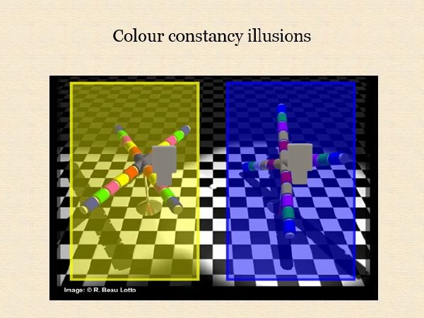
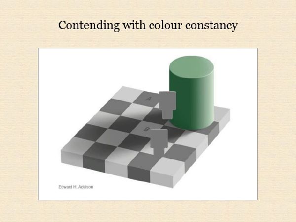
[00:24] An iconic example of a colour constancy illusion is neuroscientist Edward Adelson's checker shadow illusion published in 1995. In Adelson's words on his web page the squares marked A and B are the same shade of gray yet appear different. Neuroscientists Dale Purves and Beau Lotto produced some of the most remarkable colour constancy illusions ever published in connection with their 2003 book Why We See What We Do In these web versions of three of their demonstrations the area's isolated by the mask match physically but appear very different when the mask is removed.
Definitions
[01:26] Many discussions of colour constancy illusions have been marred by confusion of concepts so let's begin by defining our terms. The standard nomenclature of the CIE International Lighting Vocabulary currently defines six attributes of perceived colour and we'll need to refer to five of these: hue, lightness, chroma, brightness, and colourfulness.
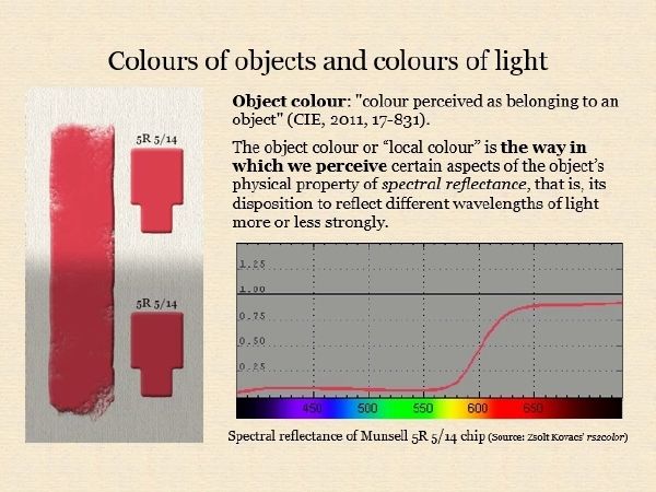
[01:52] I'm sure that the attributes of hue, lightness and chroma will be familiar to most of us. For the purposes of this talk these simple definitions will suffice. The hue of the colour is the most similar colour in the cycle of red, yellow, green, blue, red and their intermediates, in the case of this stripe a middle red. The lightness of a colour is the least contrasting gray of a series between black and white, in this case a middle gray The chroma of a colour is the intrinsic chromatic strength for the amount of colour difference from the least contrasting gray in this case a high strength for physical paint. One way to specify hue lightness and chroma more precisely is by the notation of the corresponding colour chip from the Munsell Book of Color in this case 5R 5/14 which means a Munsell hue of 5R a Munsell value or lightness of 5 and a Munsell chroma of 14.
[02:53] Now consider what you perceive when the red stripe is unevenly illuminated. We perceive that the stripe itself does not change its intrinsic colour between the shadow and the light and so we would expect to confirm that it matches the same Munsell chip placed beside it in the shadow and the light. Nevertheless the stripe appears brighter and more colourful in the light than in the shadow. Brightness and colourfulness are attributes of the perceived colour of the light reaching our eyes from different areas of the object as opposed to the colour seen as belonging to the object itself. Note that brightness and colourfulness are defined in the CIE system as attributes a visual perception not as physical properties of lights, but what are they perceptions of?
[03:45] The brightness of a light is the way in which we perceive its luminance. Luminance is a psychophysical measure, neither purely physical nor purely perceptual, that can be explained as follows. We think of visible light as being radiation in the range from about 400 to about 700 nanometers but wavelengths of the extremes of this range are barely visible and the visibility for a given amount of energy increases up to a maximum for wavelengths in the middle of the spectrum, which we see as greenish-yellow. For a given light if we multiply the amount of each wavelength present by its visibility given by this curve and add up the products we obtain a number for luminance or energy of light as visible to a standard human eye.
[04:38] So brightness is our perception of this quantity luminance, the hue and colourfulness of a light are essentially the ways in which we perceive the direction and absolute magnitude of the imbalance between its long, middle and short wavelength components relative to daylight. An isolated light that has the same balance of long middle and short wave components as daylight is perceived as lacking hue and colourfulness that is as being white light.
[05:10] Getting back to our simple little scene, notice that in addition to perceiving varying brightness and colourfulness we have two further superimposed perceptions within the same rectangle an arrangement of different coloured objects and an arrangement of light and shadow. These perceptions are often likened to seeing colours belonging to objects through a layer of illumination. Notice that we don't have to consciously work out which areas are darker because there's a darker coloured object there and which are darker because the illumination there is lower We needn't explore here the controversial question of how our visual system generates these perceptions; for this talk we only need to observe that they arise more or less instantly, automatically and without conscious thought or effort.
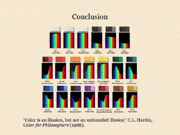
[06:02] It's only because we see the visual field resolved in this way that we see objects as having an intrinsic hue lightness and chroma and not just constantly shifting hue brightness and colourfulness. colours perceived to belong to an object and specifiable in this way are called object colours. An object colour is the way in which we perceive certain aspects of an object's physical property of spectral reflectance, or its disposition to reflect this or that sort of raised more copiously than the rest as Newton called it. Specifically the lightness of an object is the way in which we perceive its overall reflectance of light, and the hue and chroma are the ways in which we perceive the direction and amount of imbalance among the long middle and short wavelength components of this reflectance. A bright red like 5R 5:14 is the way in which we perceive the reflectance of an object that has a very high long-wavelength component and very low middle- and short-wavelength components.
Object-Colour Constancy
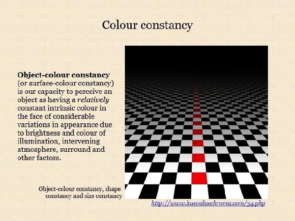
[07:11] The term colour constancy is not defined by the CIE and has been used in some quite different senses. Some authors include brightness adaptation and chromatic adaptation the capacities of a visual system to adjust to dim or coloured lighting so that the appearance of the visual field is brighter or less colourful than it otherwise would be. The kind of colour constancy involved in the illusions discussed here is not an adaptation-related constancy like these but the kind by which we see objects as maintaining a relatively constant intrinsic object colour despite variations in appearance.In this example we see the series of reddish squares in the middle of the scene as having the same bright red object colour even though the higher areas appear darker than the lower areas. We don't adapt to this darkness, we see the higher areas as darker but attribute this darkness to the illumination rather than the object colour.
[08:2]1 Object colour constancy is thus comparable to other perceptual constancies including shape constancy and size constancy our ability to instantly perceive an object as having a constant intrinsic shape and size despite variations in appearance due to viewpoint In this example we perceive objects as being squares even though we see none of them as occupying a square patch of the visual field and we perceive these squares as all being the same size even though we see them as occupying smaller areas of the visual field as we go higher.
Image Colours
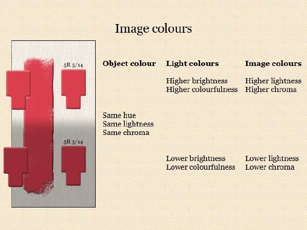
[08:5]8 Finally because our rectangle is not an actual scene but an object, a digital painting, we also have a perception of the hue lightness and chroma of the digital paint used to create the image. Here we perceive two image or paint colours, that is two object colours relating to the spectral properties of the image surface itself used in a depiction of a uniformly-coloured virtual object.
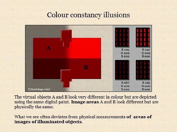
[09:3]0 In painting we inevitably use image areas of different digital paints to depict a uniformly coloured object in uneven illumination, and generally we can perceive these physically different image areas as different image colours A and B or C and D here. Conversely we may sometimes end up using the same digital paint to depict two different coloured objects under different illumination as A and D here. The essence of colour constancy illusions is that it can be remarkably difficult to see these image areas of physically matching paint as similar colours.
[10:08] There's something magical about these illusions so I suppose it's understandable that their authors often misdirect us, like all good magicians when presenting their tricks. Are the squares here really the same shade of grey as Adelson states on his webpage? The squares exist only as virtual objects depicted in the scene. Our capacity for object colour constancy is serving as well in seeing these squares as having different shades. Square B would have to be a lighter gray object than Square A to send the same amount of light from the shadow as a sends from the light It's not the squares but the rhombic image areas that are the same shade of gray. The surprising thing is not that the squares in the scene appear different colours it's that it's so difficult to see the rhombic image areas as the same colour.
[11:08] Difficult but not impossible. Painters strike situations like this all the time in depicting actual scenes and are well aware of the elusiveness of brightness perception, especially in the face of variation in object colours (what we call local colour). We well know that our casual impressions of relative brightness can be very different from the results of careful comparison, for example with the Munsell chip or grayscale held alongside at a fixed angle, by which we can see that the brightness of the two areas match the same thing. The painters trick of squinting, that is viewing through nearly closed eyes also helps and with a little practice enables us to perceive A and B as matching in brightness.
The Purves and Lotto Fallacy
[12:01] No one employed misdirection more consistently in presenting their illusions than Purves and Lotto. In their book and in these examples from Lotto's website each illusion is introduced with a patter in the form "Objects A and B appear very different in colour (or length or angle etc) but in fact objects A and B are physically the same. However in each case objects A and B and the first part are the virtual objects depicted in the scene and in the second part they are the image areas used to depict these objects.
[12:39] Here the surfaces of the folded card appear different in lightness but it's actually the corresponding surfaces of the image that are physically identical.
[12:47] Here the two large surfaces in the foreground appear different in colour but it's not these surfaces depicted in the scene but the corresponding surfaces of the image that are physically identical.
[13:08] Here the central elements appear different in colour but it's not these objects but the corresponding image areas that match physically.
[13:20] And here certain tiles on the cubes appear very different in colour but once again it's not these tiles but the corresponding image areas that are physically identical.
[13:30] Purves and Lotto apparently even misdirected themselves, because the conclusions they drew from their series of illusions were that "What we see deviates from physical measurements of objects and conditions in the real world" and "visual perceptions do not stand for the actual properties of objects in the physical world". On the basis of these assertions they proposed a new theory of visual perception that they regarded as a radical departure from current theories. Their theory remains an extreme minority view among vision scientists but it continues to influence non-specialists1, so I think it's worth addressing the simple fallacy that it's based on.
[14:14] When the fallacy in the formula is corrected the statement becomes: the virtual objects A and B look very different in colour but are depicted using the same digital paint, which is true but not surprising. It's very likely that sometimes we will paint different coloured objects under different illumination using the same paint. The surprising thing, the thing that qualifies these demonstrations as illusions is that these image areas look different but are physically the same.
[14:42] From this corrected statement we are only justified in making a much less general assertion: what we see often deviates from physical measurements of areas of images of illuminated objects. Now overall when we examine objects freely in daylight our visual system is remarkably good at representing each object to us as having a relatively stable object colour that is a very good indication of the general character of the spectral reflectance. So why is our perception so unreliable for this one particular class of object?
[15:18] It's crucial to note that we do not need to isolate the physically identical image areas to see them as matching in colour. We just need some help to attend to the image colours and notice these as matching.To do this we must in some way break the representational spell of the image, as in this case by providing a reference seen as being outside the illumination depicted in the image.
[15:47] What seems to be happening is that we find the perceived colours of the virtual objects depicted in these images so visually insistent that it's very difficult to attend to and compare colour perceptions relating to the image areas themselves' Here for example the differing lightnesses of the two virtual objects dominate our perception and it's only when we provide a reference chip that we can perceive the relative luminances of the two areas veridically.
[16:14] Notice that there's no suggestion that the brightness of either image area changes when the reference chip is introduced; we simply find the relative brightness of the two areas very difficult to attend to until the chip is in place.
[16:27] This difficulty is really not surprising: the main value of vision for us is in representing properties of objects in the world rather than properties of patches of light making up the visual field ,so the colours we tend to notice are those relating to objects. We didn't need to concern ourselves with the visual field until we started painting appearances. Properties of the visual field and of areas of images depicting the visual field are not inaccessible to us, but we are not used to looking at them, so they often hide in plain sight.
[17:05] This illusion is particularly alarming because the physically matching image areas depict object colours exhibiting blackness and fluorence respectively, but are suddenly perceived as the same image colour when the reference chips are introduced.
Object-Colour Constancy Through a Translucent Material
[17:25] Our visual system also has some capacity for object-colour constancy through a translucent film or atmosphere, and the next few demonstrations illustrate both this capacity and our difficulty in attending to some image colours in such demonstrations, at least on casual inspection. Here the central piece of each object is depicted using neutral gray digital paint but what we tend to notice instead of the perceived colours of the virtual objects perceived through the translucent coloured films.
[17:58] Note by the way that the gray Munsell chip changes somewhat in perceived colour when it moves from the yellowish to the bluish background, a partial failure of object colour constancy with respect to different surrounds called simultaneous contrast. This failure is much smaller in scale than that seen in the image areas.
[18:21] In these variations on Lotto's right hand image a full range of perceived object colour hues is evoked by a much smaller range of digital paint hues, and in each case the object depicted with gray digital paint is seen as having an object colour complementary to the colour of the filter. This is the colour that the object would in fact have to display in a physical setup in order for the light reaching the viewer to be neutral. Here for example the neutral image areas are seen as bright green objects viewed through a translucent magenta screen, at least when the image is viewed globally. Notice however that attentive viewing of just one such area such as A favors perception of a colour relating to the image surface itself, either gray or, due to simultaneous contrast, greenish gray.
[19:20] Also in this category are Akyoshi Kitaoka's strawberries from last year, which appear red but are painted with a blue-green to gray digital paint. Again global viewing favors perception of bright red virtual strawberries while attentive viewing of a single area especially in comparison with the white margins may favor perception of a gray or grayish image colour.
[19:49] I could add here my teaching slide showing an emulation of the effect of a translucent blueish atmosphere. The paint's used converge towards the bluish colour of the atmosphere as can be clearly seen when they are viewed on a white surround but in a different surround perception of a much fuller range of object colours seen through a coloured atmosphere predominates.
New Illusions
[20:16] New colour constancy illusions continue to appear by accident or design. In "The Dress" the camera's exposure and white balance settings accidentally produced an image that our object colour constancy processing can automatically parse in two very different ways, in which the blueness and the darkness of the dress image is attributed in the one case to the dress itself and in the other to the illumination.
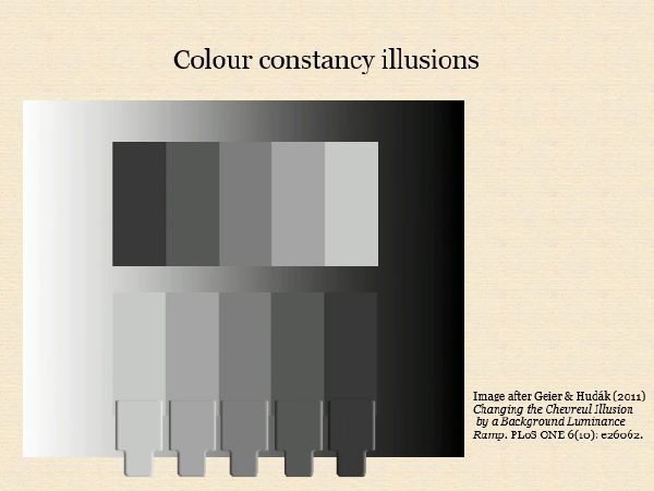
[20:46] The Chevreul effect is a well-known example of simple simultaneous contrast in which the physically uniform rectangles making up the scales appear slightly graded, lighter against the darker gray neighbor and darker against the lighter gray, creating a subtle scalloped affect. In this striking recent variant a much more dramatic failure of object colour constancy occurs when the scales are surrounded by a lightness gradient. Ironically however this much greater failure demonstrates our object colour constancy processing at work. We seem to see the lower scale through the gradient and attribute some of its left-to-right darkening to the gradient rather than the scale. The effect is both to make the lightness difference between the vertical bars seem much less and to create a much stronger scalloped effect this layered perception is so dominant that it's very hard to attend to colours of the image surface until we introduce a reference outside what is an effect being perceived as an illuminated scene. Many relatively strong illusions that have been classified as simultaneous contrast involve some form of perceptual layering like this.
Painters' Techniques and Strategies
[22:07] Painters faced the same difficulty illustrated by colour constancy illusions when they compare patches of the visual field, especially patches occupied by objects differing in object colour. In order to capture the appearance of this scene a painter would need either a viewing technique to recognize that A and B must be painted with the same paint, or at least have a painting strategy that eventually arrives at this result.
[22:36] The most common viewing technique used by painters is squinting, that is viewing the scene through nearly closed eyes. Other techniques with similar effects are staring intently at a point between A and B, so that these are seen peripherally, and the technique of unfocusing the eyes. Another very effective viewing technique is comparing areas against a grayscale, a Munsell chip or a swatch of paint held at a fixed angle to catch a fixed amount of light. And yet another technique for making comparisons is viewing through an opaque screen with two apertures.
[23:21] In addition painters can employ a variety of painting strategies to arrive at the required result. One strategy is to begin with the preparatory greyscale study to research value or lightness relationships without the distraction of hue and chroma. Another way of simplifying the problem is to identify a small number of representative colours (say nine or so) and to test these out either as a small simplified colour study or thumbnail or applied to the main canvas as separated colour notes. In each case any initial misperceptions of colour relationships can be corrected by a process of progressive refinement.
Summary
[24:05] To sum up, one of the great successes of our visual system is that we see objects as having relatively stable intrinsic object colours that are usually a very good indication of the general character of their spectral reflectance. Any credible theory of visual perception must explain this success. Optical illusions make us doubt that we can trust our eyes, but paradoxically colour constancy illusions demonstrate our remarkable capacity to arrive at these perceptions of the spectral reflectance of physical objects rapidly, automatically and without conscious effort. What qualifies these demonstrations as illusions is that our colour constancy processing is so rapid, automatic and effortless that we can't always trust our eyes to accurately compare areas of images depicting illuminated objects.
[25:03] What we tend to notice are colours relating to the properties of the virtual depicted objects rather than the colours relating to the properties of the physical image surface. This makes sense because the value of visual perception to us is in representing properties of objects rather than properties of the visual field. Properties of the visual field are not inaccessible to perception but they are relatively difficult to attend to. Representational painters contend with this difficulty using a number of effective viewing techniques and painting strategies. Thank you.
1 For example, see painter Anthony Waichulis' essay What Does Realistic Look Like? (Version 1.2).
Page added October 28, 2018. YouTube video published October 3, 2018.