
my colour short course is
now offered online through
Australia's National Art
School in Sydney! There's
a choice of two sessions to
suit every time zone. LINK
Home
The Dimensions of Colour
Basics of Light and Shade
Basics of Colour Vision
Additive Mixing
Subtractive Mixing
Mixing of Paints
Hue
Lightness and Chroma
Brightness and Saturation
Principles of Colour
Afterthoughts
- Purves and Lotto
- Modern Colour Theory
- Traditional Colour Theory
- What is Color?
- Answers
- Colour Constancy Illusions
- The Colour Quiz
- What is a Colour?
- Colour Education
- Color Impact 2020
- Color Attributes
- Shillito portfolio
- Dimensions Today
- Index of Works
- Psychophysical
- Shillito Talk
- Elements of Colour
- Objects and Light
Glossary
References
Contact
Links
NEXT COLOUR
WORKSHOPS

11.11 More than Three Dimensions: Communicating the Attributes of Colour Perception in Colour Education
This video is a recording of a rehearsal for a presentation that I gave on September 1, 2021, at the 14th AIC Congress Milan 2021. "Watch on Youtube" to view fullscreen.
[00:09] In colour education, colour is usually described as having three attributes or dimensions, most commonly synonyms, more or less, of hue, lightness and chroma. Just three attributes suffice to describe colour as long as we only consider a single mode of colour appearance, such as colours of objects, but other attributes come into play when we must also consider colours of light. The CIE defines six attributes of perceived colour, and their definitions, based on work published in the late 1970’s by R. W. G. Hunt, have been essentially stable in the International Lighting Vocabulary from its 1987 edition through to the current edition, published late last year. But despite this very long period of stability of the standard scientific nomenclature, I’ve observed that the distinctions between these six CIE-defined attributes are often poorly understood even by very experienced colour educators, and so I’d like to share a selection of the illustrations and explanations that I’ve found useful in communicating these concepts in my courses.
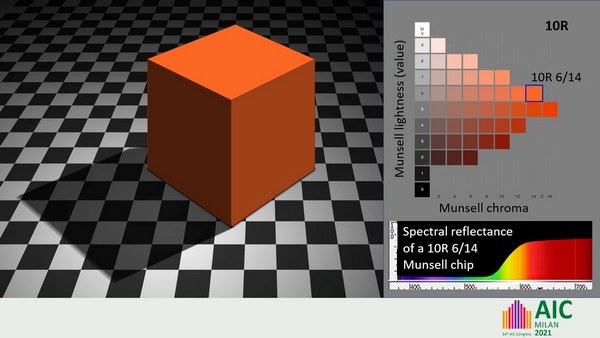
[01:17] This cube is perceived to have a uniform orange colour, as if it were painted all over with the same paint, and a perceived colour seen as belonging to an object such as this is called an object colour. This colour could be described in CIE terms as having a uniform hue, lightness and chroma. Although it is a perception, this uniform object colour is seemingly located outside of us in the object itself, in this case in a physically nonexistent cube. Under favorable viewing conditions the attributes of an object colour are reliable as general indicators of different aspects of the intrinsic spectral reflectance of the object, including the overall direction of imbalance among its long, middle and short wavelength components (its hue), the overall amount of this imbalance (its chroma), and the overall proportion of light reflected (its lightness).
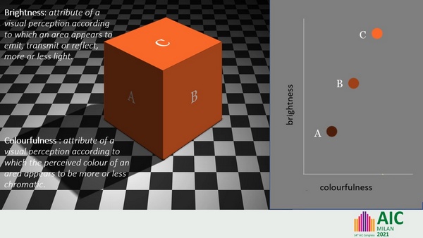
[02:18] Now notice that the left, right and top planes of this cube appear progressively brighter and more colourful. Similarly, although the lighter-coloured areas of the floor are all perceived as squares having the same object colour of the same lightness (that is, as being white things), these white squares appear brighter in some areas of the floor than others. These colour attributes of brightness and colourfulness relate to the appearance of the light reaching the eye from different areas of an object, as opposed to the colour seen as belonging to the object itself.
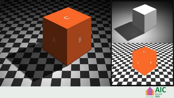
[02:57] So within this rectangular image we have a perception of an array of orange, black and white object colours (shown bottom right), but within the same rectangle we also perceive a pattern of illumination, comprising areas of light and shadow (shown top right). Colours of illumination, as well as colours of self-luminous objects, can be described in terms of the three attributes of hue, brightness and either colourfulness or saturation (which we’ll look at in a minute). But the illumination here is perceived as achromatic, varying only in brightness. Notice that we experience these perceptions of object colour and illumination superimposed in the same rectangle, as if the object colour is seen through the illumination and that these perceptions arise without conscious analysis: we automatically, instantly, and seemingly effortlessly resolve the illuminated scene into perceptions of intrinsic spectral reflectance (as object colour) and of illumination. It‘s only because of this remarkable capacity of our visual system that we perceive objects as having a relatively constant and seemingly intrinsic lightness and chroma, and not just constantly varying brightness and colourfulness.
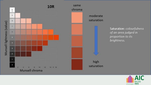
[04:29] The word “saturation” is often used as a generic term for chromatic intensity, but in CIE terminology it has a specific meaning, defined as the “colourfulness of an area judged in proportion to its brightness”, which amounts to the balance of chromatic (coloured) and white light components perceived in the light from the area. A column of digital colour swatches of uniform chroma can be seen to range from lighter swatches emitting lots of relatively whitish light to darker swatches emitting a smaller amount of less whitish or more saturated light.
A note to the CIE definition of saturation reads that within certain limits, a colour stimulus of a given chromaticity exhibits approximately constant saturation as the intensity of light (luminance) varies. Chromaticity refers to the overall balance of long-, middle- and shor-wavelength components in a light, and this would be expected to stay constant when a uniform object such as our cube reflects illumination varying only in intensity. This relationship of constant saturation has been implemented in our cube, so that proceeding from A to B to C the colourfulness of the light increases in step with its brightness.
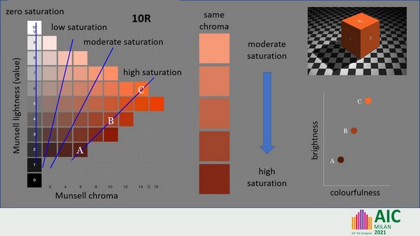
[05:54] We might therefore expect that in the image of our orange cube, the image areas used to depict faces A, B and C should increase in chroma in step with their lightness, and this is approximately true. Swatches exhibiting constant saturation lie along lines that radiate from near the zero point on the value scale, in contrast to the vertical lines of constant chroma. So swatches A, B and C all exhibit similarly high saturation but vary considerably in chroma, while swatches in any vertical column exhibit the same chroma but vary in saturation.
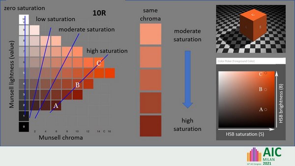
[06:39] The dimension called “saturation” (S) in the widely used digital colour space HSB is a simple predictor for saturation (as defined by the CIE) relative to the maximum saturation possible for digital colours of a given hue. Image areas A, B and C have the same HSB “saturation”, and so lie along a vertical line in the Adobe Photoshop colour picker.
[07:08] Given that saturation and hue together are the way in which we perceive chromaticity (or overall balance of wavelengths), perception of saturation seems likely to play a part in the capacity of our visual system, discussed previously, to disentangle object colours and illumination. Uniform chromaticity provides our visual system with a strong clue as to which patches of the visual field represent the same stuff, and based on that, which variations in luminance are likely to be due to illumination. The figure on the left shows how readily we perceive areas of uniform hue and saturation and consistently varying brightness as uniformly coloured objects under varying illumination.
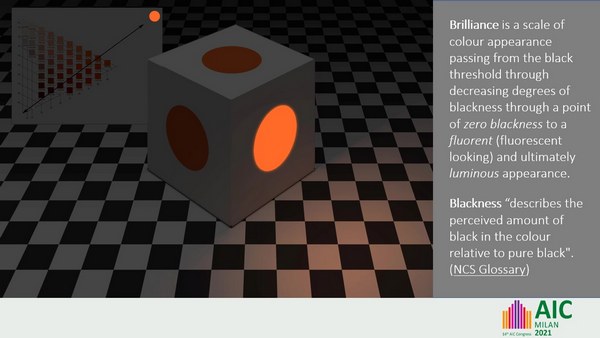
[07:58] Brilliance is a scale of colour appearance discussed by Ralph Evans in his 1974 book The Perception of Color. If a light stimulus of fixed chromaticity increases in luminance from zero to very high in relation to its surroundings, it passes through a consistent series of stages, appearing equally black until a “black threshold” is reached, then passing through decreasing degrees of blackness (called greyness by Evans) to a point of zero blackness. It then goes on to appear fluorent (fluorescent-looking), and ultimately self-luminous. To actually depict a luminous object you would need to gild the lily a bit by painting in some illumination.
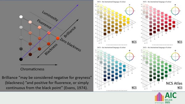
[08:58] Evans showed that perception of zero blackness occurs at a brightness level that varies greatly depending on the hue and saturation of the stimulus. The attribute of blackness is of course well known through its use in the NCS, in which object colours are conceived to be made up of black, white and chromatic perceptual components. Zero blackness in the NCS Atlas occurs at correspondingly varying lightness levels, tracking generally close above the range of physically realized paint chips.
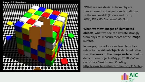
[09:35] In this image by Beau Lotto the tiles on each face, apart from the central tile, all exhibit approximately zero blackness, but they do so at very different brightness levels, lowest for saturated blue, much higher for saturated yellow, highest of all for white. The central tile on the top face is relatively dark for its hue and saturation, and exhibits high blackness, while the central tile on the shaded face is very bright for its hue and saturation, and appears luminous. Brilliance (including blackness) thus seems to be a perception of brightness relative to the maximum brightness level possible or unconsciously expected for light reflected from objects, allowing for its hue and saturation.
Alarmingly, both central tiles are depicted using physically matching image areas. Purves and Lotto took illusions such as this one to demonstrate that “What we see deviates from physical measurements of objects and conditions in the real world". While this is of course true to a degree, what these illusions specifically reveal is that when we view images of illuminated objects, what we “see” can deviate very strongly from physical measurements of the image surface. As I said earlier, under favourable viewing condition the colour that we see an object as having is quite reliable as an indicator of the object’s overall spectral reflectance, so why is our perception so unreliable for this one class of objects? I’ve argued elsewhere that in viewing images of illuminated objects the colours that we tend to notice relate to the virtual objects depicted in the image rather than the areas of the image surface used to depict those objects. But if we break the representational spell of the image, as in this case by providing a reference seen as being outside the illumination depicted in the image, we can make veridical comparisons of the image areas. Similarly the difficulty, well known to painters, in making precise comparisons of the light from different areas of an actual scene can be addressed by holding up a reference such as a Munsell chip to facilitate comparisons.
[11:56] To sum up, three attributes or dimensions suffice to describe a colour, but different attributes are needed to describe colours of light and colours of objects. The six CIE-defined perceived-colour attributes, along with brilliance (including blackness), are well suited for describing the often-unappreciated intricacies of the appearance of illuminated scenes, which entail co-occurring perceptions of colours of luminous and nonluminous objects, of a pattern of illumination, and of the light reaching the eye from different areas of each object.