my colour short course is
now offered online through
Australia's National Art
School in Sydney! There's
a choice of two sessions to
suit every time zone. LINK
Home
The Dimensions of Colour
Basics of Light and Shade
Basics of Colour Vision
Additive Mixing
Subtractive Mixing
Mixing of Paints
Hue
Lightness and Chroma
Brightness and Saturation
Principles of Colour
Afterthoughts
- Purves and Lotto
- Modern Colour Theory
- Traditional Colour Theory
- What is Color?
- Answers
- Colour Constancy Illusions
- Colour Quiz
- What is a Colour?
Colour Education
Color Impact 2020 - Colour Attributes
- Shillito portfolio
- Dimensions Today
- Index of Works
- Psychophysical
- Shillito Paper
- Elements of Colour
- Objects and Light
-
Glossary
References
Contact
Links
NEXT COLOUR
WORKSHOPS

11.2 TRADITIONAL AND MODERN COLOUR THEORY PART 1: MODERN COLOUR THEORY
These two pages contain the text of a webinar I presented for the NSW Division of the Colour Society of Australia in July 2015. The direct link to the video recording of the webinar on YouTube (above) is https://www.youtube.com/watch?v=4enFjTGVTnc.
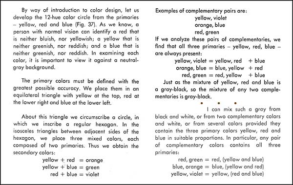
Figure 11.2.1. Extracts representative of traditional colour theory, from Johannes Itten's The Art Of Color (1961, pp. 34, 78 and 22).
[EDIT July, 2023: The term "traditional colour theory" is employed in this presentation for colour training based on the concept that red, yellow and blue are the three "primary colours" that form the ultimate components of other colours, characterized as "secondary" and "tertiary", as seen expressed in what is widely known as the "traditional color wheel". This concept, sometimes known as the "RYB color model", was overturned as a scientific theory by Helmholtz and others in the mid-19th century, but has persisted to the present in art education texts including Johannes Itten's highly influential The Art of Color (1961). The contrasting term "modern colour theory" is employed here for colour training that is informed by this mid-19th century revolution in our scientific understanding of colour, with the works of Rood, Munsell, Ostwald and others given as examples.
Over the last half century the term "traditional colour theory" has been used in different senses depending on which theories of colour were being contrasted as non-traditional, making it important to pay attention to the sense in which the term is used in order to avoid making arguments at cross purposes and misdirected criticisms. Thus I note for example that Dr Zena O'Connor has more recently employed the term "traditional colour theory" in a very different sense to that employed here (e.g. O'Connor, 2023), to include, in addition to works of red-yellow-blue colour theory, the works of Rood, Munsell, Ostwald and others that in this presentation are taken to typify "modern colour theory". It should be clear therefore that the criticisms expressed in this presentation are directed only at part of the disparate array of practical colour instruction deemed by O'Connor to comprise "traditional colour theory", and only insofar as that instruction is based on the RYB model].
Colour training in the arts today is curiously divided between traditional and modern colour theory. Traditional colour theory characteristically begins with the concept of three primary colours identified as red, yellow and blue. These historical primaries rose to prominence over the course of the 17th century, and then as now were based on the observation that mixtures of a wide range of colours can be obtained from colourants (paints and dyes) of just a reddish, a yellowish and a bluish colour, along with the psychological perception that red, yellow and blue seem pure or "simple" compared to most other colours. A second characteristic of traditional colour theory in its typical form is that it speaks as if colours themselves intermix when we mix colourants, so that the colour of a paint mixture is made of the colours of its component paints. From this viewpoint each of the three "secondary" colours made by mixing colourants of two primary colours is made of those two colours, for example the colour orange is physically made of the colours red and yellow and the colour green is made of the colours yellow and blue. Black, grey and greyish colours are commonly held to contain all three primaries, since they can be made by mixing a secondary with the remaining primary, called its opposite or complementary colour (Fig. 11.2.1). Greyish colours are sometimes called "tertiary" to reflect this belief that they are made of three components, although this term is also used in traditional colour theory in a different sense, for the six third-order colours that lie between adjacent primaries and secondaries, and so supposedly "contain" two primaries in unequal amounts. By extrapolating from these assumptions, red, yellow and blue, along with white and sometimes black, are deemed to be the fundamental components of all colours, and paints of these three colours should "in theory" yield all possible colours by intermixture. The fact that they do not can be blamed on a lack of "pure" primaries among available paints, and clearly a bluish-red paint, which by this view contains the primary colour red plus a visible "impurity" of blue, must be further from being a good colourant-mixing primary than one that is perceptually pure red.
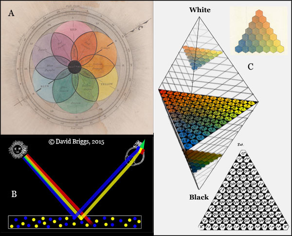
Figure 11.2.2. A. Colour wheel from George Field's Chromatography (2nd edn, 1841). Numbers around the circumference indicate the proportions in which secondary and tertiary colours must be present in order for the three primaries to be balanced. B. Post-Newtonian model of traditional colour theory, in which white light is thought to consist of red, yellow and blue rays. A mixture of yellow and blue paints reflects only the yellow and blue rays, which are detected by yellow and blue receptors in the eye, leading to a mixed sensation of green. C. Three-dimensional colour space proposed in a 1758 lecture by Swedish astronomer Tobias Mayer, in which colours are arranged in a double pyramid according to proportions of red, yellow, blue, black and white components.
Traditional colour theory readily adopted Newton's hue circle of 1704 in the form of the artists' "colour wheel" with its symmetrically placed historical primaries (e.g. Fig. 11.2.2A). More problematic was Newton's conclusion that lights of all colours are composed of rays of the innumerable but seven-named colours of the spectrum, and that green and orange lights could be physically simple as well as compound. This problem however could be countered by supposing that the spectrum is not continuous, as Newton had thought, but is actually made of separate red, yellow and blue rays that produce the remaining colours by intermixture. The suggestion that our eyes have three kinds of receptors responsible for colour vision was first made based on this hypothesis of red, yellow and blue rays. In this enviably simple view of colour, the historical colourant-mixing primaries coincide with the primaries for mixing coloured lights, with the sensitivities of the visual receptors, and with the psychological primaries of perception. For example in Fig. 11.2.2B, a mixture of yellow and blue paints reflects only the yellow and blue rays, which are detected by yellow and blue receptors in the eye, leading to a mixed sensation of green. The three-ray hypothesis was quite widely accepted in science, and the first three-dimensional colour order systems for classifying object colours were made on the assumption that all such colours are mixtures of red, yellow, blue and white (+ black) components in various proportions (Fig. 11.2.2 C). This hypothesis was not overturned until 1852, when the version of it promoted by the Scottish physicist Sir David Brewster was convincingly demolished by the brilliant German physicist and physiologist, Hermann von Helmholtz.
In subsequent years Helmholtz, his contemporaries including James Clerk Maxwell and Ewald Hering, and their successors collectively transformed our understanding of what colour is and how it works as fundamentally as Darwin transformed our understanding of biology over the same period, and this new understanding in turn led to modern colour printing, colour photography, cinema and television, and eventually to digital photography, painting and rendering. Modern colour theory, as understood on this website, is a system of guidance resting on the legacy of this late 19th century revolution, adapted to the practical needs of painters and teachers of painting.
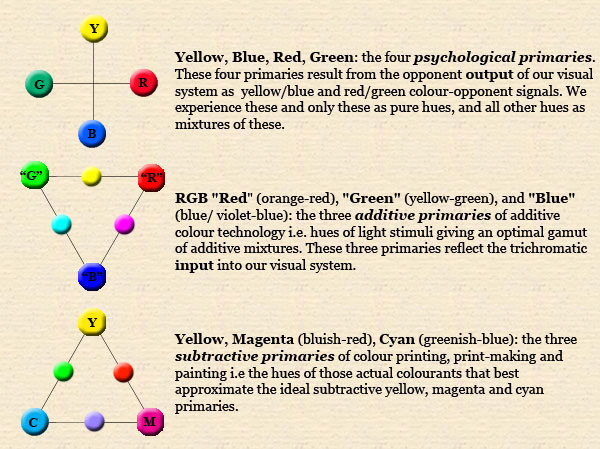
Figure 11.2.3. The psychological, additive and subtractive primaries of modern colour theory.
In line with Hering's widely accepted opponent model, modern colour theory recognizes four psychological primaries, the three historical primaries plus green, arranged in two opposing pairs, yellow/blue and red/green (Fig. 11.2.3A). This model is founded not on neuroscience but on contemplating how we experience colour: only red, yellow, green and blue are experienced as pure hues, and all other hue perceptions are combinations of adjacent pairs of these four: yellow-red (orange), yellow-green, blue-green (cyan, turquoise, etc.), and blue-red (purple, magenta etc.). Red, yellow, green and blue are thus the true primary colours of modern colour theory, as opposed to primary colour stimuli (of additive mixing), or primary colourant hues (of subtractive mixing).
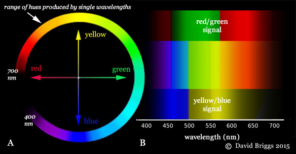
Figure 11.2.4. A. The four opponent hues or "psychological primaries", and the range of their combinations evoked by single wavelengths of light, and therefore seen in the spectrum. B. Origin of the colours of the spectrum from successive combinations of red vs green and yellow vs blue colour-opponent signals created in the brain.
These four opponent hues are not physical components of light, but are perceptions created in the brain of the observer in the form of yellow vs blue and red vs green colour-opponent signals. Blue is evoked by the shorter and yellow by longer wavelengths of visible light, while green is evoked by the middle wavelengths and red by the two extremes (Fig. 11.2.4B). Successive combinations of these four hue perceptions create the sequence of hues seen in the spectrum as well as the nonspectral hues like magenta, and thus explain how we arrive at this circular succession of hues that has no physical basis in the linear sequence of wavelengths in the spectrum. The concept of four psychological primaries has strongly influenced several important colour order systems, notably the Ostwald system, which was the standard for British education in the 1930's, and the Natural Colour System (NCS), the current colour standard in Scandinavia and Spain, and was foreshadowed in the writings of Leonardo, Goethe and others.
In addition to the four psychological primaries, modern colour theory refers to three additive (or light-mixing) and three subtractive (or colourant-mixing) "primary colours" for the colours of lights and colourants respectively that yield a maximum gamut or range of colours of their mixtures. None of the additive or subtractive primaries bear a direct relationship to any of the psychological primaries, but we have a strong unconscious predisposition to apply to the former the names of these hues that form the framework of our experience of colour. Thus before the twentieth century, when our best available colourant-mixing primaries were slightly greenish yellow, bluish red and greenish blue paints, we almost universally labelled these primaries as simply "yellow", "red" and "blue". In the same way today we routinely label the orangeish red, yellowish green and blue or violet-blue primaries of additive-mixing technology as simply "red", "green" and "blue" (RGB).
It is counterproductive to the wider acceptance of modern colour theory, as well as misleading, to dismiss the red, yellow and blue primaries as merely obsolete, or worse, to insist (by adopting an idiosyncratic and unrealistic definition of the term) that primary colours "do not exist". The three historical primaries were as much a step towards recognition of the four modern psychological primaries as they were an imprecisely-named set of colourant-mixing primaries.
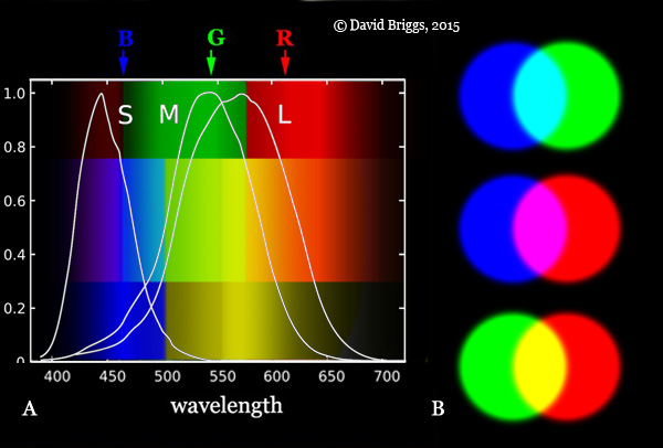
Figure 11.2.5. A. Dominant wavelengths of sRGB "red", "green" and "blue" additive primaries in relation to responses of the L, M and S cone cells. B. Mixing of RGB additive primaries.
So while the number four is the key to colour perception, three is the key to colour stimulus and colour technology. This number three stems from the fact that colour vision is ultimately based on three types of receptors in the eye called L, M and S cone cells. These cone cells are often loosely termed "red", "green" and "blue", and were once believed to "detect" the red, green and blue-violet bands of the spectrum, and to directly create red, green and violet or blue "fundamental sensations" respectively. However it is now known that the L, M and S cones do not detect individual wavelength bands or "colours" of the spectrum, but respond to very broad and extensively overlapping ranges of wavelengths peaking in the parts of the spectrum we see as greenish-yellow, green and blue-violet (Fig. 11.2.5A), and respond in exactly the same way, just to different degrees, throughout their range. Nor do they directly create sensations of individual colours. Instead, differences in the responses of the three cone types are recorded in the retina in the form of cone-opponent signals (L-M and L+M-S). Colour as such is created in the brain in the form of colour-opponent signals based indirectly on the wavelength-dominance information contained in these cone-opponent signals. When a light creates a balanced response of all three cone types, each cone-opponent signal is balanced at zero, and the light is seen as colourless ("white light"). Colours of lights are perceptions created by our visual system in response to an uneven distribution of wavelengths, as detected by an unequal response of our three cone types.
RGB "red", "green" and "blue" lights work as additive (light-mixing) primaries because each of them stimulates one cone type more than the other two (Fig. 11.2.5A), and so when mixed in different proportions they produce a large variety of relative L, M and S cone responses, and therefore cone-opponent signals, and therefore ultimately colours. "Red" and "blue" lights unsurprisingly yield mixtures passing through magenta (red-blue), and "green" and "blue" lights unsurprisingly yield mixtures passing through cyan (green-blue), but, to the perennial astonishment of students, "red" and "green" light mixtures pass through an apparently new colour, yellow, that is neither reddish nor greenish (Fig. 11.2.5B). This asymmetry is the inevitable consequence of the mismatch between having three additive and four psychological primaries. The yellow is not really a “new” colour, in that it is already present in the colours evoked by the component lights (they are orange-red and yellowish green after all!), and when these are mixed the yellow signals add together while the red and green signals cancel out, leaving pure yellow. The yellow colour is not made of the colours red and green, and is certainly not some sort of mistaken guess that the light has a wavelength that lies between those of red and green.
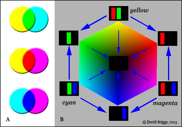
Figure 11.2.6. A. Subtractive mixing of digital subtractive primaries. B. Explanation of subtractive mixing of digital subtractive primaries.
Helmholtz recognized that the "colour mixing" of two colourants was in large part a subtractive process in which the colour of the mixture depends on which wavelengths both colourants pass on. It was soon realized that in theory three transparent colourants that each completely absorb one additive primary and completely pass on the other two would, when mixed subtractively in varying proportions, yield the entire gamut of those additive primaries, and hence be optimal for subtractive mixing. These ideal subtractive primaries would therefore resemble the pure yellow ("red" plus "green"), magenta ("red" plus "blue") and cyan ("blue" plus "green") colours of computer screens (Fig. 11.2.6), the last two being far from the red and blue primaries of traditional colour theory. It took many decades however before permanent pigments at all close to ideal magenta and cyan were developed, and even today our best magenta and cyan paints and inks are redder and bluer respectively than ideal subtractive magenta and cyan. (Fig. 11.2.7A).
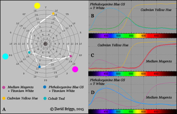
Figure 11.2.7. A. Mixing paths of a yellow, a magenta and two cyan colourants, calculated using the program drop2color by Zsolt Kovacs Vajna. (For mixtures using a greener yellow see Fig. 2.7, next page). B-D. Spectral reflectances of pairs of cyan, magenta and yellow colourants and representative mixtures, calculated using the same program.
Figure 11.2.7 shows predicted mixing paths and reflectance profiles of some cyan. magenta and yellow paints, calculated and plotted using the program drop2color by Zsolt Kovacs Vajna. Consistent with modern colour theory, the paints produce a larger and more evenly distributed gamut (range of colours) than the historical red, yellow and blue primaries (see Fig. 11.3.6, next page). Note well that in subtractive mixing, yellow and cyan colourants make green not because green "contains" yellow and cyan, as typical traditional colour theory assumes, but because both yellow and cyan colourants pass on large amounts of "green" wavelengths (Fig. 11.2.7B).
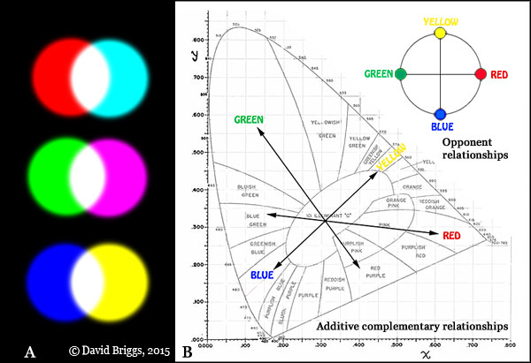
Figure 11.2.8. A. Additive complementary pairs: digital "red" and "cyan", digital "green" and "magenta" and digital "blue" and "yellow". B. Comparison of opponent pairs and additive complementaries. In this CIE xyY (chromaticity) diagram, additive complementaries are connected by a straight line through the central "white point", in this case Illuminant C (after Kelly, 1943). Middle yellow and middle blue are essentially complementary, but middle red and middle green are not.
Just as different sets of colours are considered primary for perception, for mixing lights and for mixing colourants, modern colour theory also recognizes somewhat different pairs of "opposite" colours in these three contexts. For every imbalance of cone responses that we experience as a colour of light, there are lights that create an opposite or complementary imbalance, and which therefore by mixing in the right proportion can create white light. Examples of such pairs of lights include the digital red-cyan, green-magenta and blue-yellow pairs familiar from graphics programs (Fig. 11.2.8A). Perhaps because the relationship between the cone-opponent responses and the colour-opponent signals we ultimately experience is indirect, pairs of colours of lights that mix to make white light (additive complementaries) do not always coincide with the axes of our perceptual framework of opponent colours determined by experimental studies of large numbers of observers. According to such studies the yellow - blue opponent pair is also additively complementary or nearly so, but the red - green opponent pair is not (Fig. 11.2.8B).
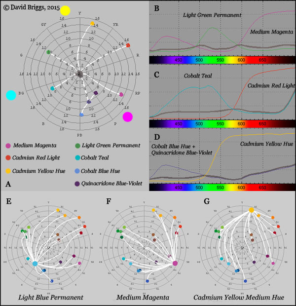
Figure 11.2.9. A-D, Mixing of subtractive complementaries (Liquitex Acrylics). E-G Mixing paths of a cyan paint, Light Blue Permanent (E), a magenta paint, Medium Magenta (F) and a yellow paint, Cadmium Yellow Medium Hue (G), with other paints in the collection. All diagrams produced using the program drop2color by Zsolt Kovacs Vajna.
Colours of pairs of colourants that make neutral (black or grey) mixtures are called subtractive or colourant-mixing complementaries. The exact result of subtractive mixing depends on the precise wavelength-by-wavelength absorption of the colourants, and can not be exactly predicted from their colours alone, but the importance of this proviso is sometimes exaggerated as far as actual colourants go, and it does not prevent reasonably reliable generalizations being made about colourant-mixing complementaries. Subtractive and additive complementaries coincide quite closely near the red-cyan and green-magenta axes, but differ substantially near the yellow-blue axis (Fig. 11.2.9A, E). A yellow and a blue paint that are opposite on the Munsell hue circle would be approximate additive complementaries, so that when lights from these paints are mixed (for example, using spinning discs) they would make a near neutral (see Fig. 4.4.1), but such paints nevertheless reflect enough green wavelengths in common to make a mid-chroma green mixture when combined physically. It is this generation of green as an apparent compound of two visually distinct colours that has influenced painters since Leonardo to reject or question green as a "simple" or primary colour.
To make a mixing complementary for a yellow paint generally requires a precise mixture of blue and violet paints (as in Fig. 11.2.9A) that is more reddish than the blue additive complementary, but less reddish than the middle purple expected in traditional colour theory (e.g. Fig. 11.3.1, next page). Interestingly, afterimage complementaries show a similar sort of pattern to these paint-mixing complementaries, in that they agree well with the additive complementaries near the red-cyan and green-magenta axes, but depart in a similar way near the yellow-blue axis. Complementary-coloured afterimages result from changes in the relative adaptation of the three cone types, and act as coloured virtual filters, subtractively modifying the areas of the visual field they occupy.
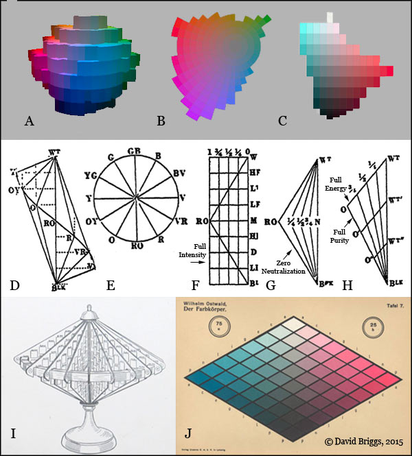
Figure 11.2.10. A,B,C, External view, hue plane and value-chroma plane of the Munsell system. D,E, side and top view of colour solid devised by Arthur Pope based on the colour classification of his former teacher, Denman Ross. F,G, Ross' subdivision of the colours on a hue page according to chroma relative to the maximum possible ("intensity") and chroma relative to the maximum possible at that value ("neutralization"). H. Pope's subdivision of a hue page according to "purity" (later called saturation) and "energy of vibration" (later called brightness and then brilliance). I,J, External form and cross section of the Ostwald system, showing divisions according to proportional black, white and colour content.
Modern colour theory, like modern colour science, makes constant practical use of concepts of three-dimensional colour space. The framework of hue, value (lightness) and chroma (colour strength) devised by the American artist and art teacher Albert Munsell (1858-1918) for classifying object colours has proved especially useful to painters. Munsell explained his system in his small book A Color Notation in 1905, and embodied it as a published Atlas of colour samples in 1915. The Atlas was succeeded by the Munsell Book of Color (published from 1929 to the present), and following extensive testing and refinement by the Optical Society of America in 1943, has become a very widely accepted standard in science and industry. The Munsell Book of Color, or any of several less expensive alternatives, enables a painter to examine almost every colour obtainable from paint mixtures set out in a logical, value-based arrangement. On this site I show how the system makes a potent framework for observing colours, for understanding colour mixing in paints, and for creating effects of light from the imagination. While painters most commonly use only the conceptual framework of relative hue, value and chroma rather than the absolute Munsell dimensions, there are strong practical benefits to at least using an absolute scale of value like the Munsell scale.
A simpler system of hue, value and relative chroma devised by Munsell's friend and rival Denman Ross has also been widely used in art education, and was further developed by Ross' former student Arthur Pope (1921). Pope showed how hue pages could also be divided up according to the saturation ("purity") and brightness ("energy") of the reflected light producing each object colour (Fig. 11.2.10 D-H), in a similar way to that later adopted in the HSB (or HSV) colour space of graphics programs. Lines of uniform saturation are of great importance to the painter in that they correspond to shading series, or the paths of the image colours needed to represent an object of one colour under different levels of illumination. Colour spaces such as the historical Ostwald system (Fig. 11.2.10 I,J) and the modern Natural Colour System (NCS) that lack a dimension of greyscale value are less useful for most painters, but have found favour in many areas of design.
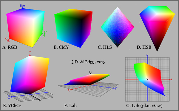
Figure 11.2.11. Digital colour spaces A. RGB: relative brightness scales of the "red" (R), "green" (G) and "blue" (B) component lights. B. Ideal CMY. C. HLS: simple double cone model using digital hue (H), a pseudo-value dimension (L) and relative chroma (S). D. HSB (also known as HSV): digital hue angle (H), and measures of saturation (S) and brightness relative to the maximum possible (B). E. YCbCr: used for jpg compression and as a space for some operations in Photoshop. F, G. Lab: perceptual space with dimensions of greyscale value (L), reddish/greenish chroma (a/-a) and yellow/blue chroma (b/-b). Lab space can also be expressed as Lch: value (L), chroma (C) and hue (H).
The series of colour spaces devised by the Commission Internationale de l' Eclairage (CIE) are central to modern colour science and to the development of all forms of digital colour technology including digital painting. Most fundamental is the CIE XYZ space, which is the foundation of colour management, and measures colours in relation to three virtual "primaries" that are not colours, but are purely mathematical transformations of actual lights. More commonly encountered by digital painters are the CIE xyY or chromaticity diagram (Fig. 11.2.7B), and CIE L*a*b* space, which arranges colours similarly to the Munsell system, but describes their positions in terms of reddish/greenish (a*/-a*) and yellowish/bluish (b*/-b*) chroma instead of hue and total chroma. Photoshop uses a version of CIE L*a*b* known as Lab space as an means for designating colours in the colour picker, and as a working colour space. Digital painters can select and apply modifications to their colours using a great variety of colour spaces for different purposes (Fig. 11.2.11), though probably only a small minority understand these spaces well enough to take full advantage of this versatility. Many painters who use traditional media are familiar with CIE colour spaces through the Handprint website by Bruce MacEvoy, whose plots of watercolour paints as points on the CIE L*a*b* and CIE CAM02 hue planes are quite widely quoted on painting forums.
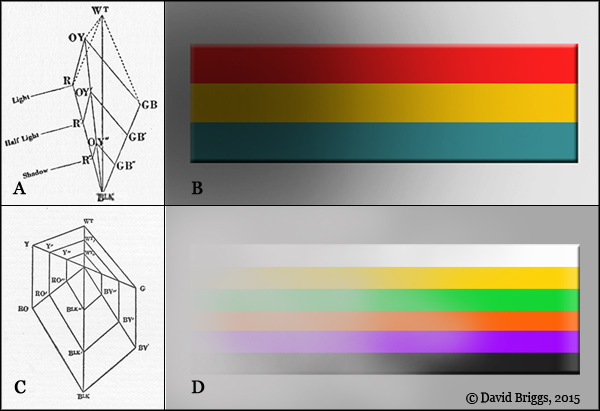
Figure 11.2.12. A,C. Diagrams by Arthur Pope (1921) conceptualizing the effect of changing illumination (A) and of greyish atmospheric mist (C) on the appearance of an array of uniformly coloured stripes. B,D. Realizations in Photoshop of the relationships postulated in Pope's diagrams A and C respectively.
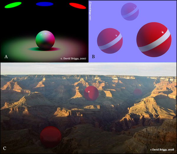
Figure 11.2.13. A,B, Emulation of additive mixing of coloured lights (A) and effect of translucent atmospheric mist (B) from the original upload of this site. David Briggs, Photoshop CS2, 2007. C. Digital painting exercise in which students examine a photograph to determine lighting and atmosphere, and then paint in a simple object to be consistent with these. Class demonstration in Photoshop CS2 by David Briggs, Understanding Digital Colour, Billy Blue College of Design, 2008.
Principles governing the relationship of colour and light have been an important part of artistic colour theory since the times of Alberti and especially Leonardo, but these principles could be expressed only verbally before modern models of colour space provided a framework for their more precise formulation. In the early 1920's Arthur Pope set out a series of important principles of colour appearance in terms of his own colour order system (Fig. 11.2.12), and beginning in the 1930's Faber Birren used the framework of the Ostwald and Munsell systems to describe colour relationships that create various effects of iridescence, lighting and atmosphere. In the middle decades of the century the American illustrator and highly influential teacher Frank Riley devised an extremely elaborate system for calculating effects of light and atmosphere within the framework of the Munsell system. Applying Reilly's system in oil paint generally involved the use of an extensive palette of "strings" of premixed colours kept in tubes. Principles of this kind can now be applied very easily using the controls available in digital painting programs (Fig. 11.2.12 B,D, Fig. 11.2.13; for details see Section 10), and of course can be applied automatically using rendering software.
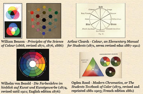
Figure 11.2.14. Four popular late 19th-century textbooks that explained the Helmholtz-Maxwell revolution in our understanding of colour for artists and art students.
Numerous excellent texts explaining modern color theory for artists began to appear soon after the Helmholtz-Maxwell revolution, and those by Benson, Bezold, Rood, and Church in particular proved popular enough to be reissued in multiple editions over several decades (Fig. 11.2.14). One of the most influential was Modern Chromatics, or The Students' Text-book of Color (1879) by American physics professor and trained painter Ogden Rood, which is a revelation as to the level of technical understanding of color and light that was considered appropriate for academically trained artists of the time.
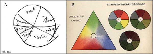
Figure 11.2.15. A. Colour wheel sketch from one of Degas' notebooks of the early 1880's, illustrated by Richard Kendall in Degas, Beyond Impressionism (1996, p.101). Though mistaken by Kendall for "a rather inaccurate drawing of on elementary colour wheel", the circle in fact shows additive complementary pairs (vert opposite violet, jaune opposite indigo, and orange and rouge opposite bleu) in an orientation that seems to link it specifically to a diagram from the frontispiece of Ogden Rood's Modern Chromatics (B).
It is difficult to say just how widely painters of this era used modern colour theory, because most art historians in their research (and teaching) seem to neglect fundamental elements of the artist's craft like colour in the pursuit of more esoteric concerns. For example, author Richard Kendall maintained that "there is no indication that [Degas] joined those of his contemporaries who engaged in a more thorough study of [colour] theory and application. On the contrary a previously unpublished and rather inaccurate drawing of an elementary colour wheel from one of Degas's notebooks of the early 1880's (fig. 104) suggests a delayed interest in such matters" (Fig. 11.2.15A). The drawing is not an inaccurate elementary colour wheel, but in fact shows the recently established additive complementaries, probably transcribed from Rood's Modern Chromatics whose French edition had been published in 1881. Thus the painter Degas took a close interest in the latest developments in modern colour theory, even though the art historian and Degas specialist Richard Kendall did not.
These pioneering texts were followed over the course of the 20th century by numerous others incorporating various aspects of our developing understanding of colour, by Albert Munsell, Wilhelm Ostwald, Arthur Pope, Faber Birren and many others. Ralph Evans' An Introduction to Color (1948) and George Agoston's Color Theory and its Application in Art and Design (1979, 1987) may be singled out among the many that are still well worth reading today. The Munsell system was disseminated throughout the 20th century in numerous editions and reprintings of Munsell's A Color Notation and in its successor, The New Munsell Student Color Set of 1994 by Joy Turner Luke (unfortunately the text is less reliable in more recent editions), through college textbooks such as Maitland Graves' The Art of Color and Design (1941, 1951), and orally through teachers such as Frank Reilly and his disciples. Although Reilly did not publish his Munsell-based painting system himself, elements of it have been published by several of his former students, most completely by Apollo Dorian (1989). A simple introduction to many elements of modern color theory is included in James Gurney's excellent Color and Light: A Guide for the Realist Painter, which I recommend as a first step to any students who have difficulty approaching my own site. For more detailed accounts of colour science written for artists, and of historical and modern colour order systems, the best and most reliable sources are the books of Professor Rolf Kuehni, while Bruce MacEvoy's enormous Handprint website provides online information and opinion on a wealth of advanced topics.
Published June 30, 2015.
Previous: In What Senses is Visual Perception Not Veridical?
Next: Traditional and Modern Colour Theory Part 2: Traditional colour theory strikes back!
