
my colour short course is
now offered online through
Australia's National Art
School in Sydney! There's
a choice of two sessions to
suit every time zone. LINK
Home
The Dimensions of Colour
Basics of Light and Shade
Basics of Colour Vision
Additive Mixing
Subtractive Mixing
Mixing of Paints
Hue
Lightness and Chroma
Brightness and Saturation
Principles of Colour
Afterthoughts
- Purves and Lotto
- Modern Colour Theory
- Traditional Colour Theory
- What is Color?
- Answers
- Colour Constancy Illusions
- The Colour Quiz
- What is a Colour?
- Colour Education
Color Impact 2020 - Colour Attributes
- Shillito portfolio
- Dimensions Today
- Index of Works
- Psychophysical
- Shillito Paper
- Elements of Colour
- Objects and Light
-
Glossary
References
Contact
Links
NEXT COLOUR
WORKSHOPS

11.9 Where is Colour Education Now?
Invited Presentation, Munsell Centennial Symposium, Boston 2018
Below is a precis of my invited presentation at the ISCC/AIC Munsell Centennial Symposium held in Boston in June 2018. A pdf of the full text and slides (without this precis) is available on the ISCC website at http://www.iscc-archive.org/Munsell2018_Presentations/Briggs-Presentation-WhereIsColourEducationNow.pdf
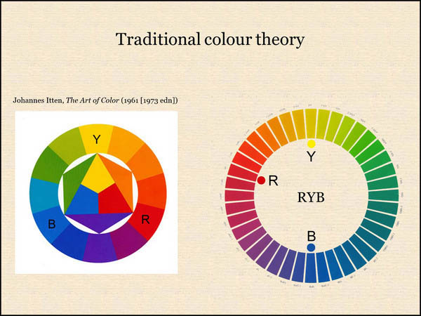
Colour education today presents flawed explanations of many aspects of colour, right down to the standard attributes of perceived colour and their physical basis. Attempts to critique the historical “primary colours” of art education have had limited impact, not least because they have often been made on the basis that the “real”, “modern” or “scientific” primary colours are cyan, magenta and yellow, an approach that fails to acknowledge the perceptually primary status of red, yellow and blue as unique hues. Scientific explanations of colour vision also commonly omit hue opponency, leaving the impression that hues are properties residing in wavelengths of light and even individually “detected” by the three cone cell classes. Hue should be explained not as a property of wavelengths but as the way in which we perceive a direction of imbalance among the long-/middle-/short-wavelength components (1) of light relative to daylight, or (2) of the spectral reflectance of an object. The assumption that colour has just one set of three attributes irrespective of mode of appearance has led to conflation and confusion of the attributes of chroma, colourfulness and saturation, and indiscriminate use of the word “saturation” for numerous different concepts and measures of chromatic intensity has created endemic confusion, especially surrounding digital colour spaces. Much colour education in art and design treats the “colour wheel” and lightness scale separately or integrates them only simplistically as a spherical model that cannot represent absolute lightness and chroma scales. Among painters the framework of hue, lightness and chroma (for objects, including paints and paint-mixing paths) has a degree of currency in the context of the Munsell system, but the other useful three-dimensional frameworks of hue, brightness and colourfulness (for light and the visual field) and hue, saturation and brilliance (relevant to effects of illumination and luminosity) are currently much less widely understood.
Page published May 11, 2020.