my colour short course is
now offered online through
Australia's National Art
School in Sydney! There's
a choice of two sessions to
suit every time zone. LINK
Home
The Dimensions of Colour
Basics of Light and Shade
Basics of Colour Vision
Additive Mixing
Subtractive Mixing
Mixing of Paints
Hue
Lightness and Chroma
Principles of Colour
Afterthoughts
Glossary
References
Contact
Links
NEXT COLOUR
WORKSHOPS

Please note: The pages forming Part 8 were part of the original Dimensions of Colour site uploaded in 2007 and have not been updated recently. They are left here for the moment because some of the diagrams have been linked to by other sites or reproduced in publications. For much more recent discussions of lightness and chroma please see:
Section 1.3 The Dimensions of Colour: Lightness
http://www.huevaluechroma.com/013.php
Section 1.5 The Dimensions of Colour: Chroma
http://www.huevaluechroma.com/015.php
THE DIMENSION OF CHROMA
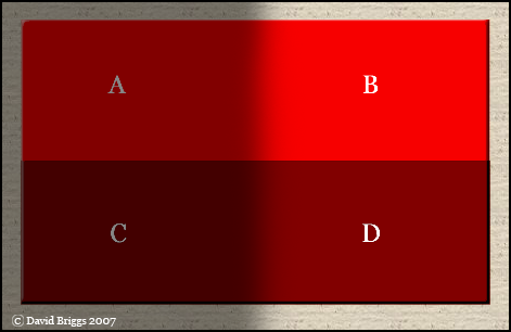
Chroma is the perceived strength of a surface colour, the degree of visual difference from a neutral grey of the same lightness. In recent technical literature of colour appearance, chroma is defined as "colorfulness" of an object relative to the brightness of a white object similarly illuminated, which allows for the fact that a surface of a given chroma displays increasing colorfulness as the level of illumination increases (Figure 8.4).

Figure 8.4. Chroma and colorfulness. A surface of a given chroma is more "colorful" in higher illumination (B,D) than in low illumination (A,C). Ttonal painters would observe this difference in brightness and "colorfulness" of light, and represent it with paint areas of different lightness and chroma, in order to create the illusion of a surface of uniform chroma under varying light. A and D are in fact exactly the same screen colour, but are seen in normal viewing mode as a light colour in shadow and a dark colour in light respectively. (As always, squinting helps to see this relationship).
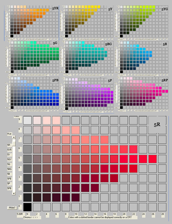
The term chroma was invented by Munsell (1905), who subsequently quantified the term as an open-ended scale of perceptually uniform steps, defined in relation to his atlas of colour samples (Munsell, 1915). In doing so he showed that the maximum chroma actually attainable in surface paints was different for different hues. As new pigments are discovered the range of possible chroma for each hue increases . Chroma ranges beyond 20 for some normal reflecting materials, as is as high as 30 for some fluorescent paints.
As well as being measurable in perceptually equal steps, as in the Munsell system, chroma can also be described on a relative scale between zero and the maximum possible for the hue, as is implicit in the circular shape of the traditional artist's colour wheel. Denman Ross (1907) suggested using a relative scale of one-quarter, half, three-quarter and full "color-intensity".
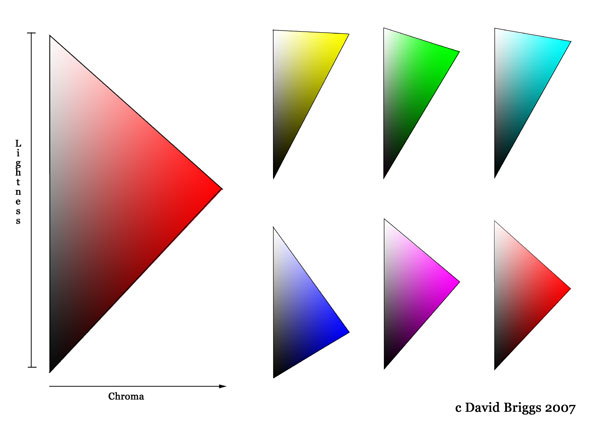
We saw in the introduction that in order to have high chroma, a surface must reflect light of relatively high saturation and brightness for a given degree of illumination. For any given hue, it is possible to imagine a surface that reflects all wavelengths of light that contribute to the sensation of that hue, and none that cause desaturation of that hue. Such a surface would have the maximum possible chroma for that hue: any surface of higher lightness necessarily reflects less saturated light, and any surface that of lower lightness obviously reflects less bright light. Conceptually the range of possible variations of a single hue may therefore be visualized as a triangle, in which the range of possible chroma becomes progressively more restricted as one approaches white and black respectively. The lightness level at which this maximum chroma occurs is highest for yellow and lowest for hues around violet-blue (Figure 8.5).

Figure 8.5. Diagram of all possible RGB colours of a single hue angle, showing variations in the range of possible chroma with lightness.
In the digital realm, RGB colours conform precisely to this simple triangular geometry (Figure 8.5), but actual surface colours also conform broadly to this general triangular pattern (Figure 8.6).

Figure 8.6. Range of chroma for values 0-9 for each of the ten principal hues of the Munsell system. White (value 10) omitted from each diagram. Pages generated using WallKillColor Munsell Conversion programme 7.0.1.
ĀĀĀĀĀĀĀĀĀĀĀ
